TLDR: This week’s update delivers 20 new WooCommerce block patterns to enhance your online store, 40 Bauhaus-inspired icons for unique design elements, and practical tips for e-commerce websites.
Hello Creators 👋
Here’s what’s new in the MaxiBlocks toolkit this week.

Scrollable image inside of a frame
A free playground pattern
A MaxiBlocks creator requested a feature to showcase a tall image in a scrollable frame. 🔗View demo
To achieve this scrollable image effect in MaxiBlocks:
1) Create a group with a background image
2) Set a specific height for the group
3) For the normal state:
– Set background size to ‘cover’
– Set background position to ‘center top’
4) For the hover state:
– Change background position to ‘center bottom’
5) Adjust the transition time to 4 seconds
This simple method uses MaxiBlocks’ background layers feature without requiring the interaction builder, providing an easy solution for image scrolling effects.
20 New WooCommerce block patterns (2,228 Total)
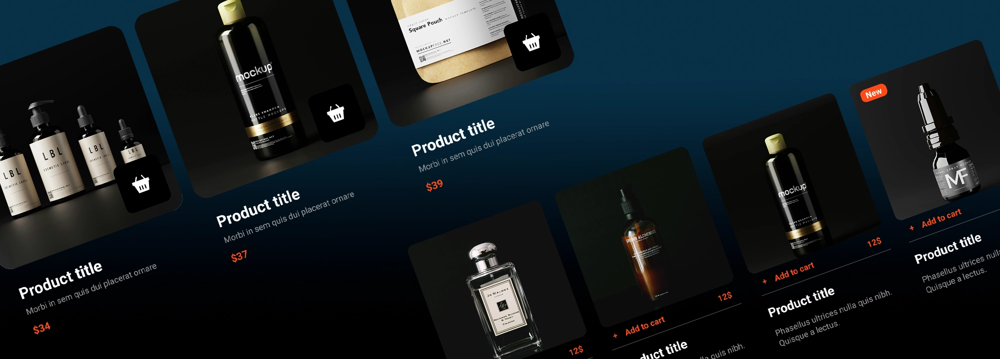
Introducing our first set of WooCommerce-specific patterns. These designs provide versatile layouts for showcasing your products:
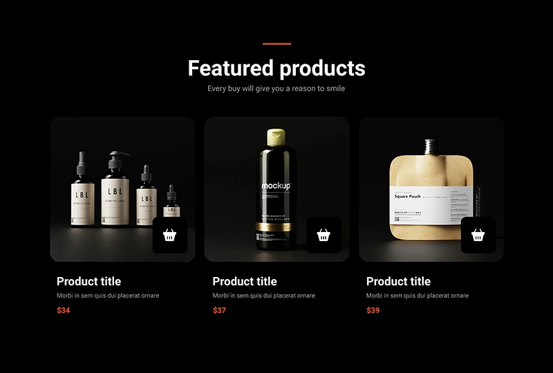
A modern, minimalist product showcase features a header and three-column grid layout with rounded product cards. Each card displays a large black and white shoe image, title, repeated subtitle, price, and a subtle shopping cart icon. The design’s unique aspects include consistent use of monochrome photography and repeated messaging, making it ideal for a stylish, cohesive presentation of featured products.

WooCommerce Dark WCD-PRO-01
This minimalist, product showcase features a single-row, four-column grid layout with rounded product cards. Each card displays a square product image, title, price, and underlined “Add to cart” button. The design’s unique aspects include subtle shadows, rounded corners, and a strong visual hierarchy, making it ideal for showcasing premium or modern product lines.
This clean, high-contrast design showcases new tech product arrivals in a grid layout. It features four product cards with images, names, and descriptions, unified by consistent styling and shopping cart icons. The design is sleek, mobile-friendly, and ideal for an e-commerce tech store’s new arrivals or featured products section.
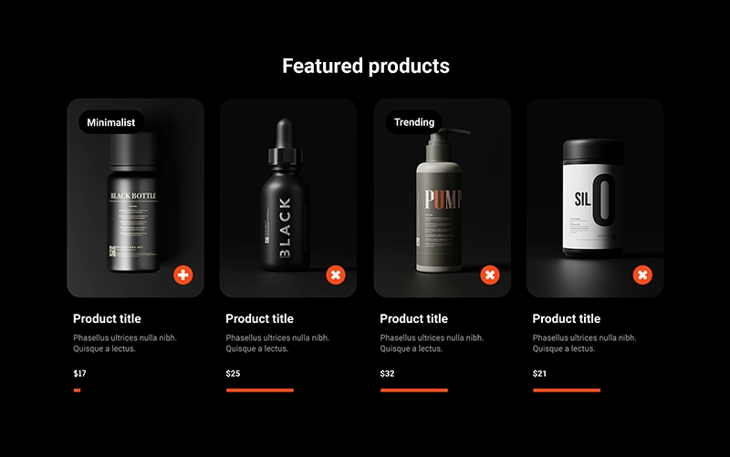
This elegant, grid-based design showcases featured shoe products with a clean aesthetic. It uses black and white photography, interactive elements like remove buttons and progress bars, and a tagging system. The layout is balanced and mobile-friendly, ideal for an e-commerce platform’s featured products or new arrivals section.

WooCommerce Dark WCD-PRO-04
This refined, grid-based design showcases chair products using black and white photography. It features a tiered product system (Starter, Silver, Gold), interactive elements, and consistent “Add to basket” buttons. The clean layout and monochromatic scheme create a sophisticated look ideal for a furniture e-commerce platform.
This neat, grid-based template offers a versatile layout for showcasing featured products. It presents a clean, four-column design with consistent product cards, each featuring an image, product code, title, price, and an interactive icon. The template includes elements for highlighting new items or discounts, making it adaptable for various e-commerce needs. Its monochromatic scheme and ample white space create an elegant, uncluttered look suitable for a wide range of products and industries.
A sleek 2×2 grid layout showcasing four tech products against a dark background. Each product card features a high-contrast image, product title, price, and “Add to cart” button. The design emphasizes simplicity and visual appeal, ideal for premium tech or gadget e-commerce sites.
An asymmetrical 2×2 grid highlighting different product categories: “Hot new products,” “New arrivals,” and “Editor’s picks.” Each section features striking product images on a dark background with “Explore” CTAs. This layout is perfect for showcasing diverse product lines or featured collections on a homepage.
A horizontally-aligned “Featured products” section displaying four camera-related items. The design uses rounded image containers, uniform pricing display, and a central “View all” button. This template is well-suited for highlighting a specific product category or promoting best-sellers.
A “Trending products” section showcasing four premium bottles (likely fragrances or skincare) in a single row. Each product card includes an image, title, price, brief description, and “Add to cart” option. The design’s elegance makes it ideal for luxury goods or high-end cosmetics e-commerce sites.
To use these patterns, you’ll need:
- WooCommerce plugin installed and configured
- Products with title, category, price, tags, featured image, and short description
- For detailed instructions on exporting and importing products, view the woocommerce docs
E-commerce design tips
- Use consistent product card layouts for a cohesive look
- Implement hover effects to engage users
- Utilize white space to create a clean, uncluttered design
- Incorporate high-quality product images
- Ensure mobile responsiveness for all patterns
- Use colour psychology to influence purchasing decisions
- Implement clear calls-to-action (CTAs) on product cards
40 Bauhaus-inspired SVG icons (14,273 Total)
Bauhaus icon design style is rooted in the principles of the Bauhaus art school and movement that originated in Germany in the early 20th century. This style emphasizes simplicity, functionality, and geometric forms. Here are the key characteristics of Bauhaus icon design:
Geometric shapes: Icons primarily use basic geometric forms like circles, squares, triangles, and rectangles.
Minimalism: Designs are stripped down to their essential elements, avoiding unnecessary details or ornamentation.
Bold colours: The style often incorporates primary colours (red, blue, yellow) along with black and white.
Clean lines: Straight lines and smooth curves are used to create clear, easily recognizable forms.
Balance and symmetry: Compositions are often balanced and symmetrical, creating a sense of order and harmony.
Abstraction: Icons represent objects or concepts in a highly stylized, abstract manner rather than realistic depictions.
Grid-based layouts: Designs are often based on a underlying grid system for consistency and alignment.
Typography integration: When text is used, it’s often incorporated as an integral part of the design, using sans-serif fonts.
Functionality: The primary focus is on creating clear, easily understandable icons that serve their purpose effectively.
Contrast: Strong contrasts between elements help create visual interest and improve legibility.
The Bauhaus design style has had a significant influence on modern graphic design and user interface design, particularly in creating clear and intuitive icons for digital interfaces. Its principles of simplicity and functionality continue to be relevant in today’s design landscape.
These Bauhaus-inspired SVG icons offer tremendous versatility in web design. Their scalability and ability to change colours make them perfect for various applications. Here are some creative ways to use them:
Image Masks: Use icons like Bauhaus 25 (circle in square) or Bauhaus 7 (quarter circle) as image masks to create interesting photo frames.
Apply icons with multiple shapes (e.g., Bauhaus 28 or 40) to create multi-layered image reveals.
Background Layers: Use repeating patterns like Bauhaus 26 (dots) or Bauhaus 12 (stars) as subtle textured backgrounds. Layer multiple icons with different opacities to create depth in your background.
Dividers: Icons like Bauhaus 35 (vertical lines) or Bauhaus 11 (waves) can serve as unique section dividers. Use Bauhaus 3 or 4 (curved lines) as dynamic separators between content areas.
Overlays: Apply icons like Bauhaus 24 (checkerboard) or Bauhaus 23 (horizontal lines) as semi-transparent overlays on images or videos. Use Bauhaus 1 (pinwheel) or Bauhaus 13 (starburst) as focal point overlays to draw attention.
Motifs: Incorporate icons like Bauhaus 22 (eye) or Bauhaus 39 (person) as recurring motifs throughout a site for thematic consistency. Use simpler shapes like Bauhaus 31 (steps) or Bauhaus 32 (columns) as subtle decorative elements.
Interactive Elements: Use Bauhaus 37 (asterisk) or Bauhaus 8 (flower) as hover effects for buttons or links.
Header and Footer Designs: Incorporate larger versions of geometric icons (e.g., Bauhaus 21, 27, or 29) as distinctive header elements.
Use repeating patterns (Bauhaus 33 or 5) in footers for a cohesive design.
New to Maxi? Access 14,000 icons, 100 style cards, pages, and patterns for free. MaxiBlocks WordPress plugin is open-source and free forever.
Install the plugin directly from your WordPress site:
- Go to Plugins > Add New
- Search “MaxiBlocks”
- Install and activate
- Add Maxi blocks or insert cloud patterns
Once installed, you can start using MaxiBlocks and cloud patterns right away.
We’re always here to help if you have any questions. Don’t hesitate to reach out if you need assistance implementing these new features.
That’s all for this week. Until our next update, may your designs be bold and your workflow smooth.
Have a great weekend!
Christiaan
