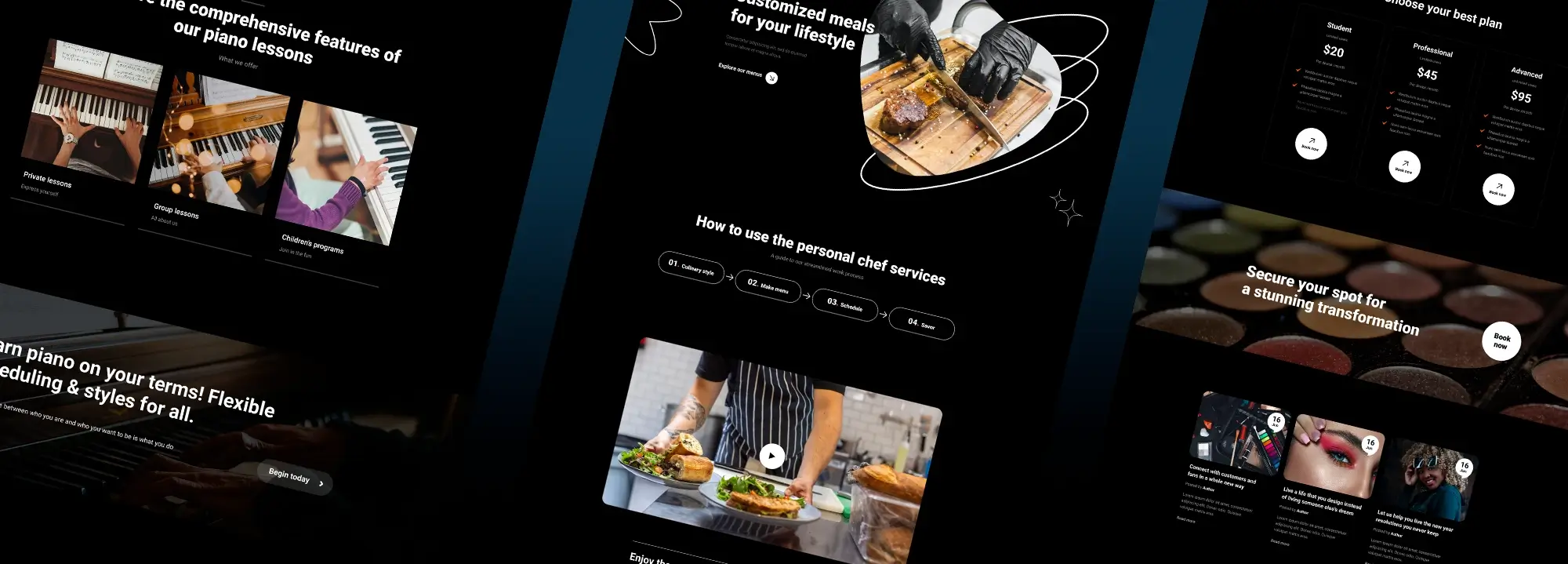
TLDR: This week’s update brings 3 new home page designs, 25 additional ribbon icons, and 7 practical use cases for incorporating ribbon icons effectively.
Hello Creators 👋
New homepage templates (176 total)

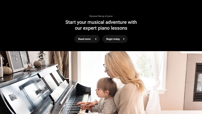
Piano lessons hero image
Piano Lessons POLS-PRO-01
🔗 Piano Lessons Dark Variation
Design: Clean and structured design that uses earth tones and well-spaced sections to promote an educational and inviting atmosphere for learning piano.
Storyline: This design appeals to learners by showcasing the joy and expertise in piano lessons. Inviting images of diverse people engaging with lessons cater to a wide audience, from beginners to advanced players. The “Uncover the secrets of masterful piano playing” section uses curiosity to guide potential students towards enrolment.
Statistical data about the academy’s achievements build credibility and authority, while flexible pricing ensures accessibility, encouraging visitors to convert into students.
Tags: Piano, Music, Lessons, Education, Teaching, Learning, Training, Tutoring
Personal Chef PLCF-PRO-01
🔗 Personal Chef Dark Variation
Design: A modern and inviting design with a focus on high-quality visuals of food preparation and personalized meal services.
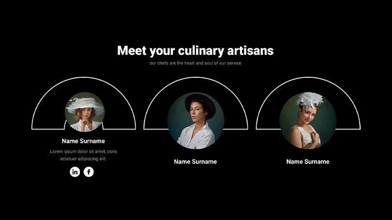
Storyline: This design creates a personal, engaging experience that mirrors the service’s meal customization. Dominant visuals of food and chef interactions are complemented by clear, minimal text speaking directly to the user’s culinary needs. The “Meet your culinary artisans” section with chef profiles adds a personal touch that builds trust.
Strategically placed prominent calls-to-action (CTA) after visually engaging content naturally guide users to engage with the service. The design journey clearly flows from introduction, through detailed offerings, to action, underlining the personalized service promise.
Tags: Private chef, Meal plans, Food service, Cooking, Nutrition, Cuisine, Menu, Catering

MaxiBlocks SVG shapes
Makeup Studio MPSO-PRO-01
🔗 Makeup Studio Dark Variation
Design: Elegant and artistic design with a dramatic use of dark colours and spotlighted images to emphasize the transformational aspect of makeup.
Storyline: High-contrast imagery and a dark theme evoke sophistication and focus on makeup transformation stories. Spotlighted images draw attention to the artistry of makeup application, enhancing the visual journey across styles and occasions.
The layout emphasizes personal expression and transformation, reinforced by diverse customer testimonials and a CTA directly inviting users to start their own transformation. This strategy motivates user engagement by showcasing the immediate, impactful benefits of the service to help conversion.
Tags: Beauty, MakeUp, Cosmetics, Fashion, Style, Trends, Glamour, Skincare, Salon
25 New ribbon icons (14,098 total)
MaxiBlocks continues to expand its icon library, now offering 57 ribbon icons and a total of 14,098 icons. These versatile assets can enhance your website’s visual communication and user experience.
7 Practical use cases for ribbon icons
- Labelling sale or discounted items: Ribbon icons can be used to clearly mark products or services that are on sale or being offered at a discounted price. This quickly draws users’ attention to promotional offerings.
- Indicating new or updated content: Attaching ribbon icons to recently added blog posts, articles, product listings, or features can help returning visitors easily identify new content they haven’t seen before.
- Highlighting important announcements or alerts: Placing a ribbon icon next to critical site-wide announcements, such as changes to terms of service or privacy policies, can ensure users don’t overlook this important information.
- Designating required form fields: In online forms or surveys, denoting mandatory fields with a ribbon icon can provide clear visual indication to users which information they must provide to proceed.
- Showcasing awards or recognitions: Websites can display ribbons next to products, services, or content that have received special awards, high ratings, or noteworthy recognitions to establish credibility and trust.
- Indicating subscription-only or premium content: Ribbon icons can signify which content or features are exclusively available to paid subscribers or premium members, differentiating these from free offerings.
- Encouraging desired actions: Strategically placing ribbon icons next to key calls-to-action, such as “Sign Up Now” or “Download the App”, can subtly encourage users to take those desired steps.
Design tip: Use ribbon icons sparingly to highlight only the most important items on your site. Each ribbon’s meaning should be clear and consistent to avoid confusing users. When used purposefully, ribbon icons provide helpful visual cues that guide attention without cluttering the design.
Building on accessibility
Last week, we introduced ARIA label support in MaxiBlocks to enhance accessibility for users with different abilities. This feature allows you to add descriptive labels to foundation blocks, making your content more inclusive and compliant with standards like WCAG.
By using ARIA labels strategically, you can create a better user experience for all visitors and ensure your website is accessible to a wider audience. If you missed it, check out the guide in our previous blog post.
That’s all for this week! We hope these new additions inspire your designs and help you create better websites. Stay tuned for more updates coming soon.
Take care and have a great weekend, Christiaan.
