What are the 40 WordPress website design trends to watch in 2025?
Try MaxiBlocks for free with 500+ library assets including basic templates. No account required. Free WordPress page builder, theme and updates included.
Updated 15th May 2025
Key takeaways:
- Accessibility for equality and inclusivity will be enforced with laws
- AI will play a part in every aspect of WordPress website design
- Responsive websites will continue to take centre stage
- No code will continue to democratise WordPress website design
- Good design will make a come back in website design
The year 2025 and WordPress website design
During 2025 WordPress website design will continue to focus on minimalism. Expect to see a focus on simplicity, clean lines, and plenty of negative space. This trend is all about creating a sense of calm and clarity, making it easier for visitors to navigate and find what they’re looking for. To achieve this, designers will be using a limited colour palette, plenty of white space, and a focus on typography to convey the message.
Another trend to watch out for is the rise of “dark mode” design. This involves using a predominantly dark colour scheme, often with a bold or bright accent colour to create visual interest. This trend is all about creating a sense of sophistication and luxury, and is particularly well-suited to industries such as finance, technology, and healthcare. To get this look right, designers will be using a combination of dark colours, subtle textures, and clever use of lighting effects to create a sense of depth and dimension.
Also expect to see a greater emphasis on accessibility and inclusivity in website development and website design. This means using clear and consistent navigation, high contrast colours, and clear typography to make websites easier to use for everyone. This trend is all about creating a sense of equality and inclusivity, and is particularly important for businesses that want to appeal to a broad audience. To achieve this, WordPress website designers will be using a combination of design principles, such as clear headings, consistent layout, and alt text for images, to create a website that’s accessible to all. Voice search optimisation could add to this.
Colour & typography
1. Dark mode design
Dark mode is here to stay, with more people finding it easier on the eyes, especially at night. It’s not just stylish; dark mode can help reduce screen glare and even save battery on mobile devices. Block themes make it easy to let users switch between light and dark modes based on what feels best for them.
A good example:
An online magazine could include a dark mode option to give late-night readers a more comfortable experience, helping them stay on the site longer without straining their eyes.
2. Bold typography: Making a statement
Bold typography is taking centre stage in 2024, with large, impactful fonts setting a distinctive tone and capturing attention. This WordPress website design trend goes beyond style it improves readability and gives websites a modern, confident look.
Example use:
A personal blog could use bold typography for headings to establish a strong brand voice and make key messages stand out.
3. Gradient and duotone colours: Adding vibrancy and style
Gradients and duotone colour schemes add a stylish and modern touch to web design. These effects create depth and visual appeal, helping brands stand out and experiment with different colour combinations that fit their identity.
Real-world scenario:
A music website might use duotone effects on artist profiles and album covers, creating a cohesive, visually engaging experience.
Subscribe to our newsletter
Layout & minimalism
4. Minimalist and clean design
Minimalist design keeps the focus on essential content, stripping away distractions for a clean, uncluttered look. With the resources available in the Gutenberg template library, it’s easier than ever to create layouts that feel open, modern, and user-friendly.
Real-world example:
A photography portfolio might use a minimalist design to let the images speak for themselves, keeping the layout simple and unobtrusive.
5. CSS grid layouts: A flexible foundation
CSS grid layouts provide a flexible, structured approach to design, allowing for complex and responsive layouts that stay organised across different devices. This method helps create visually neat and balanced sites that are easy to navigate.
In action:
An online magazine could use grid layouts to organise articles into visually engaging sections, giving readers a seamless browsing experience.
6. Minimalism reigns supreme: Less is more, but more impactful
Minimalism focuses on clean, uncluttered layouts that highlight essential content and create a comfortable browsing experience. With bold typography and intentional use of space, WordPress website designs ensure a site looks modern while staying user-friendly.
Real-world scenario:
An online magazine might adopt a minimalist design to make articles easy to read, keeping distractions to a minimum and letting the content take centre stage.
Advanced visual elements
7. Advanced animation and micro-interactions
Adding subtle animations or interactive effects can make a site feel more lively and polished. Small touches like hover effects, loading animations, or smooth transitions help guide users through the site in a way that’s enjoyable and intuitive, keeping their attention as they move around.
Where this works:
An e-learning platform could use animations to highlight key sections or provide feedback on quiz answers, making navigation feel seamless and learning more interactive.
8. 3D elements
Bringing 3D elements into a site design can create a more immersive experience, whether it’s for showcasing products or adding depth to a visual story. This trend lets visitors interact with models or images in ways that feel more engaging than static images, offering a modern touch that stands out. Many block-compatible WordPress themes now support 3D features, making it easy to integrate these effects.
Practical use:
A home decor store could feature 3D models of furniture, allowing customers to view items from every angle before making a purchase.
9. Scrolling transformations: Captivating user journeys
Scrolling transformations make the journey through a website more interactive and engaging. Effects like parallax scrolling, smooth transitions, and animations triggered by scrolling add visual appeal and can guide users naturally from one section to another.
Practical example:
A portfolio site could use scrolling transformations to reveal project details gradually, keeping viewers engaged and encouraging them to explore further.
10. Micro-interactions: Subtle details, big impact
Micro-interactions add small, responsive animations or effects, like button hover effects or smooth menu transitions. These subtle touches enhance the user experience, making the website feel more interactive and engaging.
Where it’s useful:
An online shop might add micro-interactions to product images and buttons, creating a more engaging and polished experience that encourages users to explore further.
Build like a pro
Mixed media & creative assets
11. Mixed media: A feast for the senses
Incorporating different types of media, like videos, audio, and images, adds depth and variety to a site. Mixed media allows for a more dynamic experience, helping visitors engage with content in different ways.
Practical example:
An educational website might mix video tutorials, infographics, and podcasts to cater to various learning preferences, keeping users engaged longer.
12. SVG icons: Scalable and versatile
SVG icons are ideal for modern web design because they scale seamlessly across devices without losing quality. They load quickly and look crisp on screens of any size, making them a reliable choice for icons, logos, and other graphic elements.
Example use:
An app developer might use SVG icons for navigation buttons, ensuring they look sharp on both mobile and desktop devices.
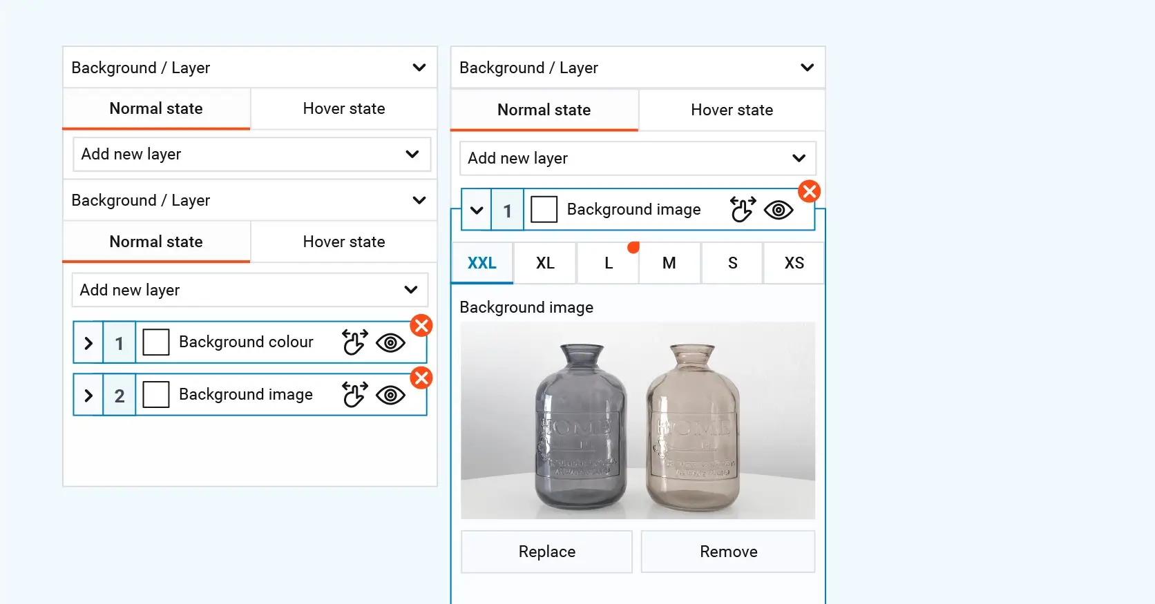
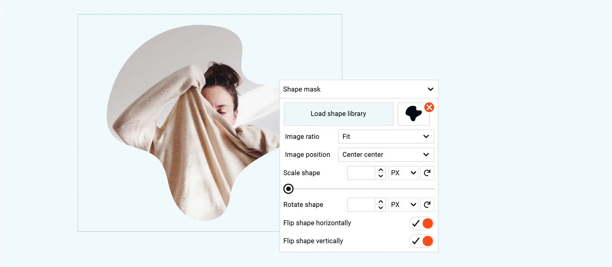
13. Masks and layering: Adding depth and dimension
Masks and layering create a sense of depth and visual interest, making it easy to highlight specific elements or add creative effects. Techniques like text overlays and hover reveals can add a polished look that subtly guides user attention.
In action:
A portfolio site could use layered images with subtle shadows and hover effects, making each project stand out with a professional finish.
Eco-friendly & sustainable approaches
14. Sustainability in web design: Doing good looks good
Eco-friendly design is more than a trend; it’s becoming essential. Sustainable design practices focus on faster loading times, lower data usage, and themes optimised for minimal resource consumption, all of which help reduce a site’s environmental impact.
Real-world scenario:
A nonprofit organisation could use a lightweight theme and optimise images to create a fast-loading, eco-conscious website that aligns with its mission.
Subscribe to our newsletter
Accessibility & responsive design
15. Accessibility-first design
Designing with accessibility in mind means making sites usable for everyone, including those with disabilities. Accessibility features like screen reader compatibility, intuitive navigation, and high-contrast visuals are becoming standard, ensuring a smoother browsing experience for all users.
In action:
An educational site could implement easy-to-read fonts, adjustable text sizes, and keyboard navigation to provide accessible learning resources for students with different needs.
16. Mobile-first design: The unbreakable rule
As mobile browsing continues to dominate, designing with mobile in mind remains a top priority. Responsive design tools ensure that websites function smoothly on all screen sizes, from phones to tablets, making it easy for users to navigate on any device.
Where this shines:
An e-commerce store could optimise its layout for mobile to offer easy browsing and checkout, ensuring a positive experience for on-the-go shoppers.
17. WordPress navigation menus: A foundation for user flow
WordPress navigation menus are essential for guiding users through a site, and recent advancements allow for more dynamic, user-responsive menus. These adaptable menus can highlight relevant content based on user behaviour, improving site usability and creating a smoother browsing experience.
Example use:
A news website might use dynamic menus that show trending stories or recently viewed categories, making it easier for users to find the content they’re interested in.
Interactive & immersive experiences
18. Interactive storytelling
Interactive storytelling transforms websites from static pages into engaging experiences. Adding elements like clickable timelines, animations, or multimedia sections allows users to explore a story at their own pace, making the content more memorable and immersive.
Example in use:
A travel blog could use interactive maps and photo galleries, letting readers explore destinations visually and connect more deeply with the journey.
19. AR and VR integration
Augmented reality and virtual reality are bringing new possibilities to online experiences. By integrating AR and VR, websites can offer immersive features, like virtual product try-ons or 360-degree tours, creating a more engaging way for visitors to interact with content.
Real-world scenario:
An online furniture retailer could let shoppers view how items look in their own rooms, helping them feel confident in their choices before buying.
20. Dynamic scrolling: Adding a touch of wow
Dynamic scrolling effects, such as parallax and smooth transitions, add movement to a site, making it more engaging. These scrolling animations can guide the user experience naturally through a page, creating a seamless flow from one section to the next.
Practical example:
A product page could use dynamic scrolling to reveal product details as users scroll down, creating an immersive, story-like experience.
Voice & AI enhancements
21. Voice search optimisation
As voice-activated searches gain popularity, more sites are optimising their content for voice assistants like Siri, Alexa, and Google Assistant. By using structured data and natural language phrasing, websites become more accessible and visible to voice search users, giving them a leg up in local and mobile search results.
Example in action:
A neighbourhood café might optimise for common voice queries, such as “Where’s the closest coffee shop?” to capture nearby customers searching on mobile while on the go.
22. AI-powered personalisation
AI is bringing a new level of personalisation to WordPress websites, allowing them to adapt to individual users’ interests or browsing habits. This could mean showing tailored content, product recommendations, or even adjusting the layout based on what a visitor tends to click on, making each visit feel more relevant and engaging.
Real-world use:
An online bookstore might use AI to suggest books based on previous purchases or browsing, giving readers a personalised experience that encourages them to explore more titles.
23. AI website builders: Intelligent design assistance
AI is becoming a helpful tool in website design, offering features like design suggestions, layout recommendations, and even automated content generation. These tools streamline the design process, making it easier for creators to build a polished site with minimal effort.
In action:
A new business could use an AI website builder to quickly set up a site, with AI-generated suggestions for layout and design elements tailored to their industry.
Editor & theme enhancements
24. Full-site editing with Gutenberg
Full-site editing puts complete design control into the hands of the website creator. With Gutenberg’s capabilities, site owners can customise everything from headers to footers, allowing for a cohesive style throughout without needing to touch code.
Where it fits:
Small businesses can use full-site editing to maintain consistent branding across their site, easily adjusting design elements as needed.
25. WordPress block themes: Building blocks for success
Block themes are changing the way WordPress websites are created by allowing customisation without heavy coding. These themes use the Gutenberg editor with pre-designed blocks, making it easy to build visually appealing, unique layouts that fit a brand’s style.
Example use:
A small business might use block themes to quickly set up a professional-looking website, customising each block to align with its branding.
26. Gutenberg editor’s rise to dominance: A user-friendly future
The Gutenberg editor’s block-based design simplifies content creation, making it accessible for those with little to no coding background. Its intuitive layout and customisation options make it a popular choice for creating professional, polished websites.
Where this helps:
Bloggers and small business owners can use Gutenberg’s tools to create visually appealing pages with minimal effort.
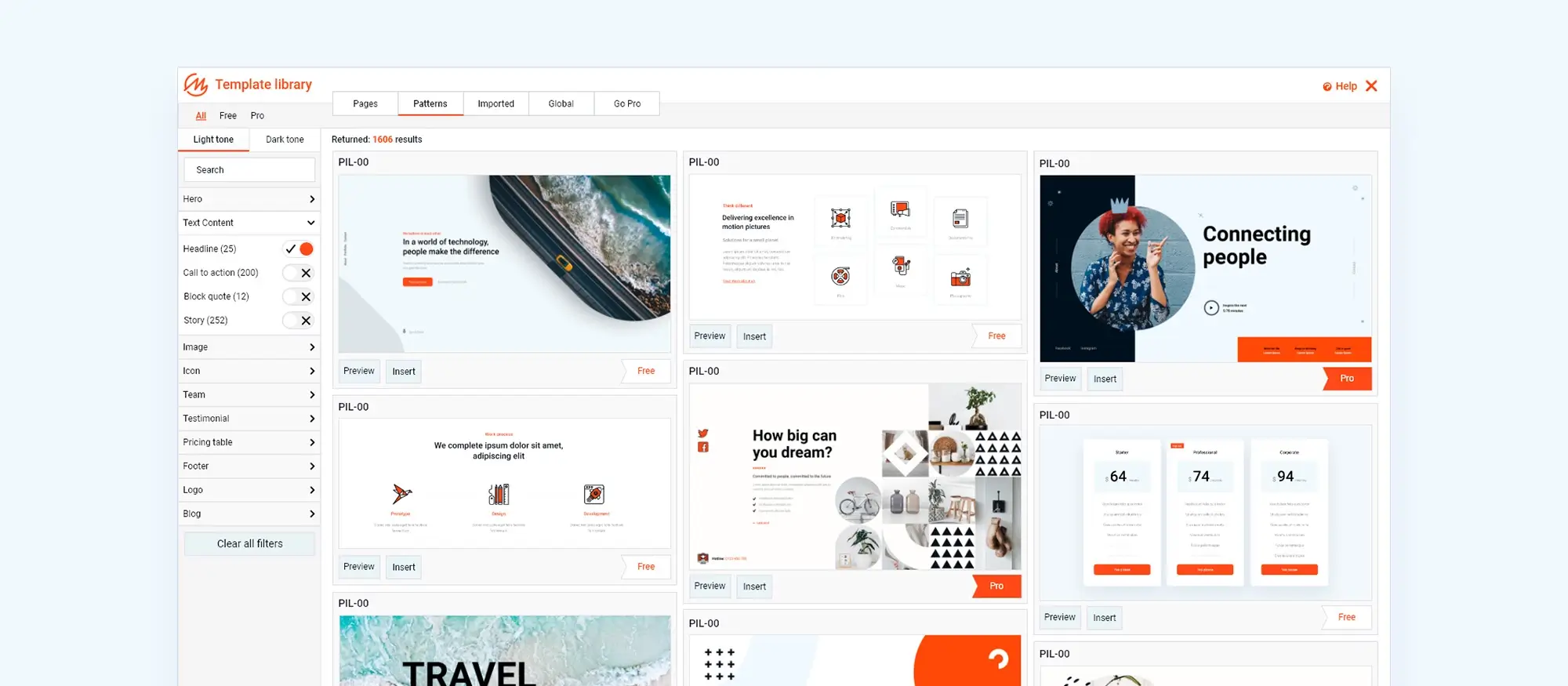
27. Beyond Gutenberg blocks: Pattern library expansion
The Gutenberg pattern library is expanding to include more than just single blocks. This growing collection will feature pre-designed sections and layouts that can be easily integrated, helping users build cohesive and visually appealing sites without needing design skills.
Example in action:
A business website could use expanded pattern options to create consistent layouts for service pages, saving time while maintaining a professional look.
Build like a pro
Open source & code optimisation
28. No-code development: Democratizing design
The no-code movement makes it possible for anyone to build professional sites without needing to write code. With a range of visual design tools and themes, it’s easier than ever to create and customise layouts that look polished and fit a brand’s identity.
Practical use:
A small business owner with no coding experience could use no-code tools to set up a fully functional website, saving on development costs and gaining creative control.
29. Open source website builders: Power to the people
Open-source builders are making sophisticated web design accessible to more people. By offering flexible, customisable platforms, open-source builders support creativity and independence, removing barriers for those without technical expertise.
Example in action:
A nonprofit could use an open-source builder to create and manage its own site, easily updating content and features without needing a developer.
30. Drag and drop website builder open source platforms: Freedom and flexibility
Open-source drag-and-drop builders offer both ease of use and freedom to customise without vendor restrictions. This blend of flexibility and accessibility enables users to create unique, visually appealing sites that fit their needs.
Real-world scenario:
A startup could use an open-source drag-and-drop builder to quickly build and adjust their site, ensuring full control over design and functionality.
31. Open source website builder momentum: A growing movement
The momentum behind open-source website builders is increasing, encouraging innovation and accessibility in web design. These platforms offer flexibility, allowing anyone to build and modify a site without being locked into proprietary systems.
Practical example:
A nonprofit could use an open-source builder to create a customised site, enjoying the freedom to adapt it as needed without relying on a specific vendor.
Layout techniques & pattern management
32. Flexbox: Flexible layouts made easy
Flexbox is a powerful tool for building responsive layouts that adapt smoothly to different screen sizes. WordPress block themes and plugins allow for precise control over the alignment and distribution of elements, ensuring that a website looks organised and professional across devices.
Real-world scenario:
An online clothing store could use Flexbox to arrange product grids that automatically adjust for desktop, tablet, and mobile views.
33. Pattern library powerhouse: Page builders with built-in assets
Pattern libraries in page builders are transforming design by offering pre-built sections and layouts that are ready to use. These drag-and-drop assets save time and help maintain a cohesive look across a site, allowing creators to focus on content rather than complex design work.
Practical example:
A business website could use pattern libraries to quickly build consistent pages for services, testimonials, and contact information.
34. Pre-designed WordPress block templates: Hit the ground running
Pre-designed block templates offer an easy starting point for building pages. These templates come with pre-built blocks that can be customised, giving sites a professional look without needing a full design from scratch.
Example use:
A freelance portfolio site might use block templates to quickly set up project galleries and testimonials.
35. Synced patterns in the WordPress pattern library: Consistency made easy
A synced WordPress pattern library allows for easy updates across multiple pages by linking patterns to a central design. Any edits to a pattern automatically update across the website, saving time and ensuring a cohesive visual look.
Practical use:
An online store might use synced patterns for product descriptions, allowing changes to be reflected site-wide in one step.
36. Micro-blogging and social features: Fostering a community
Integrating micro-blogging and social features can create a sense of community on a site. Features like short-form posts, social media feeds, and comment sections encourage interaction, making it easy for visitors to connect with content and each other.
Example in use:
A lifestyle brand might include a micro-blog with quick tips and a social feed to give users fresh content and a place to engage with the brand directly.
37. Dynamic content: Personalisation for a unique experience
Dynamic content personalises user experiences by displaying different information based on factors like location, browsing history, or previous interactions. This approach makes a website feel more relevant and engaging to each visitor.
Example in action:
A travel website could show personalised recommendations based on a user’s past searches, such as similar destinations or related travel tips.
Essential support & resources
38. Essential plugins for every site: Building a strong foundation
Some plugins are key for a well-rounded website, including those for security, SEO, performance optimisation, and backups. These essentials help keep a site safe, fast, and user-friendly, ensuring a strong foundation to handle traffic and protect data.
Example in use:
An e-commerce site could install security and backup plugins to protect customer information and prevent data loss in case of a technical issue.
39. Expanding the WordPress design library: A treasure of resources
The design library is continuously growing, offering a rich selection of pre-designed elements and templates. This expanded library provides an easy way to start building professional websites with access to elements that can be customised to fit any brand or style.
Example use:
A freelancer could use the library to speed up the design process by choosing from pre-made templates and modifying them to meet client needs efficiently.
Build like a pro
Future-oriented technologies
40. Blockchain technology: Exploring the future
Blockchain is introducing new opportunities in web design, such as secure content management, decentralised marketplaces, and enhanced privacy. Although still developing, blockchain’s potential applications could redefine how websites handle security and transactions.
Real-world scenario:
An art marketplace could use blockchain to verify digital art ownership, offering artists and buyers a secure, transparent platform.
Final thoughts
In 2025, website design is moving further toward creating experiences that feel more personal, intuitive, and enjoyable. From AI-powered recommendations to immersive scrolling and 3D visuals, the focus is on helping people connect with content in ways that are simple and satisfying. Features like bold typography, SVG icons, and micro-interactions bring a sense of quality and polish, while minimalist layouts and eco-conscious practices help keep things clean, fast, and sustainable.
At the same time, tools like Gutenberg’s growing pattern library, no-code design platforms, and open-source builders are making professional site creation easier than ever. These innovations give creators the flexibility to experiment with modern design trends while keeping control over branding and usability. Whether you’re a developer or just starting out, 2025 is shaping up to be a year where creativity, accessibility, and thoughtful design come together and helping people build websites that feel just right for their audience.
Ready to bring these trends to life?
Whether you’re starting from scratch or giving your WordPress site a fresh look, MaxiBlocks makes it easier than ever to design fast, modern, and fully custom websites no code needed.
Build better with powerful blocks, an intuitive editor, and design freedom that works for everyone from beginners to pros. Give it a go and see the difference.
Beautiful WordPress web designs to kickstart your site
Find responsive and accessible WordPress web designs to match your brand and goals.
FAQ: 40 WordPress design trends to watch in 2025
What is dark mode and why are more WordPress sites using it?
Dark mode reduces eye strain, especially in low light, and can improve battery life on mobile. Many themes now support toggling between light and dark for better accessibility and user comfort.
How does voice search impact WordPress content?
Voice search favours conversational phrasing and quick answers. Optimising your content with FAQs and natural language can improve discoverability on voice assistants.
What is AI personalisation in WordPress?
AI tools can show personalised recommendations and adjust content based on user activity. This keeps visitors engaged and encourages them to explore more.
Why use micro-interactions on a site?
They add feedback and polish like hover effects or animated button clicks helping users feel more in control and engaged as they browse.
Are 3D elements really useful in WordPress design?
Yes. They’re great for product showcases, virtual tours, or adding visual depth. Some themes and plugins now make 3D integration easier than ever.
What is accessibility-first design?
It means building your site to work for everyone including those using screen readers or navigating via keyboard. WordPress has built-in support and plugins to help with this.
Why is minimalist design so popular?
It puts content front and centre. Clean layouts, whitespace, and fewer distractions make sites easier to read and navigate.
How does interactive storytelling work on WordPress?
Using tools like timelines, sliders, and animations, you can build stories that users scroll through or click through at their own pace.
What’s the point of adding AR or VR to a site?
To create immersive, next-level experiences. Whether it’s testing furniture in your room or exploring a destination, AR/VR brings content to life.
What is full-site editing in WordPress?
It gives you control over headers, footers, templates, and design styles all in one place using the block editor, no extra builder needed.
Why are bold fonts trending?
They grab attention and add visual structure. Bigger, heavier type can guide users through content more easily.
What is mixed media in WordPress design?
It’s the combination of videos, audio, animations, and images to create richer, more varied content on a page.
Why is mobile-first design still relevant in 2025?
Because the majority of users visit sites from mobile devices. A mobile-optimised site loads faster and works better across all screen sizes.
How does web design affect sustainability?
Lighter websites load faster and use less energy. Efficient images, clean code, and minimal plugins all help reduce your site’s environmental impact.
What are block themes?
Themes built for the Gutenberg editor. They let you customise layout and content with drag-and-drop blocks no coding needed.
What is CSS grid layout and why use it?
It’s a flexible system for placing elements in rows and columns. It helps create organised, responsive layouts that work well across devices.
How can WordPress sites include social features?
Add comment sections, live feeds, or micro-blog posts. These features encourage community interaction and repeat visits.
What are scrolling animations?
As users scroll, elements move, fade, or change. It keeps things dynamic and visually interesting without overwhelming visitors.
How is blockchain used in web design?
For things like verifying digital ownership or enabling secure, decentralised transactions especially useful in art, collectibles, or memberships.
What is no-code WordPress development?
It means building sites without touching any code, using tools like page builders or the block editor to customise layout and features visually.
Why go open-source for a site builder?
It gives you full control. No vendor lock-in, more flexibility, and a large community of support.
What is Flexbox in web design?
Flexbox is a layout model that helps you align and space elements easily. Many themes use it to ensure content looks good at every screen size.
What are pattern libraries?
They’re reusable content sections like hero banners, testimonials, or contact blocks. You can drag and drop them into pages and edit them quickly.
What are SVG icons?
Scalable Vector Graphics are lightweight, crisp icons that look sharp on any screen size without affecting load speed.
What is layering in web design?
It’s stacking visuals like images, text, and shadows to create depth and guide attention especially effective in hero sections and product highlights.
What plugins are essential in 2025?
Yoast SEO, WooCommerce, Contact Form 7, UpdraftPlus (backups), and Wordfence or Sucuri (security) are still must-haves for most sites.
What are pre-designed block templates?
They’re page sections ready to go just customise the content. You don’t need to design from scratch.
What are gradient and duotone colour effects?
They add visual interest and help you build a brand identity. These colour treatments are now supported natively in the block editor.
What is dynamic content?
Content that changes based on user input or behaviour like location, past visits, or device type creating a more personalised experience.
What are synced patterns?
They’re reusable design sections that auto-update across your site if you change them perfect for footers, banners, or CTAs.
How do open-source drag-and-drop builders work?
They let you design visually with full ownership of your code and data. No restrictions on features or long-term fees.
Is Gutenberg still the future of WordPress editing?
Yes. It continues to evolve with more powerful tools for layout control, site styling, and custom block support.
What are scrolling transformations?
These are effects triggered as users scroll like zooming images, sliding panels, or fading text. They can make long pages feel more interactive.
How do AI website builders help?
They suggest layouts, content, and even colour schemes based on your site’s purpose, helping speed up design for beginners and pros alike.
What’s new in the WordPress design library?
More pre-built sections, templates, and synced patterns for faster setup and consistent style across pages.
Why is minimalism still going strong?
Less clutter equals more focus. Minimalism improves readability and makes sites feel faster and more modern.
How is the pattern library expanding beyond blocks?
It now includes full-page layouts, sections, and even synced reusable elements, making custom design easier than ever.
Why is the open-source movement gaining traction?
Creators want control and flexibility. Open-source tools offer freedom to build what you want without depending on locked-down platforms.
What are micro-interactions and why use them?
They’re small animations or responses to actions like button hovers or toggle switches that help users know their actions are working.
How do modern menus improve navigation?
New navigation tools adapt to user behaviour and highlight trending or related content, helping people move through your site more smoothly.
What is a hero section and how does it support engagement?
The hero section is the top visual element of a webpage, designed to capture attention and guide users toward a specific action. To see what makes a strong example, this hero banner showcase features layouts that balance impact and clarity.
How can I create a hero section in WordPress without code?
With the Maxiblocks hero section builder for WordPress, you can design engaging, mobile-friendly hero sections using a simple drag-and-drop editor, ideal for beginners and fast development.
Is there a Maxiblocks tool just for hero design?
Yes, the website hero section builder from Maxiblocks is specifically created to help users build flexible, high-impact hero sections that work seamlessly across devices.
What software should I use to design a website?
Efficient web design starts with the right tools. Whether you’re designing layouts, editing visuals or building a full site, this guide to website design software covers platforms that balance power with usability.
How do I make my website responsive?
A responsive site adjusts to all screen sizes, providing an optimal experience on mobile, tablet and desktop. This ultimate guide to responsive design offers a practical overview of techniques and best practices to follow.
WordPress itself
Official Website
wordpress.org – This is the official website for WordPress, where you can download the software, find documentation, and learn more about using it.
WordPress Codex
codex.wordpress.org/Main_Page – This is a comprehensive documentation resource for WordPress, covering everything from installation and configuration to specific functionality and troubleshooting.
WordPress Theme Directory
wordpress.org/themes – The official WordPress theme directory is a great place to find free and premium WordPress themes. You can browse themes by category, feature, and popularity.
maxiblocks.com/go/help-desk
maxiblocks.com/pro-library
www.youtube.com/@maxiblocks
twitter.com/maxiblocks
linkedin.com/company/maxi-blocks
github.com/orgs/maxi-blocks
wordpress.org/plugins/maxi-blocks

Kyra Pieterse
Author
Kyra is the co-founder and creative lead of MaxiBlocks, an open-source page builder for WordPress Gutenberg.
You may also like
