TLDR: MaxiBlocks 1.8.4 brings ARIA label support, 3 medical-themed homepages, 45 landscaping icons, and new blog hero patterns to enhance your website’s accessibility and design.
Hello Creators👋
This week’s update includes several significant improvements:
- Added ARIA label support in the advanced settings tab to enhance accessibility for users of assistive technologies
- Fixed bugs related to Advanced Custom Fields (ACF) and beta theme testing
- Overhauled the pagination system to enhance the theme
Read the full release notes for more details.
Accessibility with ARIA Labels in MaxiBlocks
We’ve added a new feature in MaxiBlocks that allows you to add ARIA (Accessible Rich Internet Applications) labels to any foundation block, enhancing web accessibility for users with different abilities, especially those using screen readers.
Here’s how to use this feature:
Adding ARIA Labels in MaxiBlocks
Select your block: Click on the foundation block you want to edit.
Navigate to the advanced tab: Switch to the ‘Advanced’ tab in the block settings panel.
Locate the ARIA Label section: Find the ‘ARIA label’ section.
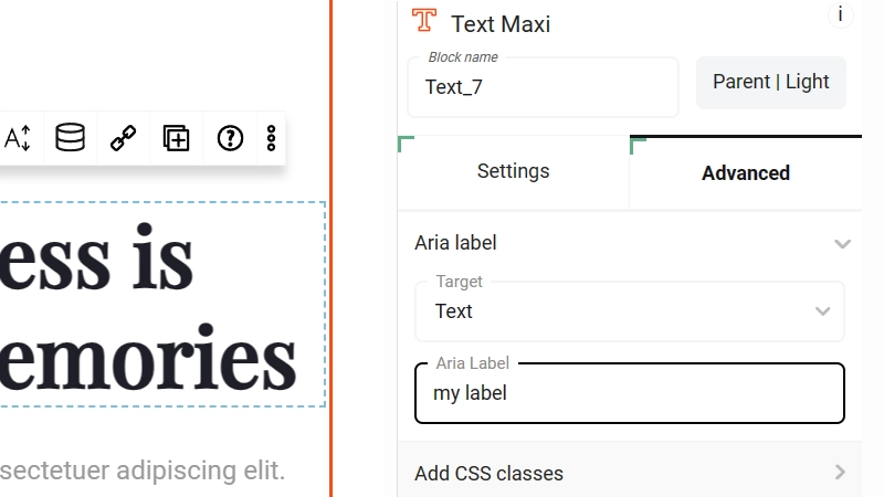
Set the target: Use the dropdown menu to select the target element inside the block that needs an aria-label.
Define your label: Enter a clear, descriptive label in the ‘ARIA Label’ input field. This text should clearly describe the function or content of the block to assistive technologies.
Save your changes: Save to apply the ARIA label to the selected block.
Example: In the screenshot below, an ARIA label is being added to a text block. Entering “my label” ensures that screen readers will provide this description to users, improving the contents accessibility.

Accessibility with ARIA Labels in MaxiBlocks
Benefits of using ARIA Labels
Improved user experience: ARIA labels provide crucial context, making web navigation easier for users with disabilities.
Compliance: Adding ARIA labels helps comply with accessibility standards like WCAG (Web Content Accessibility Guidelines).
Inclusivity: Ensuring all users can access and understand your content creates a more inclusive web environment.
MaxiBlocks’ ARIA label feature is a simple yet powerful tool for enhancing your website’s accessibility. Take advantage of this functionality to make your web content inclusive and accessible to a wider audience. Start using ARIA labels today for a more user-friendly website!
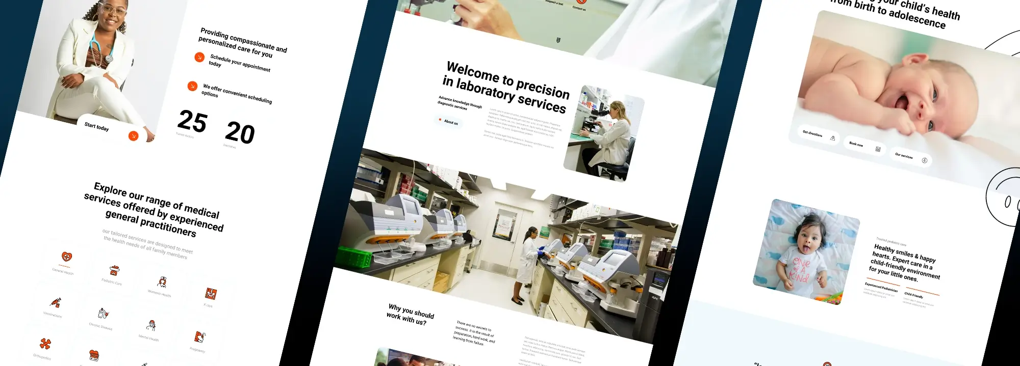
3 new medical-themed homepages added (173 pages total)

Pediatric wordpress homepage template
Pediatrician PN-PRO-01
🔗 Pediatrician | light variation
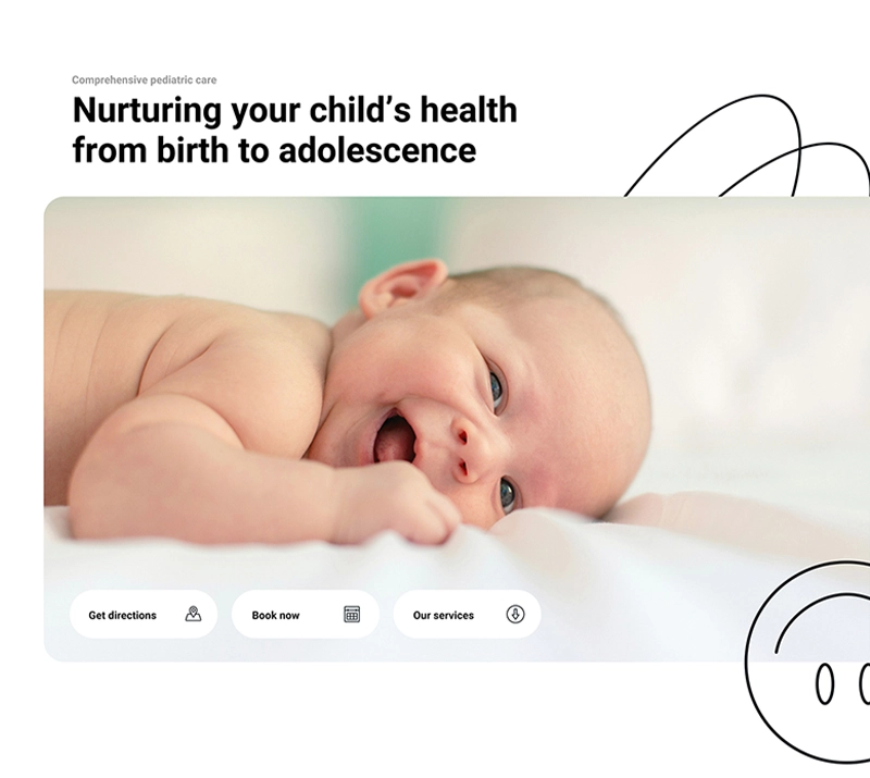
Layout and design: This pediatric clinic homepage offers comprehensive care for children from birth to adolescence. The clean, friendly layout features a soft color palette and ample white space.
Header and introduction: The header includes a welcoming message, a baby’s image, and quick access buttons for directions, appointments, services, and reviews. A smiling child’s photo and a reassuring message highlight the clinic’s friendly environment and experienced staff, followed by a testimonial section.
Services and contact: Services are organized into Newborn Care, Childhood, and Adolescent Care, with icons and descriptions. The contact section invites visitors to book appointments, while a segment outlines the clinic’s values and working hours, accompanied by an image of baby feet.
Resources and footer: The final section offers health and parenting resources, showcasing parents and children engaging in educational activities. The footer includes company details, services, support, policies, and social media links. The approachable, user-friendly design aims to reassure parents and provide easy access to pediatric care and resources.
Healthcare Clinic HECC-PRO-01
🔗 Healthcare Clinic | Light variation
Layout and introduction: This general medical clinic homepage emphasizes health and well-being with a modern, welcoming layout, clean design, and friendly color scheme. A smiling patient and a message about the clinic’s dedication to health and well-being set a positive tone.
Services and testimonials: Buttons allow visitors to book appointments and contact the clinic. The clinic offers compassionate, personalized care and convenient scheduling options. Icons and descriptions highlight services like general health, pediatric care, women’s health, X-rays, vaccinations, chronic disease management, mental health, pregnancy care, orthopedics, cardiovascular care, lab services, and emergency care. Patient testimonials emphasize satisfaction with the clinic’s services.
News and contact: A latest news section provides updates and health tips. The contact section encourages visitors to reach out with questions or to schedule appointments. The footer includes company details, services, support, policies, and social media links. The approachable, user-friendly design provides easy access to comprehensive medical care and fosters trust with patients.
Laboratory Testing LYTG-PRO-01
🔗 Laboratory Testing | Light variation
Layout and introduction: This laboratory webpage design emphasizes precision and expert testing with a clean, professional layout featuring images of advanced lab equipment and technicians at work. A large image of a scientist using a microscope sets the tone, accompanied by a message encouraging visitors to choose the lab for expert testing and quick links to learn more about services.
Services and expertise: The welcome section highlights the lab’s commitment to precision and advanced diagnostic services, supported by a photo of a lab technician. The next section explains why visitors should choose this lab, emphasizing advanced technology, skilled staff, and reliable results, along with an image of a busy lab environment.
Diagnostics and resources: The services section details comprehensive diagnostic options, including blood tests, genetic testing, and pathology, with icons for specialties like microbiology, immunology, clinical chemistry, hematology, and toxicology. Sections for patient diagnostics, healthcare provider support, and research services include links for more details. Resources for patients and healthcare professionals are highlighted, including patient portals, FAQs, educational materials, and billing information.
Testimonial and footer: A testimonial section features a placeholder quote praising the lab’s services. The footer provides company details, services, support options, policies, and social media links. The user-friendly design aims to build trust by showcasing the lab’s expertise and comprehensive diagnostic capabilities.
New icons: 45 Landscaping icons (14,073 total)
These landscaping icons were created for a community member to complement the new landscaping page templates we’re developing. If you require specific icons, please send your request to support[@]maxiblocks.com, and we’ll be happy to create them for you.
Uses for landscaping icons
Here are some real-life examples of how these icons can be used on different sections of a website.
Landscaping service page
- Service listing: Use icons such as “Grass cutting”, “Hedge”, “Pruning”, and “Lawnmower” next to the corresponding service descriptions. This helps users quickly identify services visually.
- Service categories: Group services into categories (e.g., “Maintenance”, “Design”, “Installation”) and use icons like “Fountain”, “Landscape Design”, and “Shrubs” to represent each category.
Online store
- Product categories: In an online store for gardening supplies, use icons like “Fertilizer”, “Watering can”, and “Gardening Gloves” to visually distinguish between different product categories.
- Product highlights: On individual product pages, use icons to highlight key features, such as “Paving” for paving stones or “Sprinkler” for irrigation systems.
Blog or informational website
- Blog post thumbnails: Enhance blog posts about gardening tips with relevant icons, like “Cleanup” for posts about autumn cleanup or “Fertilizer” for articles about plant nutrition.
- Resource guides: Create guides or how-to articles and use icons such as “Aerator”, “Shed”, and “Well” to break up the text and make it more engaging.
Homepage
- Feature sections: Use icons to highlight key features of your landscaping business, such as “Sustainable Practices” with a “Tree” icon, or “Custom Designs” with a “Landscape Design” icon.
- Call to action: Pair icons with calls to action, like “Schedule a Consultation” with a “Calendar” icon or “Get a Quote” with a “Calculator” icon.
Contact page
- Service map: If you have a map showing the areas you service, use icons like “House” or “Fence” to represent different service zones or types of work done in those areas.
- FAQ section: Use icons to categorize common questions, such as “Cleanup” for seasonal maintenance questions or “Lawnmower” for equipment-related inquiries.
Portfolio
- Project showcase: In a portfolio section, use icons to represent different types of projects, like “Fountain” for water features, “Swing” for outdoor play areas, or “Paving” for driveway and walkway projects.
- Project details: On individual project pages, use icons to list out services provided, like “Trimming”, “Shrubs”, and “Lawnmower” to give a quick overview of the work done.
New Blog Hero patterns coming soon
We’re designing a new pattern-type for blog hero sections to be included in the upcoming MaxiBlocks theme. These 50 pre-designed patterns will offer various layouts with titles, images, author information, and dates, making it easy to create unique and engaging blog posts. The patterns can be linked to featured images for a cohesive look. Stay tuned for the release of these blog hero patterns in a future update. Sneak peek below…
That wraps it up! Enjoy the weekend and see you next time.
