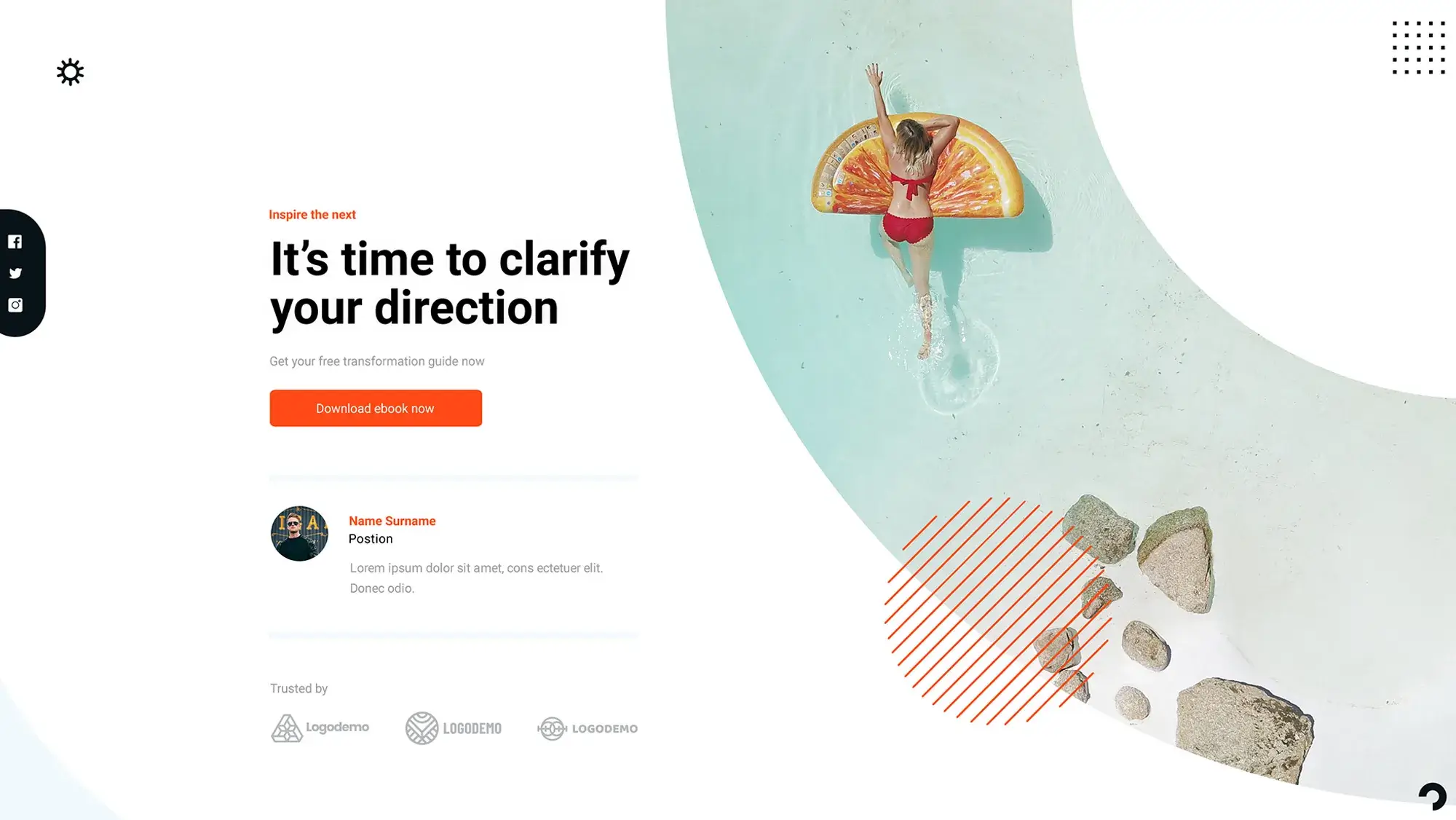
Free WordPress themes for businesses of all sizes
Try MaxiBlocks for free with 500+ library assets including basic templates. No account required. Free page builder, theme and updates included. Start now
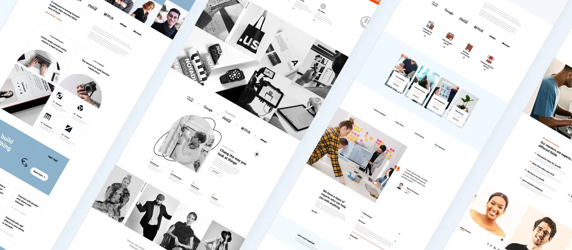
Adding a personal touch to your pre-designed website with MaxiBlocks
Your homepage is the first impression you make on potential customers, and – let’s be honest – generic templates can feel about as warm and fuzzy as a lukewarm fish. (shudder)
That’s where MaxiBlocks swoops in to save the day! We take those pre-designed templates (think of them as the sturdy, but kinda plain, foundation of a house) and infuse them with your brand’s unique personality. We’re talking custom colours, fonts, and maybe even a sprinkling of your CEO’s hilarious cat anecdotes (if that fits your vibe, of course!).
The end result? A website that’s not just functional, but reflects your company’s true awesomeness. Now that’s what we call a win-win!
The webpage presents a bright and modern design with a primary banner featuring an image of a person in vibrant yellow, which adds a pop of colour and captures the user’s attention immediately. The headline “We have a team of experts who can help you with anything” underscores the company’s broad expertise and customer service focus.
Bringing life to your banner
Imagine walking into a party. The first thing you notice is the vibrant energy, the infectious laughter – that’s the website banner doing its job! It’s your chance to grab attention, set the tone, and make a lasting first impression.
Here’s why your website banner is a prime piece of real estate:
It’s ground zero for engagement: Those first seconds a visitor lands on your page are gold. A captivating banner can hook them in and make them want to explore further. Think of it as your website’s opening line – make it count!
It sets the stage for your brand: The banner is a billboard for your company’s personality. A bright, modern design with a friendly face, like the one you described, instantly conveys approachability and expertise.
Now, let’s talk about taking your banner to the next level with MaxiBlocks.
Update the image: Maybe the yellow is a bit too loud for your brand. No problem! With MaxiBlocks, you can easily swap in a new image that better reflects your style. Think calming nature scenes for a spa website or sleek product shots for an e-commerce store.
Craft a compelling headline: Ditch the generic “We’re experts!” MaxiBlocks allows you to edit the text, so craft a headline that’s specific, intriguing, and uses sentence case for a modern, clean feel. For example, “Grow your business with our marketing gurus!” or “Unleash your creativity: Design tips and tricks.”
Keep it concise: People are busy! Aim for a clear, concise message that grabs attention without overwhelming visitors. MaxiBlocks gives you the flexibility to find the perfect balance.
Below the banner are three images, each representing a different aspect of the company’s services or values: “A greater measure of confidence,” “Better sound through research,” and “Creating value through true convergence.” This suggests a company that values precision, research, and innovation. The images appear to be product-focused, indicating tangible outcomes of the company’s work.
Personalizing service images and descriptions
The images and descriptions below your banner are like mini-billboards, each one shouting a piece of your company’s story. But are they shouting in a language your audience understands?
Imagine a picture of a delicious burger with no mention of the juicy patty or toasted bun. Not very appetizing, right? The same goes for your service images. They need clear, concise descriptions to truly tell the story.
Here’s how images and descriptions work together
Visual appeal: Images grab attention and create a lasting impression.
Descriptive power: Descriptions explain what the image is about and connect it to the company’s services.
Emotional connection: The right combination can evoke emotions and resonate with potential customers.
How to make this section your own
Update the images: Ditch the generic stock photos! Upload your own images, showcasing your actual products, team, or work environment. This adds authenticity and builds trust.
Edit the text: Maybe the existing image “A greater measure of confidence” is a bit too abstract. Swap it for a message of a confident client using your product or service.
Be descriptive: Update those descriptions! MaxiBlocks allows you to edit the text, so ditch the jargon and replace it with clear, concise language that highlights your unique offerings. For example, instead of “Better sound through research,” explain how your research translates to improved audio experiences for customers.
Remember:
Focus on benefits: People care about what your services can do for them.
Keep it concise: Short, punchy descriptions pack a bigger punch.
Align with your brand: Use language and visuals that reflect your company’s personality.
Showcase your expertise, build trust, and leave a lasting impression on potential customers.
The subsequent section “Change the way you look at things” features a trio of icons – “Seed investment,” “Business strategy,” and “Product vision” – indicating a structured approach to business growth and development. This part of the design communicates strategic thinking and an investment in long-term planning.
Reimagining your business strategy section
Those three icons under “Change the way you look at things” might seem simple, but they’re actually silent strategists! Icons, when used well, can be incredibly powerful tools for communicating a business’s approach to growth and development.
Here’s why visuals matter in this section
Icons are universally understood: Unlike text-heavy explanations, icons transcend language barriers. A seed icon instantly conveys the concept of investment, while a lightbulb represents ideas and vision.
They break down complex ideas: Strategic planning can sound intimidating. Icons help simplify these concepts by offering a quick visual cue that visitors can grasp immediately.
Icons add visual interest: Let’s face it, a wall of text can be snooze-ville. Strategic use of icons adds visual variety and keeps visitors engaged as they scan your webpage.
Make this section reflect your unique business strategies:
Choose a different icon: Maybe your company focuses more on “Customer Acquisition” than “Seed Investment.” MaxiBlocks allows you to swap out the icons for ones that better represent your core services. There’s a library of options to choose from!
Update the text: The current text, “Change the way you look at things,” is a good starting point, but make headlines more specific to your approach. For example, “Building a Sustainable Growth Strategy” or “From Seed to Success: Our Proven Business Development Process.”
Consider adding a short blurb: A sentence or two under each icon can provide more detail. Add concise descriptions that explain how your company executes each strategy.
It’s all about telling a clear and compelling story that resonates with potential clients.
A call to action, “Choose freedom,” is positioned above an evocative image of a dog looking out over a cityscape, perhaps symbolizing the company’s encouragement of independence and bold decision-making.
Choosing images that speak volumes
That image of the dog gazing out over the cityscape isn’t just there to look pretty – it’s a powerful storytelling tool! Images are more than just decorations; they’re emotional triggers that can connect with customers on a deeper level. The right image, like the one used here, can instantly evoke the feeling of freedom and possibility that the company wants to associate with their brand.
Here’s why choosing the perfect image for your call to action matters:
Images spark emotions: The dog overlooking the vast cityscape instantly conveys a sense of freedom and boundless potential. This resonates with viewers who may desire a similar sense of liberation in their own lives.
They create a lasting impression: People remember visuals more readily than text. A powerful image paired with a clear call to action leaves a lasting impact and encourages viewers to take the next step.
Images build trust and connection: When the image aligns with the company’s values, it fosters trust and a sense of connection with the viewer. They see themselves reflected in the image and feel a sense of belonging.
Further down, there’s a testimonial or personal statement section featuring a photo and a quote, suggesting customer or employee stories that highlight the company’s impact and work culture.
Building trust through real stories
That testimonial section with the photo and quote is pure gold! Testimonials are more than just feel-good snippets – they’re trust builders. Here’s why:
Social proof: People are naturally drawn to recommendations from others. Positive testimonials from satisfied customers or employees act as social proof, demonstrating the value your company delivers.
Credibility booster: Testimonials add a layer of credibility to your claims. Hearing firsthand accounts of your company’s impact makes potential clients more likely to believe in your services.
Emotional connection: Well-written testimonials can evoke emotions in readers. A client raving about how your product helped them achieve their goals can inspire potential customers to take action.
Showcase real stories
Now, let’s use MaxiBlocks to take your testimonial section to the next level:
Real client stories: Ditch generic quotes. Feature testimonials from real clients. Reach out to satisfied customers and ask them to share their experiences. Authentic stories are far more impactful.
Employee spotlight: Don’t forget your team! Showcase employee testimonials as well. Highlighting your company culture and the positive impact you have on your employees builds trust and attracts top talent.
Showcasing real stories with a human touch is a powerful way to connect with potential clients and establish yourself as a leader in your industry.
The page transitions into a section punctuated by slogans such as “Strength lies in unity” and “Better together,” which convey messages of teamwork and collaboration.
Highlighting teamwork and collaboration
Those seemingly simple slogans like “Strength lies in unity” and “Better together” pack a powerful punch! The messages you convey on your website can significantly impact how visitors perceive your company culture.
Here’s why messaging around teamwork and collaboration is important:
It attracts talent: People today crave a collaborative work environment. Showcasing these values through your messaging lets potential employees know your company values teamwork and fosters a supportive atmosphere.
It builds trust with clients: Clients want to know they’re working with a team that can effectively communicate and collaborate to achieve their goals. Highlighting teamwork assures them you have the expertise and synergy to deliver results.
It reflects your company culture: Your website is a window into your company’s soul. By promoting teamwork in your messaging, you’re not just telling, you’re showing, what kind of environment you’ve cultivated.
Personalize your teamwork message
Take your teamwork message a step further and personalize it to truly reflect your company culture:
Craft compelling slogans: “Strength lies in unity” is a great start, but MaxiBlocks allows you to edit the text. Consider slogans that are specific to your company’s values. For instance, if your team thrives on brainstorming, “Great ideas spark from great collaboration” could be a powerful fit.
Mix it up: Who says teamwork messaging has to be all slogans? Think short blurbs about your collaborative processes, team-building activities, or even a client testimonial highlighting the success of your teamwork.
Strong messaging attracts the right talent, builds trust with clients, and gives visitors a glimpse into your company’s positive work culture.
Below this, the webpage features a “Read our news” section with images and headlines about community and technology advancements, reflecting the company’s engagement with current trends and its role as an information provider.
Keep the news and updates fresh
The “Read our news” section showcases your thought leadership, engagement with current trends, and commitment to keeping your audience informed. But in today’s fast-paced world, staying fresh is key!
Here’s why keeping your news section updated matters:
Relevance is king: People crave information that’s current and relevant. A stale news section can make your company appear outdated and out of touch.
SEO boost: Fresh content gets noticed by search engines, potentially improving your website’s ranking and driving more organic traffic.
Engaged audience:
Regularly updated news keeps visitors coming back for more, fostering a sense of community and loyalty.
Keep your news section up to date
Maintain a fresh and engaging news section
Schedule updates: Gone are the days of scrambling for content. You can schedule news posts in advance, ensuring a steady stream of fresh information for your audience.
Easy editing: Newsworthy events happen daily? No problem! Update headlines, swap out images, or add new information to keep your content timely.
Scheduling and editing features, you can transform your news section from a static archive to a dynamic hub of current events and industry insights.
Near the bottom, the webpage showcases team members with a clean, symmetrical grid of headshots, followed by their names and titles, reinforcing the company’s transparency and the importance of its staff.
Feature your team
That section showcasing your team with headshots and titles is more than just an employee directory – it’s a trust builder! People do business with people, and showcasing the faces behind your company adds a layer of transparency and approachability.
Here’s why featuring your team is a winning strategy:
Humanizes your brand: A website can feel impersonal. Seeing the friendly faces of your team members makes your company more relatable and fosters trust with potential clients.
Highlights expertise: Titles and bios allow visitors to identify the experts within your company. This showcases the depth of knowledge and experience you bring to the table.
Builds connections: People connect with people. Seeing the team behind the company allows potential clients to imagine themselves working with you, building a sense of connection.
Put your team in the spotlight
Now, let’s use MaxiBlocks to take your team member profiles to the next level:
Picture perfect: Ensure the headshots are up-to-date and professional. Swap out photos for each team member, keeping things fresh and ensuring every face shines.
Accurate information: Is someone’s title outdated? Edit the text of the profiles, ensuring names and titles are current and accurate.
Bios with personality: Consider adding short bios to each profile. Include a sentence or two about each team member’s expertise and interests. A touch of personality goes a long way in building connections.
Transform your team member section from a simple directory to a vibrant showcase of the talented individuals who make your company great.
The footer contains a “Have any questions?” prompt, with a clickable call-to-action for contacting the company. The footer also includes a menu with links to about, work, staff, and product pages, offering easy navigation and indicating a well-organized business structure.
Design an inviting footer
The footer is often an overlooked website section, but it shouldn’t be! It’s your last chance to leave a positive impression on visitors and nudge them towards taking action.
Final call to action: The footer is a prime spot for a final call to action, like the one you mentioned with “Have any questions?” It reminds visitors to connect with you before they leave the website.
Easy navigation: A clear and concise navigation menu in the footer, like the one with “About,” “Work,” “Staff,” and “Product” pages, allows visitors to find the information they need quickly and easily, even if they haven’t explored the main menu.
Make the footer your own
Create a footer that’s both informative and inviting:
Contact info: Need to update your phone number or email address? MaxiBlocks allows you to easily edit the contact information in the footer, ensuring it’s always current and accessible.
Navigation on point: The existing navigation seems great, but maybe you want to add a link to a new service page? No problem! MaxiBlocks allows you to edit the navigation links in the footer, keeping it organized and relevant to your current offerings.
Design harmony: The footer should complement your overall website design. Adjust fonts, colours, and even add subtle visual elements to ensure the footer integrates with your brand.
User-friendly design
Strategic calls to action, clear navigation, and a focus on content over clutter all contribute to a positive user experience. This, in turn, encourages visitors to engage with your brand and take the next step. Overall, the webpage is designed to be visually appealing and user-friendly, with strategic placements of calls to action and company information that encourage user interaction and convey the company’s brand story.
If you’re new to WordPress or looking to enhance your skills in WordPress web design, there are many tools and resources available to help. A great place to start is the WordPress getting started guide, which covers the basics of using website builder WordPress and open source website builder options. As you progress, explore free WordPress themes or customise your site with WordPress block templates and Maxi Blocks to create a unique look. For full control over your layout, WordPress full site editing is a great tool, and you can take things further by using Gutenberg blocks and WordPress dashicons to add visual appeal.
For those looking for the best tools, the WordPress website builder is one of the most flexible solutions, especially for website design in WordPress. Whether you’re working with a WordPress website designer or doing it yourself, free WordPress templates and WordPress free themes provide plenty of options to start. For even more flexibility, explore WordPress patterns and Gutenberg templates to build custom pages.
Make sure your site looks polished by following favicon size guidelines and using WordPress icons like dashicons WordPress. If you’re keeping an eye on costs, WordPress website design prices and WordPress website design cost can vary, but with affordable free WordPress templates, it’s possible to create a professional site without spending too much. Use tools like Maxi Blocks and Gutenberg block tutorials to make the most of your design.
If you want a more professional touch, consider hiring WordPress web designers who can help with advanced features like WordPress page builders. For DIY enthusiasts, drag and drop website builder open source tools and website design on WordPress give you the ability to create a responsive site without coding.
Whether you’re using WordPress blog design services, working with WordPress website designers, or exploring free website development software, there are many ways to create stunning WordPress website designs that are both functional and beautiful.
FAQs about creating an acupuncture website with MaxiBlocks and a pre-made theme
Q: How many free themes does MaxiBlocks offer?
A: MaxiBlocks offers one free theme, which is included in the MaxiBlocks library.
Q: What can I find in the MaxiBlocks library?
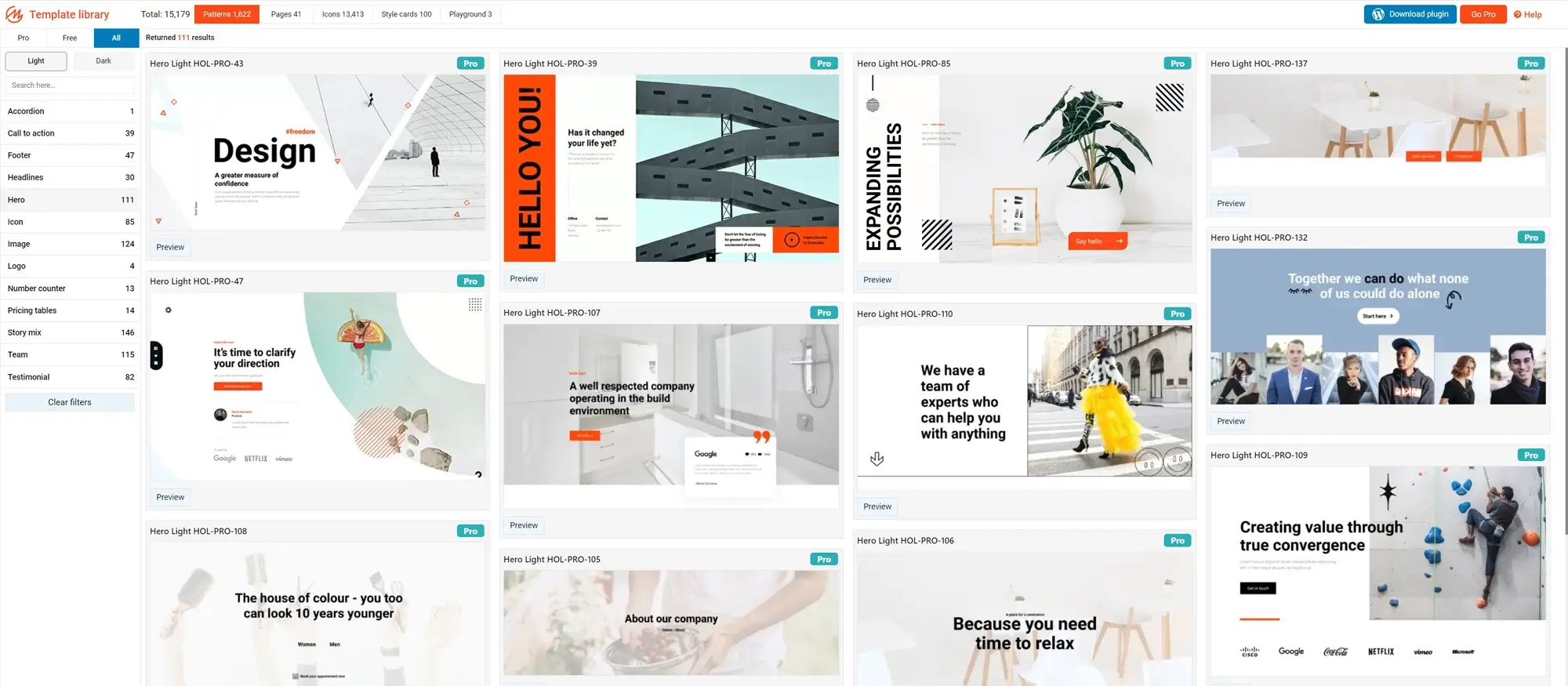
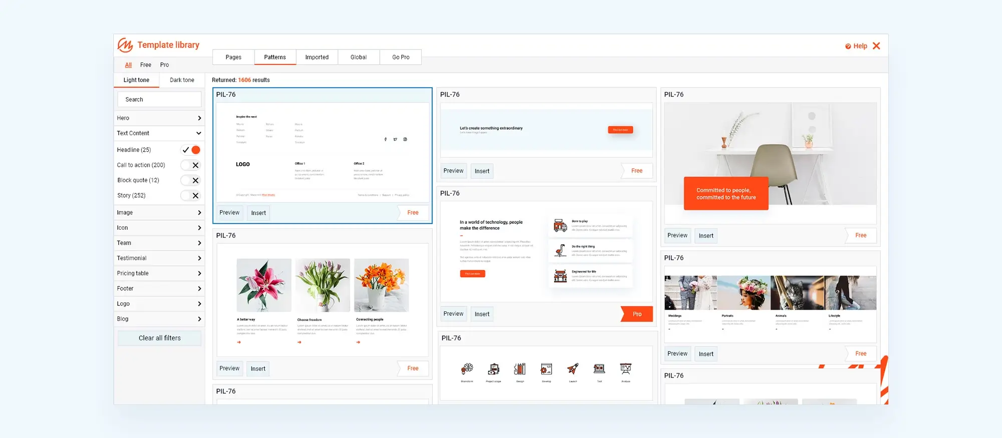
A: The library contains thousands of patterns, icons, and hundreds of homepages tailored for many niches.
Q: Can I customize the pre-designed templates to fit my company’s personality?
A: Yes, MaxiBlocks allows for extensive customization to ensure the template reflects your company’s unique character and expertise.
Q: How can I make my website’s homepage stand out?
A: Customize your homepage with unique colors, fonts, and elements that represent your brand, using MaxiBlocks to inject personality into your website.
Q: Is it possible to update images and headlines in the website banner?
A: Absolutely, with MaxiBlocks, you can easily swap images and edit the text in your website banner to better convey your brand message.
Q: Can I update the service images and descriptions on my website?
A: Yes, MaxiBlocks enables you to replace service images and edit their descriptions to accurately reflect your offerings and connect with your target audience.
Q: How can I personalize the business strategy section of my website?
A: You can customize this section by choosing icons that align with your business strategies and updating the accompanying text for clarity and impact.
Q: How important is the choice of images for calls to action?
A: Choosing the right images is crucial as they can significantly enhance the message and effectiveness of your calls to action.
Q: Can I create custom blocks for WordPress block themes?
A: Yes, developers can create custom blocks using JavaScript and React to extend the functionality of WordPress block themes.
Q: Can I feature real client testimonials on my website?
A: Yes, showcasing real client testimonials is encouraged to build trust and credibility, and MaxiBlocks makes it easy to update this section.
Q: How can I feature my team on the website?
A: Update your team section with current, professional headshots and personalized bios to highlight the people behind your brand
WordPress itself
Official Website
wordpress.org – This is the official website for WordPress, where you can download the software, find documentation, and learn more about using it.
WordPress Codex
codex.wordpress.org/Main_Page – This is a comprehensive documentation resource for WordPress, covering everything from installation and configuration to specific functionality and troubleshooting.
WordPress Theme Directory
wordpress.org/themes – The official WordPress theme directory is a great place to find free and premium WordPress themes. You can browse themes by category, feature, and popularity.
maxiblocks.com/go/help-desk
maxiblocks.com/pro-library
www.youtube.com/@maxiblocks
twitter.com/maxiblocks
linkedin.com/company/maxi-blocks
github.com/orgs/maxi-blocks
wordpress.org/plugins/maxi-blocks