TLDR: Our newest release includes fresh block and image patterns, new homepages, and a flexible numbered icon set with usage tips. In other news, the MaxiBlocks theme beta is advancing well, as we conduct extensive cross-browser testing.
Hello Friends👋
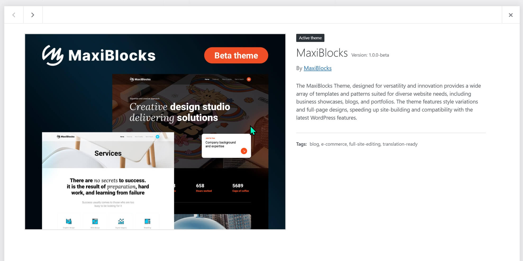
This week, we’ve been refining the MaxiBlocks Theme based on insights from our 3rd round of beta tester feedback. The process involves code improvements the plugin and theme, then testing them together across Chrome, Firefox, Edge, and Safari.

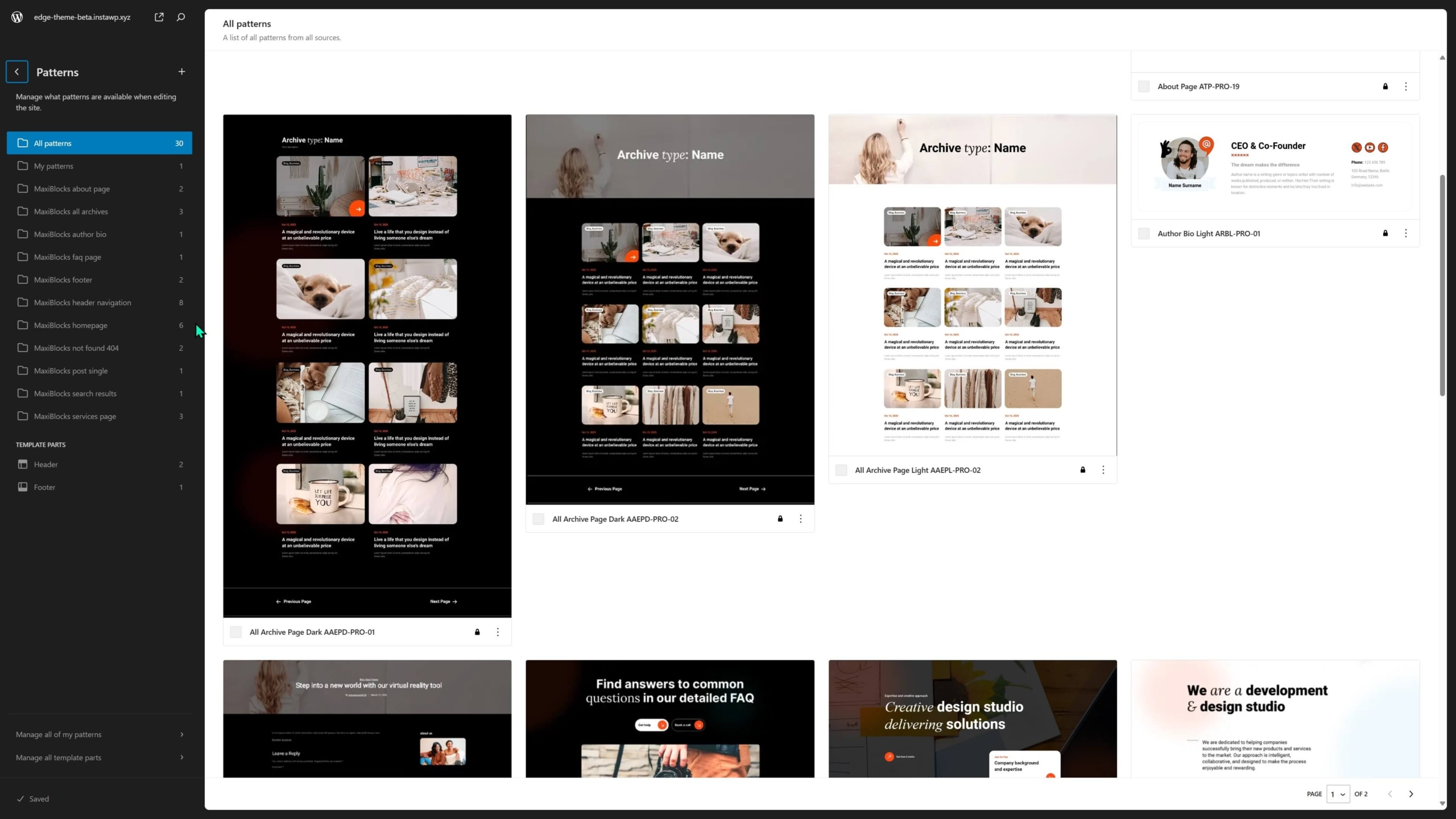
Here’s a teaser of the MaxiBlocks theme pattern library from the site editor. It’s looking great so far, with just some finishing touches needed. The wait will be worth it.

10 New block patterns (2096 total)
🔗SML-PRO-120 Maintaining a monochrome palette, this layout contrasts a sprawling construction site with a sharp circular focus, accompanied by a timeline element, invoking a sense of history and progress.
🔗 SMD-PRO-120 A dark-themed design with a sophisticated edge, incorporating a diagonal division that juxtaposes a sleek building image with a bold typographic block, all underpinned by a sharp contrast in lighting.
🔗SML-PRO-121 This variant offers a minimalistic approach with geometric rigor, displaying a monochrome architectural image on one side and a circular vignette of a historical photo on the other, creating a dynamic interplay of shapes.
🔗 SMD-PRO-121 The design employs a split-screen layout with an asymmetric balance, featuring a detailed sketch on one side and a bold numeric counter on the other, bordered by a circular cutout that unifies both elements.
🔗 SMD-PRO-122 A striking call-to-action section that employs bold typography, contrasting numbers, and a pun to engage viewers in a black and white theme.
🔗SML-PRO-122 The same call-to-action section as the previous file, maintaining a high-contrast black and white theme with bold typographic elements and a humorous play on words.
🔗SML-PRO-140 A serene design with a single dominant coaching image, offering a sense of tranquility and focus through its expansive use of white space and natural light.
🔗 SMD-PRO-140 A bold design with a panoramic coaching image, featuring a motivational message overlaid on a semi-opaque black layer for strong visual impact.
🔗SML-PRO-167 It presents a clean and light design with vibrant photographs that capture moments of collaboration and creativity in various settings.
🔗 SMD-PRO-167 This dark theme layout presents a quartet of images with ambient lighting, conveying themes of innovation and excellence in a high-contrast setting.
4 New image patterns
🔗PIL-PRO-110 The design features a triptych of muted construction and tiling scenes, using transparency and monochrome filters for a cohesive professional impression.
🔗PID-PRO-110 A triptych display with a focal central image flanked by semi-transparent overlays, connecting practical work scenes to the concept of architectural planning.
🔗PIL-PRO-111 A contrasting design with full bleed monochrome images that shift from architectural to interior spaces, emphasizing clean lines and open spaces.
🔗PID-PRO-111 A grid layout with monochrome architectural images, employing rounded bottom corners for a soft yet structured look.
3 New homepages (167 total)
💼📊🔍 Consulting page template (COPT-PRO-04)
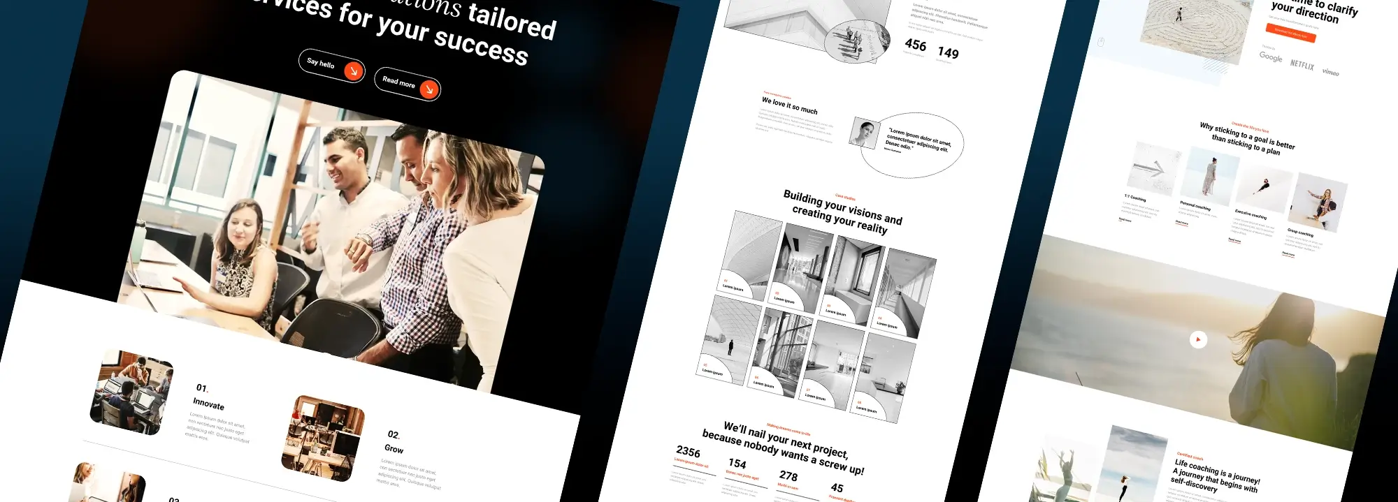
This design uses vibrant overlay buttons with icons, soft cornered images, and card designs with shadow effects for depth, alongside a monochrome colour palette with strategic colour accents for emphasis.
👤🌱📈 Life coach page template (LECP-PRO-01)
The layout features minimalist design with ample white space, circular shapes for client testimonials, and muted tones with occasional colour highlights, employing line icons and clean sans-serif typography.
🚧🏗️👷 Construction page template (CSTP-PRO-03)
The page template incorporates grayscale images with occasional colour filters, grid layouts with thin borders for project displays, large numerical typography for statistics, and a bold, sans-serif font throughout for clarity and impact.
New icons: 70 letters & numbers (13,937 total)
This week’s icon set, a custom request from a Maxi Creator, adds numbers and letters to the icon library.
Numbered icons have many uses;
- Make instructions easy to follow, like a DIY project guided by a friendly expert.
- Turn timelines into exciting adventures, making key events in history or a company’s journey clear and memorable.
- Add fun to lists, like “Top 10 Travel Destinations”, making them scannable and highlighting the top spot.
- Clarify service tier features presented side-by-side, making choosing the best plan a snap.
- Bring a touch of class to certificates and awards, like a “Level 3” skills badge or a special icon celebrating 5 years of service.
That’s all we have for you today. Have a great weekend. We’ll see you next week.
