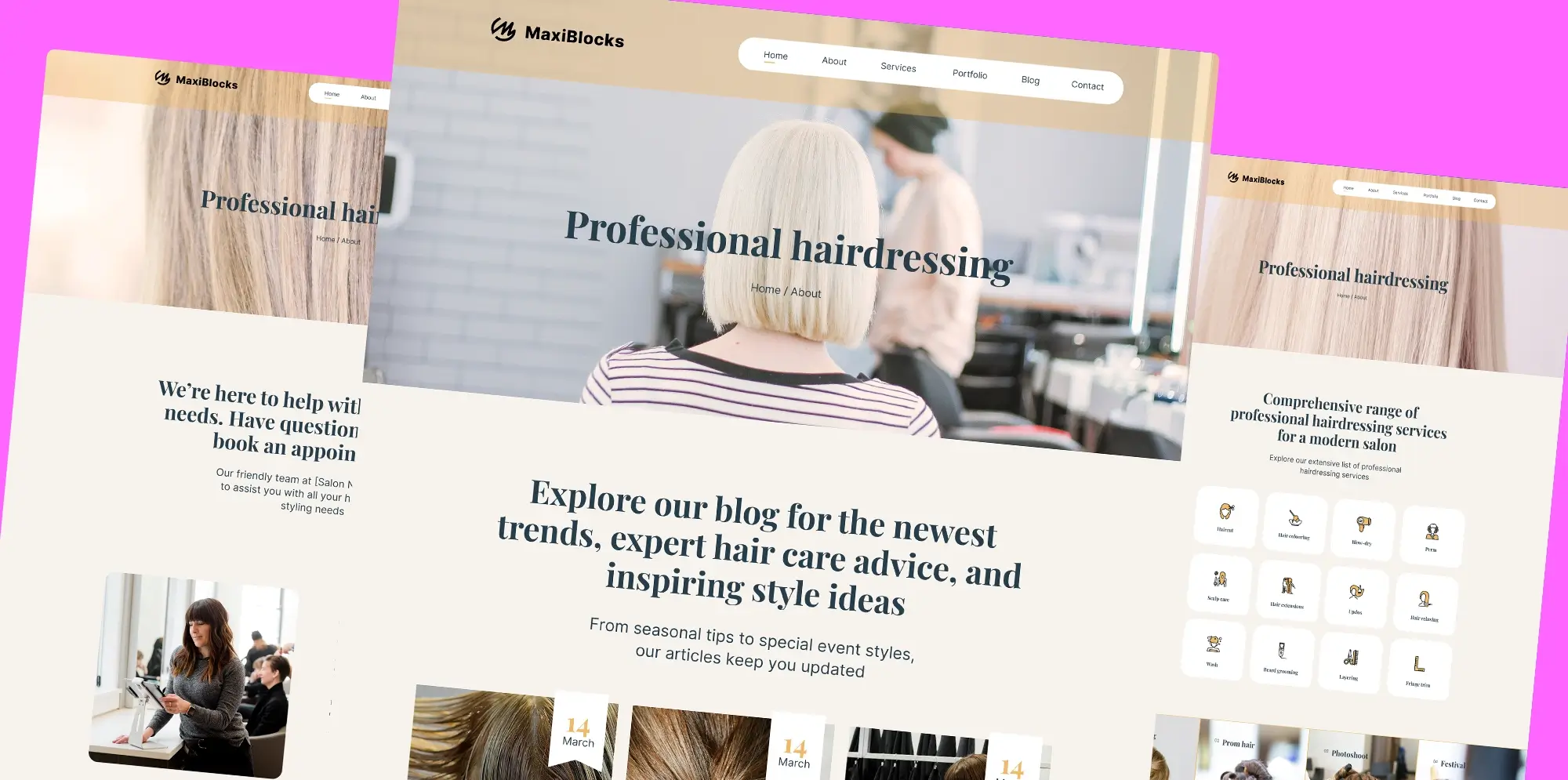
MaxiBlocks: A free open-source WordPress page builder
Try MaxiBlocks for free with 500+ library assets including basic templates. No account required. Free WordPress page builder, theme and updates included.
Updated 15th May 2025
MaxiBlocks: a free and open-source WordPress page builder
A modern alternative to traditional page builders
MaxiBlocks is a free WordPress page builder created for people who want to design high-quality websites without writing code. Whether you are new to website building or have experience, it offers a visual editing experience that is simple to use but flexible enough to support professional results.
Designed to work seamlessly with WordPress
MaxiBlocks integrates directly with the WordPress block editor, so there is no need to switch systems or worry about compatibility. It expands on what WordPress already offers by giving you more layout control, more styling options and a cleaner editing experience.
Build pages faster with pre-designed patterns
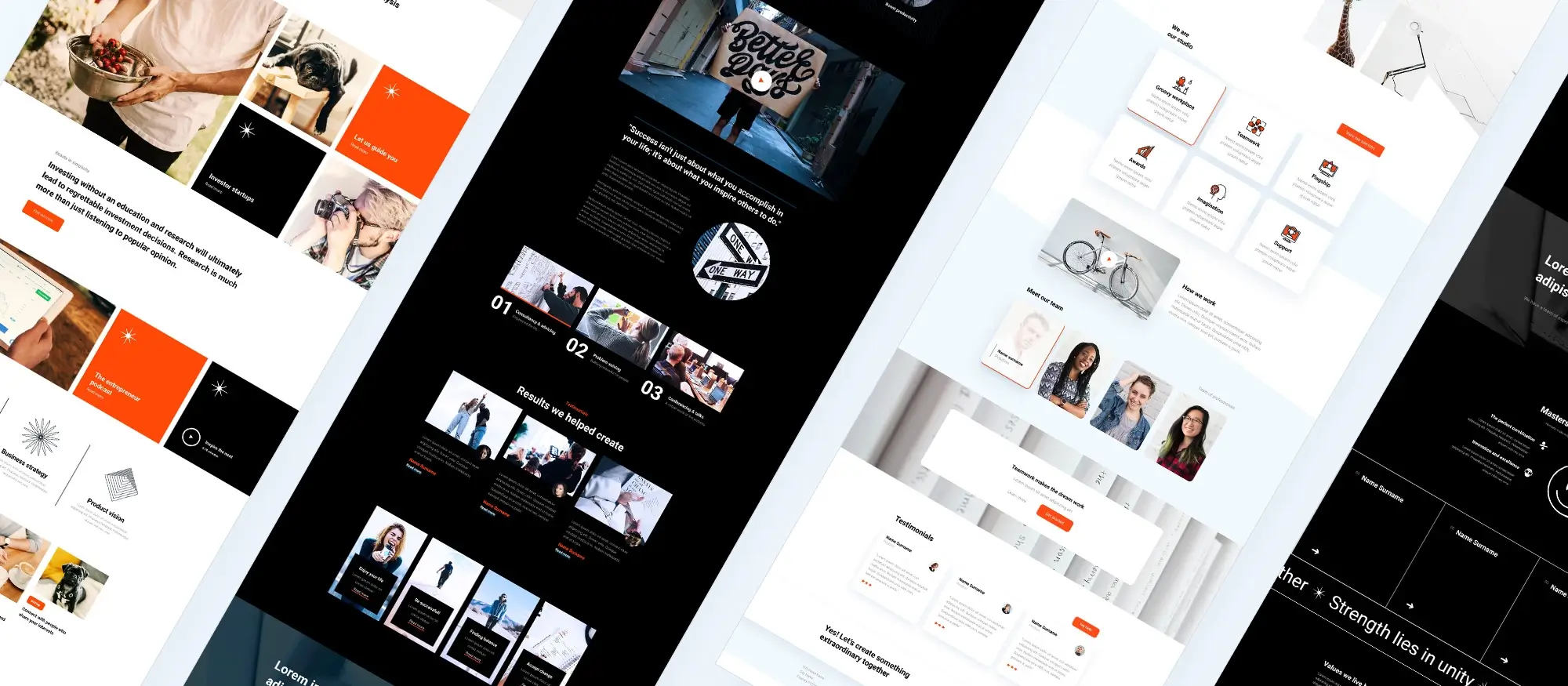
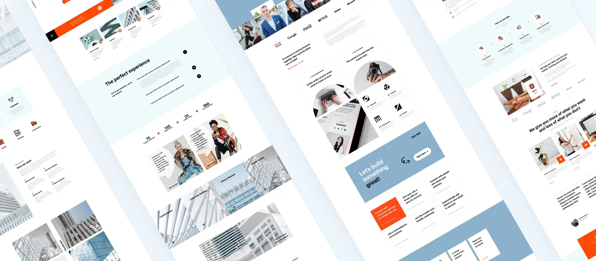
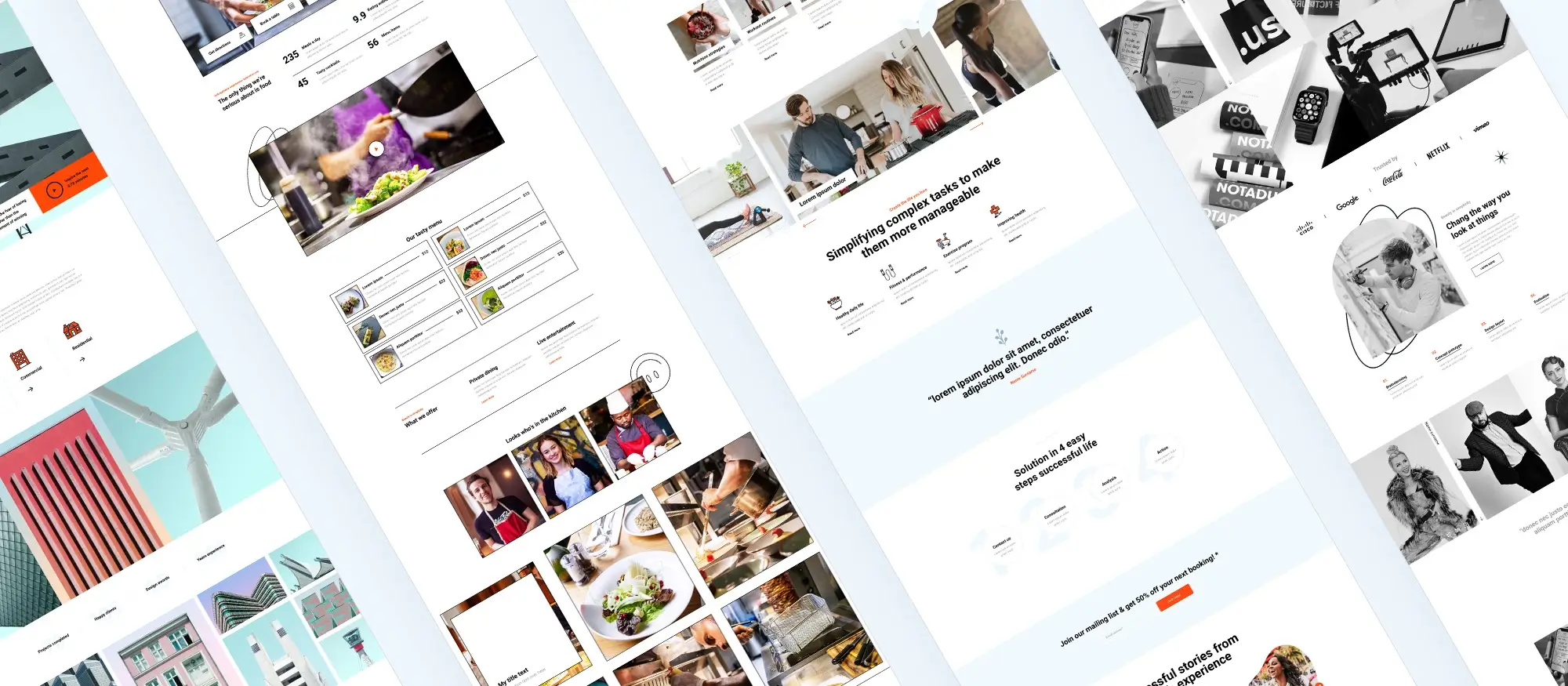
With over 2,300 design patterns and 280 ready-made page templates, MaxiBlocks makes it easy to get started. These templates are fully customisable and built for mobile responsiveness, helping you launch polished websites quickly without sacrificing quality.
Access thousands of icons and design assets
The built-in library includes more than 14,000 icons and shapes, which you can use to customise your layouts and make them stand out. These icons are optimised for performance and blend well with any visual style.
Improve site speed and SEO with clean code
MaxiBlocks outputs lean, well-structured HTML and CSS. This helps your site load faster and supports your search engine rankings. If you pair it with the MaxiBlocks Go theme, you also gain finer control over how your site looks and performs.
What users say about MaxiBlocks
People are already noticing the benefits. One user shared:
“It is a wonderfully versatile and amazingly fast tool. The site I built is lightning fast, too.”
Where to get MaxiBlocks
You can download MaxiBlocks from the WordPress plugin directory for free. It gives you a professional toolkit without the need for premium upgrades or licence restrictions.
How MaxiBlocks works with WordPress
Build pages with ease using a visual drag-and-drop editor
MaxiBlocks allows you to create WordPress pages visually, using a straightforward drag-and-drop interface. Instead of writing custom code, you simply choose from a growing library of design blocks, such as text, images, buttons and containers. You can move and adjust them in real time, seeing the layout take shape as you go.
Customise every detail without touching code
Every block is fully editable. You can change spacing, colours, borders and font settings directly in the editor. This means you can build a site that reflects your brand’s style without needing to write a single line of CSS. The editing tools are responsive, so you can also control how your layout looks across desktop, tablet and mobile.
Use built-in tools that speed up design
MaxiBlocks comes with helpful design tools already included. Style Cards let you apply a consistent colour scheme and typography across your site with one click. You also get instant visual feedback as you make changes, so there is no need to switch between editing and preview modes. It all happens in one place.
As one user put it: “I couldn’t believe how wow MaxiBlocks is. I wanted a plugin website builder for Gutenberg that was templatized for easy deployment of professional websites.”
Built to save time and make design easier
- More than 2,300 layout patterns help you get started quickly
- Over 280 complete page templates are available for full-page design
- A library of 14,300 icons adds visual flexibility
- More than 100 Style Cards make it easy to change your site’s overall look
With everything managed in one smooth workflow, MaxiBlocks helps you design professional websites faster, without giving up creative control.
Subscribe to our newsletter
The power of the grid system in MaxiBlocks
Structure and balance for every screen size
MaxiBlocks is built around a flexible grid system that helps keep your website looking clean, consistent and well-aligned. This structure acts like invisible scaffolding, giving you a simple way to organise your layout without second guessing placement or spacing. By working with rows and columns that automatically adapt to different screen sizes, you can create designs that feel polished and easy to read whether viewed on a phone or a wide desktop display.
Why the grid matters in website design
Grids are essential in layout design because they create order. With MaxiBlocks, content stays aligned as it scales across devices, which makes the site easier to follow and more enjoyable to browse. This approach doesn’t just improve looks it also helps users find what they need faster, leading to better engagement and stronger SEO performance.
Responsive layout control across devices
The grid system includes six built-in breakpoints, covering screens from small smartphones to ultrawide monitors. This means you can fine-tune how each section looks depending on the viewer’s device. The layout stays readable, balanced and responsive without needing custom code.
Design flexibility with rows and columns
You can create layouts with as many columns as needed and adjust gutter widths, padding and alignment directly in the editor. Each section is based on grid containers, making it easy to shift things around or redesign entire blocks without breaking your layout.
A better way to organise your content
Grids help guide the eye and present your content in a clear and predictable flow. This improves the user experience and keeps visitors engaged for longer. Sites using responsive grid layouts have been shown to reduce bounce rates and encourage more interaction.
As one user shared: “MaxiBlocks is a powerful tool designed to enhance the WordPress experience by offering versatile and customisable block templates.”
When over half of website traffic now comes from mobile, having a solid grid system is more important than ever. MaxiBlocks helps you design with a mobile-first mindset, then build up from there for larger screens keeping performance and usability front and centre.
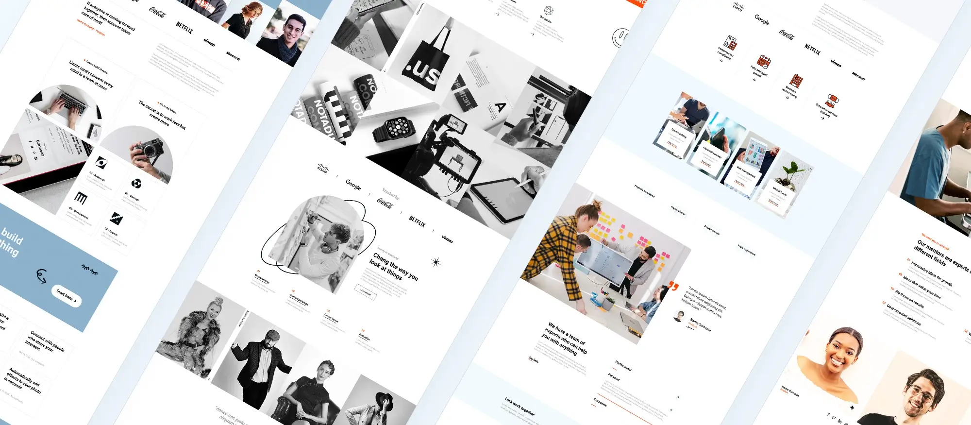
Getting started with MaxiBlocks for WordPress
A simple way to build your first website
MaxiBlocks makes it easy to build a new WordPress site without needing coding experience. Whether you’re setting up a blog, portfolio or business site, the visual editor and ready-made blocks help you get started quickly. Everything is done inside WordPress using a familiar interface, so there is no need to learn a new system.
How to set up your first page with MaxiBlocks
To begin, install the MaxiBlocks plugin by logging into your WordPress dashboard. Go to the Plugins section, click Add New, and search for “MaxiBlocks.” Once you find it, click Install and then Activate.
Now, go to the Pages section and click Add New. Launch the editor and start building.
Start by inserting a container block. This is the foundation for your layout. Click the plus icon to search for “Container,” then add it to your page. Use the sidebar to control how many columns you want and adjust spacing, padding or alignment.
Next, add content blocks inside the container. You can insert text, images, buttons or other design elements by clicking the plus icon again. The sidebar will allow you to change colours, fonts and other visual settings.
When you’re happy with your layout, use the Preview option to check how your design looks on different screen sizes. Once everything is in place, click Publish to make your page live.
One user shared their experience: “I’ve only used MaxiBlocks for about a day but it seems to be very user-friendly and intuitive.”
Tips for a faster build
Using a Style Card at the start helps apply consistent fonts, colours and spacing across your page. This keeps your design clean and balanced. You can also save time by starting with one of the 280 pre-made page templates, then adjusting it to fit your content. Preview your layout often to make sure it looks right on phones and tablets.
MaxiBlocks is designed to get you from a blank page to a finished design in minutes. The average setup time for a basic layout is under ten minutes, and there are over 100 style cards available if you want to change the look of your site in just a few clicks.
Build like a pro
Advanced features and pro tips for designing with MaxiBlocks
Unlock more power with layout precision and responsive control
Once you’re confident using the basics, MaxiBlocks opens up a range of advanced features that give you deeper control over your design. These tools help you build more dynamic, responsive and polished websites ideal for designers and developers who want to go beyond simple layouts.
Align and distribute content with Flexbox containers
MaxiBlocks supports Flexbox, which offers a more flexible way to organise content inside rows and columns. This is useful when you need elements to be perfectly centred, evenly spaced, or automatically adjusted even when they vary in size. For example, you can use Flexbox to align call-to-action buttons in the middle of a section regardless of how much text surrounds them.
Style entire sites instantly with Style Cards
There are more than 100 pre-designed Style Cards available in MaxiBlocks. These let you change your website’s colour scheme, typography and hover effects with a single click. It’s especially helpful when you want to switch a design direction quickly or apply consistent branding across your whole site.
Tailor the layout for every device
With six responsive breakpoints built in, you can fine-tune how your design looks on phones, tablets, laptops and ultra-wide screens. Adjust column widths, font sizes and visibility based on screen size, so your site stays user-friendly wherever it’s viewed.
Add dynamic content for personalised pages
MaxiBlocks supports dynamic blocks that show real-time data or personalised content. This means you can build interactive sites that respond to individual users for example, displaying the latest blog post, user-specific messages or filtered product listings.
Maintain performance and boost SEO
The builder is optimised to generate clean and minimal code, which keeps your site fast. Quick load times improve the browsing experience and help with search engine rankings. Because scripts are only loaded when needed, your pages stay light even as your site grows.
As designer Teylor Feliz noted: “MaxiBlocks has over 13,000 icons available, and their colours and styles can be changed to adapt to your design or style cards.”
Tips for experienced users
Use the Navigator panel to move through complex layouts quickly. Save reusable blocks to avoid repeating your work on future projects. Combine Flexbox and grid layouts for added precision. And apply Global Styles to make sure fonts, buttons and colours are consistent across every page.
MaxiBlocks offers over 14,000 customisable icons, more than 100 style cards, and responsive controls across six screen sizes. Whether you’re building a one-page site or a full-scale web project, these features help you design with confidence and efficiency.
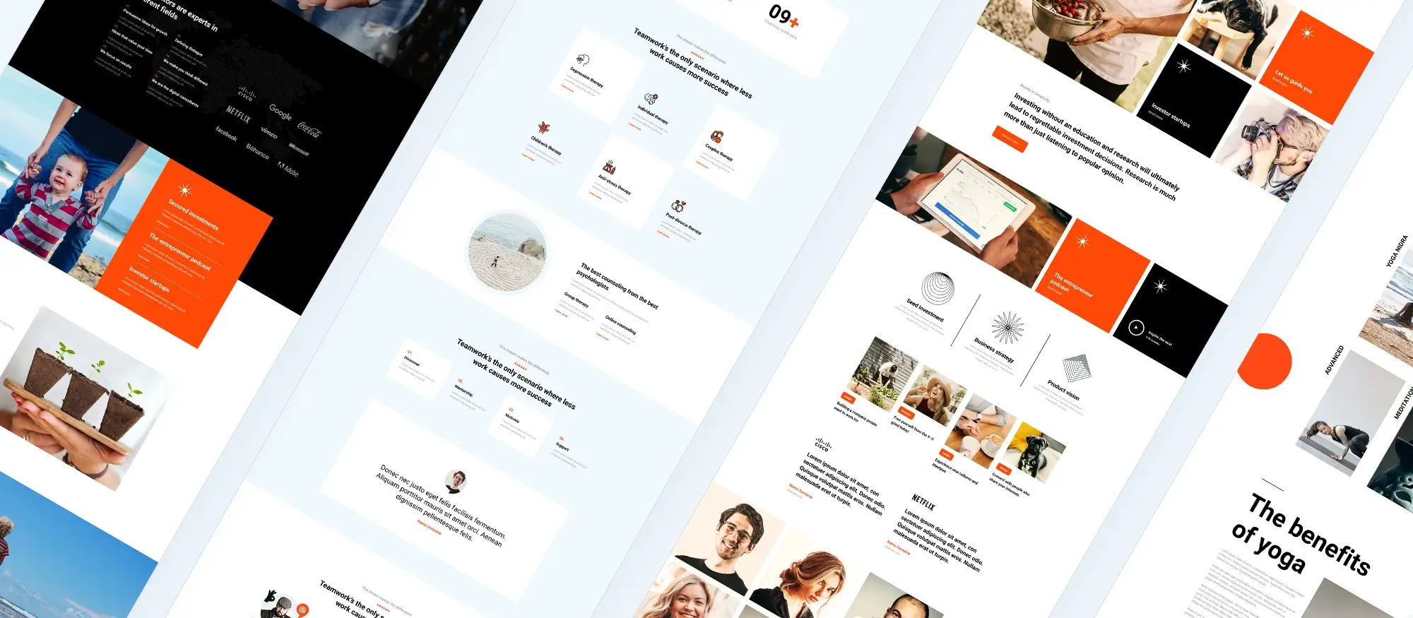
Final thoughts on using MaxiBlocks for WordPress
A complete design solution for modern WordPress websites
MaxiBlocks is a free and open-source page builder that combines ease of use with powerful tools. Whether you’re a solo creator or building websites for clients, it gives you everything you need to work faster and smarter without relying on complicated setups or expensive licences.
MaxiBlocks stands out because it delivers visual design freedom inside the native WordPress editor. You get full control over your layout, fonts, colours and animations, along with fast page load times and responsive design tools built in from the start.
Designed for performance and flexibility
With MaxiBlocks, you don’t have to choose between a lightweight build and visual control. It’s carefully optimised to deliver clean code and fast-loading pages, all while offering a user-friendly drag-and-drop interface that lets you preview changes instantly.
From simple landing pages to advanced full-site designs, you can create exactly what you need without touching code.
Who is MaxiBlocks for?
MaxiBlocks works well for anyone looking to build professional WordPress sites without the technical overhead. It’s especially useful for:
- Freelancers and small agencies who want speed and flexibility
- Content creators and bloggers who need intuitive tools
- Web designers who want full creative control using a visual editor
- Developers who prefer clean, Gutenberg-based architecture
One happy user summed it up like this:
“WooW! I’m really impressed with the capabilities of this plugin… I know this category of plugins very well – I have probably tested all Gutenberg add-ons available on the market and I must admit that MaxiBlocks is really top shelf and top league!” Peter
Key takeaways for using MaxiBlocks
What makes it worth trying
- It’s free and open-source with no usage limits or licence keys
- The editor is intuitive, yet powerful enough for complex websites
- It includes Flexbox support, global style controls and dynamic content features
- It comes with thousands of prebuilt blocks, icons and layout templates
- It works seamlessly with the WordPress core and the MaxiBlocks Go theme
Your next step
If you want a faster and more flexible way to build with WordPress, download the MaxiBlocks plugin and pair it with the MaxiBlocks Go theme. You can start creating beautifully responsive websites today without paying for bloated features you don’t need.
Creative fun: Build, design, and learn with MaxiBlocks
Build faster, smarter websites with MaxiBlocks an all-in-one design library, page builder made for WordPress web designers.
FAQs about MaxiBlocks for WordPress
What is MaxiBlocks?
MaxiBlocks is a free, open-source page builder for WordPress. It works with the native block editor (Gutenberg) and offers a visual drag-and-drop experience. It helps users build responsive, fast-loading websites without needing to code.
Is MaxiBlocks really free?
Yes, MaxiBlocks is free to use. The core plugin and the MaxiBlocks Go theme are both available at no cost. There’s also a Pro Library with extra templates and design elements, but all the main features are included in the free version.
Do I need to know how to code to use MaxiBlocks?
No coding knowledge is required. MaxiBlocks is designed to be fully visual and user-friendly. You can build layouts, add content, and apply styling using the editor’s simple controls.
How does MaxiBlocks compare to Elementor?
Unlike Elementor, which adds an extra layer on top of WordPress, MaxiBlocks is built to work directly with Gutenberg. This means it is lighter, faster, and better integrated with WordPress updates. It’s also open-source, with no licence restrictions.
Can I use MaxiBlocks with any WordPress theme?
Yes, MaxiBlocks works with most modern WordPress themes, but it’s best paired with the MaxiBlocks Go theme, which is optimised for full compatibility and performance.
Does MaxiBlocks support responsive design?
Yes, it includes built-in responsive controls. You can preview and adjust how your site looks on mobile, tablet, and desktop, all from within the editor.
What kind of design options are available?
MaxiBlocks includes more than 2,000 block patterns, over 280 page templates, and a library of 14,000 icons. You can also use Style Cards to apply colours, fonts and spacing consistently across your entire site.
Is there support if I get stuck?
Yes, MaxiBlocks is backed by a growing community and has documentation, tutorials and support channels available to help you along the way.
WordPress itself
Official Website
wordpress.org – This is the official website for WordPress, where you can download the software, find documentation, and learn more about using it.
WordPress Codex
codex.wordpress.org/Main_Page – This is a comprehensive documentation resource for WordPress, covering everything from installation and configuration to specific functionality and troubleshooting.
WordPress Theme Directory
wordpress.org/themes – The official WordPress theme directory is a great place to find free and premium WordPress themes. You can browse themes by category, feature, and popularity.
maxiblocks.com/go/help-desk
maxiblocks.com/pro-library
www.youtube.com/@maxiblocks
twitter.com/maxiblocks
linkedin.com/company/maxi-blocks
github.com/orgs/maxi-blocks
wordpress.org/plugins/maxi-blocks

Kyra Pieterse
Author
Kyra is the co-founder and creative lead of MaxiBlocks, an open-source page builder for WordPress Gutenberg.
You may also like
