Using typography in web design
Try MaxiBlocks for free with 500+ library assets including basic templates. No account required. Free WordPress page builder, theme and updates included.
Updated 15th May 2025
Typography in WordPress website design
Typography plays a major role in how visitors read and interact with your content. Clear, well‑chosen fonts improve readability, reinforce your brand and support accessibility. WordPress makes it simple to customise your site’s typography, whether you choose from preloaded options, use plugins or upload your own font files.
Choosing the right fonts
Font categories
Fonts typically fall into one of four groups:
- serif, which features small lines at the ends of letters and works well for body text
- sans‑serif, without extra lines and offering a clean, modern look
- script, resembling handwriting and suited to decorative purposes
Font pairing
Combining two complementary fonts one for headings and one for body text creates hierarchy and visual interest. Use tools like Google Fonts or Adobe Fonts to preview different pairings and select options that match your brand’s tone.
Customising typography in WordPress
Plugin options
If your theme offers limited font controls, install a plugin such as Easy Google Fonts or Typography. These plugins add new typography settings to the Customiser, letting you adjust font family, size, weight and spacing without editing code.
Manual CSS tweaks
For more precise control, add custom CSS via the Customiser’s Additional CSS section. For example, you might increase line height for better mobile readability or adjust letter spacing on headings to improve legibility:
h2 {
letter-spacing: 0.5px;
line-height: 1.3;
}
p {
line-height: 1.6;
}
Using your own fonts on WordPress
Uploading font files
To include a custom font, upload the font files (WOFF, WOFF2 or TTF) into your theme or child‑theme folder, typically under /fonts.
Defining the font in CSS
Add an @font‑face rule to your theme’s style.css, then apply the font in your stylesheet:
@font-face {
font-family: ‘MyCustomFont’;
src: url(‘fonts/MyCustomFont.woff2’) format(‘woff2’),
url(‘fonts/MyCustomFont.woff’) format(‘woff’);
font-weight: normal;
font-style: normal;
}
body {
font-family: ‘MyCustomFont’, sans-serif;
}
Once defined, your custom font will load alongside a fallback system font, ensuring text remains legible even if the custom file fails to load.
Advanced typography techniques
Adding fonts to WordPress without plugins
Using @font-face in your theme
You can add custom fonts without a plugin by uploading your font files (WOFF, WOFF2 or TTF) into a fonts folder inside your theme or child‑theme. Then define them in your stylesheet with @font-face. For example:
@font-face {
font-family: ‘MyCustomFont’;
src: url(‘fonts/MyCustomFont.woff2’) format(‘woff2’),
url(‘fonts/MyCustomFont.woff’) format(‘woff’);
font-weight: normal;
font-style: normal;
}
body {
font-family: ‘MyCustomFont’, sans-serif;
}
Once this is in place, your custom font will load first, with a system‑default font as fallback.
Creating a visual hierarchy
Visual hierarchy guides visitors to the most important elements first. You can achieve this by:
- varying font size so headings stand out
- using font weight to emphasise key text
- applying distinct styles for different levels of headings
For example, use larger, bolder text for main headings, mid‑size for subheadings and regular size for body copy. This helps readers scan your content and find what they need quickly.
Improving readability and legibility
To make text easy on the eye:
- choose a minimum body font size of 16px
- set line height around 1.5 to avoid cramped lines
- adjust letter spacing for clarity, especially on headings
- ensure strong contrast between text and background
Proper alignment, left‑aligned for most Western languages, combined with ample whitespace around paragraphs, also improves legibility on all devices.
Subscribe to our newsletter
Advanced typography strategies
Responsive typography
Media queries and viewport units
Use CSS media queries to set font sizes at specific screen widths. For example, you might use a base size of 18px on desktop and reduce it to 16px on screens under 600px. You can also use viewport units for fluid typography. For instance, h1 { font-size: 5vw; } scales headings based on the viewport width, keeping text readable as the screen changes.
Fluid typography
Combine relative units with minimum and maximum settings to prevent text from becoming too small or large. For example:
html {
font-size: clamp(16px, 2vw, 20px);
}
This rule ensures body text never drops below 16px or exceeds 20px, while still adapting to the screen size.
Using typography to reinforce branding
Consistent font application
Choose one or two fonts that match your brand personality whether formal, playful, modern or classic and apply them across headings, paragraphs and buttons. Consistent use helps visitors recognise your site instantly.
Selecting brand‑aligned styles
Adjust font weight, style and case to match your brand voice. A bold, all‑caps sans‑serif may suit a tech brand, while a refined serif with italics can reflect a luxury identity. Keep styling uniform to strengthen brand cohesion.
Typography and accessibility
Legible fonts and contrast
Avoid decorative fonts for long passages. Stick to clear serif or sans‑serif options. Ensure a contrast ratio of at least 4.5:1 between text and background. This level of contrast meets WCAG guidelines and helps users with low vision.
Testing and tools
Validate your choices with tools like WAVE or the WP Accessibility plugin. These services check contrast, font sizes and other factors, allowing you to spot and fix issues before they affect real users.
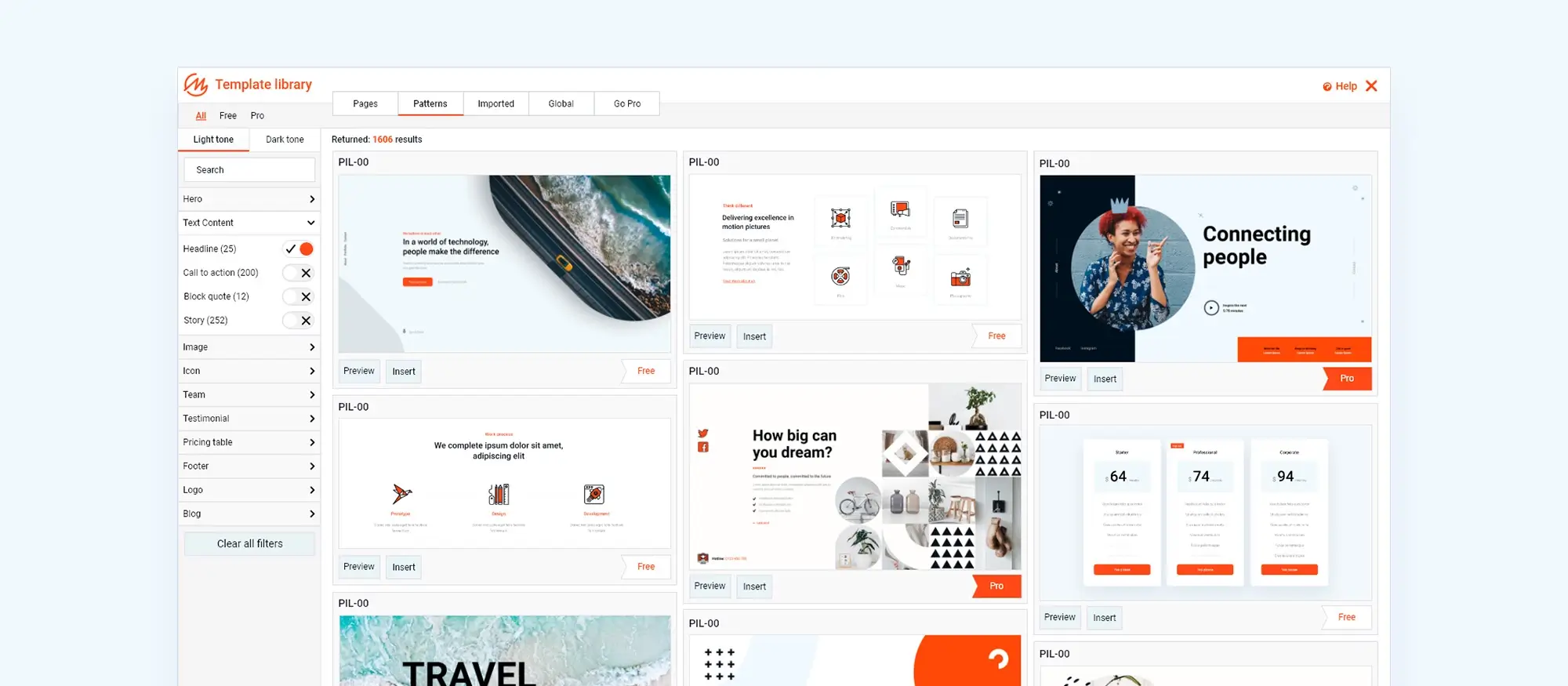
Advanced typography techniques and examples
Advanced typography techniques
Variable fonts for better performance
Variable fonts let you adjust weight, width and slant from a single file. This cuts load times compared with loading separate font files, while giving you more design flexibility.
Typographic animations and transitions
Simple CSS transitions such as a slight change in letter spacing or colour on hover draw the eye without slowing down the text. Keep animations brief so they enhance rather than distract from your content.
Layout with CSS grid and Flexbox
Use CSS grid to place text in precise areas, such as centring headlines or creating multi‑column body text. Flexbox helps you align and distribute space within containers, ensuring your typography adapts smoothly to screen size changes.
Case studies and examples
Exemplary typography on real sites
Sites like The Guardian and Smashing Magazine showcase effective font pairing and hierarchy. Notice how their headings stand out and guide readers, while body text remains clear and inviting.
Applying these ideas
On a blog, try a bold serif for your main headings paired with a clean sans‑serif for paragraphs. For an online store, highlight product names in uppercase sans‑serif and use a lighter serif for descriptions to create contrast.
Free resources for WordPress fonts
Google Fonts library
Google Fonts provides hundreds of high‑quality, web‑safe fonts for free. You can embed them via the WordPress Customiser or by adding the appropriate <link> tags to your theme.
Plugins to manage fonts
Plugins like Easy Google Fonts and Custom Fonts let you add and preview new fonts directly in the Customiser. This saves manual CSS work and helps you see changes in real time.
Build like a pro
Choosing and previewing fonts in WordPress
Previewing fonts in the Customiser
You can see your font choices live by heading to Appearance → Customise → Typography. If you want more options without touching code, install the Easy Google Fonts plugin from wordpress.org/plugins/easy-google-fonts. and it will add a typography panel where you can test different families, weights and sizes on desktop, tablet and mobile before saving.
Default and extra font options
Most themes fall back to simple, reliable fonts such as Arial, Helvetica or Georgia. To give your site a unique touch, browse the Google Fonts library at fonts.google and copy the supplied <link> tag into the Customiser’s Additional CSS/HTML field. Assign the new font in your theme’s stylesheet or via the typography panel, and you’ll see your headings and body text update instantly.
Managing fonts with plugins
If you’d rather avoid manual code, the Typography plugin (wordpress.org/plugins/typography/) is another solid choice. It integrates directly into the Customiser, letting you control line height, letter spacing and font pairing with immediate visual feedback.
Free font sources to consider
For high‑quality, free web fonts beyond Google’s selection, visit Font Squirrel at fontsquirrel Download your chosen WOFF or TTF files, upload them to your theme’s fonts folder, then define them in your stylesheet using @font-face no licensing fees required.
Final thoughts
Typography shapes how users experience your content. Clear font choices, a well‑defined hierarchy and layouts that adjust across devices all contribute to a site that feels polished and professional. WordPress gives you the tools to fine‑tune every aspect of your typography, whether you’re selecting from default fonts, integrating Google Fonts or uploading your own files with @font-face.
Key takeaways
Good font pairing guides readers through your pages and reinforces brand identity. Responsive typography using media queries or fluid units keeps text legible on phones, tablets and desktops. Adding custom fonts manually via @font-face offers full control without relying on plugins. Live previews in the Customiser or via font plugins let you test and refine your styles before you publish. Accessible typography choosing clear typefaces, strong contrast and ample spacing ensures every visitor can engage with your content.
For an all‑in‑one solution that streamlines responsive layouts, adds built‑in breakpoints and provides visual block editing, install the free MaxiBlocks plugin and pair it with the lightweight MaxiBlocks Go theme. Together they deliver advanced typography controls and full‑site editing right from your WordPress dashboard.
Beautiful WordPress web designs to kickstart your site
Find responsive and accessible WordPress web designs to match your brand and goals.
FAQs – Typography in web design
What is responsive typography?
Responsive typography ensures text adjusts smoothly to different screen sizes. By using CSS media queries or viewport units, you can set font sizes that change based on device width, keeping headings and body text legible on phones, tablets and desktops alike.
How do I add custom fonts to WordPress without a plugin?
You can upload font files (WOFF, WOFF2 or TTF) into a fonts folder in your theme or child theme, then define them with an @font-face rule in your stylesheet. After that, apply the new font family in your theme’s CSS or via the Customiser’s Additional CSS panel.
What is visual hierarchy in typography?
Visual hierarchy guides readers through your content by varying font size, weight and style. Main headings should be larger and bolder than subheadings, which in turn are more prominent than body text. This structure helps users scan pages and find information quickly.
How can I ensure my typography is accessible?
Choose clear, legible fonts with a minimum contrast ratio of 4.5:1 against the background. Keep body text at least 16px and set line heights around 1.5. Avoid overly decorative typefaces for long passages and test your pages with tools like WAVE or the WP Accessibility plugin.
Can I preview typography changes live in WordPress?
Yes. The WordPress Customiser shows live previews of font changes on desktop, tablet and mobile. You can also use plugins such as Easy Google Fonts, which add a typography panel to the Customiser for instant visual feedback without saving.
Do I need a plugin to use Google Fonts in WordPress?
No. You can add Google Fonts by copying the <link> tag from the Google Fonts website into the Customiser’s Additional CSS/HTML field and then assigning the font family in your stylesheet. Plugins make this process more user‑friendly but are not strictly required.
How does MaxiBlocks help with typography?
MaxiBlocks provides visual block editing with built‑in responsive controls and style cards that let you adjust fonts, weights and spacing for each screen size. To get started, install the free MaxiBlocks plugin and pair it with the MaxiBlocks Go theme.
What sets advanced WordPress design apart from basic site builds?
Advanced WordPress design involves custom functionality, refined user flows and a deeper integration of branding and performance strategies. You can explore this further in this guide to advanced WordPress web design.
Why should I consider a custom WordPress website instead of using a theme?
A custom site offers full flexibility, optimised speed and design precision. Unlike off-the-shelf themes, custom builds allow you to tailor everything to your audience and goals. Learn more about the advantages in this article on custom WordPress design.
How do UX and UI principles improve WordPress websites?
User experience and interface design are central to how visitors navigate, interpret and act on your content. Well-crafted UX and UI can significantly boost conversion and satisfaction. Discover best practices in this WordPress UX/UI design guide.
What are the most current trends in modern website design?
Design trends now focus on immersive experiences, strong typographic layouts and performance-friendly visuals. Find out what’s popular in this overview of modern website design trends.
When is it time to redesign your WordPress site?
You might need a redesign if your site is visually outdated, difficult to navigate, or underperforming. This website redesign guide explains how to evaluate and approach the process.
What does responsive WordPress design actually mean?
Responsive design ensures that your site adjusts smoothly across different screen sizes, offering the best experience on mobile, tablet and desktop. This guide to responsive WordPress design covers the fundamentals.
How can I make my site responsive from the ground up?
Designing responsively involves using fluid grids, flexible media and mobile-first layouts. Learn how to implement these techniques in this comprehensive responsive web design guide.
What tools help build responsive websites in WordPress?
Choosing the right theme, using visual editors and following responsive design principles are key. This guide on responsive WordPress development provides a useful starting point.
Is it possible to build a high-quality WordPress site on a limited budget?
Yes. With smart planning and free tools, you can launch a polished site affordably. This resource on affordable WordPress design offers practical strategies for cost-effective builds.
What defines a professional WordPress design?
Professional design includes clean layouts, optimised navigation, mobile responsiveness and brand consistency. This article on professional WordPress design outlines what to focus on.
Are there real-world examples of successful WordPress designs?
Yes. Studying effective projects can reveal patterns and practices worth applying to your own site. See these WordPress design case studies for insights.
How does typography shape the user experience of a website?
Typography affects readability, mood and overall visual hierarchy. The right font choices enhance both design and clarity. For guidance, check this article on typography in web design.
What principles define modern web design in 2024 and beyond?
Design today is focused on speed, minimalism, interactivity and accessibility. Explore these concepts in this modern web design overview.
What are web design page blocks and why are they useful?
Page blocks are pre-structured sections that make it easier to build consistent, attractive layouts. They save time and improve visual flow. This guide to web design page blocks explains how they work.
What are the most popular WordPress design trends right now?
Visual storytelling, dark mode, micro-interactions and layered layouts are trending. This list of 40 WordPress design trends showcases what’s hot right now.
What website design trends are emerging for 2025?
Expect to see growth in personalisation, AI-driven layouts, and more inclusive design standards. This 2025 design trends article offers a glimpse into the future.
What is a hero banner and how should it be designed?
A hero banner is the prominent visual at the top of a page. It should deliver your key message quickly with strong visuals and clear calls to action. Learn how to design one in this hero banner guide.
How do I create a hero section in WordPress without coding?
Drag-and-drop builders make it easy to customise hero layouts without touching code. Try this Maxiblocks WordPress hero section builder for a smooth start.
Is there a tool for building hero sections specifically for Maxiblocks?
Yes, this dedicated hero builder from Maxiblocks is tailored for fast, flexible hero section creation in WordPress.
Where can I view examples of effective hero banners?
Explore this visual showcase of hero banners to see various layouts and approaches used across industries.
What tools are best for designing websites efficiently?
From visual builders to wireframing apps, there’s a wide range of design software available for every skill level. This guide to web design tools highlights the best ones to consider.
WordPress itself
Official Website
wordpress.org – This is the official website for WordPress, where you can download the software, find documentation, and learn more about using it.
WordPress Codex
codex.wordpress.org/Main_Page – This is a comprehensive documentation resource for WordPress, covering everything from installation and configuration to specific functionality and troubleshooting.
WordPress Theme Directory
wordpress.org/themes – The official WordPress theme directory is a great place to find free and premium WordPress themes. You can browse themes by category, feature, and popularity.
maxiblocks.com/go/help-desk
maxiblocks.com/pro-library
www.youtube.com/@maxiblocks
twitter.com/maxiblocks
linkedin.com/company/maxi-blocks
github.com/orgs/maxi-blocks
wordpress.org/plugins/maxi-blocks

Kyra Pieterse
Author
Kyra is the co-founder and creative lead of MaxiBlocks, an open-source page builder for WordPress Gutenberg.
You may also like
