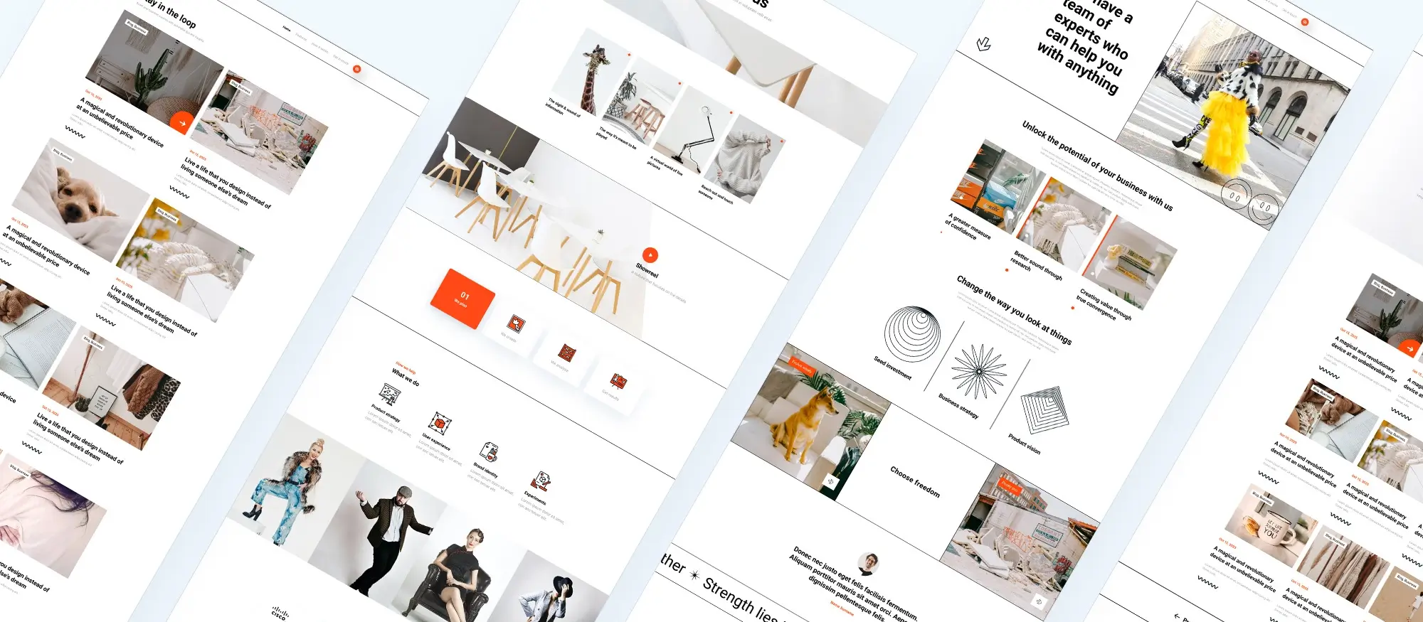
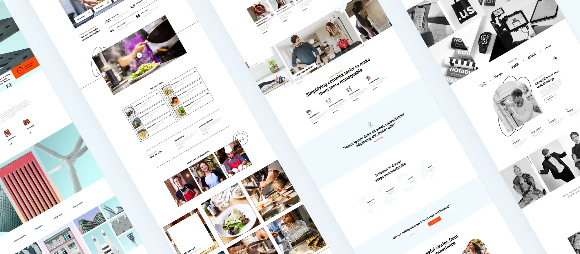
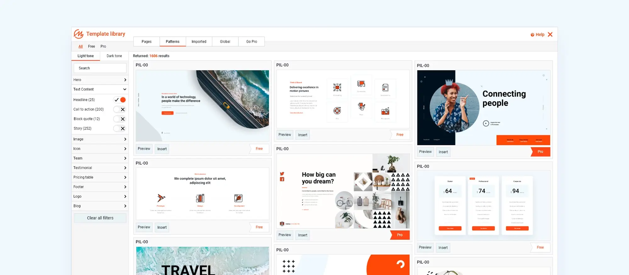
What is responsive WordPress design and why does it matter?
Try MaxiBlocks for free with 500+ library assets including basic templates. No account required. Free WordPress page builder, theme and updates included.

Updated 15th May 2025
Introduction to responsive WordPress design
What responsive design actually means
Adapting your site for all screen sizes
People don’t just browse on laptops anymore. Phones, tablets and everything in between are used to visit websites. Responsive design means your site adjusts depending on the screen. Instead of making different versions for each device, you just build once and it reshapes itself based on where it’s being viewed. Layouts shift, text resizes, and images scale properly without you having to mess around with separate mobile or desktop versions.
Why it matters
If your site’s annoying to use on a phone, people won’t stick around. If they have to pinch and zoom or scroll sideways, they’ll leave. That also affects how you show up on Google. Sites that work well on mobile usually get ranked higher. So a responsive site isn’t just about looking nice it makes things easier for your visitors and can help get more eyes on what you’re doing.
How MaxiBlocks helps
MaxiBlocks takes care of a lot of the heavy lifting. You drag and drop blocks into place, and the layout adjusts itself for different screen sizes. It’s built with flexibility in mind, so you don’t have to fight with code to get things working right on mobile. It also gives you a live preview while you work, so you can see exactly how your page looks on a phone, tablet or desktop before you hit publish.
What goes into responsive design
Layouts that stretch and shrink
Instead of fixed-width designs, responsive sites use percentages and relative units. This means sections grow or shrink depending on the screen size. So whether someone’s using a widescreen monitor or an old iPhone, the layout still works.
Images that don’t break the layout
You can’t just slap a massive image into your site and expect it to behave. Responsive sites use images that resize based on the screen. They fill the space without overflowing or becoming too small to see.
Using media queries and breakpoints
Media queries are bits of code that tell your site how to behave on different screen sizes. For example, you might stack two columns vertically on mobile but keep them side-by-side on desktop. MaxiBlocks makes this easier by giving you built-in breakpoints, so you don’t have to write the code yourself. You just pick how it looks on each screen size.

Why responsive design matters
How it affects user experience
People expect websites to just work
If someone visits your site on their phone and it’s hard to read or click anything, they’re going to leave. Responsive design helps avoid that by making sure your content looks right on any screen. It keeps layouts simple to scroll, makes text readable, and buttons easy to tap without the user needing to zoom in or scroll sideways.
It keeps people on your site
When a site is easier to use, people stay longer and are more likely to click through to what they need. This means fewer people bouncing off your site and more chances they’ll sign up, buy something, or get in touch.
How MaxiBlocks helps
MaxiBlocks outputs clean, lightweight code behind the scenes, which helps your pages load quickly. It also makes the whole building process easier, so you’re not stuck tweaking layout issues for hours.
What it means for SEO
Search engines prefer mobile-friendly sites
Google and others are pretty clear: if your site doesn’t work well on mobile, it won’t rank as well. Responsive design tells search engines your site is made for all users, which helps it show up higher in search results.
Speed plays a big part
Clean code usually means faster loading times. And speed is a ranking factor. MaxiBlocks keeps the code lean, which helps your pages load faster and gives your site a better shot at showing up higher in search results.
Subscribe to our newsletter
MaxiBlocks and responsive design
Features that make it easier to build for every screen
MaxiBlocks is made with responsive design in mind. It comes with tools that help you build layouts that look right on all screens, without needing to dig into code. Flexbox controls let you stack and align content properly so nothing breaks when someone switches from desktop to mobile.
It also gives you six screen breakpoints 4K, desktop, laptop, tablet, mobile landscape and mobile portrait so you can fine-tune how your content behaves on each one. Whether it’s a two-column layout or a full-width image, you get more control over how it looks depending on the screen.
Templates and blocks in MaxiBlocks are already set up to be responsive, so you spend less time fixing things and more time building.
More control with customisation
MaxiBlocks includes customisation options that make it quicker to build responsively. You can use style cards to change fonts, colours and spacing across your site. These updates carry over to all screen sizes, so you don’t need to repeat work for each layout.
Foundation blocks also give you flexibility. You’re not stuck with rigid templates you can build layouts from the ground up and still keep them responsive. It’s helpful if you want more control but don’t want to get buried in settings.

Best practices for responsive design with MaxiBlocks
Start with layout and planning
Good responsive design starts before you even place your first block. It’s usually a smart idea to begin with mobile layouts first, then build outwards. This helps you focus on what really matters, content that works well on smaller screens, before adding extras for larger ones.
MaxiBlocks includes a grid system that helps keep your content organised. It gives you a solid structure to build on, and it adjusts smoothly across breakpoints.
Whatever you build, test it on a range of screen sizes desktop, tablet, and both views of mobile. Don’t just rely on one device. MaxiBlocks’ live preview makes this easier, but it’s always worth checking the real thing too.
Keep your content clear and simple
Good responsive design starts before you even place your first block. It’s usually a smart idea to begin with mobile layouts first, then build outwards. This helps you focus on what really matters content that works well on smaller screens before adding extras for larger ones.
Build like a pro
Responsive design moving forward with MaxiBlocks
The future of responsive design
Responsive design doesn’t stand still. As new screens, devices and resolutions come along, websites need to keep up. That means being ready for bigger monitors, foldable screens, and whatever else comes next.
MaxiBlocks is designed to stay up to date with these changes. It gets regular updates and improvements, so you’re not stuck with tools that feel behind. You can keep your site looking modern and working well without having to start from scratch every time the tech moves forward.
Why MaxiBlocks is built for this
MaxiBlocks gives you everything you need to build responsive websites in WordPress without the hassle. You get Flexbox controls, screen-size breakpoints, style cards, and blocks that adjust across devices.
It works for beginners who want something simple and for developers who need more control. Whether you’re laying out a quick landing page or building a full site, you can make sure it looks good and runs smoothly on anything from phones to wide screens.

Final thought
Responsive design isn’t a trend it’s just how websites are expected to work now. If your site doesn’t load properly on a phone or tablet, people will leave. That’s the reality. But building something that works across devices doesn’t have to be complicated.
With tools like MaxiBlocks, you can create layouts that adjust smoothly without spending hours fine-tuning breakpoints or fixing spacing issues. You’ve got full control over how your site looks on every screen, and you don’t need to touch a line of code to get there.
The main points are simple: design for mobile first, test on real devices, keep things clear and flexible, and make sure your images and text are readable everywhere. If you’re already doing that or ready to start you’re ahead of most.
To get started, you can download the free MaxiBlocks plugin on WordPress.org and pair it with the MaxiBlocks Go theme. They work together out of the box and give you all the tools you need to build responsive pages that load fast and look right on any screen.
Beautiful WordPress web designs to kickstart your site
Find responsive and accessible WordPress web designs to match your brand and goals.
FAQs – Responsive WordPress design
What is responsive design in WordPress?
Responsive design means your website adjusts automatically to fit different screen sizes. Whether someone’s visiting from a phone, tablet, laptop or desktop, your site should look good and work properly without the user needing to zoom or scroll sideways.
Do I need coding skills to build a responsive site with MaxiBlocks?
No, you don’t need to write any code. MaxiBlocks is built for people of all skill levels. You can drag and drop blocks into place, and the design adapts across screen sizes. You can also preview how your site will look on mobile, tablet, and desktop while editing.
What devices does MaxiBlocks support?
MaxiBlocks has six built-in breakpoints that cover 4K, desktop, laptop, tablet, mobile landscape, and mobile portrait. You can adjust how your layout behaves on each of these, so your site looks good everywhere.
Can I customise layouts for mobile without affecting desktop?
Yes. With MaxiBlocks, you can tweak spacing, text size, layout and more for different screen sizes. This means you can fix issues on mobile without messing up how things look on a laptop or desktop.
Is the MaxiBlocks plugin free?
Yes. You can download MaxiBlocks for free on WordPress.org. It’s open source and includes a full set of features without needing a paid licence.
Does MaxiBlocks have a theme?
Yes. The MaxiBlocks Go theme is a free theme built to work perfectly with the plugin. It’s lightweight, clean, and made for full site editing.
How do successful WordPress websites achieve their results?
Analysing top-performing sites can reveal the design patterns and content strategies that lead to better engagement. This collection of WordPress case studies offers valuable lessons in layout, structure and conversion.
Why is typography essential in website design?
Typography impacts how people consume your content. It influences tone, clarity and how easily users navigate your site. This guide on typography in web design shows how font choices affect everything from aesthetics to accessibility.
What makes web design feel truly modern?
Modern design focuses on simplicity, clarity and a seamless user journey. Trends like bold visuals, minimal layouts and intuitive navigation are covered in this introduction to modern web design.
How do page blocks improve the web design workflow?
Page blocks offer ready-made sections you can use to speed up page creation. They’re perfect for maintaining consistency while allowing creative flexibility. Learn more in this article about web design page blocks.
What does responsive WordPress design involve?
Responsive design ensures your website looks and works well on every screen size, from phones to large desktops. This responsive WordPress design guide explains how to build layouts that adapt naturally to users’ devices.
What are the most popular design trends in WordPress right now?
From clean aesthetics to immersive scrolling, WordPress designs are embracing function and simplicity. These 40 WordPress website trends highlight the key styles and features that are defining today’s best sites.
What design changes are expected in 2025?
Future designs will likely include more AI-driven personalisation, eco-conscious branding and voice-activated interfaces. This preview of 2025 web design trends outlines what’s next in user-centred design.
How can a hero banner improve my site’s first impression?
A hero banner grabs attention immediately, helping visitors understand your offering in seconds. This hero banner design guide shows how to create impactful visual headers that drive action.
Can I build a hero section in WordPress without needing to code?
Yes, the Maxiblocks hero builder for WordPress allows anyone to create beautiful, responsive hero sections using drag-and-drop tools.
Is there a simple way to create hero sections with Maxiblocks?
The Maxiblocks website hero section builder gives you the flexibility to build and customise hero areas to match your content and design style.
Where can I get ideas for designing a hero banner?
If you’re looking for layout and content inspiration, this showcase of hero banners features a range of creative approaches that perform well visually and functionally.
What are the best tools for designing websites today?
Whether you’re working on a landing page or an entire site, this guide to website design software shares tools that support efficient and professional results for all experience levels.
How do I ensure my website works across all screen sizes?
Responsive web design is key to creating a consistent experience for every visitor. This complete responsive design guide covers layouts, media and mobile-first techniques in detail.
WordPress itself
Official Website
wordpress.org – This is the official website for WordPress, where you can download the software, find documentation, and learn more about using it.
WordPress Codex
codex.wordpress.org/Main_Page – This is a comprehensive documentation resource for WordPress, covering everything from installation and configuration to specific functionality and troubleshooting.
WordPress Theme Directory
wordpress.org/themes – The official WordPress theme directory is a great place to find free and premium WordPress themes. You can browse themes by category, feature, and popularity.
maxiblocks.com/go/help-desk
maxiblocks.com/pro-library
www.youtube.com/@maxiblocks
twitter.com/maxiblocks
linkedin.com/company/maxi-blocks
github.com/orgs/maxi-blocks
wordpress.org/plugins/maxi-blocks

Kyra Pieterse
Author
Kyra is the co-founder and creative lead of MaxiBlocks, an open-source page builder for WordPress Gutenberg.
You may also like

