Responsive WordPress design
Try MaxiBlocks for free with 500+ library assets including basic templates. No account required. Free WordPress page builder, theme and updates included.
Updated 15th May 2025
Introduction to responsive WordPress design
Benefits of responsive WordPress design
Improved accessibility
A responsive WordPress design ensures your site is easy to use on any device. Text, images and menus resize automatically for desktops, tablets and smartphones, making content approachable for all visitors.
Better search rankings
Google rewards mobile‑friendly websites. By using responsive design, your WordPress site is more likely to appear higher in search results, driving more organic traffic without extra SEO work.
Faster page loading
Responsive themes often include optimised code and media queries that load only the assets needed for each screen. This reduces load times, keeping visitors engaged and lowering bounce rates.
Consistent branding
Maintaining the same look and feel across devices builds trust in your brand. Responsive WordPress design ensures colours, fonts and layouts remain uniform, so users recognise your site wherever they view it.
Key elements of responsive WordPress design
Flexible grid layouts
Using percentage‑based grids rather than fixed widths lets content expand or contract to fit any screen. This keeps columns aligned and spacing consistent, regardless of device size.
Fluid images and media
Responsive design uses scalable images and video containers that adjust to their parent element. This prevents distortion and ensures visuals remain clear and sharp on high‑resolution screens.
CSS media queries
Media queries apply different style rules based on screen width or orientation. By defining breakpoints such as for mobile portrait, tablet and desktop you can tailor typography, margins and element visibility for each device.
Touch‑friendly navigation
Menus and buttons must be large enough to tap without zooming. Responsive WordPress design includes touch‑optimised elements and clear spacing, so users can navigate easily on touchscreen devices.
Choosing a responsive WordPress theme
What to look for in a responsive theme
Built‑in mobile support
Select a theme that clearly states it is responsive or mobile‑friendly. Themes like MaxiBlocks Go, OceanWP and Hestia are designed to adjust layouts, fonts and menus automatically across screen sizes. Always review the theme’s demo on different devices before installing.
Testing and tweaking for perfection
Check reviews and ratings
User feedback often highlights issues on tablets or smartphones. Read recent reviews to see if anyone has reported problems with menu display, image scaling or page speed on mobile devices.
Fine‑tune your settings
After activating your theme, use the Customiser to adjust font sizes, line heights, padding and margins. Preview changes on mobile and tablet views to ensure text remains legible and elements don’t overlap. A few minutes of tweaking can make a huge difference to your site’s usability and SEO performance.
Subscribe to our newsletter
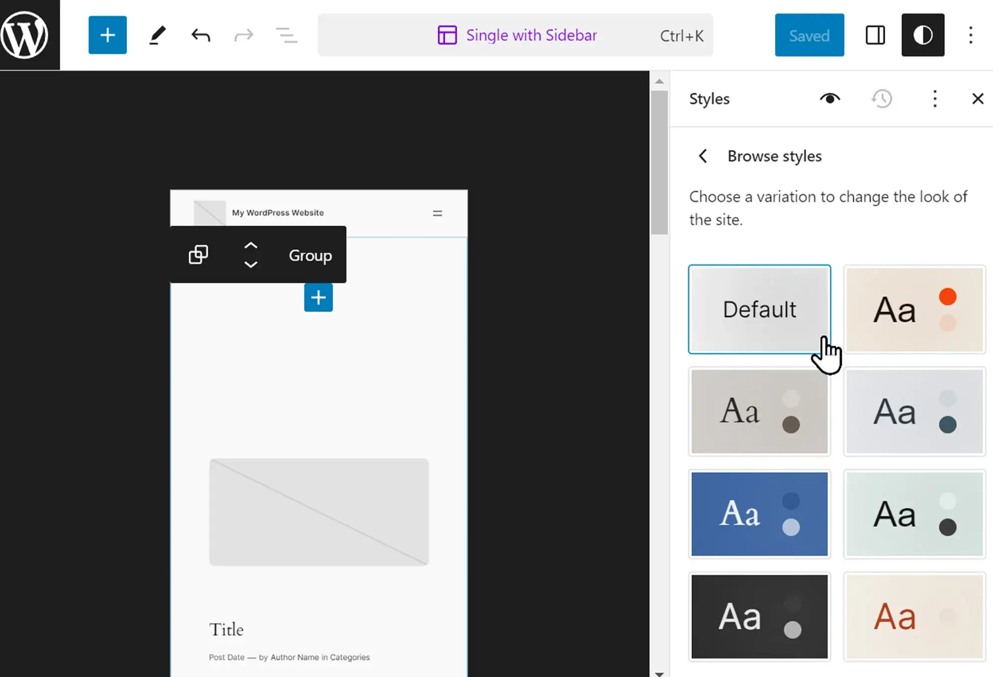
Choosing a responsive WordPress theme
Evaluating theme responsiveness
A truly responsive WordPress theme adjusts layouts, fonts and menus across screen sizes without extra plugins. Look for themes labelled as responsive and check user reviews for mobile performance. Popular choices include MaxiBlocks Go, OceanWP and Hestia, all of which offer built‑in support for flexible grids and fluid images.
Testing and customisation
After activating your chosen theme, preview it on smartphones, tablets and desktop browsers. Adjust font sizes, line heights, padding and margins in the Customiser to ensure text remains legible and elements stay aligned. A few minutes of tweaking guarantees your site looks polished and performs well on every device.
Testing your responsive WordPress site
Using online testing tools
Google mobile‑friendly test
Google’s tool analyses individual pages and flags any issues that affect mobile usability, such as touch‑target size or viewport settings.
BrowserStack
BrowserStack lets you see your site in real time across dozens of browser and operating system combinations, so you can spot layout or functionality problems before they reach your visitors.
Responsinator
Responsinator gives quick previews of how your pages look on popular devices in portrait and landscape, helping you catch any obvious design glitches.
Testing on real devices
Common issues to watch for
On real phones and tablets, you might find buttons too small to tap, text that’s hard to read or elements that run off the screen.
How to fix problems
Increase font sizes and touch targets in your theme settings or style cards. Use media queries to adjust padding and margins at breakpoints. Ensure images and videos are set to scale fluidly so they never overflow their containers.
Build like a pro
Optimising content and performance for responsive WordPress sites
Best practices for responsive content
Use clear headings and lists
Break up your copy with descriptive headings and bullet points. This makes text easier to skim on both large and small screens.
Include scalable images and media
Choose images that resize smoothly, and avoid large files that slow down mobile devices. Embed videos responsibly so they never overflow their containers.
Maintain generous whitespace
Adequate spacing around text and elements helps readability on any device. Whitespace also guides the eye and prevents a cluttered appearance.
Performance optimisation for responsive sites
Compress and serve images efficiently
Use tools or plugins to reduce image file sizes without noticeable loss of quality. Consider modern formats like WebP for faster loading on mobile networks.
Minify CSS, JavaScript and HTML
Remove unnecessary characters and comments from your code. Minification reduces file sizes, cutting down load times for every visitor.
Leverage browser caching
Set up caching so repeat visitors load pages from their device rather than fetching every asset again. This simple step can dramatically speed up your site on all devices.
Final thoughts and key takeaways
Creating a site that works on any screen is no longer optional it’s expected. Responsive design keeps your content readable, your navigation smooth and your visitors engaged, whether they’re on a smartphone, tablet or desktop. MaxiBlocks takes the hassle out of building flexible layouts by offering visual tools like Flexbox controls, built‑in breakpoints and responsive blocks. You can see exactly how your pages look on different devices and tweak them instantly, without touching code.
Key takeaways
- Responsive design improves usability and cuts bounce rates by adapting layouts, images and menus to every screen size.
- Google ranks mobile‑friendly sites higher, so a responsive theme and clean code give you an SEO edge.
- Breakpoints in MaxiBlocks let you fine‑tune your design for 4K, desktop, laptop, tablet and both mobile orientations.
- Image compression, code minification and caching speed up your site on every device.
- Starting with responsive content clear headings, scalable media and ample spacing makes the rest of the process smoother.
Ready to simplify responsive design? Install the free MaxiBlocks plugin on your WordPress site and pair it with the lightweight MaxiBlocks Go theme to start building pages that look great everywhere.
Beautiful WordPress web designs to kickstart your site
Find responsive and accessible WordPress web designs to match your brand and goals.
FAQs – Responsive WordPress design
What is responsive design?
Responsive design means a website automatically adjusts its layout, images and navigation to fit the screen it’s viewed on, whether that’s a phone, tablet or desktop. It ensures users can read text without zooming and tap links without accidental clicks.
Why is responsive design important for WordPress sites?
Most visitors browse on mobile devices. If your site isn’t easy to use on a phone, they’ll leave quickly. A responsive design keeps users engaged, reduces bounce rates and is favoured by Google in search rankings, helping your site get more visibility.
How can I test my site’s responsiveness?
You can use online tools such as Google’s Mobile‑Friendly Test or Responsinator to see how your pages look on various devices. It’s also worth checking on real phones and tablets to catch any touch‑target or layout issues that automated tools might miss.
Does MaxiBlocks require coding knowledge to create responsive layouts?
No. MaxiBlocks is built for visual editing. You drag and drop blocks and use the built‑in breakpoints and Flexbox controls to adjust how content sits on small or large screens. The plugin handles the underlying code automatically.
What breakpoints does MaxiBlocks support?
MaxiBlocks includes six breakpoints covering 4K, desktop, laptop, tablet, mobile landscape and mobile portrait. You can preview and tweak your design at each of these sizes to make sure it looks right on every device.
Can I fine‑tune mobile styles without affecting desktop?
Yes. MaxiBlocks lets you set different padding, font sizes and layout options for each breakpoint. That means you can make text larger or move elements on mobile without changing how they appear on a desktop screen.
Is the MaxiBlocks plugin free?
Absolutely. You can download the MaxiBlocks plugin for free from WordPress.org. It comes with all core features at no cost, and you can add the Go theme for a complete responsive setup.
Do I need a specific theme to use MaxiBlocks effectively?
While MaxiBlocks works with most block‑based themes, pairing it with the MaxiBlocks Go theme ensures full compatibility and performance. The theme is lightweight and optimised to take advantage of all MaxiBlocks’ responsive features.
What can we learn from successful WordPress website designs?
Real-world examples reveal what actually works in design. From user experience to layout structure and branding, these WordPress case studies highlight best practices and provide insight into how design decisions impact results.
Why is typography so important in web design?
Typography shapes the tone and clarity of your content. The right fonts help guide readers, establish visual hierarchy and improve accessibility. This typography in web design guide covers how to make type work effectively in your layouts.
What defines modern web design today?
Modern web design is built around clarity, responsiveness and user experience. Clean layouts, fast loading times and mobile-first thinking are key components. Explore the principles of modern web design to understand how to apply them to your own projects.
How do page blocks improve the website design process?
Page blocks are reusable content sections that make site building faster and more consistent. Whether you’re working in WordPress or another platform, this guide to web design page blocks explains how to use them effectively.
What is responsive WordPress design and why is it essential?
Responsive design ensures your website looks and functions correctly on all screen sizes, from smartphones to desktops. It’s critical for usability and SEO. This article on responsive WordPress design explains how it works.
What design trends are shaping WordPress websites right now?
WordPress design is seeing a shift towards minimalism, dark mode, micro-interactions and accessible design. This list of 40 design trends highlights the most current and effective approaches.
What can we expect from web design trends in 2025?
Looking ahead, expect a focus on AI integration, sustainable design, and greater personalisation. This preview of 2025 design trends provides a glimpse into how the landscape is evolving.
What is a hero banner and why is it important?
A hero banner is the large, visual header section at the top of a web page. It introduces your brand or message in an impactful way. Learn how to craft one that engages users in this hero banner design guide.
Can I build a hero section without coding in WordPress?
Yes, tools like the Maxiblocks hero section builder for WordPress make it easy to design responsive and visually appealing hero banners using drag-and-drop functionality.
Is there a specific tool for creating hero sections with Maxiblocks?
The Maxiblocks website hero section builder offers customisable hero layouts that integrate seamlessly into your WordPress site without needing technical skills.
Where can I find examples of well-designed hero banners?
If you’re looking for visual inspiration, browse this collection of hero banners to see how different designs can effectively capture attention and communicate value.
What are the best tools for designing websites today?
Designers can choose from a wide range of platforms depending on their needs, from prototyping tools to full-featured builders. This guide to website design software outlines top options for all experience levels.
How can I make my site fully responsive and mobile-friendly?
Responsive web design is crucial for modern websites. It involves using flexible grids, scalable images and mobile-first strategies. This complete guide to responsive web design walks through the process step by step.
WordPress itself
Official Website
wordpress.org – This is the official website for WordPress, where you can download the software, find documentation, and learn more about using it.
WordPress Codex
codex.wordpress.org/Main_Page – This is a comprehensive documentation resource for WordPress, covering everything from installation and configuration to specific functionality and troubleshooting.
WordPress Theme Directory
wordpress.org/themes – The official WordPress theme directory is a great place to find free and premium WordPress themes. You can browse themes by category, feature, and popularity.
maxiblocks.com/go/help-desk
maxiblocks.com/pro-library
www.youtube.com/@maxiblocks
twitter.com/maxiblocks
linkedin.com/company/maxi-blocks
github.com/orgs/maxi-blocks
wordpress.org/plugins/maxi-blocks

Kyra Pieterse
Author
Kyra is the co-founder and creative lead of MaxiBlocks, an open-source page builder for WordPress Gutenberg.
You may also like
