Try MaxiBlocks for free with 500+ library assets including basic templates. No account required. Free WordPress page builder, theme and updates included.
Updated 15th May 2025
Introduction
Your hero banner is the first thing people see when they land on your site. It sets the tone, communicates your message, and encourages users to keep scrolling or click through. A strong hero section can build trust and guide visitors toward action all in just a few seconds.
With MaxiBlocks, a free, open-source page builder for WordPress, you can create high-impact hero banners without writing a single line of code. It’s built on Gutenberg, comes with customisable blocks, and includes everything you need to create visually engaging and mobile-ready headers.
Why hero banners matter in web design
- They make a strong first impression
- They showcase your brand’s style, message, and purpose
- They guide user action through calls to action (CTAs)
- They visually separate your site’s top section from the rest
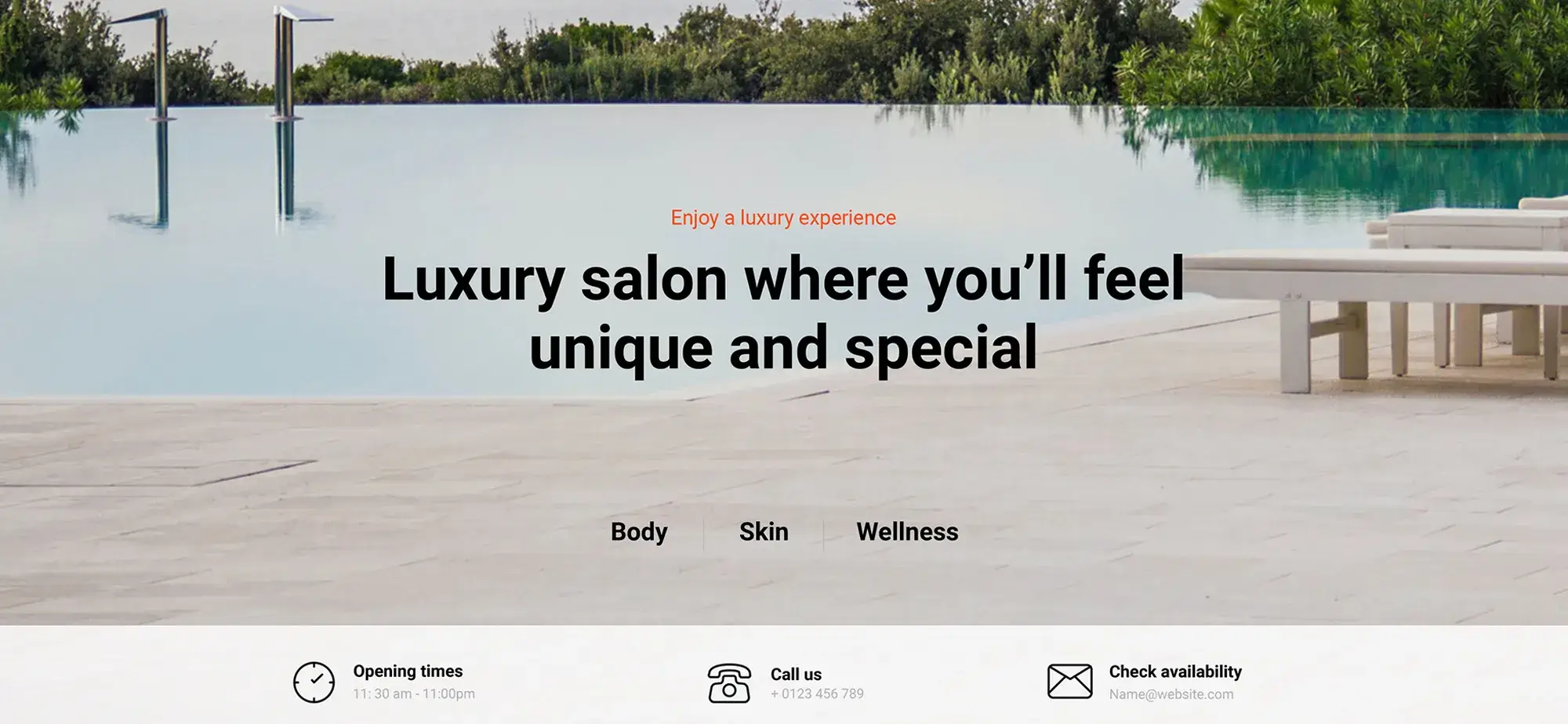
A well-built hero section typically includes:
- A clear, bold headline
- A short supporting message or subtext
- A call-to-action (CTA) button
- A background image, video, or solid colour
Step 1 – Choose a starting point
MaxiBlocks includes a huge library of ready-made hero section patterns. Choose a template that fits your niche whether it’s creative, business, e-commerce, or personal.
Step 2 – Customise with style cards
Style cards allow you to instantly update fonts, colours, button styles, and links across your site. Pick from over 100 pre-made style card variations or create your own.
Step 3 – Add your message
Use the Gutenberg editor to type in your headline, subheading, and CTA. Everything updates live, so you can see how it looks instantly.
Step 4 – Add background visuals
You can use high-resolution images, videos, or even SVG shapes from the MaxiBlocks design library. Add overlays to maintain contrast and improve readability of your text.
Subscribe to our newsletter
Creating an effective hero banner starts with clarity, visual appeal, and performance. Here are design ideas to help you create a standout hero section that looks great across all devices and encourages users to take action.
Visual inspiration and layout ideas
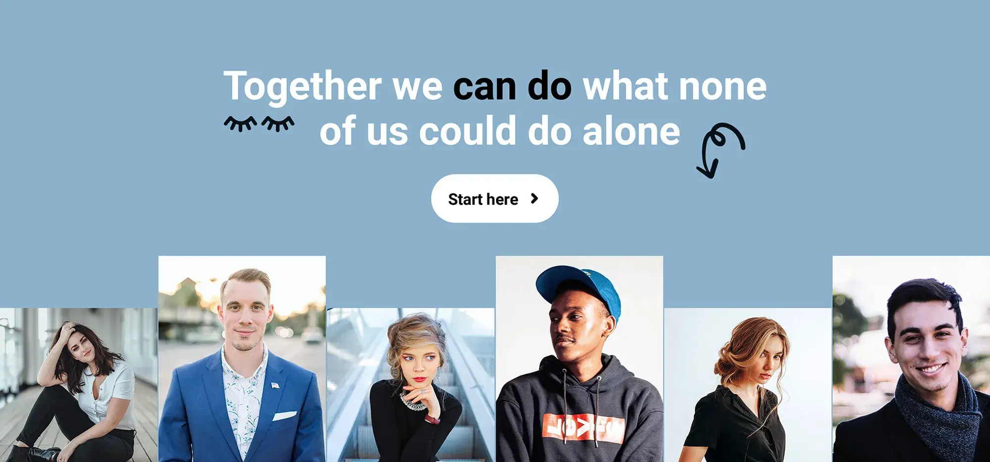
- Full-width hero with headline on the left, image or video on the right
- Centred headline and CTA with vertical stack
- Split layout with bold text on one side and a muted background image on the other
- Overlay layout with image or video and a dark transparent filter for text clarity
Colour palette suggestions
- Trustworthy and clean: navy blue, white, grey
- Bold and action-driven: orange, charcoal, cream
- Minimal and modern: black, white, neon accent (green or teal)
- Creative and soft: lilac, warm beige, muted coral
Use colour to create mood, draw attention to key elements, and improve text visibility. A semi-transparent overlay over images helps ensure your message stands out.
Visual elements to include
- High-contrast images or subtle abstract backgrounds
- Semi-transparent overlays to improve text readability
- Icons or badges to highlight features or trust signals
- Subtle scroll or hover animations to increase engagement
Typography pairings
- Modern and clean: Montserrat (heading) + Open Sans (body)
- Professional and readable: Lato (heading) + Roboto (body)
- Elegant and creative: Playfair Display (heading) + Source Sans Pro (body)
Stick to one or two fonts, and use font size, weight, and colour to guide attention.
Keep it clear and focused
Your hero should communicate one core message at a glance. Use a strong headline and one short supporting sentence to express your value clearly.
- Avoid overcrowding the space with too many elements
- Focus on a single goal (e.g. subscribe, explore, shop now)
Make your CTA pop
Your call-to-action should be easy to see and act on.
- Use a bold button colour that contrasts with the background (e.g. yellow on dark blue, white on black)
- Keep CTA text short and direct (“Start free”, “Book a call”, “See pricing”)
- Place the button above the fold for immediate visibility
Visual balance
A balanced layout builds trust and makes your content easier to consume.
- Leave enough white space between elements
- Use a central grid or two-column layout for structure
- Try masked images, icons, or SVG shapes for extra creativity
Optimise for mobile
With most users visiting on mobile, responsive design is essential.
- MaxiBlocks offers six responsive breakpoints for easy mobile preview
- Stack content vertically for smaller screens
- Ensure buttons are large enough to tap and text remains easy to read
These hero banner strategies not only help your design stand out they also guide users to take action, keep your layout flexible, and ensure a polished experience across devices.
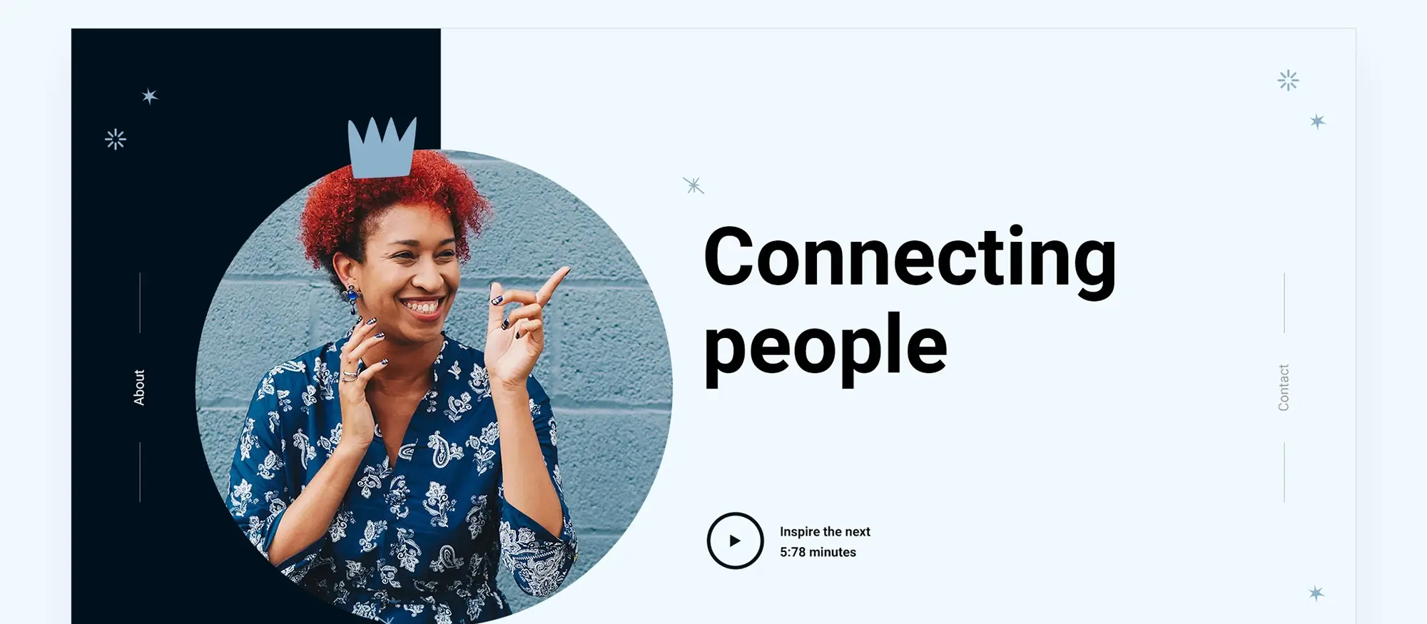
Go beyond static hero sections
Add scroll effects or animations
MaxiBlocks supports scroll-triggered animations like fade-ins, parallax, and background movement. These effects help guide the user’s attention without overwhelming the page.
Use dynamic content
Connect your hero section with live content such as latest blog posts, products, or user-specific data (via ACF + MaxiBlocks). This keeps your banner fresh and relevant.
Launch with no limits
No locked blocks or licence keys
Unlike other builders, MaxiBlocks gives you full access to all features. Use any block or template without restrictions no subscriptions, no domain limits.
Performance and SEO ready
MaxiBlocks generates clean HTML and CSS, ensuring fast load times, mobile responsiveness, and strong SEO performance.
Final thoughts
Your hero section is your digital first impression. Don’t waste it on generic design or clunky builders. With MaxiBlocks, you can design something powerful, personal, and professional all without code.
Whether you’re creating a landing page, portfolio, or home page, your hero banner can set the tone for the entire experience. MaxiBlocks makes it easy.
Start designing your site’s most important section with full creative freedom.
Create fast. Design smart. Stand out.
Beautiful WordPress web designs to kickstart your site
Find responsive and accessible WordPress web designs to match your brand and goals.
How do I choose the right hero layout?
It depends on your content and goal. A centred layout works well for simple messages, while split layouts are ideal for showcasing products or visuals alongside text.
What size should my hero banner be?
A common height is 600–800px for desktops. Use full-width containers and ensure it scales well on smaller screens using responsive breakpoints in MaxiBlocks.
Can I use video backgrounds in MaxiBlocks?
Yes, MaxiBlocks supports video backgrounds. Just make sure to optimise your videos for performance and always provide fallback images for mobile devices.
How do I make sure my text stays readable?
Use high-contrast colours and consider placing a semi-transparent overlay on your background image. This helps keep the focus on your headline and CTA.
Should every page have a hero banner?
Not always. Use hero banners on pages where you need to grab attention quickly homepages, product landers, or campaign pages. For other pages, simpler headers might work better.
Do I need to customise every block in MaxiBlocks?
No. You can start with a pre-designed hero pattern, apply a style card, and only tweak what you need. It saves time while still making the design feel custom.
What are the key trends in modern website design today?
Website design is evolving towards cleaner layouts, faster performance and more user-centred visuals. Designers are prioritising accessibility, mobile responsiveness and bold yet minimal styles. You can explore current approaches in this guide to modern website design trends.
When should I consider redesigning my website?
If your website feels outdated, loads slowly or no longer reflects your brand’s goals, it may be time for a redesign. A fresh approach can improve user experience and support your digital strategy. For practical guidance, visit this article on when to redesign your site.
What is responsive WordPress design and why does it matter?
Responsive design ensures that your website automatically adapts to different screen sizes. It’s essential for mobile users and helps improve search rankings. This introduction to responsive WordPress design explains how it works and why it’s critical.
How can I make sure my site performs well on all devices?
Responsive design requires flexible layouts, optimised content and mobile-first development. This complete guide to responsive web design outlines the core principles and techniques.
Are there practical tools to help with responsive WordPress development?
Yes, page builders and block-based design tools make it easier to build mobile-friendly layouts. Learn how to apply them effectively in this responsive WordPress design overview.
Can I design a WordPress website on a budget?
Absolutely. With the right tools and planning, it’s possible to create a clean, functional site without overspending. This article on affordable WordPress design shows how to stay cost-effective without sacrificing quality.
What defines a professional WordPress website?
A professional website features well-structured content, fast performance, responsive design and cohesive branding. This overview of professional WordPress design outlines what sets high-quality sites apart.
Are there real-world examples of successful WordPress websites?
Yes, reviewing actual case studies can reveal what works and why. This collection of successful WordPress website designs provides insight into design decisions that led to success.
Why is typography so important in web design?
Typography impacts how users read and interact with your content. It guides hierarchy, tone and readability. This guide to typography in web design breaks down how font choices affect the user experience.
What are the fundamentals of modern web design?
Modern web design focuses on usability, speed, accessibility and strong visual hierarchy. This article on the foundations of modern design helps you understand what makes a site effective today.
What are page blocks and how do they simplify design?
Page blocks are reusable design sections that help speed up page creation while maintaining consistency. You can explore how they work in this guide to web design page blocks.
What are the latest WordPress design trends I should know about?
From animated content to minimalist aesthetics, new trends are shaping how websites look and function. This list of 40 WordPress design trends shares what’s current and emerging.
What will define website design in 2025?
Expect to see growth in inclusive design, AI integration and more visual storytelling. For future-focused inspiration, read this preview of website design trends for 2025.
What is a hero banner and how should I design one?
A hero banner is the large section at the top of a web page, often used to highlight your main message. It should be visually strong and purpose-driven. This hero banner design guide explains what makes a banner effective.
How can I build a hero section in WordPress without coding?
Tools like the Maxiblocks hero section builder for WordPress allow you to build responsive, attention-grabbing hero sections visually and easily.
Is there a tool specifically for Maxiblocks hero section creation?
Yes, the Maxiblocks website hero section builder offers drag-and-drop design flexibility for building impactful header areas quickly.
Where can I see examples of high-performing hero banners?
Explore various layout ideas and techniques in this visual showcase of hero banners to find inspiration for your own design.
What tools can I use to design websites effectively?
From prototyping to live site building, there are many tools available for designers at every level. This guide to website design software highlights platforms that make the process more efficient.
WordPress itself
Official Website
wordpress.org – This is the official website for WordPress, where you can download the software, find documentation, and learn more about using it.
WordPress Codex
codex.wordpress.org/Main_Page – This is a comprehensive documentation resource for WordPress, covering everything from installation and configuration to specific functionality and troubleshooting.
WordPress Theme Directory
wordpress.org/themes – The official WordPress theme directory is a great place to find free and premium WordPress themes. You can browse themes by category, feature, and popularity.
maxiblocks.com/go/help-desk
maxiblocks.com/pro-library
www.youtube.com/@maxiblocks
twitter.com/maxiblocks
linkedin.com/company/maxi-blocks
github.com/orgs/maxi-blocks
wordpress.org/plugins/maxi-blocks

Kyra Pieterse
Author
Kyra is the co-founder and creative lead of MaxiBlocks, an open-source page builder for WordPress Gutenberg.
You may also like
