Try MaxiBlocks for free with 500+ library assets including basic templates. No account required. Free WordPress page builder, theme and updates included.
Updated 15th May 2025
Build striking hero sections with MaxiBlocks
Combine MaxiBlocks hero blocks with native Gutenberg blocks to design a hero section that grabs attention, expresses your brand and drives conversions. The hero banner sits at the top of every page, so a strong first impression improves engagement, lowers bounce rate and guides visitors towards your call‑to‑action. MaxiBlocks WordPress page builder makes that process simple with ready‑made layouts, flexible styling and drag‑and‑drop controls.
Use high‑quality, relevant images
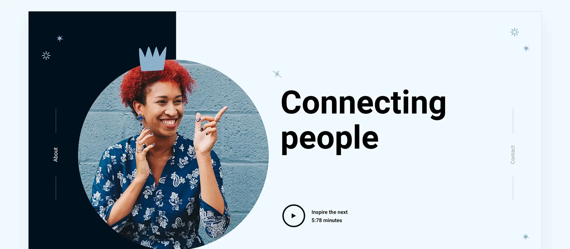
Strong imagery is your digital handshake, so choose pictures that reinforce the message of your WordPress hero section and resonate with your audience:
- Relevance – select visuals that reflect your product, service or value proposition.
- Emotion – favour shots that spark the feeling you want to evoke, such as confidence, relief or excitement.
- Originality – whenever possible use custom photography rather than generic stock to stand out and build trust.
- Composition – pick images with clear focal points and sufficient negative space for headline copy or buttons.
Complement the image with clear headings, concise copy and a prominent CTA button. MaxiBlocks lets you overlay text, apply filters and fine‑tune alignment without code.
Optimise images for speed and responsiveness
Fast loading improves user experience and search rankings, so follow these best practices:
- Compress files before upload with tools such as TinyPNG or ImageOptim.
- Serve WebP or AVIF formats to supported browsers, and fall back to JPEG or PNG for older ones.
- Supply multiple sizes and let WordPress choose the best fit for each screen.
- Enable lazy loading so off‑screen images download only when needed.
By pairing the creative freedom of MaxiBlocks with these optimisation steps, you deliver a hero section that looks sharp on every device and loads in seconds, keeping visitors engaged and ready to convert.
Add convincing, informative text
The words you place over your hero image must explain your value quickly and motivate visitors to act. Combine a crisp message with readable typography and you will see higher engagement and more conversions.
Craft clear headlines and supporting copy
- Be clear and concise – replace jargon with plain English and keep sentences short.
- Write a strong headline – start with an action verb or pose a question that highlights the problem you solve.
- Add a helpful sub‑headline – expand on the headline with one short sentence that gives context or detail.
- Emphasise benefits, not features – show exactly how the visitor’s life improves when they choose you.
Choose readable typography
- Select a clean, legible sans‑serif font that scales well on mobile screens.
- Use a font size and colour that stand out against the background without overpowering the image.
- Limit yourself to one primary font and one accent font for a tidy, professional look.
Tailor content to audience and goals
Know your readers and reflect their priorities. Align every word with your primary objective whether that is capturing leads, driving sales or sharing information. Test alternative headlines and descriptions with MaxiBlocks’ easy duplication and preview features, measure results, then refine your copy until it performs at its best.
Subscribe to our newsletter
Design engaging above the fold visuals with MaxiBlocks
Why the fold still matters
Visitors decide whether to stay on your site in a few seconds; the content they see without scrolling must therefore work hard. A clear value proposition, matched with strong visual cues, tells users what you offer and what to do next. When your above the fold area is persuasive, bounce rate falls and engagement rises.
Core principles for a powerful hero
Hierarchy
Arrange elements by importance so that the eye moves naturally from image to headline, supporting text and call to action. Size, colour and spacing all help visitors understand what matters most.
Balance and contrast
Keep the layout balanced so no single element overwhelms the others unless it is the focal point. Use contrasting tones to make text and buttons stand out against the background.
Simplicity
Remove clutter that distracts from your message. A clean hero section loads quickly and lets visitors grasp your value at a glance.
Imagery and colour
Choose photographs that reflect your brand and prompt the emotion you want users to feel. Ensure the palette complements your logo and keeps copy readable.
Add prominent calls to action
A clear call to action converts interest into revenue. Place the button beside or just below the headline where the eye naturally pauses. Give it a shape or outline that makes it pop while staying on brand. Use precise verbs such as “Get started”, “Learn more” or “Download now” so visitors know exactly what will happen next. Testing alternative wording, colours and positions with MaxiBlocks WordPress page builder helps you raise click‑through rates and, ultimately, conversion.

Craft clear calls to action
A visible and persuasive CTA button turns passive visitors into customers. Combine straightforward wording with thoughtful design to improve click through rate and overall website conversion.
Message clarity boosts conversions
Before users click they need to know exactly what will happen next. Keep the micro‑copy short and benefit led.
- Use clear verbs such as sign up, start or buy
- Add a benefit where possible for example get my free ebook instead of download
- Match the CTA promise with the landing page content to avoid confusion and reduce bounce rate
When the headline, sub‑headline and button text work together the visitor feels confident about taking the next step.
Colour size and whitespace guide the eye
The button must catch attention without overpowering the hero section.
- Choose a contrasting colour that fits your brand palette
- Make the button large enough for easy tapping on mobile yet not so big that it overshadows the headline
- Surround the CTA with ample whitespace so the eye moves naturally from the message to the action
Use MaxiBlocks preview tools to test different colours, sizes and placements. Measure which variation of your call to action gains the most clicks then keep refining until performance levels off.
Build like a pro
Why pick a website builder
A modern WordPress builder blends drag and drop ease with open source flexibility, so you can craft an eye catching hero banner without coding expertise. It lets you:
- drag images, text and buttons straight onto the canvas
- preview changes instantly before publishing
- reuse saved blocks across other pages
Start fast with free themes and templates
Ready made layouts
Free WordPress themes and block templates give you a hero section that is already styled.
- choose a template that suits your niche and colours
- swap placeholder photos for high resolution images
- edit headlines and calls to action to reflect your offer
Customise with MaxiBlocks
MaxiBlocks makes tailoring a template simple.
- adjust spacing, shadows and alignment without CSS
- mix MaxiBlocks hero blocks with core Gutenberg blocks to build richer layouts
- save your custom hero as a reusable pattern
Take full control with site editing
Personalise every element
WordPress full site editing lets you fine tune fonts, backgrounds and structure.
- create reusable patterns for future banners
- add WordPress dashicons as visual cues on buttons or lists
- keep brand styling consistent across headers, footers and hero areas
Keep the design professional and light
An impressive banner also needs to perform well.
- use the recommended favicon size and brand icons for a polished finish
- compress images so pages load quickly
- test responsiveness on both mobile and desktop
If time is limited you can hire a WordPress designer for advanced animation and optimisation. For most sites, however, a good builder provides all you need to create a high impact hero banner that captures attention from the very first glance.
Key takeaways
- Place a clear value proposition above the fold, supported by high‑quality, well‑optimised images.
- Write concise, benefit‑focused headlines and calls to action, then give buttons contrast and breathing space so they stand out.
- Maintain a simple visual hierarchy, reduce clutter and A/B‑test wording, colours and layouts to improve click‑through rate.
- Speed development with ready‑made templates and full site editing, but customise fonts, colours and spacing so the banner feels fully on brand.
- Keep performance in mind by compressing images, serving modern formats and checking that every element scales on mobile.
Call to action
You can build a conversion‑focused hero banner in minutes by installing the free MaxiBlocks plugin and pairing it with the lightweight MaxiBlocks Go theme. Open your WordPress dashboard, activate MaxiBlocks, pick a hero block that fits your style and start tailoring text, imagery and calls to action until the design feels perfect.
Beautiful WordPress web designs to kickstart your site
Find responsive and accessible WordPress web designs to match your brand and goals.
What is a hero banner in WordPress?
A hero banner is the large, visually prominent section at the top of a page that showcases your key message, image and call to action. In WordPress it is often built with a block or full‑width container so it spans the entire viewport.
Do I need coding skills to design a hero banner with MaxiBlocks?
No. MaxiBlocks provides a drag‑and‑drop interface and ready‑made hero blocks, so you can build and style the section without touching HTML or CSS.
Is MaxiBlocks free to use for hero banners?
Yes. The core MaxiBlocks plugin is free, and the MaxiBlocks Go theme is also free, giving you a complete toolkit for building banners at no cost.
Will a large hero image slow down my WordPress site?
Not if you optimise properly. Compress images, serve modern formats such as WebP and enable lazy loading in MaxiBlocks to keep performance high.
Can I edit my hero banner on a phone or tablet?
You can update text and images in the WordPress mobile app, but the full MaxiBlocks interface is optimised for desktop. Use a larger screen for precise spacing and advanced styling.
How do I add a clear call to action in my hero section?
Insert a Button block inside your MaxiBlocks hero layout, choose a contrasting colour that matches your brand palette and write benefit‑focused text such as Get started or Book a demo.
Are there pre‑designed templates for hero banners?
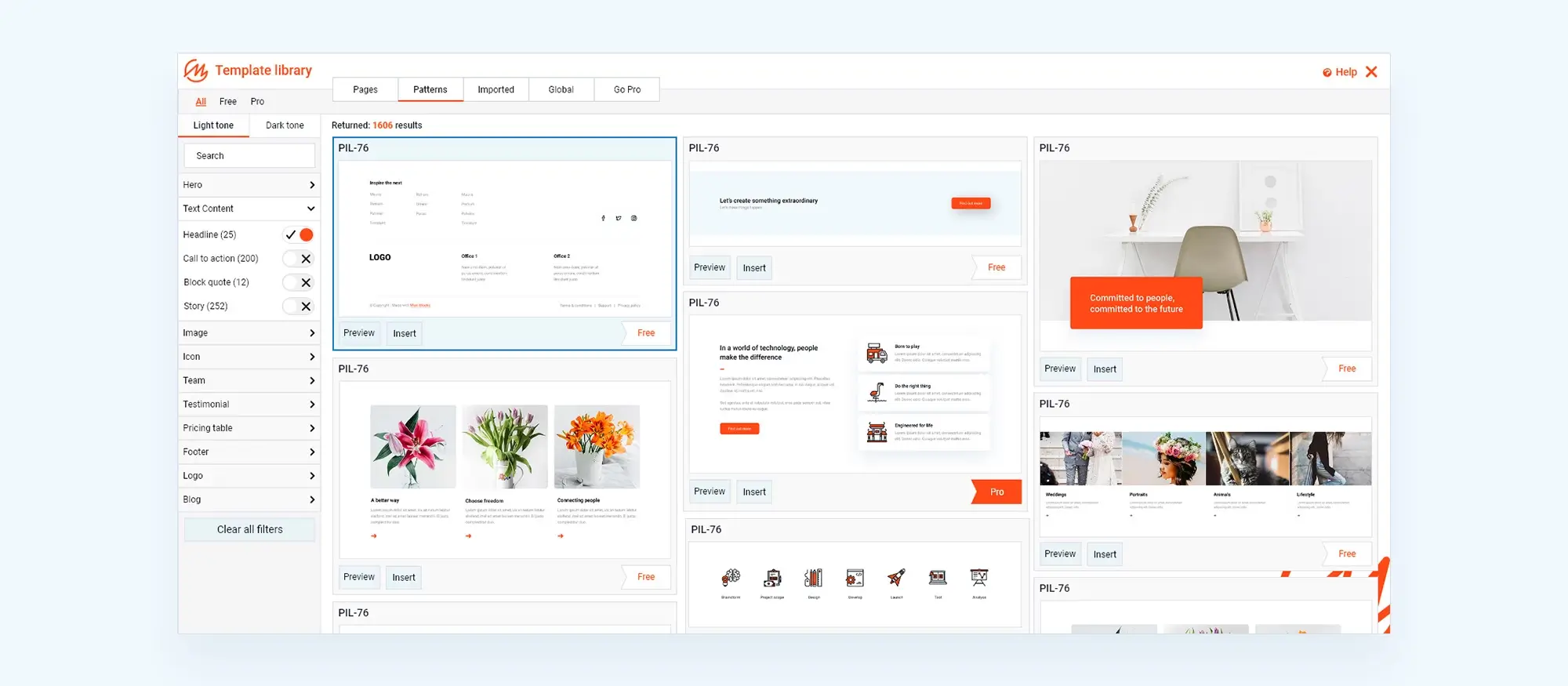
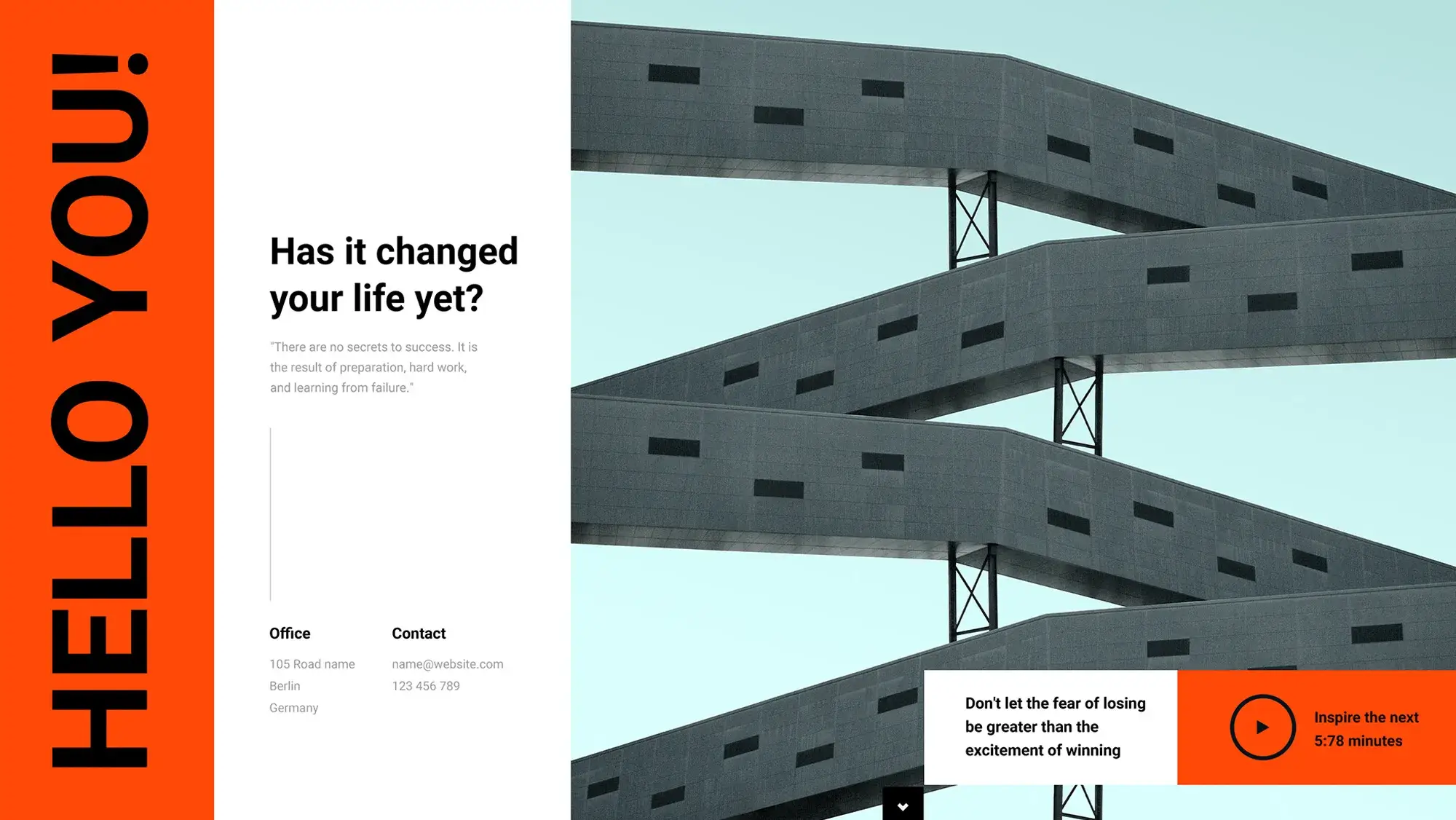
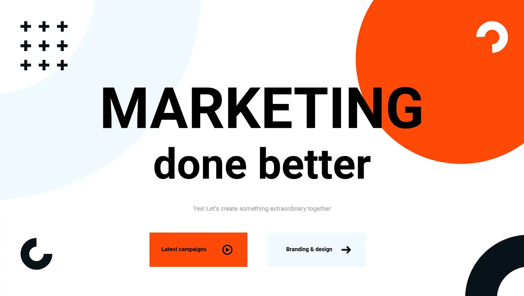
Yes. MaxiBlocks includes starter layouts and patterns that cover common hero styles such as split screen, video background and centred headline. Swap the placeholder content for your own to launch quickly.
Can I use full site editing to customise the hero banner further?
If you activate a block theme such as MaxiBlocks Go, you can open the Site Editor, select the header template part and fine‑tune fonts, padding and background colours across your whole site.
How do I test which hero banner version converts better?
Create two versions of the hero block, install an A/B testing plugin and split traffic between them. Compare click‑through or signup rates, then keep the version that performs best.
What maintenance is required after publishing a hero banner?
Review analytics regularly, replace outdated imagery, refresh headline copy to match campaigns and retest loading speed whenever you add new assets. Routine tweaks keep the section fresh and effective.
What does advanced WordPress design involve?
It’s not just about appearance. Advanced WordPress design combines custom development, thoughtful structure and performance-focused decisions to create powerful, purpose-driven websites. Explore examples and methods in this advanced WordPress web design guide.
Why go with a custom WordPress website instead of using a theme?
Custom design means your site is built for your goals from the ground up. It removes the limitations of pre-made templates and improves flexibility and performance. Learn the key benefits in this overview of custom WordPress design.
How does UX and UI design enhance a WordPress site?
UX helps users navigate with ease, while UI makes that journey visually appealing. A thoughtful combination of the two results in better engagement and retention. See best practices in this UX and UI guide for WordPress.
What trends are shaping modern website design today?
Designers are leaning into minimalism, bold fonts, animations and immersive content. See how modern techniques are evolving in this article on current web design trends.
When should I redesign my website?
If your site looks dated, loads slowly or no longer fits your brand, it might be time for a redesign. This website redesign guide walks through how to make that decision confidently.
What does it mean to have a responsive WordPress website?
Responsive design ensures your website adapts to any screen size so users have a consistent experience across devices. This explanation of responsive WordPress design covers what it means and why it matters.
How can I make sure my WordPress website is fully responsive?
Using flexible grids, optimised media and mobile-first design strategies is essential. Learn how to apply them with this ultimate responsive web design guide.
What tools and themes help with responsive WordPress development?
There are specific themes, plugins and page builders that support responsive layout creation. This responsive WordPress guide shows how to choose and use them effectively.
Is it possible to create a well-designed WordPress site affordably?
Yes, it’s entirely achievable using quality free tools, page builders and smart planning. This article on affordable WordPress design explains how to balance budget and results.
What gives a WordPress site a professional look?
Professional design comes from clarity, consistency and usability. Attention to detail with layout, fonts and navigation makes all the difference. This guide to professional WordPress design breaks it down.
Are there any case studies of successful WordPress websites?
Yes, you can learn from real examples of sites that achieved both visual and functional success. Explore insights in these WordPress design case studies.
How important is typography in WordPress design?
Typography affects tone, readability and structure. Choosing the right font pairings and spacing improves how users experience your content. For expert tips, read this typography in web design guide.
What are the foundations of modern web design today?
Speed, simplicity and responsiveness define modern websites. These elements help meet user expectations and improve performance. This article on modern web design explores the core principles.
What are page blocks and how do they help in WordPress?
Page blocks are modular design sections that can be reused and rearranged, saving time while keeping layouts consistent. This guide to web design page blocks explains how they work.
What design trends are shaping WordPress in 2024?
You’ll see more dynamic content, minimal navigation and interactive design elements. For a full list, check these 40 WordPress design trends currently gaining attention.
What should I expect in WordPress and web design trends for 2025?
Personalisation, eco-conscious design and seamless user flows are just a few of the predicted trends. Learn what’s ahead in this preview of 2025 design trends.
What is a hero banner and how does it influence the page?
It’s the large section at the top of a page that introduces your message. A strong hero banner sets the tone and encourages visitors to explore more. This guide to hero banner design covers how to create one that works.
Can I build a hero section in WordPress without knowing code?
Yes, visual tools make it easy to create compelling hero sections. This Maxiblocks WordPress builder is a good place to start.
What tools does Maxiblocks offer for building hero sections?
You can use the Maxiblocks hero section builder to customise layouts, images and messaging without touching code.
Where can I find examples of effective hero banner designs?
To see what works, browse this hero banner showcase featuring layouts across industries and use cases.
What software can I use to design websites efficiently?
From WordPress page builders to UI design tools, there are many useful options for creating beautiful, responsive websites. This software guide highlights the top tools available.
WordPress itself
Official Website
wordpress.org – This is the official website for WordPress, where you can download the software, find documentation, and learn more about using it.
WordPress Codex
codex.wordpress.org/Main_Page – This is a comprehensive documentation resource for WordPress, covering everything from installation and configuration to specific functionality and troubleshooting.
WordPress Theme Directory
wordpress.org/themes – The official WordPress theme directory is a great place to find free and premium WordPress themes. You can browse themes by category, feature, and popularity.
maxiblocks.com/go/help-desk
maxiblocks.com/pro-library
www.youtube.com/@maxiblocks
twitter.com/maxiblocks
linkedin.com/company/maxi-blocks
github.com/orgs/maxi-blocks
wordpress.org/plugins/maxi-blocks

Kyra Pieterse
Author
Kyra is the co-founder and creative lead of MaxiBlocks, an open-source page builder for WordPress Gutenberg.
You may also like
