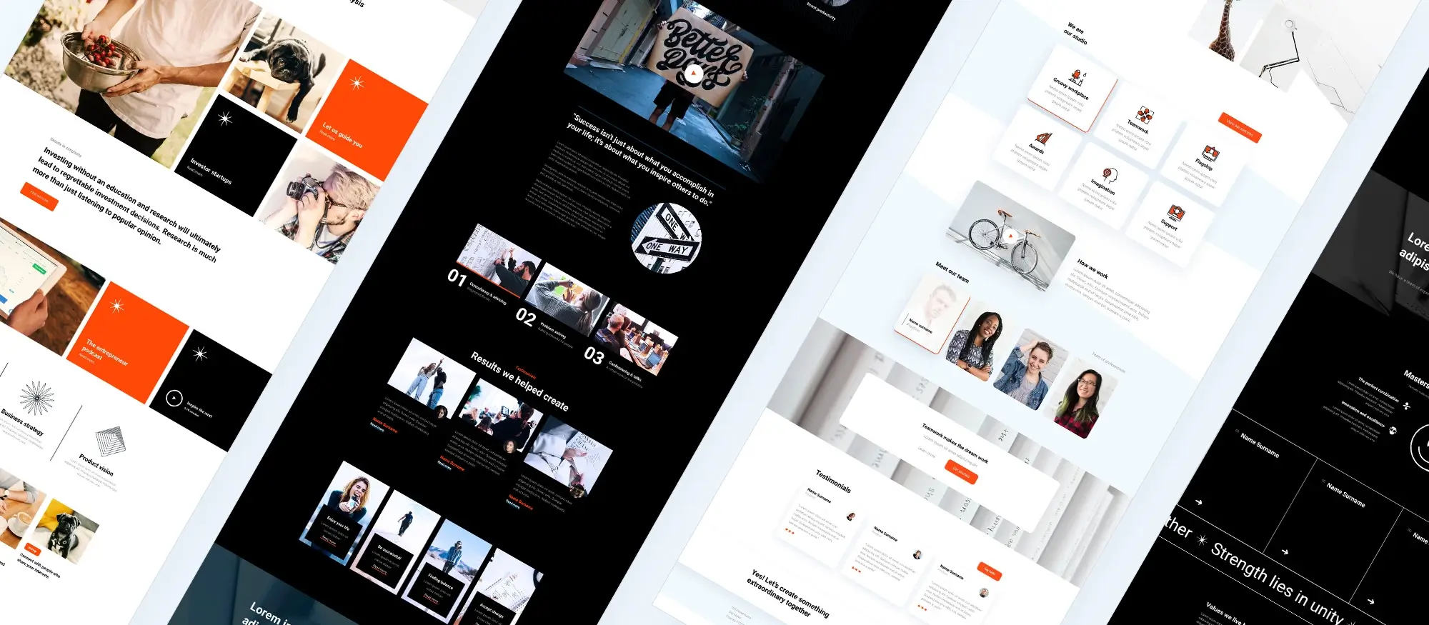
Introduction to responsive web design and MaxiBlocks
Try MaxiBlocks for free with 500+ library assets including basic templates. No account required. Free WordPress page builder, theme and updates included.
Updated 15th May 2025
The importance of responsive web design and how MaxiBlocks makes it easy
Why responsive web design matters
Adapting to every device
With people accessing the internet on desktops, laptops, tablets, and smartphones, screen sizes and resolutions vary dramatically. Responsive web design ensures that your website’s layout, images, and features adjust automatically to fit each device, creating a seamless experience for every visitor.
Key benefits of responsive design
- Improved user experience: Visitors can navigate and interact with your website easily, no matter what device they use.
- SEO advantages: Google prioritises mobile-friendly websites in its search results, so responsive design can boost your site’s visibility.
- Consistent branding: Maintaining a cohesive design across all devices strengthens your brand identity and builds trust with your audience.
Building responsive websites with MaxiBlocks
MaxiBlocks: a flexible, user-friendly solution
MaxiBlocks is a free, open-source WordPress page builder designed specifically for responsive web design. Its intuitive drag-and-drop interface and built-in responsive features make it easy to create sites that work and look great on any device or browser.
Features that make MaxiBlocks ideal for responsive design
- Automatic block adaptation: The large library of MaxiBlocks adjusts to fit different screens, so your content always displays correctly.
- Flexbox integration: Advanced layout tools, such as Flexbox, give you even more control to fine-tune how elements behave and stack across breakpoints.
- Visual previews: Preview your site on various devices right in the editor to ensure a flawless experience for all users
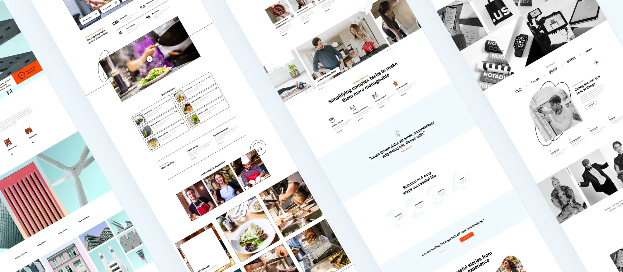
Features of MaxiBlocks for responsive design
Tools designed for modern websites
Responsive blocks
MaxiBlocks includes a wide range of blocks such as text, image, and button blocks that automatically adjust to fit different screen sizes. This ensures your content stays accessible and visually balanced across mobile, tablet, and desktop devices.
Flexbox integration
With integrated Flexbox support, MaxiBlocks allows for advanced layout control. Flexbox enables items within a container to align and distribute space efficiently, even when their size changes. This makes it easier to create clean, flexible layouts that adapt seamlessly to any screen.
Device-specific customisation
MaxiBlocks lets you customise your design for different devices individually. You can set specific padding, spacing, alignment, and typography values based on device type, helping to maintain a consistent user experience.
Live preview functionality
The live preview feature allows you to see exactly how your site will appear on different devices while you’re building it. This real-time visual feedback ensures your layout, text, and images look great no matter the screen size.
Subscribe to our newsletter
Setting up your website with MaxiBlocks
Installation and setup
Installing the plugin
To get started with MaxiBlocks, head to your WordPress dashboard. Navigate to the Plugins section, click Add New, and search for MaxiBlocks. Click Install Now, then Activate the plugin to enable it on your site.
Accessing MaxiBlocks in the editor
Once installed, MaxiBlocks is available directly in the WordPress block editor. When creating or editing a page or post, click the Add Block (+) button to browse the selection of MaxiBlocks. From layout components to media and interactive elements, you’ll find everything you need to build your page.
Tips on initial settings for optimal responsiveness
Use responsive blocks
Always use the built-in responsive blocks provided by MaxiBlocks. These blocks automatically adjust to fit any screen size, helping maintain a consistent layout and user experience.
Customise for different devices
Take advantage of device-specific settings. Adjust padding, spacing, font sizes, and layout arrangements for desktop, tablet, and mobile views ensuring your content looks perfect everywhere.
Test your design
Use the live preview feature to check how your site looks across multiple devices. Make necessary refinements to ensure readability and usability on every screen size.
Creating your first page with MaxiBlocks
Start with a new page
From your WordPress dashboard, go to Pages and click Add New. This opens the page editor where you’ll begin building.
Add your blocks
Click the Add Block button and explore the available MaxiBlocks. Choose the ones that suit your layout needs and start adding them to the page.
Customise each block
Once added, each block comes with its own settings panel. Use it to adjust spacing, layout, colours, and typography to match your brand and style.
Preview and publish
Preview your page using the responsive view toggles, and once everything looks right, click Publish to go live.
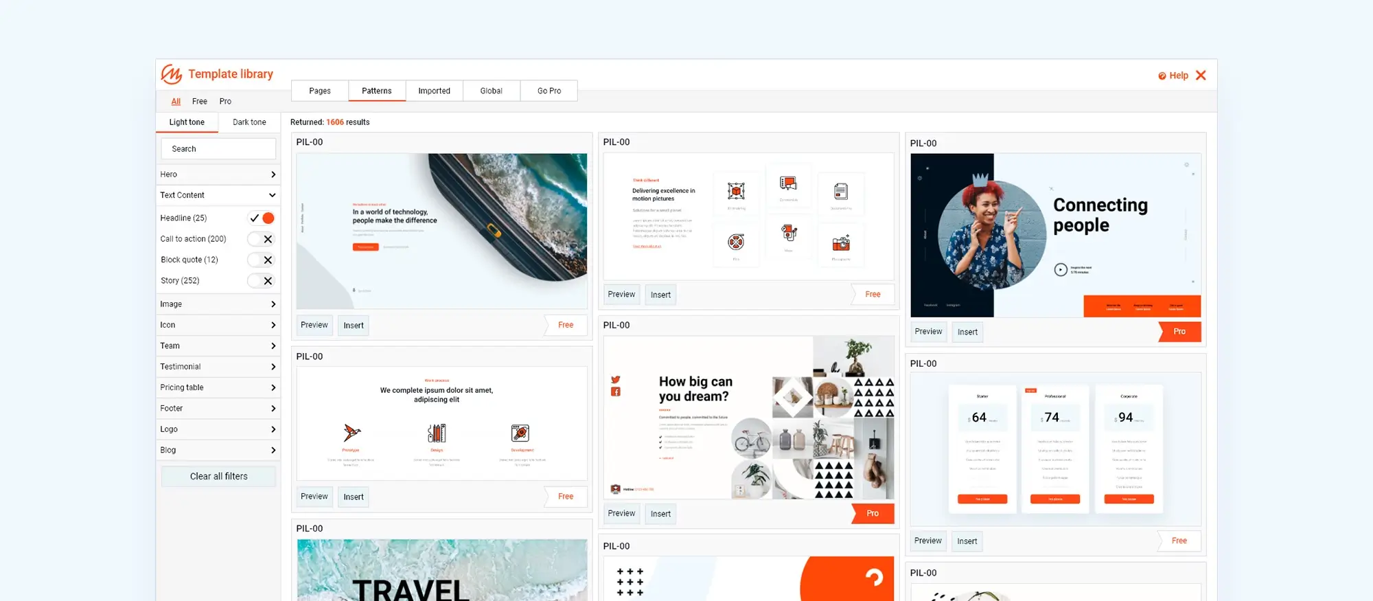
Understanding MaxiBlocks’ six responsive breakpoints
What are breakpoints in responsive web design?
Breakpoints are specific screen widths where a website’s layout adjusts to improve the user experience across devices. These changes ensure your content remains readable, usable, and visually appealing whether it’s viewed on a smartphone, tablet, laptop, or large desktop monitor.
MaxiBlocks includes six responsive breakpoints each one designed to give you fine-grained control over how your site appears and behaves on different devices.
The six breakpoints in MaxiBlocks
Extra small devices
Designed for smartphones and small mobile devices with screen widths under 576px.
At this size, content stacks vertically, touch targets are increased, and padding may be reduced for better usability.
Small devices
Targets larger smartphones and smaller tablets, typically 576px to 767px.
Layouts begin to open up slightly while still prioritising simplicity and readability for handheld use.
Medium devices
Covers tablets and small laptops with widths from 768px to 991px.
This breakpoint may introduce more spacing, larger images, or dual-column layouts as screen space becomes more available.
Large devices
Applies to standard laptops and desktops from 992px to 1199px wide.
Designs here may include additional columns, larger text, wider containers, and enhanced UI elements.
Extra large devices
For high-resolution desktops and laptops with widths 1200px and above.
Layouts can take advantage of full-width containers, sidebars, and multi-column content arrangements.
Extra extra large devices
For ultra-wide or 4K+ displays wider than 1400px.
Designs may feature extensive white space, high-resolution images, and maximum layout flexibility for premium, large-format displays.
Why these breakpoints matter
Using these six breakpoints, MaxiBlocks allows you to adapt your site’s design across the full spectrum of devices ensuring content is always accessible, attractive, and easy to navigate. Fine-tuning your design at each breakpoint helps deliver a consistent, professional experience for all users, no matter what screen they’re on.
Build like a pro
Recommended resources for learning responsive web design
Build your skills with trusted tools and tutorials
MDN Web Docs
MDN Web Docs by Mozilla is one of the most comprehensive resources for web development. It includes detailed explanations of responsive web design principles, with excellent guides on CSS media queries, Flexbox, and layout techniques.
W3Schools
W3Schools Responsive Web Design Tutorial offers clear and accessible tutorials for beginners. Their responsive design section covers key concepts with interactive examples to help you understand how layout adjustments work across devices.
Coursera
Responsive Website Basics: Code with HTML, CSS, and JavaScript is a course offered by the University of London and Goldsmiths via Coursera. It provides a structured introduction to responsive web design, perfect for learners who prefer an academic approach.
CSS-Tricks
CSS-Tricks is a go-to blog for web designers and developers. Their guide on media queries for standard devices and other responsive layout techniques is incredibly useful for those ready to deepen their understanding.
Practice makes perfect
To truly master responsive web design, the best thing you can do is build. Use these resources as a foundation, then experiment with your own projects. Apply what you learn, iterate often, and don’t be afraid to make mistakes they’re part of the process.
Final thoughts on responsive design with MaxiBlocks
Responsive web design is no longer optional it’s essential. With users accessing websites across a wide variety of devices, ensuring your site looks great and performs well on every screen is a critical part of delivering a positive user experience.
MaxiBlocks makes this easier than ever. With built-in responsive blocks, Flexbox layout control, device-specific customisation, and six intuitive breakpoints, you have all the tools you need to build beautiful, fully responsive websites without writing a single line of code.
Key takeaways
- Responsive design improves usability, SEO, and brand consistency.
- Breakpoints allow your design to adapt perfectly to different devices.
- MaxiBlocks provides live preview tools and custom settings for every screen size.
- You don’t need to be a developer as MaxiBlocks makes responsive design accessible to everyone.
Ready to build a responsive site without the hassle?
MaxiBlocks is free, fast, and designed for creators who want full control without the complexity.
MaxiBlocks simplifies this process by offering:
- 2300+ block patterns and 280+ full-page templates to jumpstart your design.
- 14.3K SVG icons and 100+ style cards for consistent branding.
- Six responsive breakpoints to ensure optimal display on any device.
- Full Gutenberg integration for a modern, code-free editing experience.
If you’re ready to take your design workflow to the next level, try the free MaxiBlocks plugin on WordPress.org and pair it with the sleek, lightweight MaxiBlocks Go theme to get the most out of your responsive design experience. Start building smarter, faster, and more beautifully right from your WordPress dashboard.
Beautiful WordPress web designs to kickstart your site
Find responsive and accessible WordPress web designs to match your brand and goals.
FAQs – Responsive web design
What is responsive web design?
Responsive web design is a design approach that ensures your website adjusts automatically to fit various screen sizes and devices. It improves usability, accessibility, and helps provide a consistent experience across mobile phones, tablets, laptops, and desktops.
Why is responsive design important for SEO?
Google favours mobile-friendly websites in its search results. Responsive design reduces bounce rates, improves page speed, and increases accessibility all factors that contribute positively to search engine rankings.
Does MaxiBlocks support mobile and tablet layouts?
Yes. MaxiBlocks is built for modern responsive design and includes six breakpoints that let you fine-tune your layout for extra small to extra extra large screens. You can customise styles for each device directly in the editor.
Can I preview my site on different devices with MaxiBlocks?
Absolutely. MaxiBlocks includes a live preview feature that lets you view your design at various screen sizes as you build. This helps ensure your content looks and functions perfectly on all devices.
Do I need coding skills to create a responsive site with MaxiBlocks?
Not at all. MaxiBlocks is designed to be fully visual and beginner-friendly. You can drag, drop, customise, and fine-tune your layout without writing any code.
What makes MaxiBlocks different from other page builders?
MaxiBlocks is lightweight, open-source, and optimised for speed and flexibility. Unlike many bloated builders, it offers clean code, full site editing compatibility, and device-level styling all in a free plugin with no license restrictions.
Is the MaxiBlocks theme required?
While you can use MaxiBlocks with many themes, the MaxiBlocks Go theme is optimised for maximum compatibility and performance. It’s a great option if you want full control and design consistency out of the box.
Where can I download MaxiBlocks?
You can download the MaxiBlocks plugin from WordPress.org. It’s free, easy to install, and packed with features to help you build stunning, responsive websites.
What can real-world WordPress case studies teach us?
Looking at actual websites provides insight into what makes a design truly effective. From layout decisions to user flow, these WordPress design case studies show how well-thought-out visuals and structure can influence success.
Why is typography such a central part of website design?
Typography helps communicate tone, structure and brand personality. The right font pairing can make content easier to digest and more appealing to the eye. If you’re unsure where to start, this guide on web typography breaks down how to use type effectively.
What are the core traits of modern web design?
Today’s design standards focus on simplicity, accessibility and responsiveness. Modern layouts avoid clutter and prioritise user needs. Discover what’s considered best practice in this overview of modern web design.
How do page blocks simplify website creation?
Page blocks are pre-designed elements you can reuse and customise, which helps maintain consistency and reduces design time. This article on using page blocks explores how they improve both speed and structure.
What is responsive design in the context of WordPress?
Responsive design allows your site to work across all screen sizes without losing usability or style. This guide to responsive WordPress design explains why it’s a must-have for every modern website.
Which trends are currently shaping WordPress web design?
Minimalist design, immersive visuals, accessibility and intuitive navigation are all in focus. Explore these 40 WordPress design trends to see how top designers are approaching layout and content in 2024.
What will website design look like in 2025?
Expect to see even more emphasis on speed, clean aesthetics and AI-enhanced user experiences. This article on 2025 design trends offers a forward-thinking look at what’s coming next.
How should you design a hero banner that converts?
Your hero banner should make a bold visual statement while quickly communicating value. This guide on hero banner design includes examples and tips to help you craft an engaging header that encourages action.
Can you build a hero section in WordPress without touching code?
Yes. The Maxiblocks hero section builder for WordPress makes it easy to create eye-catching hero areas with drag-and-drop functionality, perfect for non-developers.
Is there a Maxiblocks tool just for building hero sections?
The Maxiblocks website hero section builder is tailored for building hero areas that look great and perform well, even if you’re not a designer.
Where can I find ideas for designing a hero banner?
Need inspiration? This hero banner showcase features a collection of styles and formats that can help you create something impactful and original.
What tools should I use to design a modern website?
Whether you’re prototyping or publishing live pages, using the right software makes a big difference. This roundup of website design tools lists top options for creating high-quality designs quickly.
How do I master responsive design from the ground up?
Building a responsive site involves fluid layouts, adaptive images and mobile-first thinking. This complete responsive design guide walks through each step so your site works beautifully on any device.
WordPress itself
Official Website
wordpress.org – This is the official website for WordPress, where you can download the software, find documentation, and learn more about using it.
WordPress Codex
codex.wordpress.org/Main_Page – This is a comprehensive documentation resource for WordPress, covering everything from installation and configuration to specific functionality and troubleshooting.
WordPress Theme Directory
wordpress.org/themes – The official WordPress theme directory is a great place to find free and premium WordPress themes. You can browse themes by category, feature, and popularity.
maxiblocks.com/go/help-desk
maxiblocks.com/pro-library
www.youtube.com/@maxiblocks
twitter.com/maxiblocks
linkedin.com/company/maxi-blocks
github.com/orgs/maxi-blocks
wordpress.org/plugins/maxi-blocks

Kyra Pieterse
Author
Kyra is the co-founder and creative lead of MaxiBlocks, an open-source page builder for WordPress Gutenberg.
You may also like
