Try MaxiBlocks for free with 500+ library assets including basic templates. No account required. Free WordPress page builder, theme and updates included.

A good WordPress navigation menu keeps things simple, clear, and easy to use. It should be easy to understand, look clean, and work well on all devices. Focus on short, descriptive labels, keep the number of items manageable (usually around five to seven), and organise everything in a way that feels natural to your visitors.
Updated 21 May 2025
When someone lands on your website, the navigation menu is one of the first things they notice and interact with. It’s like your website’s GPS. It doesn’t just help people get around; it shapes the entire user experience.
Done right, your navigation menu builds trust, increases engagement, improves conversions, and even supports SEO. Done poorly? It frustrates users, causes confusion, and sends your bounce rate through the roof.
In this in-depth guide, we’ll walk through the 10 essential elements of an effective WordPress navigation menu, grouped by strategy. Whether you’re launching a new site or refining an old one, you’ll leave with a clear plan for building a user-first menu that’s smart, modern, and easy to navigate.
Design and layout fundamentals
Your navigation is more than just functional it’s a key part of your design. These principles ensure your menu is visually clear, user-friendly, and seamlessly integrated with the rest of your website.
Simplicity is key
What it means
A simple menu is like a clean, well-organised shop entrance. It guides visitors clearly and calmly without distraction.
Why it matters
People don’t want to “figure out” your menu. A cluttered, complicated navigation structure slows decision-making and makes users feel overwhelmed. Simplicity reduces friction and increases the chance that visitors stick around.
You should aim for simplicity from the very beginning whether you’re building a new site or redesigning an existing one. It’s especially important on mobile devices, where space is limited and user attention is even shorter.
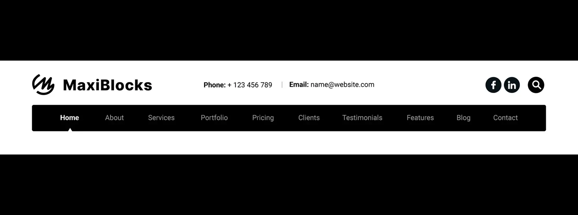
Keep your top-level navigation to no more than five to seven items. Avoid mega menus unless your site is highly complex and truly needs them.
For example, a personal trainer’s site might use: Home, Services, Success Stories, Blog, and Book a Session. It’s focused, functional, and free of distractions.
Visual hierarchy and design
What it means
Your menu’s design should make key items stand out, visually guiding users to your most important links.
Why it matters
Humans are visual. If everything looks the same, nothing stands out. If key links blend in, they get ignored.
You’ll want to apply strong visual hierarchy when customising your theme, adding calls to action, or refreshing your site’s layout. Think about colour, spacing, typography, and positioning as design tools, not just decoration.
Use bold fonts, button styles, or colour highlights to draw attention to your most important links, and give items enough spacing to keep the menu from feeling cramped.
For instance, a SaaS homepage might style its “Start Free Trial” link as a bold, high-contrast button that stands apart from the rest of the text-based navigation.
Subscribe to our newsletter
Structure and clarity
Now that your layout works visually, the next layer is structure. Clear organisation and language help users find their way without thinking twice.
Clear and descriptive labels
What it means
Be direct. Menu labels should describe exactly what a user will get when they click.
Why it matters
Ambiguous or clever labels like “Explore” or “Things” can backfire. Users won’t click what they don’t understand.
You’ll want to focus on clear, specific wording whenever you’re writing your first navigation, testing usability, or optimising for engagement.
Replace jargon with user-friendly language, and choose labels your visitors would actually search for or expect to see.
For example, a creative agency might use “Case Studies,” “Our Services,” and “Meet the Team” instead of generic or abstract terms like “Work” or “Who We Are.”
Utilise dropdown menus wisely
What it means
Dropdowns let you show more without overwhelming your primary menu but only when used strategically.
Why it matters
Too many dropdowns or dropdowns within dropdowns lead to messy, frustrating experiences, especially on mobile.
Dropdowns are helpful when you’re grouping three to five related pages under one category, like Services or Courses. They’re most effective on desktop where space allows for hover or click expansion.
Stick to a single level of depth and avoid overcrowding. Short, skimmable labels work best here.
Take an online academy, for example it might group “Marketing,” “Design,” and “Tech” under a clean “Courses” dropdown. Simple, efficient, and easy to navigate.
Consistency and placement
How and where you place your navigation links has a big impact on user confidence and flow.
Consistency across the site
What it means
Your navigation should be identical across all pages, including subpages, blog posts, and landing pages.
Why it matters
Inconsistent navigation forces users to stop and reorient. A consistent menu creates trust, familiarity, and ease.
This applies site-wide, especially across different page templates. Consistency reduces mental load and helps users feel anchored as they explore.
Use your theme’s header templates or global blocks to ensure your menu is the same no matter where users go.
For example, an e-commerce site includes “Shop,” “Cart,” “Help,” and “My Account” on every page including during checkout. It never makes visitors guess where to go next.
Strategic placement of items
What it means
Not all links are created equal. Put your most important items where users are most likely to click them.
Why it matters
Users naturally focus more on the first and last items in a navigation bar.
This becomes especially important when building your initial nav structure or revisiting your site’s UX. Placement affects visibility and visibility affects results.
Start with your most important pages and end with your highest-converting CTA. Make sure those links stand out.
A great example is a software startup that places “Free Trial” as the last item in its top nav and styles it as a button to encourage action.
Build like a pro
Mobile and responsive experience
With more than half of traffic coming from phones and tablets, mobile usability is non-negotiable.
Responsive design
What it means
Your navigation must look and function beautifully on all screen sizes, from desktops to smartphones.
Why it matters
A menu that’s awkward or broken on mobile frustrates users and kills engagement.
You’ll want to think about responsiveness during theme selection, site testing, and post-launch mobile audits. Don’t assume “mobile-friendly” means fully optimised.
Use sticky headers, clear hamburger menus, and large tap targets to improve the mobile experience.
A restaurant website might use a sticky mobile nav with icons for Menu, Order Online, and Call Now designed specifically for mobile visitors who want quick access.

User accessibility and support
Accessibility ensures your website is usable by everyone regardless of ability.
Accessibility considerations
What it means
Menus should be usable with a keyboard, readable by screen readers, and compliant with accessibility standards.
Why it matters
It improves UX, supports inclusivity, and helps with SEO and legal compliance.
Make accessibility part of your setup process and review it during every update. It’s not an afterthought it’s a core part of good design.
Use semantic markup, visible focus styles, keyboard support, and ARIA roles to help everyone navigate with ease.
An online learning platform, for example, includes skip links, proper tab order, and readable ARIA labels so all users can move through the site confidently.
Enhancements and interactivity
Navigation doesn’t have to stop at links small additions like search can add big value.
Search functionality
What it means
A built-in search bar gives users direct access to specific content especially on large or complex sites.
Why it matters
Not every user wants to navigate manually. A good search feature is like a shortcut.
This becomes essential for blogs, large stores, or resource libraries where a top-level menu can’t cover everything.
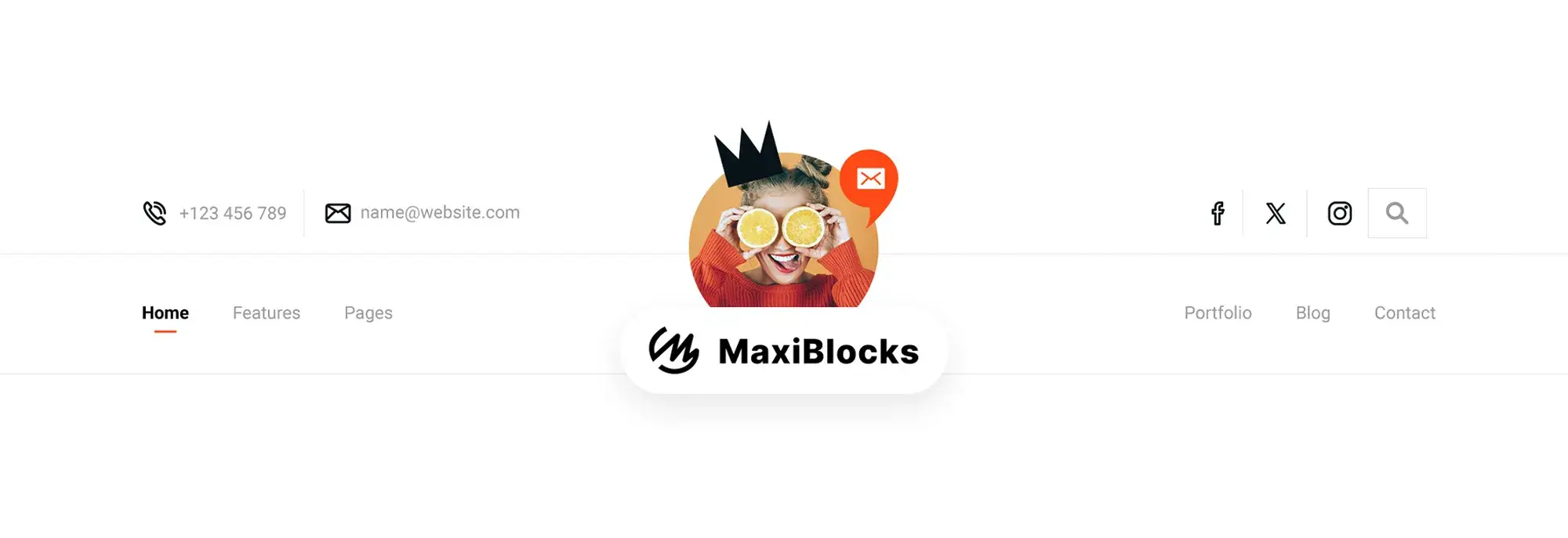
Consider using a search icon that expands into a full input field. Position it in the top right of your menu for visibility.
A digital magazine, for instance, adds a search bar next to its main menu so users can instantly find articles, authors, or topics.
Performance and iteration
Great navigation evolves. Regular testing keeps your structure relevant and user-focused.
Testing and feedback
What it means
Why it matters
Even great menus can underperform if they don’t align with how users actually browse.
Make testing a habit after launching new pages or major site updates. Track usage and adjust accordingly.
Use tools like Hotjar or Microsoft Clarity to review click maps, or simply ask your users what’s working and what’s not.
For example, a freelancer noticed that “Portfolio” was rarely clicked, while users flocked to case studies. They changed the label to “Client Results” and saw engagement rise.
Myths vs facts
Myth: You should list everything in your menu
Fact: Fewer, well-organised links convert better and keep users focused
Myth: Hamburger menus are bad UX
Fact: When styled and placed correctly, they’re ideal for mobile users
Myth: Drop-downs are outdated
Fact: Thoughtful dropdowns help organise complex content effectively
Templates and checklists
Quick checklist
Is my menu under 7 items?
Are my labels clear and action-based?
Is my most important link in a prime position?
Does my menu work well on all devices?
Have I tested for accessibility?
Simple menu template
Home | Services | About | Blog | Contact | [CTA Button: Get a Quote]
What to do when you feel stuck
If you’re unsure how to structure your navigation, start with your goals. What are the top 3 things you want visitors to do? Build your menu around those outcomes.
Sketch it on paper. Group related links. Eliminate anything that distracts. Don’t worry about perfection just focus on clarity.
If you’re using a block-based WordPress theme like MaxiBlocks Go, take advantage of its full-site editing and responsive menu presets. You can preview and adjust your layout in real time without touching a line of code.
When in doubt simplify. Great menus aren’t flashy. They’re invisible guides helping users move forward.
Final thought
Your navigation menu isn’t just a technical element it’s a silent guide that shapes how people experience your website. When designed with care, it builds trust, removes friction, and helps visitors find their way with ease.
Whether you’re starting simple or fine-tuning a large site, the principles in this guide will serve you well. Focus on clarity, usability, and purpose. The goal isn’t just to get people from point A to B it’s to help them feel confident, connected, and in control as they explore what you’ve built.
A good menu goes unnoticed. A great one feels effortless.
So take the time to get it right your users (and your results) will thank you.
Discover how to create clear, responsive, and stylish WordPress menus with expert tips and resources.
What is a WordPress navigation menu?
A WordPress navigation menu is a group of links that help visitors move around your website. It usually appears at the top or side of a page and includes links to key areas like Home, About, Services, or Blog.
How many items should I include in my main menu?
Keeping your main navigation between five and seven items is ideal. This keeps things simple and prevents overwhelming users with too many choices.
Should I use dropdown menus?
Dropdown menus are helpful for organising related content, like service categories or blog topics. Just be sure to keep them shallow one level deep is usually best for usability.
What’s the best place for a call-to-action in my menu?
Your primary call-to-action should be placed at the end of the menu, where it naturally stands out. Style it as a button or use contrasting colours to make it more visible.
Are hamburger menus good for UX?
Yes, especially on mobile devices. When styled properly and used consistently, hamburger menus are an efficient way to keep navigation clean and accessible.
How do I make my navigation accessible?
Use semantic HTML tags like <nav>, provide descriptive link text, ensure the menu works with a keyboard, and use ARIA labels for screen readers.
Should I include a search bar in my menu?
If your site has a lot of content, such as a blog or online store, a search bar can improve user experience by helping visitors find what they’re looking for faster.
How can I test if my menu is working well?
Use tools like heatmaps, click tracking, and simple surveys to understand how users interact with your menu. Monitor what’s getting clicked and what isn’t and adjust accordingly.
Can I change my menu layout after launch?
Absolutely. Your menu should evolve along with your content and goals. Don’t hesitate to test new layouts, reorder links, or rename sections based on user feedback.
What’s the easiest way to create a responsive menu?
Using a modern WordPress block theme like MaxiBlocks Go makes it simple to build responsive, mobile-ready menus visually no coding required. You can adjust layouts and preview them in real time.
WordPress itself
Official Website
wordpress.org – This is the official website for WordPress, where you can download the software, find documentation, and learn more about using it.
WordPress Codex
codex.wordpress.org/Main_Page – This is a comprehensive documentation resource for WordPress, covering everything from installation and configuration to specific functionality and troubleshooting.
WordPress Theme Directory
wordpress.org/themes – The official WordPress theme directory is a great place to find free and premium WordPress themes. You can browse themes by category, feature, and popularity.
maxiblocks.com/go/help-desk
maxiblocks.com/pro-library
www.youtube.com/@maxiblocks
twitter.com/maxiblocks
linkedin.com/company/maxi-blocks
github.com/orgs/maxi-blocks
wordpress.org/plugins/maxi-blocks

Kyra Pieterse
Author
Kyra is the co-founder and creative lead of MaxiBlocks, an open-source page builder for WordPress Gutenberg.
You may also like

