Concert WordPress template
Try MaxiBlocks for free with 500+ library assets including basic templates. No account required. Free WordPress page builder, theme and updates included.
Updated 15th May 2025
Why open source website builders are worth considering
Open source website builders give you full control over how your website is designed, launched and maintained. Whether you are managing a music event, running a business or building a portfolio, these platforms offer power and flexibility with no restrictions. Paired with tools like MaxiBlocks, you can build faster, style freely and keep full ownership of your work.
Freedom to design your way
Open source means you are not locked into a vendor’s pricing, platform or features. You are free to change your hosting, edit code, and install the plugins or tools that best fit your needs.
Avoid vendor lock-in
Choose the tools and services that work best for your goals. If your needs grow, your site can scale with you.
Make your site future proof
Open standards and broad community support ensure your site stays relevant over time and is easier to maintain or migrate later.
Cost effective and resource friendly
Many open source platforms, including WordPress, are completely free. You only pay for optional upgrades, such as themes or premium plugins.
Great for tight budgets
Start building without needing a large budget or monthly fees. Spend on what matters, like custom branding or advanced features.
Access thousands of free tools
From themes to plugins, the open source ecosystem is full of free resources to extend your site’s functionality.
Full creative control
Open source gives you access to the underlying code. You can change layout, behaviour and design to suit your audience or brand.
Edit freely with or without code
With MaxiBlocks, you get visual control without needing to touch code. For developers, customising behind the scenes is just as easy.
Design exactly what you want
Match your website design to your brand with full control over typography, colour, spacing and structure.
Popular open source website builders
WordPress: The foundation of the open web
WordPress powers more than 43 percent of the internet. It’s supported by a massive community and offers endless plugins, themes and design freedom.
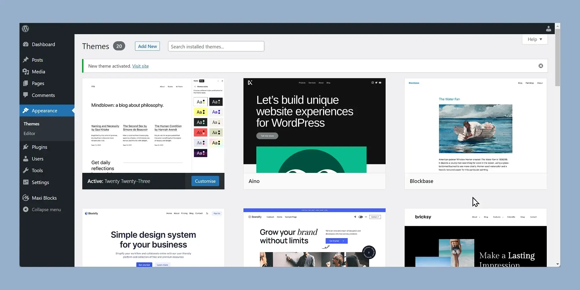
Block builders like Gutenberg and MaxiBlocks
Block builders let you build visually using a drag and drop interface. Gutenberg is built into WordPress, while MaxiBlocks enhances it with more blocks, templates and design tools.
A look at the concert homepage template
This pre-designed template is ideal for music festivals, live events or entertainment agencies. It’s full of visual energy and built to convert visitors into attendees.
Style that makes an impression
A bold orange background with white and black text creates high contrast and visual excitement. The layout includes sections for artist lineup, ticket links and event details.
Built for performance
The template is responsive, accessible and SEO friendly. Built with MaxiBlocks, it can be customised in seconds to fit any brand, event or audience.
Designing a bold and memorable hero section
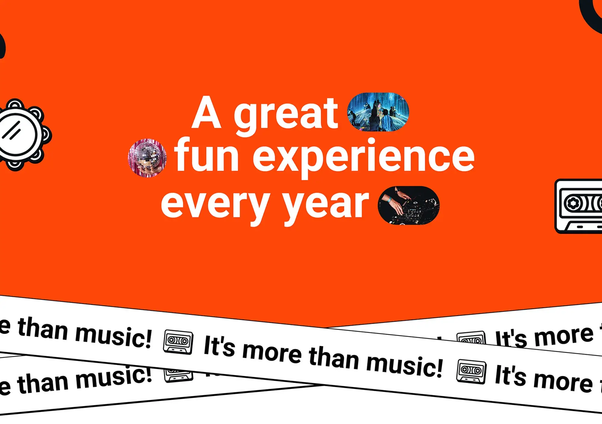
The hero section is the first thing your visitors see. For a concert or music festival homepage, it should immediately set the tone with energy, colour and clear branding. With MaxiBlocks, this is easy to achieve using visual tools and scalable graphics.
Use strong colour to command attention
A bold orange background stretches across the full width of the page. This vibrant colour choice is designed to create impact and draw the eye. MaxiBlocks allows you to apply full‑width colour blocks and adjust contrast for accessibility.
Background colour guidance
Choose a saturated orange to convey energy and fun. You can fine‑tune brightness, overlays and opacity using MaxiBlocks’ section background controls.
Add bold, central text for your headline
Place a large, central headline in white, all‑caps typography. The key phrase should convey excitement and scale. In this case, “A great fun experience every year” communicates the recurring nature and enjoyment of the event.
Highlight important words
Use heavier font weight and larger size for emphasis. For example, make “FUN” larger than the surrounding words to capture attention immediately.
Balance with music‑themed graphics
On either side of the text, include imagery that speaks to the theme:
- A vinyl record illustration on the left
- A classic cassette tape on the right
Faded icons of boomboxes and headphones can sit in the background to add depth without distraction.
Use SVG graphics for scale and clarity
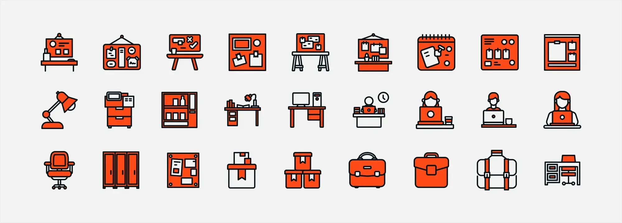
MaxiBlocks includes an extensive SVG shape and icon library. These scalable graphics remain crisp at all screen sizes and are easy to style without slowing down the site.
Reinforce the story visually
Include small decorative icons like speakers or circular shapes that hint at soundwaves or vinyl records. This subtle design layer helps tie the visual theme together.
Add personality with storytelling
Using a MaxiBlocks text block, add a short line beneath the heading that shares a memorable past event moment or highlights what makes the festival unique. Personal touches help convert casual visitors into excited attendees.
Subscribe to our newsletter
Creating bold intro text that sets the tone
After your hero section grabs attention, the next step is to reinforce the atmosphere of your event. A bold intro line with strong repetition and thematic visuals builds energy and drives your message home. MaxiBlocks makes this easy with text styling, layout tools and icon support.
Reinforce your message with repetition
Use the line “It’s more than music!” repeated across the width of the section. This repetition creates rhythm and embeds the phrase in the viewer’s mind. It acts as a visual mantra that sets the tone for what follows.
Placement and spacing
Align the line horizontally with consistent spacing between each phrase. This creates flow and maintains balance across the page. With MaxiBlocks, you can control margin and padding settings for precise alignment.
Use bold typography for impact
The phrase should be written in all capital letters with a bold, white font that contrasts against the orange background. This ensures readability and visual punch.
Font styling with MaxiBlocks
Choose a bold style from the Gutenberg font library within MaxiBlocks. Adjust font weight, letter spacing and size to match the energy of your event branding.
Enhance with thematic graphics
Each repetition can include a small white icon next to the text, such as a vinyl record, cassette tape or headphones. These icons reinforce the music theme and add variety without clutter.
Access icons from MaxiBlocks
MaxiBlocks includes a vast SVG icon collection. Add these alongside your text and customise their size, colour and spacing for a polished effect.
Maintain consistency with your colour palette
This section sits just below the header and uses the same orange background. This keeps the look cohesive and helps the viewer transition from the hero into the content smoothly.
Stay consistent with design settings
Use the same Style Card from your hero section. MaxiBlocks lets you copy visual settings from one block to another to maintain visual unity.
Showcasing your event line-up and testimonials
A well-structured line-up introduces your performers and creates excitement. Pairing this with authentic testimonials helps reinforce trust and boost engagement. With MaxiBlocks, you can design both sections using flexible blocks and clean layouts that work across devices.
Build a clear and exciting line-up
Use a strong heading like “Line Up” in capitalised bold text to anchor the section. The layout should be clean and consistent to make browsing easy.
Include event times and dates
Reserve a clear space for each day and its schedule. Include placeholders like “24” for the day and “11 AM to 6 PM” to show the performance window.
Highlight your artists
Each artist name should appear in bold text. Below each name, include a short genre tag such as “indie rock” or “electronic” to help visitors find acts they’re likely to enjoy.
Keep everything in a grid
Display artists in a neat grid using MaxiBlocks’ layout controls. Grids are ideal for scanning and work well on mobile and desktop. Group acts by day or stage as needed.
Add preview functionality
Interactive elements like “Listen now” buttons with play icons give visitors a taste of each performer. MaxiBlocks supports buttons with hover and focus states to make them stand out.
Stick to your colour scheme
Use white content blocks with black text and vibrant orange buttons for visual contrast and a cohesive look. This ties in with your hero and intro sections.
Build trust with genuine testimonials
Testimonials show that others have enjoyed your event. This builds credibility and helps new visitors feel confident attending.
Use eye-catching circular quotes
Arrange three circular blocks horizontally across the page. Inside each, place a short quote. Use large orange quotation marks at the top for visual identity. MaxiBlocks’ shape and icon blocks are perfect for this style.
Keep the text short and human
Use a clean sans-serif font. Each quote should be just one or two sentences long. Focus on enthusiasm, atmosphere, and experience.
Add background flair
You can overlay subtle speaker icons or abstract audio wave graphics using SVG blocks. This keeps the theme playful and music-focused.
Pull in content from real sources
Replace dummy text with quotes from your attendees or artists. If someone posted a great review or social media comment, include it here with a name and role if possible.
Build like a pro
Keep your site fresh with blog updates and immersive content
The blog and news section is more than a place for announcements. It keeps your site dynamic, improves search visibility, and invites visitors to stay longer. With MaxiBlocks, it is easy to create a bold, visual layout that feels integrated with your event brand.
Design an engaging blog grid
Create a 2 by 2 layout with four post blocks using MaxiBlocks’ grid tools. This keeps content organised and easy to scan, whether on mobile or desktop.
Use vibrant thumbnails
Each block should include a colourful image that captures the energy of your event. Choose shots of DJs, crowds, and live performances to reflect the excitement.
Add enticing titles and excerpts
Overlay each thumbnail with a short title and one-line excerpt. These teasers encourage clicks and provide a preview of the post’s theme.
Include dates and calls to action
On top of each image, add a small semi-transparent overlay in black with the post date and a bold “Read more” button. This helps users scan and select the most relevant stories.
Maintain your colour palette
Use orange for blog titles and button highlights. This links the section visually to the rest of your homepage and strengthens your brand identity.
Use content to deepen engagement
Your event is more than a performance. Use storytelling and regular updates to turn your website into a hub.
Keep the page current
Update your blog regularly. Fresh content gives visitors a reason to return and signals to search engines that your site is active.
Capture emotion with visuals
Let images do some of the talking. A strong photo of a crowd or artist in action creates an emotional link that pure text cannot.
Share behind-the-scenes stories
Use MaxiBlocks’ text and layout blocks to highlight moments the audience does not usually see. Share the planning, rehearsals, or interviews with artists.
Build community through interaction
Invite your audience to contribute. User-submitted stories, photos and videos give the section depth and create a sense of shared experience.
Feature section: more than music
Add a section just below your blog called “It’s more than music!” in large, bold white text. Place this over a full-width photo of a crowd in blue lighting to contrast the orange theme elsewhere on the page.
Highlight what makes your event different
Use a paragraph block to explain what makes your event special. Go beyond the music. Mention food, art, installations or community impact.
Include a call to action
Finish the section with a prominent button linking to ticket information or a full event breakdown.
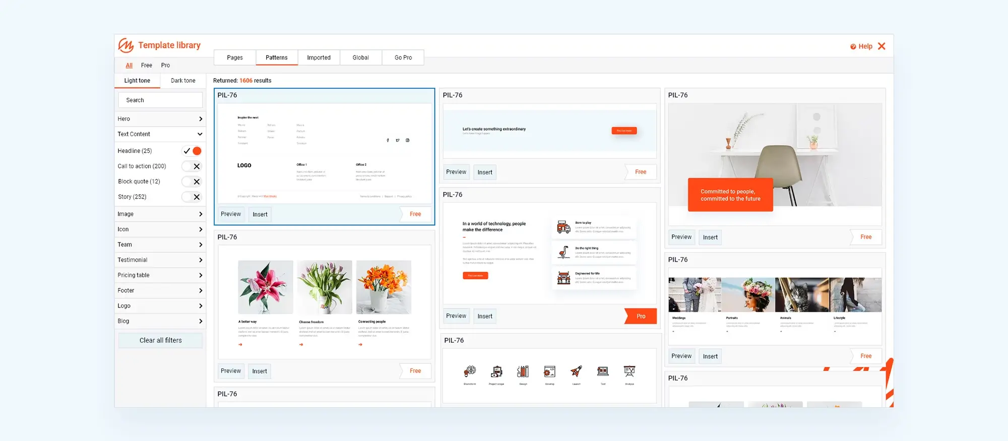
Speed up page building with templates
With MaxiBlocks and WordPress block templates, you can reuse blog layouts across your site. Drop in pre-styled patterns that match your homepage for a consistent, professional look.

Bring your event to life with immersive design and powerful storytelling
Your event website should do more than list dates and ticket prices. It should tell a story, showcase your artists, and draw in your audience with vibrant visuals and interactive elements. With MaxiBlocks and open-source WordPress tools, you have the freedom to craft something unique.
Highlight what makes your event unforgettable
Use strong visual cues and storytelling to capture attention and build emotional connection.
Show the energy
Start with a bold, high-quality background image. Crowd shots, bright lighting, and dynamic angles give visitors an instant feel for your event’s atmosphere.
Tell your story
Include a short narrative about what makes your event stand out. Is it the setting, the style, or the culture surrounding it? MaxiBlocks makes it easy to drop in styled text blocks that keep readers engaged.
Build authenticity
Use behind-the-scenes content. Add quotes from the planning team or short stories from past attendees to bring it all to life.
Showcase your sponsors the right way
Sponsorship builds credibility and strengthens your brand. Display logos in a clean layout using MaxiBlocks’ logo grid components.
Choose wisely
Feature known brands like Google or Microsoft, but only if they align with your event’s values.
Keep it local
Highlight community partners with mini spotlights. Use image blocks with captions to share their stories and involvement.
Curate a vibrant photo gallery
Visual storytelling turns casual visitors into excited fans. MaxiBlocks’ image gallery blocks help you create a cohesive and responsive layout.
Create a gallery grid
Display six or more images in a clean layout. Include a mix of crowd shots, artist close-ups, and venue highlights.
Match your colour palette
Stick to consistent tones like blues, purples, and oranges to keep things visually tied together.
Add interactivity
Enable click-to-zoom, captions, or short stories behind the photos. Encourage visitor-submitted images to deepen engagement.
Feature your artists with flair
Give every performer a moment in the spotlight using artist profile blocks.
Add personality
Use high-quality images and social media links. MaxiBlocks makes it simple to add icons and buttons for Instagram, YouTube, or Spotify.
Share unique stories
Include fun facts, video interviews, or collaborations. Let artists contribute their own bio or playlist to add depth.
Keep your footer functional and on-brand
Your footer is your final impression so make it count.
Provide clear contact options
Include your office address, a contact email, a phone number, and your social icons.
Stay accessible
Use contrasting colours and legible fonts. MaxiBlocks’ design tools ensure everything meets accessibility standards.
Keep users engaged
Add a short feedback form or invite story submissions from the community. Maintain the orange theme used across your site for visual consistency.
Build without limits using open-source tools
Open-source platforms like WordPress give you the freedom to build your dream site, no vendor restrictions, no limits.
Personalise everything
MaxiBlocks allows you to craft layouts that reflect your brand and connect with your audience.
Explore flexible tools
Try out free themes and pre-built block patterns in Gutenberg. Use templates like the concert homepage to get started quickly.
Combine creativity with freedom
Whether you build it solo or collaborate with a designer, MaxiBlocks gives you the tools to make your event site your own.
Design a show-stopping concert website with the right colour scheme
A memorable concert website needs more than just great typography and photos. The colour scheme plays a critical role in setting the atmosphere, guiding the visitor’s eye, and reinforcing the event’s mood. Starting with the concert WordPress template gives you a strong visual layout built specifically for performances, launches and live events. But it’s your colour palette that brings it all to life.
If you are not sure where to begin, the guide to WordPress block templates breaks down how different layouts support different goals, from promotions to ticket sales. You can also use the template match guide to explore other options suited to your audience and content. For even more inspiration, check out the best WordPress template sites and see how designers approach different industries with smart colour and layout pairings.
Explore mood and structure through template design
A good starting point is understanding how templates influence colour use. Darker layouts like the interior design dark theme or architectural block templates lend themselves to deep, moody tones perfect for night-time events or electronic acts. Meanwhile, layouts such as the studio website template and the MaxiBlocks photographer design offer lighter palettes and clean spacing ideal for festivals, acoustic shows or indie brands.
You can also reference examples like the acupuncture template or the craftsman homepage layout to see how calming colours and simplicity come together. For business-focused performers, the homepage block for businesses is a solid base with clear CTA space that can be tailored with vibrant hues.
Stay on trend with the future of WordPress block templates
To ensure your design stays fresh, explore future trends in block templates and how layout design is evolving. The WordPress block templates overview can help you compare common layout patterns, and if your site leans on social sharing or marketing, explore the templates made for social media for guidance on colour-driven engagement.
For those on a budget or looking to explore without commitment, free WordPress templates are a great place to start. You might also want to experiment with a basic block template or choose from curated WordPress block templates that are pre-built for music, art and entertainment.
Tie your colours into a consistent WordPress design
Once you’ve chosen your layout and set a tone, it’s important to apply your colour scheme consistently. Whether you’re exploring WordPress website templates, general templates for WordPress, or specifically WordPress website design templates, your colours should be unified across banners, buttons and background sections.
For best results, ensure your theme supports your layout. You can read about how to use WordPress themes and how they interact with your WordPress site, especially when building with WordPress websites templates. This way, your colours, content and layout all work together to create an unforgettable digital stage for your next show.
WordPress template sites for fast and easy design
Explore flexible WordPress templates with built-in styles and block layouts for faster design.
FAQs – Concert WordPress template
What is the best way to build a concert or festival website?
Use WordPress with a visual builder like MaxiBlocks. It offers flexibility, design freedom and seamless integration with block themes, helping you launch quickly and customise everything visually.
Do I need a developer to build my event website?
Not at all. MaxiBlocks is beginner friendly and works directly in the WordPress editor. You can build a fully custom site using drag and drop blocks, prebuilt templates and design tools, no coding required.
How can I make my site mobile friendly?
Choose a responsive theme and test every section on mobile and tablet. MaxiBlocks blocks and templates are fully responsive by default, so you can preview and tweak layouts across all screen sizes.
What content should I include on an event site?
Focus on sections like the hero banner, line-up or schedule, ticket information, blog or news updates, artist profiles, and a vibrant photo gallery. A good footer with contact and social details is also key.
Can I sell tickets directly on my WordPress site?
Yes. Use WooCommerce or a dedicated event ticketing plugin that integrates with WordPress. MaxiBlocks works smoothly with these tools, letting you style checkout pages and calls to action with ease.
How do I update content without breaking the design?
Use Style Cards in MaxiBlocks to lock in your design system. This way, when you update content like a new artist or sponsor the layout stays consistent.
What image sizes should I use for galleries?
Aim for under 200 KB per image. Use WebP format if possible, and always include alt text. MaxiBlocks makes it easy to swap and compress images without leaving the editor.
How can I improve SEO on my event site?
Use descriptive page titles and H1 headings, add schema to key sections like the blog or event line-up, and make sure your site loads quickly. MaxiBlocks templates are built with performance and SEO in mind.
Is it better to use a free or premium theme?
Free themes like MaxiBlocks Go are a great place to start. They are lightweight, flexible and fully compatible with full site editing. You can always upgrade later if you need extra features.
Can I use video on my homepage?
Yes. MaxiBlocks supports self-hosted video and YouTube embeds through its media blocks. Place videos in the hero or intro sections to show behind-the-scenes clips or artist promos.
WordPress itself
Official Website
wordpress.org – This is the official website for WordPress, where you can download the software, find documentation, and learn more about using it.
WordPress Codex
codex.wordpress.org/Main_Page – This is a comprehensive documentation resource for WordPress, covering everything from installation and configuration to specific functionality and troubleshooting.
WordPress Theme Directory
wordpress.org/themes – The official WordPress theme directory is a great place to find free and premium WordPress themes. You can browse themes by category, feature, and popularity.
maxiblocks.com/go/help-desk
maxiblocks.com/pro-library
www.youtube.com/@maxiblocks
twitter.com/maxiblocks
linkedin.com/company/maxi-blocks
github.com/orgs/maxi-blocks
wordpress.org/plugins/maxi-blocks

Kyra Pieterse
Author
Kyra is the co-founder and creative lead of MaxiBlocks, an open-source page builder for WordPress Gutenberg.
You may also like
