Tailoring your barber shop’s homepage with MaxiBlocks
Try MaxiBlocks for free with 500+ library assets including basic templates. No account required. Free WordPress page builder, theme and updates included.

Updated 8th May 2025
The design in your barber shop’s website
Your homepage isn’t just a landing page it’s the virtual chair where your clients get a glimpse of the experience you offer. The design reflects the quality of your services and the ambience of your shop, setting the right expectations from the very first glance. Every pixel should echo the meticulous care you put into your craft, ensuring style meets substance.
Creating an engaging header: The barber shop’s welcome mat
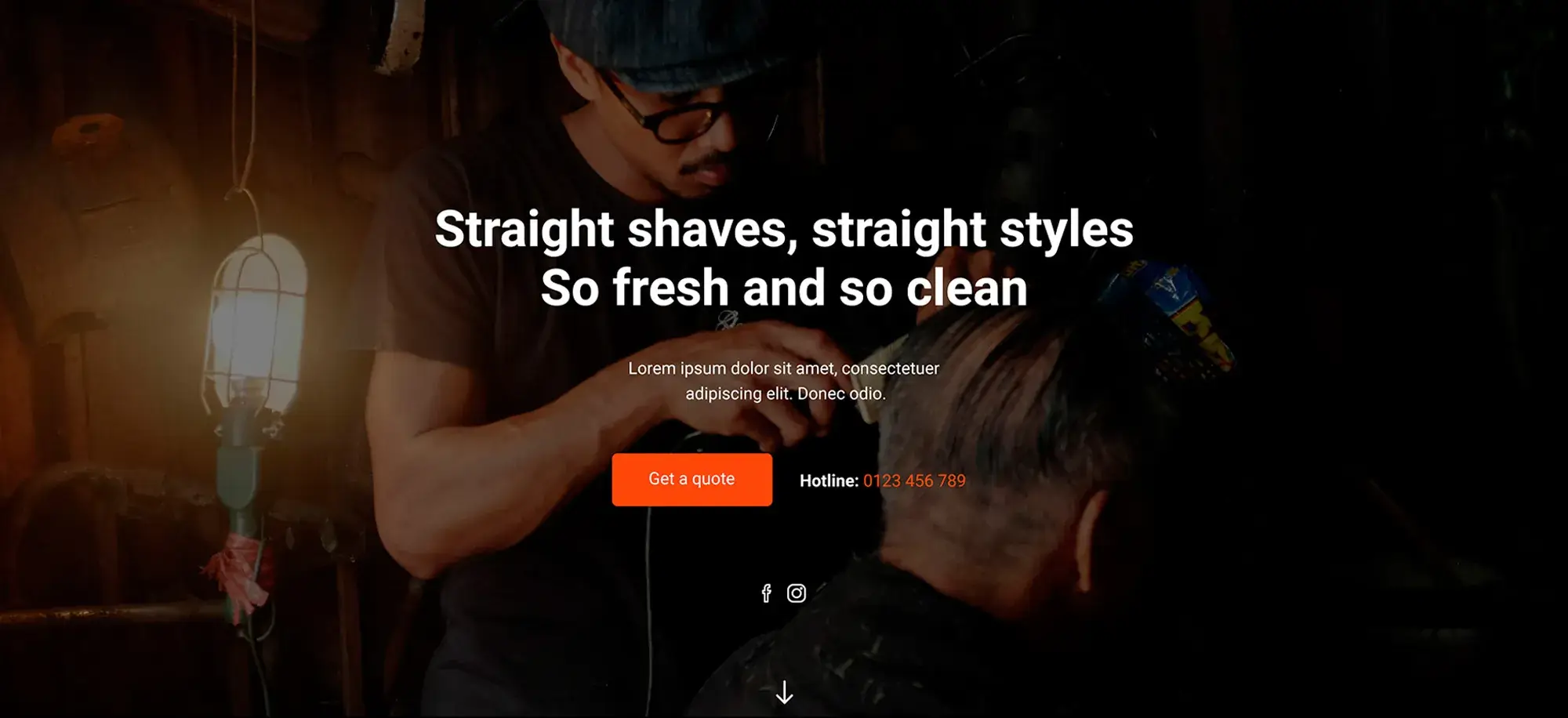
The header is your digital handshake with potential clients. It should exude confidence and clearly communicate the promise of high-quality grooming services. Imagine a bold statement paired with a captivating, immersive image that showcases your barbers’ skills. This dynamic introduction sets the stage for the unique experience clients can expect from your shop.
Fine-tuning your header with MaxiBlocks
MaxiBlocks helps you elevate your header design by offering intuitive customisation options. With this tool, you can:
- Swap out images with ease: Update your header backdrop to showcase your latest styles and the vibrant atmosphere of your shop.
- Refine your text: Adjust your tagline to highlight seasonal promotions or new services as your business evolves.
- Maintain brand consistency: Ensure that font styles, colours, and sizes remain uniform across desktop and mobile, reinforcing your brand identity.
Ready to transform your homepage into a true reflection of your craft?
Try MaxiBlocks for free to access over 500 library assets, including templates, a powerful page builder, and regular updates. Alternatively, explore premium designs and discover how you can further elevate your digital presence.
With MaxiBlocks, every detail of your website’s design will be as sharp and tailored as the haircuts you offer, ensuring that your online welcome mat is as inviting as your physical shop.
Showcasing services with a personal touch
Below the header, the “What we offer” section presents a well-organised grid of services available at the shop. Each service from beard styling and trimming to trendy haircuts, restyling, and cut & style is represented by a stylish, thematic image with prices starting from $19. This layout not only suggests affordability but also highlights a broad range of options, making it easy for clients to see what you offer.
Presenting your services grid
The current design leverages a sleek grid set against a dark backdrop to draw attention to the visuals and pricing. This approach creates a clear and enticing narrative for potential clients, setting the tone for a high-quality and personalised grooming experience.
Additional design tips with MaxiBlocks
MaxiBlocks can help keep your services section fresh and engaging. Consider incorporating the following design tips:
- Update imagery regularly: Swap out service images to reflect seasonal styles or recent work that showcases the diversity of your clientele.
- Implement hover-over effects: Add quick descriptions on hover that not only reveal the service name but also communicate the experience and quality behind each offering.
- Maintain visual consistency: Use MaxiBlocks to ensure that fonts, colours, and image styles align perfectly with your overall brand identity.
- Highlight special offers: Incorporate badges or subtle overlays to mark promotional pricing or limited-time services, drawing extra attention to these deals.
By integrating these design enhancements with MaxiBlocks, you can transform your services grid into a dynamic showcase that speaks volumes about the expertise and personal care provided at your barber shop.
Build like a pro
Assuring quality with authentic imagery
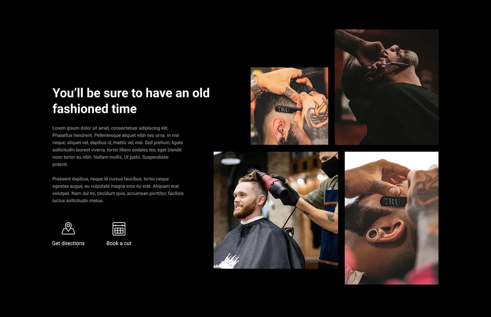
The page presents an assurance to visitors “You’ll be sure to have an old-fashioned time” accompanied by images of customers enjoying their services. This section blends the traditional charm of barbering with modern techniques, emphasising a comprehensive grooming experience. Every image serves as a visual testament to the quality you promise, ensuring that the atmosphere within your shop is authentically captured.
Creating a visual promise
Authentic imagery builds trust and sets the tone for the overall experience. The images should reflect not only the skill of your barbers but also the warm, inviting environment that characterises your shop. Each picture is an opportunity to showcase the essence of your brand.
Design tips with MaxiBlocks
- Use MaxiBlocks to regularly cycle through images, keeping the visual content fresh and engaging.
- Highlight different aspects of your service whether it’s the precision of your tools, the concentration of your barbers, or the satisfaction of your customers.
- Ensure consistency by aligning each image with your overall design theme, from the colour palette to the style.
- Consider incorporating dynamic effects or subtle transitions to add a modern twist while maintaining the authentic, traditional vibe.
By regularly updating your imagery with MaxiBlocks, your homepage will continuously convey the high-quality, inviting atmosphere that defines your barber shop.

Enhancing your barber shop website
Detailing your menu for transparency
The “Our full menu” section lists services with detailed descriptions and prices, providing clear information about what customers can expect to pay. With an extensive range of grooming services displayed in a clean, straightforward format, transparency helps build trust with visitors.
Design tip
Use MaxiBlocks to effortlessly update your menu layout. Whether adjusting the price of a shave or adding a new grooming package, integrate these changes seamlessly into your design while maintaining a refined blend of tradition and modernity.
Leveraging social proof for trust
Social proof is showcased with customer counters that highlight the number of haircuts, shaves, happy customers, and cups of coffee served. This data reinforces the shop’s expertise and customer satisfaction while enhancing credibility.
Design tip
Keep these counters updated using MaxiBlocks. Ensure the numbers are bold and clear against a dark background and that any client photos or testimonials visually pop, maintaining a contemporary aesthetic.
Incorporating video for engagement
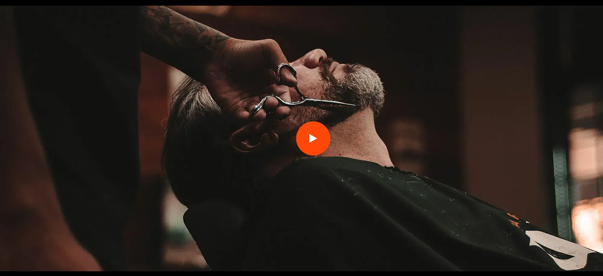
A central video segment bridges the gap between the online experience and the in-shop atmosphere. This multimedia approach brings the ambiance of your barber shop to life, offering visitors a dynamic insight into your services such as beard trimming and restyling.
Design tip
Utilise MaxiBlocks to update your video content regularly. Place the video prominently for maximum impact, ensuring the footage remains polished and professional, and always aligns with your upscale and inviting brand image.
Gathering and displaying testimonials
A dedicated testimonial section features genuine customer feedback paired with client photos, adding credibility and a personal touch to your digital presence. This human element reinforces trust in your services.
Design tip
Use MaxiBlocks to continuously refresh the testimonial section. Choose layouts that match your minimalist and impactful design, ensuring new customer stories fit seamlessly with your overall aesthetic.
Practical footer for navigation and connection
The footer anchors your homepage with essential navigation and contact information. It includes a map for locating your shop, clear business hours, and a “Say hello and book now” section with a phone number. A motivational quote, such as “In order to succeed, your desire for success should be greater than your fear of failure,” inspires visitors, while social media icons for Facebook, Twitter, and Instagram encourage deeper engagement.
Design tip
Manage the footer with MaxiBlocks to preserve its dark, elegant theme. Ensure your navigation links are intuitive, contact details current, and social media icons naturally integrated within the design.
Enhancing local SEO with map integration
A well-integrated map isn’t just a tool it’s an invitation for clients to step into your world. Prominently placing the map within your homepage enhances local SEO and reinforces your digital connection to the physical shop.
Design tip
Position the map tastefully within your page’s flow using MaxiBlocks. Ensure it aligns with your dark colour scheme and overall aesthetic, making it both functional and visually appealing.

Final thoughts
Every aspect of your barber shop’s website from the detailed menu to engaging videos and authentic testimonials works together to create a welcoming, trustworthy, and sophisticated online presence.
Key takeaways
- Transparent information: A detailed, up-to-date menu builds trust with clear service descriptions and pricing.
- Social proof: Counters and testimonials reinforce credibility and showcase your expertise.
- Engaging multimedia: Videos and dynamic imagery bring the shop’s atmosphere to life.
- Seamless design updates: MaxiBlocks enables quick, cohesive updates to maintain a modern yet timeless look.
- User-friendly navigation: A practical footer and integrated map enhance local SEO and ensure visitors can easily connect with you.
Ready to elevate your website?
Try MaxiBlocks for free to access over 500+ library assets including essential templates, a powerful page builder, and regular updates. Or, Explore premium designs to further enhance your barber shop’s digital presence.
With these tools and best practices, your website will not only reflect the high quality of your services but also continuously engage and convert visitors into loyal clients. Happy building!
WordPress website builder for design and customization
Explore guides, tutorials, and resources made for using WordPress website builders like MaxiBlocks.
Building for clients? Let’s make it easier.
If you’re working as a freelancer or agency, you already know how important it is to save time without cutting corners. The right tools can make a huge difference and that starts with choosing the best website builder for small business, especially when you’re juggling multiple projects.
To deliver results that clients actually notice, you’ll want a solid foundation. That means nailing down SEO for WordPress, making the most of the REST API, and locking in essential security from the start.
We’ve also compared the most trusted WordPress page builders so you can find one that fits your workflow—whether that’s a full-featured website builder or a fast WordPress website maker for quick-turnaround jobs.
If budget is a factor, take a look at this free WordPress builder, especially if you’re spinning up test sites or early-stage mockups. You can also explore the full roundup of WordPress builders and see how they compare to traditional design workflows.
Wondering what tools really power WordPress builders? We’ve answered key questions like do website builders actually use WordPress, which one gives you the best balance of control and speed, and whether you can design freely without a big budget.
You’ll also find guides on builder features worth using, the benefits of using builders for client sites, and how to choose the right tools for your team with this overview of workflow-friendly builders.
Want to dig deeper? Learn about creating your own site builders, scaling projects without code bloat, and putting WordPress builders to work for your business.
You can even blend design and builder tools for a smoother handoff between creative and technical teams. And if you’re serving a specific niche, templates like the barber site builder or bar business layout might save you hours.
Before launch, don’t forget to run through performance optimisation and make your client handoffs cleaner with easy WordPress customisation.
FAQs: Optimizing your barber shop’s website with MaxiBlocks and WordPress tools
What are WordPress block templates?
WordPress block templates are pre-designed layouts consisting of various customizable blocks such as text, images, and buttons. They serve as website starter kits that make it easier to set up your barber shop’s site by providing a structured design foundation that you can tailor to your unique style.
How is a block theme different from a traditional theme?
A block theme, built specifically for the Gutenberg editor, allows you to edit and customise every part of your website directly within the editor. This differs from traditional themes, which are pre-built website skins that often require additional coding or external tools for modifications. With a block theme, the process is smoother and offers greater flexibility, letting you achieve a more personal design with ease.
Can I use WordPress block patterns for my barber shop site?
Absolutely. WordPress block patterns are pre-built design elements, such as service lists and team introductions, that you can easily insert into your pages. These patterns help streamline the creation of pages by giving you ready-to-use layouts that can be customised to reflect your shop’s branding and aesthetic.
What’s a Gutenberg template?
A Gutenberg template is a page layout created using the Gutenberg editor. It is a custom arrangement of blocks that can be saved and reused throughout your website, ensuring consistency in design while allowing for flexibility in how different sections of your site are presented.
Is there a free website builder for my barber shop?
Yes. WordPress itself is a free platform, and by adding the free MaxiBlocks plugin, you gain access to a powerful open-source website builder. MaxiBlocks enhances the capabilities of the WordPress block editor, giving you extensive design control without the need to invest in paid themes.
Where can I learn more about Gutenberg?
To gain a deeper understanding of Gutenberg, you can refer to the official WordPress documentation or check out the Gutenberg wiki page. Both resources offer comprehensive information about its features, updates, and best practices for creating engaging websites.
Can I build a website for free with MaxiBlocks?
Yes, you can build a complete website for your barber shop using MaxiBlocks without any cost. This free plugin expands the functionality of the WordPress block editor, making it easier to design and customise your site to meet your specific needs.
Are WordPress block themes responsive?
Most modern WordPress block themes are designed to be fully responsive. This means your website will look and function well on any device, whether it’s a desktop, tablet, or smartphone, ensuring a seamless user experience for all visitors.
Are there other benefits to using MaxiBlocks?
Certainly. Being an open-source tool, MaxiBlocks benefits from continual improvements made by a dedicated developer community. It functions as a free WordPress page builder and theme builder, offering extensive control over your website’s design and customisation options without the additional cost associated with premium themes.
Can I create a custom block theme for my shop?
With WordPress’ flexible block system and the capabilities provided by MaxiBlocks, you have the tools to create a unique custom block theme that perfectly reflects your barber shop’s style. This allows your website to stand out and connect with customers on a more personalised level, ensuring that your digital presence is as distinctive as your services.
WordPress itself
Official Website
wordpress.org – This is the official website for WordPress, where you can download the software, find documentation, and learn more about using it.
WordPress Codex
codex.wordpress.org/Main_Page – This is a comprehensive documentation resource for WordPress, covering everything from installation and configuration to specific functionality and troubleshooting.
WordPress Theme Directory
wordpress.org/themes – The official WordPress theme directory is a great place to find free and premium WordPress themes. You can browse themes by category, feature, and popularity.
maxiblocks.com/go/help-desk
maxiblocks.com/pro-library
www.youtube.com/@maxiblocks
twitter.com/maxiblocks
linkedin.com/company/maxi-blocks
github.com/orgs/maxi-blocks
wordpress.org/plugins/maxi-blocks

Kyra Pieterse
Author
Kyra is the co-founder and creative lead of MaxiBlocks, an open-source page builder for WordPress Gutenberg.
You may also like
