Discover How to Elevate Your WordPress Content with Effective Image Analysis
Original design overview
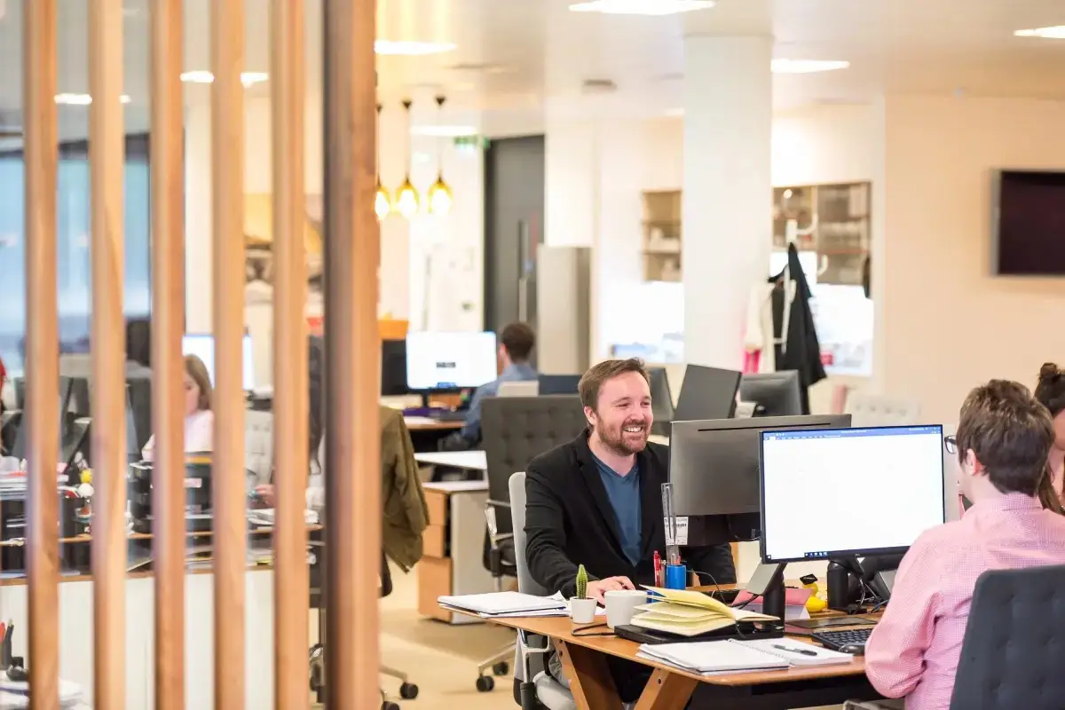
Imagine a webpage that combines text and visuals in a sleek, modern look. On one side, you have engaging text that provides essential stats and descriptions. On the other, a stunning landscape image captures people working together. This design’s asymmetry enhances visual appeal and highlights the theme of mentorship effectively.
1. Layout analysis
Overall structure
This two-column setup is all about clarity and engagement. The left column has informative text blocks while the right showcases an image that packs a punch.
Arrangement of rows and columns
You’ll find two main columns here, working in harmony. The left features text rows with critical insights, contrasted by a powerful image of teamwork on the right.
Asymmetrical choices
The stacked information on the left makes the bold image on the right stand out, attracting and maintaining attention.
2. Element and feature description
Visible elements
- Headers: You’ll find an attention-grabbing header: “Our mentors are experts in different fields.”
- Text blocks: Three compelling statistics (123, 45, 10) come with brief descriptions to boost understanding.
- Image: A vivid portrayal of work, emphasizing collaboration and productivity.
Interactive elements
While no clear interactive features are mentioned, the numbers hint at possible future engagement opportunities, like links to more info.
Typography
Think clean and modern-likely sans-serif. The headers and statistics come in different sizes for a polished look.
Icons and graphical elements
There’s a lack of icons, but the bold stats themselves act like impactful graphical elements.
Image characteristics
The landscape image takes center stage with no distracting borders, encapsulating teamwork and engagement.
3. Unique design aspects
Standout design choices
The balanced contrast between text and visuals effectively highlights the theme of mentorship, capturing the audience through a mix of information and visuals.
Hover effects/animations
None are found in the static content, but there’s potential for future interactive features.
Responsive design
The structured layout works well on smaller screens, ensuring a solid mobile experience.
Accessibility considerations
Clear headers and descriptions aid screen readers. However, colour contrast should be checked against accessibility standards.
4. Overall design style
Design style category
The layout embodies a modern and professional style, focusing on expertise and collaboration.
Visual hierarchy
The hierarchy is skillfully crafted, leading with a dominant header, followed by stats, then descriptions, and finishing with the impactful image.
Use of white space
Intentional white space is used, avoiding overcrowding and allowing each element to capture attention and enhance readability.
Ways to organise content in WordPress
1. Categories and tags
These are essential for organising your WordPress website content. Use categories for broad topics and tags for specific details within those categories. They help visitors and search engines understand your site’s structure.
2. Custom post types
When your content doesn’t fit into the usual posts and pages, consider custom post types. They’re perfect for adding unique content types to your site such as portfolios or testimonials.
3. Menus and submenus
Create a clean navigation structure with menus and submenus. This makes your site easier to navigate and helps guide visitors to the most important content.
4. Widgets and sidebars
Widgets can be added to sidebars to enhance functionality and user engagement. They’re perfect for showing additional content like popular posts or social media feeds.
5. Using shortcodes
Shortcodes allow you to embed dynamic content into your pages and posts easily, such as videos, forms, or galleries.
6. Pages for static content
Use pages for content that doesn’t change often, like your ‘About Us’ or ‘Contact’ page, helping visitors learn more about your site.
7. Portfolios
Perfect for showcasing creative work, WordPress portfolios display projects in an eye-catching format, helping professionals display their best work.
8. RSS feeds
Feeds enable users to subscribe to your content and stay updated. They can boost traffic by keeping your audience engaged and informed.
9. Landing pages
Landing pages are designed to convert visitors, focusing on a single call-to-action, making them ideal for product launches or special offers.
10. Archives
Organise posts by date, author, or category in archives, making it easier for visitors to find past content quickly.
Different types of content in WordPress
1. Blog posts
Blog posts are the bread and butter of any WordPress website design, providing regular updates and keeping your audience engaged with fresh content.
2. Pages
Use pages for timeless content like policy documents or service descriptions. They’re perfect for static information that enhances your site’s purpose.
3. Galleries
Galleries are fantastic for showing off images in a neat and organised way. They’re perfect for photographers or visual-focused bloggers.
4. Portfolios
These show off your best work, suited for creatives who need to display projects or case studies professionally and attractively.
5. Videos
Embedding video content can enrich your site’s appeal. Videos often engage better than text, providing a dynamic way to share information.
6. Testimonials
Showcase client feedback through testimonials to enhance trust and credibility. They can be sprinkled throughout your site in strategic places.
7. Podcasts
Podcasting is booming, and WordPress supports this trend by hosting your episodes, making your content more versatile.
8. Product pages
If you’re selling products, detailed product pages are crucial. They provide essential information and images to help make purchasing decisions easier.
9. Forms
Contact forms, surveys, and quizzes collect information effectively, helping you engage directly with your audience.
10. Newsletters
Integrate newsletters to keep your audience informed and engaged, building a loyal reader base by delivering valuable content directly to their inboxes.
Conclusion
By effectively combining text and engaging visuals in your WordPress website design, you can significantly boost user engagement. Embracing a well-thought-out layout not only presents information clearly but also makes your site visually appealing. Implementing these strategies and understanding the variety of content types available will set your site apart, ensuring a robust and versatile WordPress website.


