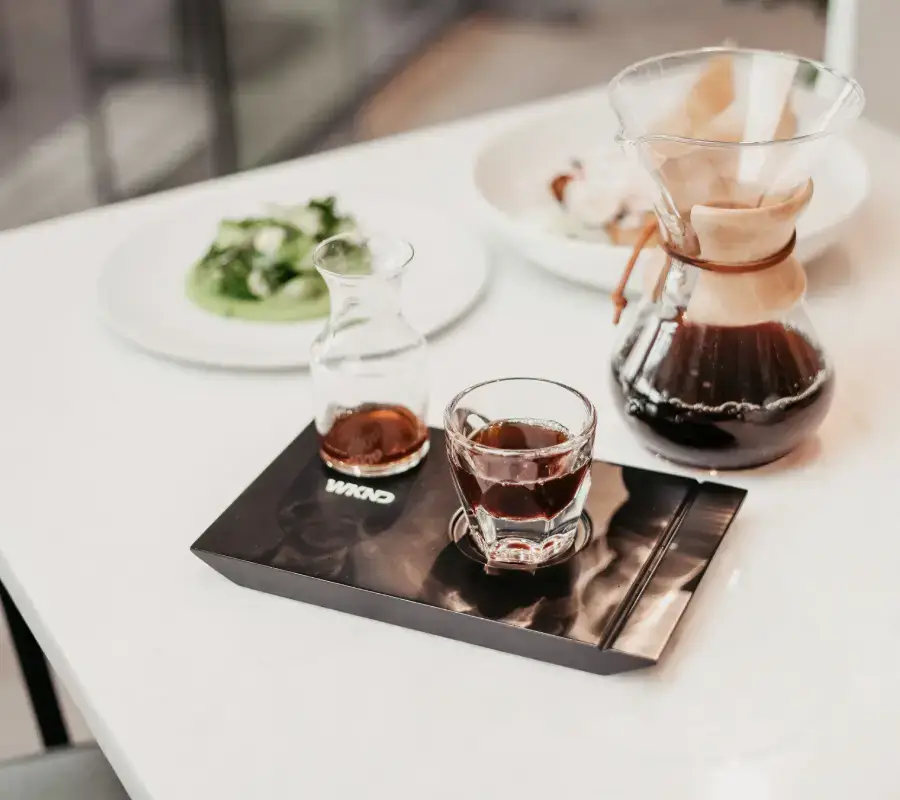

We’re always in the mood for food
Highlighted by fresh local ingredients, our prix-fixe, brunch, buffet and seasonal tasting menus boast an exquisite selection of regional produce, meat, poultry and seafood.

Build WordPress sites with MaxiBlocks. All features free forever. No locked functionality. Optional Cloud Library saves you 10+ hours per project. Start free


Highlighted by fresh local ingredients, our prix-fixe, brunch, buffet and seasonal tasting menus boast an exquisite selection of regional produce, meat, poultry and seafood.
Are you ready to elevate your WordPress website design? The original layout features a sleek, two-column arrangement that artfully balances text and visuals, drawing visitors in with its modern appeal. One column showcases a striking image of a person preparing delectable food, while the other communicates enticing text that encourages action.
Organise your content under categories for better navigation. Categories are broad topics that help group related posts, making it easier for visitors to find what interests them on your WordPress website.
Tags act as keywords for your posts, allowing specific content tracking. They are more detailed than categories and allow users to quickly find articles linked by common themes across your site.
Utilise navigation menus to efficiently direct users. Menus can highlight essential pages and posts, improving the overall user experience through structured path choices.
Create custom post types for distinct content formats. Tailor content management and presentation by defining specific post types suited to your site’s needs, beyond typical blog posts.
The media library stores all your images, videos, and documents. Keeping your media organised here ensures easy access when needed, making content creation simpler.
Enhance engagement with internal linking. Cross-referencing related content within your posts keeps readers exploring your site longer and improves search engine optimisation.
Craft visually appealing galleries to showcase images. Galleries transform ordinary image displays into curated collections, making them ideal for photography and portfolio sites.
Use a table of contents for longer posts. It gives readers a quick overview of the content and allows them to jump directly to sections of interest, improving user navigation.
Utilise sidebars to place auxiliary content such as widgets, links, and ads. Sidebars are excellent for displaying less crucial yet helpful information next to your main content.
The footer serves as a consistent spot for contact info, privacy policies, and terms of use. A well-developed footer enhances overall navigation and provides closure to each page’s content journey.
Blog posts form the backbone of most WordPress sites. They offer a chronological stream of your thoughts, news, or updates, continually keeping readers informed and engaged.
Pages are static content ideal for non-changing information like “About Us” or “Contact” pages. Unlike posts, they don’t follow a chronological order and do not need archiving.
For e-commerce sites, product listings showcase what you sell. Each product can have specifications, prices, and images, forming an essential component of an online store.
Sharing events such as webinars or meetings keeps your audience in the loop. Event posts highlight dates, times, and venues, making them essential for community-oriented sites.
Portfolios exhibit your professional work. This type of content is perfect for artists, photographers, and designers looking to showcase their skills visually.
Testimonials build trust by displaying customer feedback. Featuring positive reviews from clients can significantly enhance your site’s credibility.
Maintain a thorough FAQ section to answer common visitor queries. FAQs reduce repetition in customer communication and enhance user understanding of your offerings.
Embedding video content can significantly engage viewers. Videos capture attention better than text, proving vital for tutorials, vlogs, or any visual storytelling.
Infographics convey information visually, making complex data more digestible and attractive. This type of content is perfect for educational sites or data-driven articles.
A newsletter keeps your audience updated beyond your website. Integrated within WordPress, newsletters can inform subscribers about new posts, products, or promotions.
This well-crafted design unites a minimalist style with effective imagery and an engaging layout, showcasing your food offerings while enticing visitors to book their experience. By incorporating these elements into your WordPress website, you’ll not only attract attention but also encourage visitor interaction-turning casual browsers into loyal customers! Don’t miss out on transforming your website into a visually stunning and user-friendly experience.
Whether you’re exploring Elementor Alternatives or utilising WordPress website builders, be sure to harness the power of responsive WordPress design and use free WordPress themes efficiently-your path to a standout website is laid out.
