
We’re always in the mood for food
Highlighted by fresh local ingredients, our prix-fixe, brunch, buffet and seasonal tasting menus boast an exquisite selection of regional produce, meat, poultry and seafood.

Build WordPress sites with MaxiBlocks. All features free forever. No locked functionality. Optional Cloud Library saves you 10+ hours per project. Start free


Highlighted by fresh local ingredients, our prix-fixe, brunch, buffet and seasonal tasting menus boast an exquisite selection of regional produce, meat, poultry and seafood.
Imagine landing on a WordPress website design that immediately draws you in with its vibrant aesthetic. Our innovative multi-column layout is crafted to captivate your visitors, ensuring they have a truly engaging experience from start to finish.
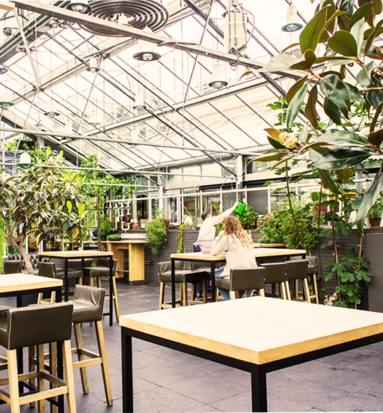
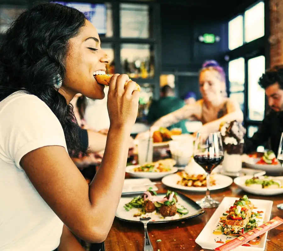
The layout features two distinct sections. On the left, we have stunning images portraying a delightful dining experience-a woman enjoying her meal beside a bustling dining scene. On the right, there’s an engaging text area paired with a call-to-action button that’s hard to ignore, encouraging users to book a table. This harmonious balance keeps audiences enthralled and curious for more.
Our thoughtfully designed layout isn’t just about looks. It invites your audience to interact meaningfully, showcasing your restaurant’s offerings while boosting bookings. For WordPress website users aiming to amplify their dining pages, this design is a superb choice. Dive into this WordPress block templates that could transform your web engagement today.
Organising content into custom categories allows users to find related topics easily. When setting up your WordPress navigation menus, consider using descriptive labels for each category to help guide visitors to the content they’re interested in.
Tags are another way to organise and improve the searchability of your posts. They offer a more detailed level of categorisation, capturing specific ideas within posts.
Publishing content consistently is crucial. Whether you’re posting weekly or monthly, a scheduling calendar can streamline this process, ensuring regular engagement with your audience.
Highlight significant posts using featured content blocks. This method keeps important content visible and accessible to first-time and returning visitors alike.
Incorporate a heading hierarchy for clarity and easy navigation. Organised headings guide readers through your posts, improving readability and engagement.
Embedding selected categories within your main menu provides immediate access to key content areas, facilitating a smoother user experience.
Linking related posts into a series not only keeps readers engaged but also encourages them to explore other areas of your website, boosting page views.
Providing an archive page enables readers to access past articles easily. It’s an excellent way to offer continuity and depth in topic exploration.
Chronological navigation offers a time-based journey through your content, letting readers experience the evolution of your ideas or business approach.
Utilise internal linking to keep visitors exploring other areas of your site. Additionally, integrating responsive WordPress design ensures consistent navigation across all devices.
The backbone of most WordPress websites, blog posts allow for knowledge-sharing and audience engagement in an informal tone.
Landing pages are specialised to convert visitors through focused content, often featuring bold headlines, captivating images, and strategic calls-to-action.
Perfect for e-commerce, product listings detail pricing, features, and purchase options, often integrating multimedia elements to enhance the experience.
To build trust, share customer reviews and success stories. Testimonials humanise your brand, showcasing real-world benefits and results.
Display your best work with a portfolio section, ideal for creative professionals looking to attract new clients by highlighting skills and completed projects.
Offer value by educating your audience with step-by-step tutorials or in-depth guides, showing your subject matter expertise and attracting novice users.
Incorporating video allows more dynamic storytelling. It’s engaging, compelling, and highly shareable, extending your content’s reach beyond your website.
Audio content like podcasts can create a more personal connection with your audience, providing insightful discussions on relevant topics.
Photo galleries are particularly effective for sites showcasing visual-centric content, such as art portfolios or photographic collections.
Interactivity is key to engagement. Surveys and polls invite active participation, fostering a community feel and providing valuable audience insights.
With the right mix of visual elements, engaging text, and seamless navigation, your WordPress website builder has the potential to not only attract viewers but convert them into loyal customers. Whether you choose a free WordPress themes or explore Elementor alternatives, the right design choices can significantly enhance user interaction and experience on your site.
