Customising your MaxiBlocks WordPress interior design homepage template
The MaxiBlocks WordPress homepage design template for interior designers is an excellent tool to showcase your expertise and creativity. This template is visually rich, combining sleek design with practical layout options to ensure your work truly shines. In this blog post, we’ll take you through the template, section by section, offering tips and guidance on how to customize each part to make the design uniquely yours.
Whether you’re setting up a website for an interior design studio, architecture firm, or even a home decor store, this guide will help you get started. We’ll explore different customization options, from image galleries to icon selections, that will help you communicate your brand’s aesthetic and professional ethos effectively.
Hero section: transform your space
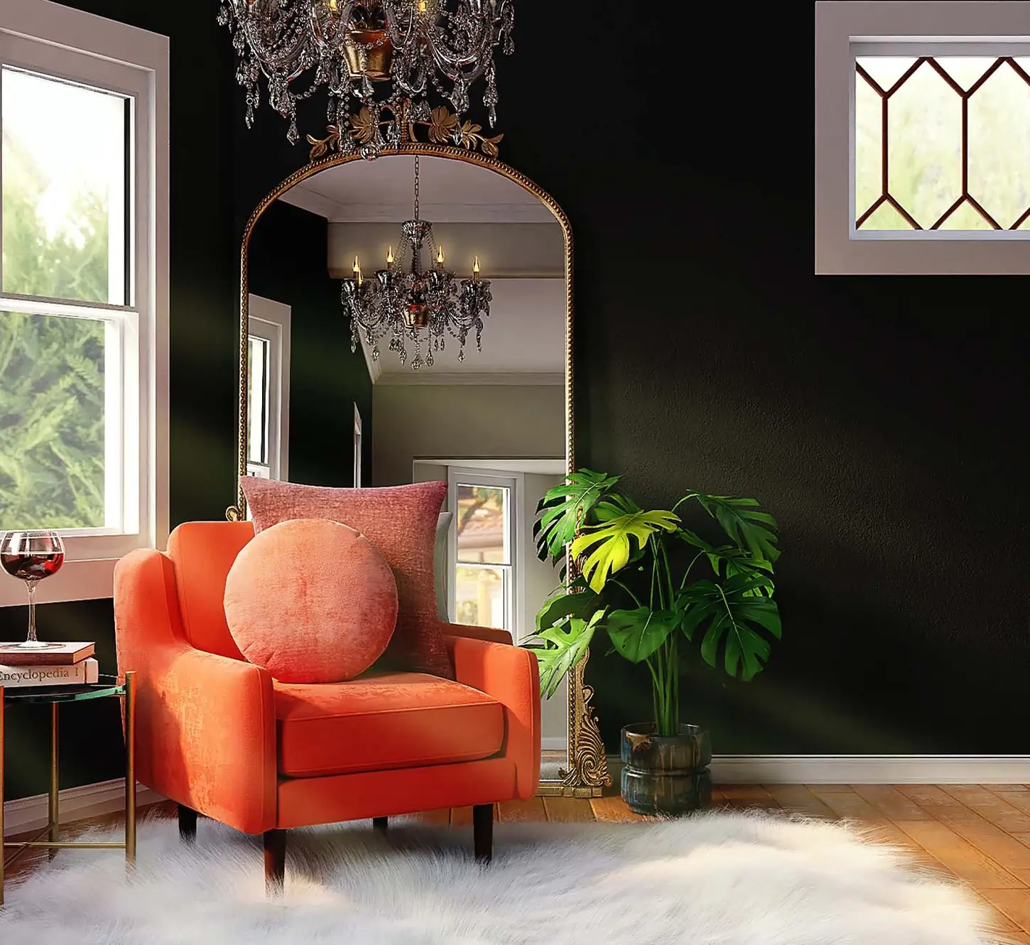
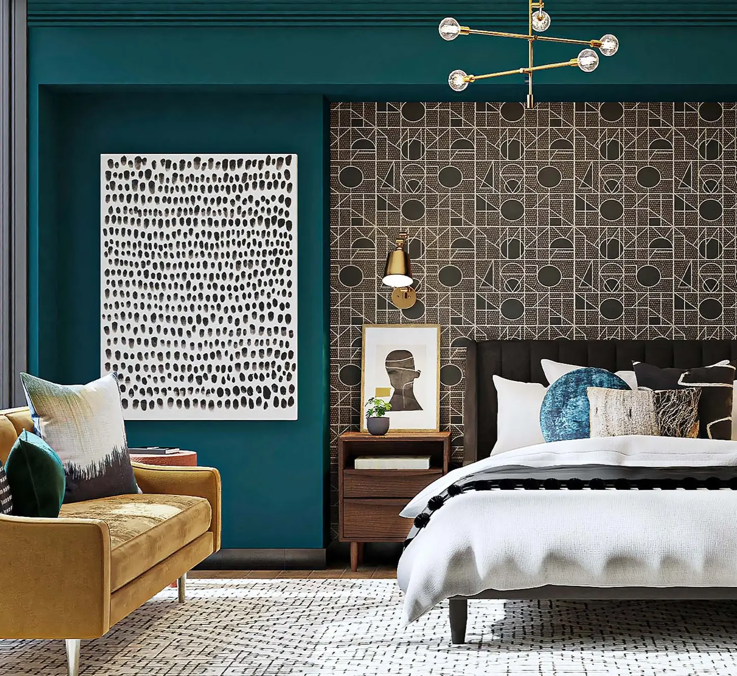
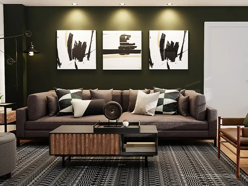
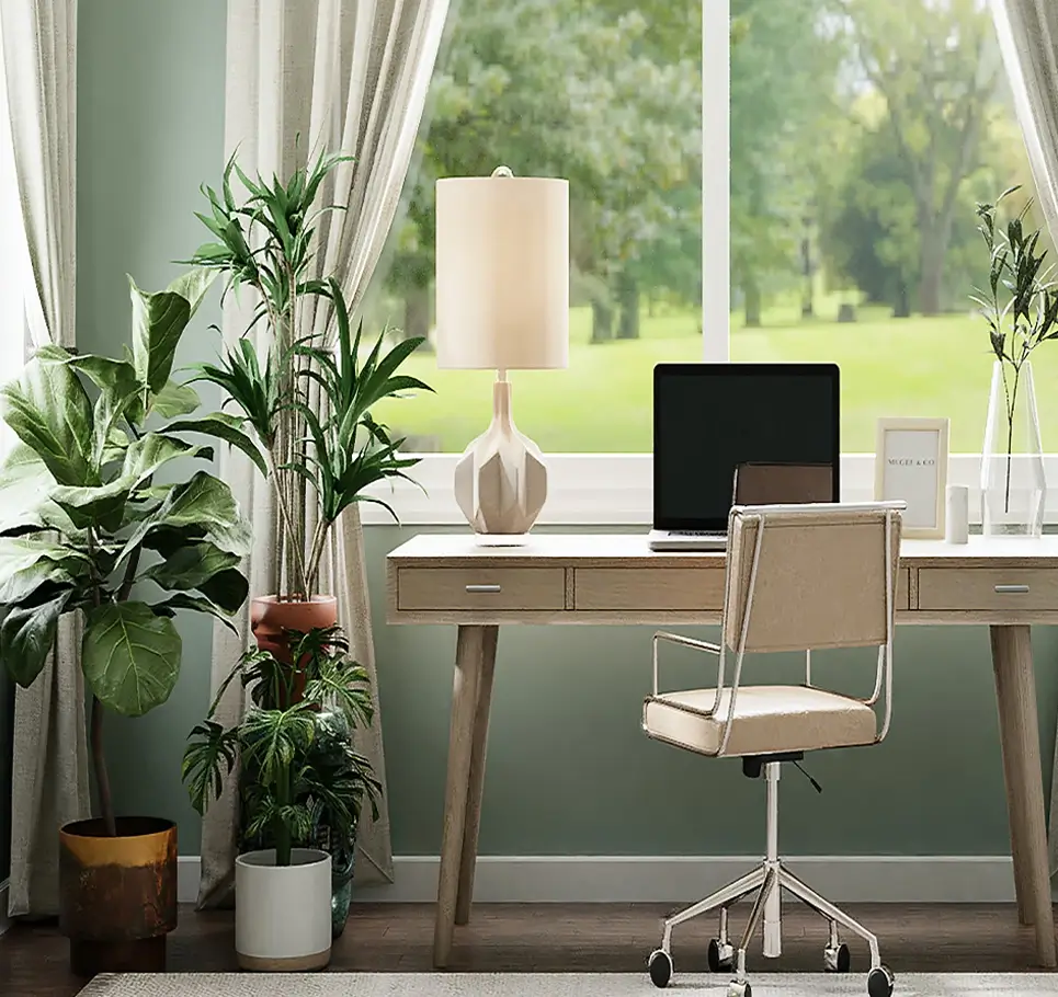
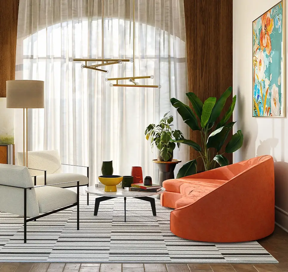
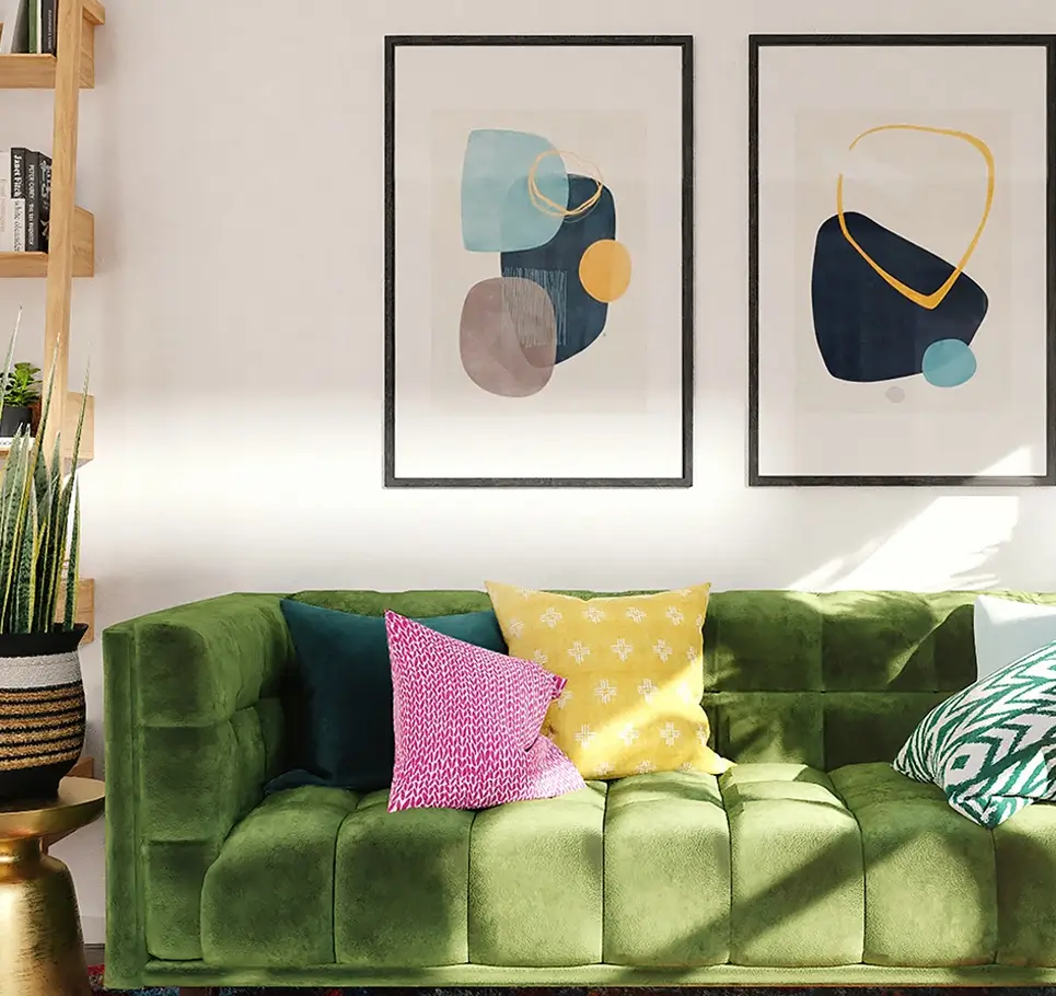
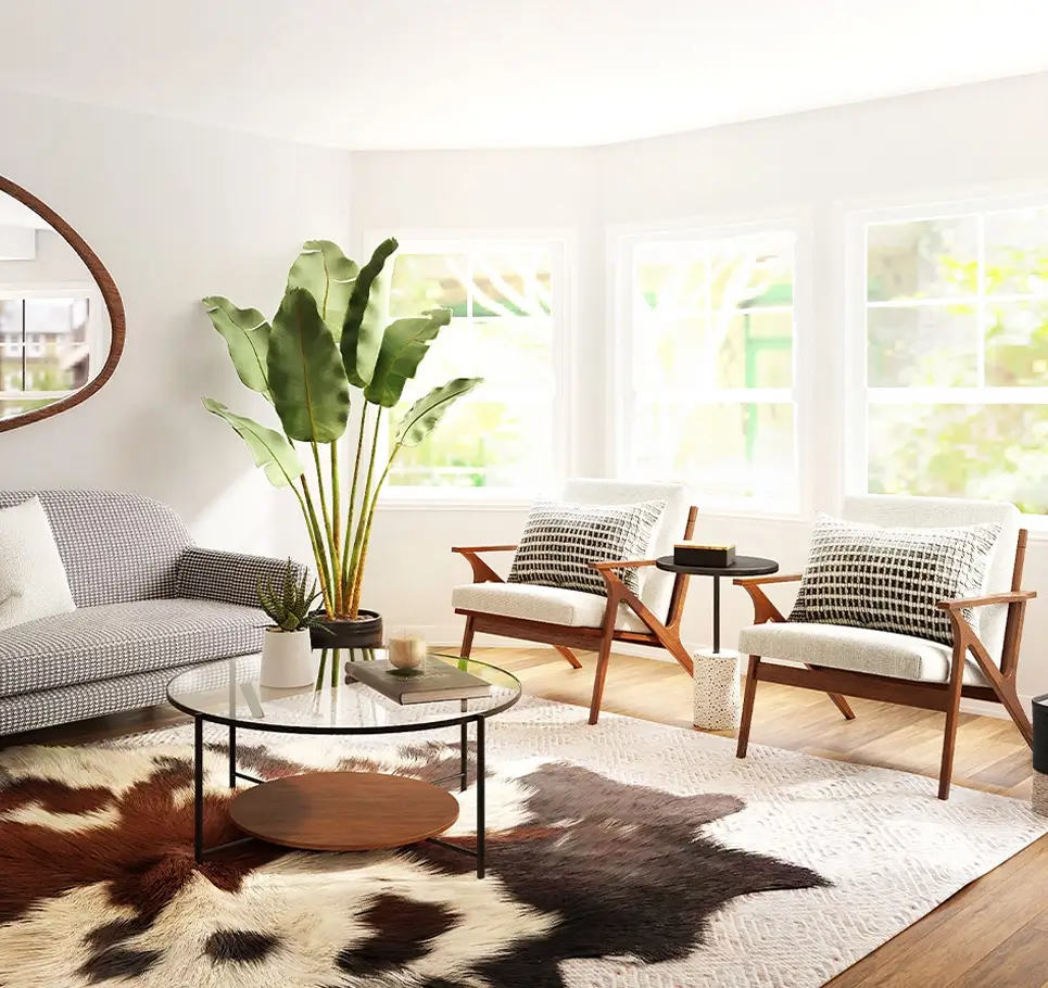
The hero section of this MaxiBlocks WordPress homepage design template features two striking images side by side. One image displays a modern, vibrant living area adorned with rich colours and textures, while the other shows a sophisticated, elegant bedroom. The two split-screen headlines, “Transform your space” and “Expert interior design,” capture attention immediately and effectively communicate your value. This visually engaging setup invites visitors to explore the depth and breadth of your design capabilities.
Customisation tips for the hero section:
- Replace the images: with ones from your most iconic projects to personalise the message.
- Adjust the headline: to reflect your brand’s message, like “Redefining Comfort and Style.”
- Add a video: instead of static images to create an engaging experience.
- Use a transparent overlay: to make the text pop more against the images.
- Experiment with different colour gradients: to add depth.
- Incorporate your logo: subtly for brand consistency.
- Change the font: to reflect your branding—whether it’s playful, elegant, or modern.
- Add animation effects: for a dynamic feel.
- Include a secondary message: below the headline for more context.
- Adjust the call-to-action (CTA) button text: such as “Explore our designs” to make it more engaging.
About section: unique designs that reflect your style
This section introduces your studio with a headline like, “Our designs are as unique as you, reflecting your style.” It’s complemented by a high-quality image of an interior space that embodies your design philosophy.
Customisation tips for the about section:
- Replace the featured image: with a recent project that best represents your brand.
- Rewrite the text: to highlight your experience, awards, or accolades.
- Add a decorative border: around the image for more visual interest.
- Include a short video: to introduce your design process.
- Use icons: from the WordPress icon library to visually represent key points.
- Change the text alignment: to give a fresh layout.
- Experiment with different typography:
- Add a subtle background pattern: to add dimension.
- Add a link to your portfolio: using a MaxiBlocks pattern template.
- Include testimonials: for added credibility.
Gallery section: our favourite projects
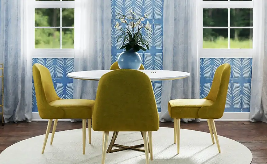
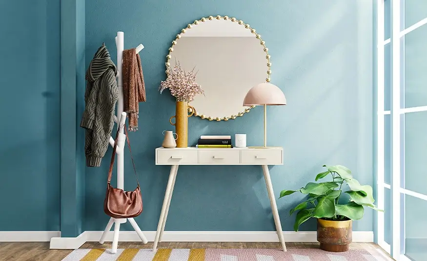
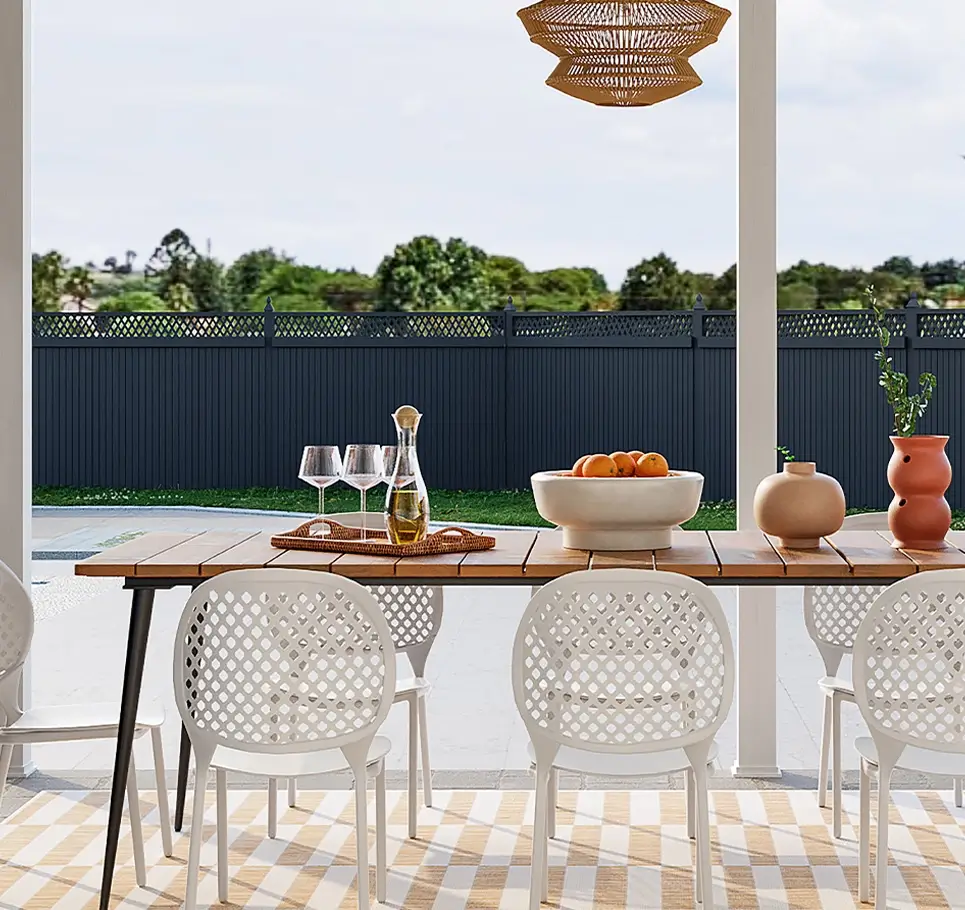
The gallery showcases completed projects, each image labelled with project names like “Evolve Wonder,” “Inspire the Look,” and “Quietly Brilliant.” This is perfect for giving a visual snapshot of your design capabilities.
Customisation tips for the gallery section:
- Replace gallery images: with high-resolution shots from your latest projects.
- Add project descriptions: underneath each image.
- Use a carousel format: to make it more interactive.
- Include hover-over effects: to provide more details about each project.
- Change the background colour: to make the images stand out.
- Add client feedback: about each project.
- Use buttons for “Learn More” links: to individual project pages.
- Incorporate subtle animations: to create an engaging user experience.
- Tag images by project type: for easy filtering.
- Add decorative frames: for an extra touch of design flair.
Why work with us section
This section details why clients should choose your studio, providing reasons such as “We delight,” “We care,” and “We inspire.” The reasons are displayed in neat blocks with brief supporting texts.
Customisation tips for the why work with us section:
- Add icons: to visually represent each reason.
- Customise the text: to include customer testimonials.
- Use different coloured backgrounds: to make each block distinct.
- Add animations: to reveal each reason upon scrolling.
- Link each reason: to relevant pages, like “Our Process” or “Our Team.”
- Experiment with different font sizes and styles:
- Add a CTA button below each reason:
- Use a video: to provide a walkthrough of your work.
- Include decorative illustrations: that relate to each point.
- Change the layout: to a two-column grid to create balance.
Team section: creativity meets professionalism
This section showcases team members with photos and descriptions. The images are arranged in a grid format, allowing potential clients to see who they will be working with.
Customisation tips for the team section:
- Use current photos: of your team members.
- Add short bios: to introduce each person.
- Include links: to social media profiles.
- Add hover-over effects: to reveal fun facts about each team member.
- Change image borders: to match your brand style.
- Experiment with different layout formats: like a carousel.
- Add animations: that bring the images to life.
- Use a consistent background colour: for uniformity.
- Include a CTA: that directs users to a “Meet the Team” page.
- Add a group shot: of the entire team for a personal touch.
Contact section: let’s create something extraordinary
This section contains a simple, focused message that encourages potential clients to get in touch, with a prominent CTA button like “Enquire.”
Customisation tips for the contact section:
- Change the CTA button: to “Get in touch today” for urgency.
- Add social media icons: for alternative ways to connect.
- Include a small contact form: directly on this section.
- Add a background image: that matches your design style.
- Include a tagline: above the button to add context.
- Use animated icons: for visual interest.
- Add a map: for physical locations.
- Customise the CTA colours: to stand out.
- Link to relevant pages: like “FAQs” or “Pricing.”
- Experiment with layout changes: such as positioning the CTA on the side for visual variety.
Footer section
The footer features links to different sections of your site, social media icons, and contact information, all neatly arranged in a grid format.
Customisation tips for the footer section:
- Include a subscription form: for your newsletter.
- Update footer links: to make them more relevant to your audience.
- Add social media links: with custom icons from the WordPress icon library.
- Use a different colour: for the footer background to make it distinct.
- Include a short description: of your studio.
- Add a logo: to maintain brand consistency.
- Use decorative borders or dividers: to separate sections.
- Add a “Back to Top” button: for easy navigation.
- Include testimonials or awards: to build trust.
- Add a copyright statement: to make the footer look complete.
Different types of websites that can use this WordPress homepage template
This interior design homepage template is perfect for a variety of businesses beyond interior design studios. Here are some examples:
Interior Design Studios: Showcase completed projects and highlight your services to attract potential clients.
- Use case: Replace images with work portfolios and add client testimonials to build credibility. This approach demonstrates your expertise and the satisfaction of past clients, enhancing trust with prospective customers.
Architecture Firms: Highlight architectural projects, show the design process, and provide project details.
- Use case: Add project renderings and images of finished buildings to attract customers interested in unique architecture. Use gallery layouts to effectively present your architectural prowess and design philosophy.
Home Décor Stores: Present products styled in various spaces to entice customers.
- Use case: Link product pages directly from gallery images, allowing customers to purchase items they see. This seamless shopping experience can significantly enhance customer engagement and sales conversions.
Get started with your WordPress design
Using this template, you can easily create a stunning website for your business. With the help of MaxiBlocks pattern templates and Gutenberg blocks, you can make it truly unique to your brand, showcasing your style and creativity.
If you’re new to WordPress, check out our getting started guide to help you take the first steps towards an outstanding website that reflects your design talent.
