



Build WordPress sites with MaxiBlocks. All features free forever. No locked functionality. Optional Cloud Library saves you 10+ hours per project. Start free


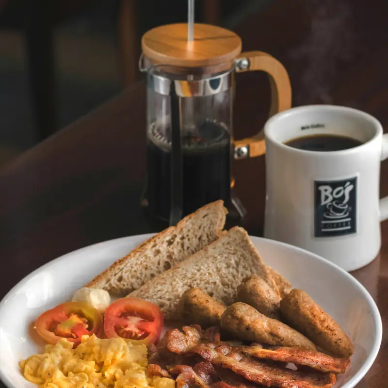
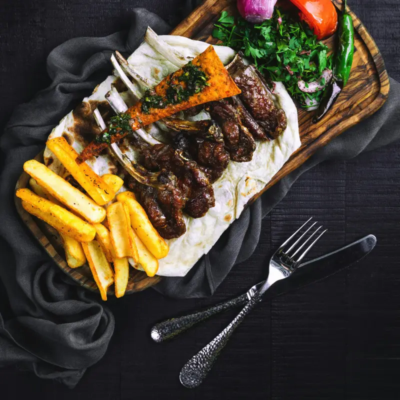
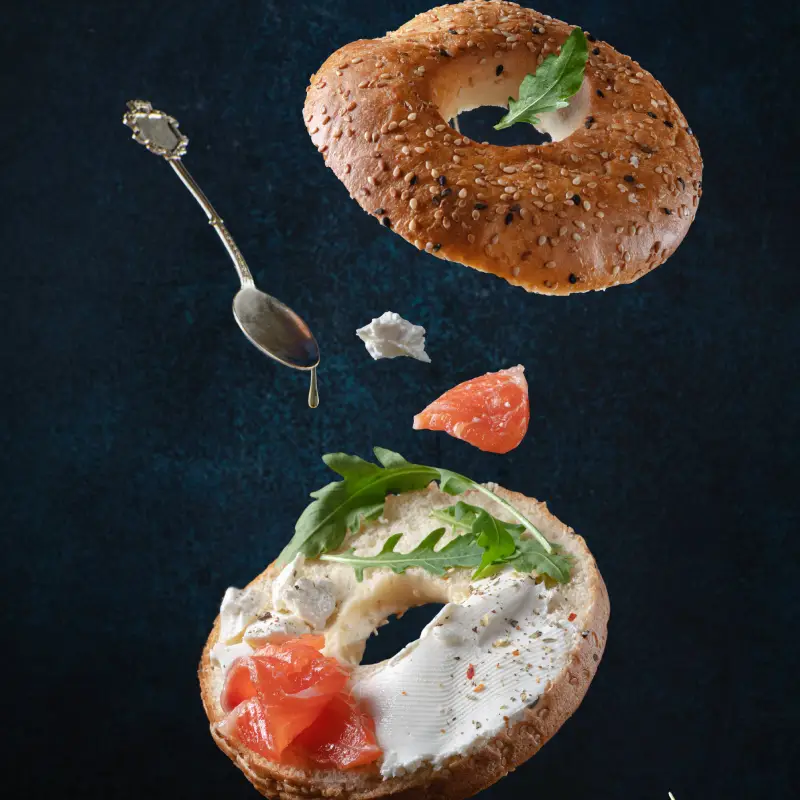
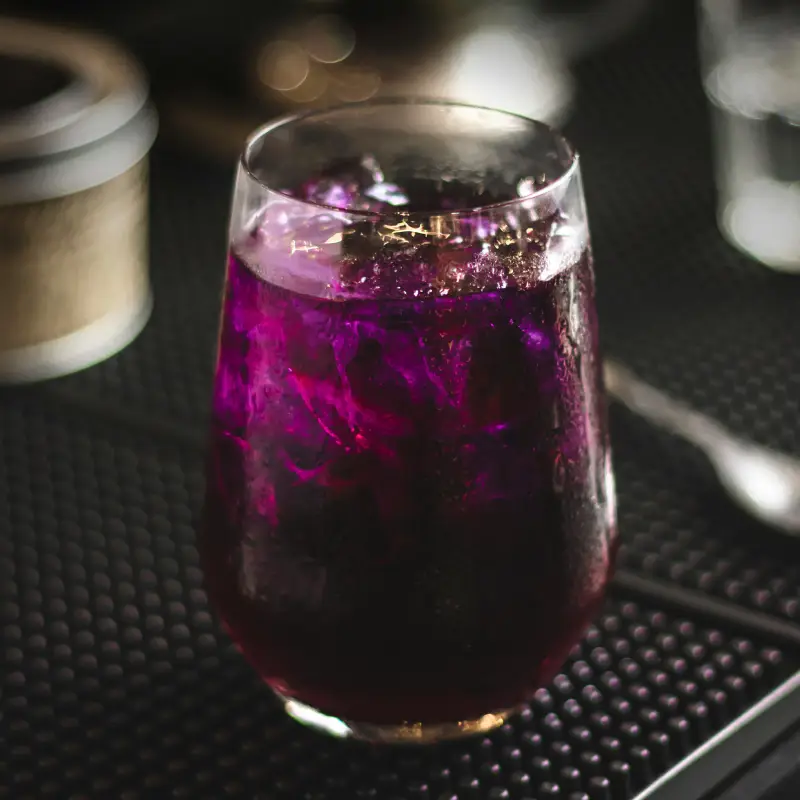
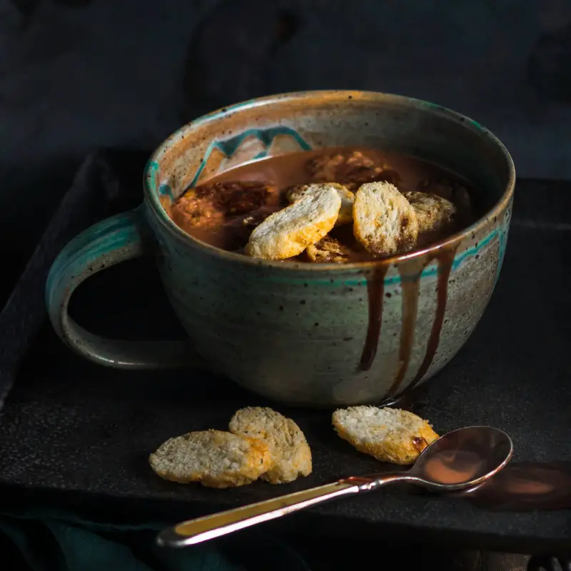
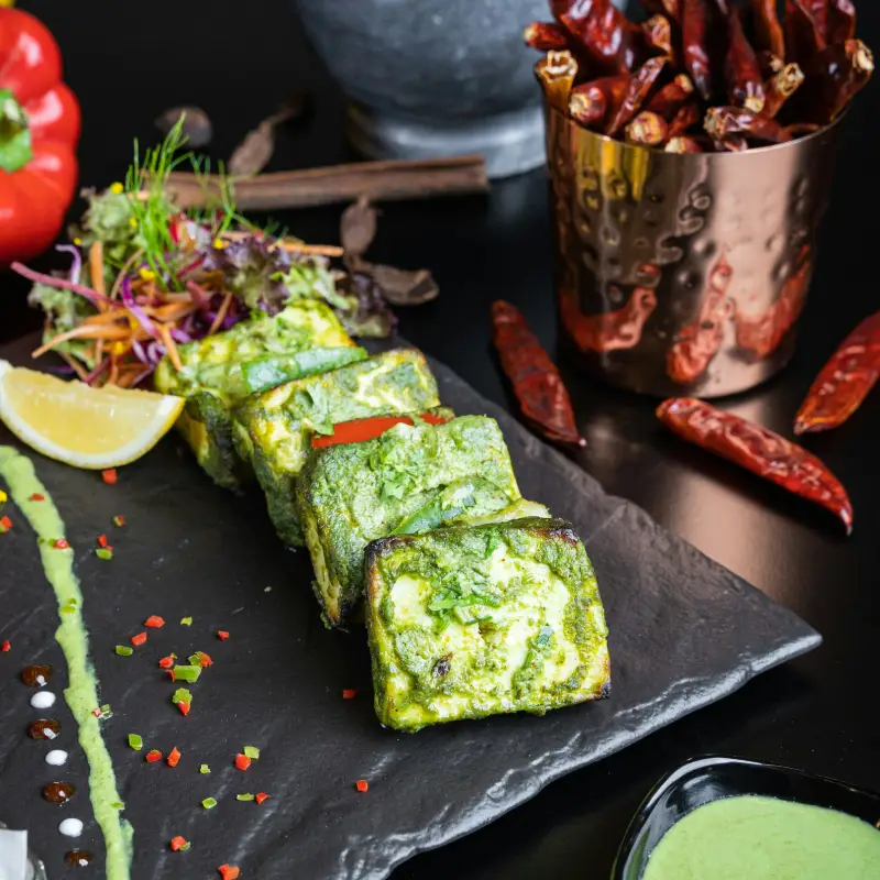
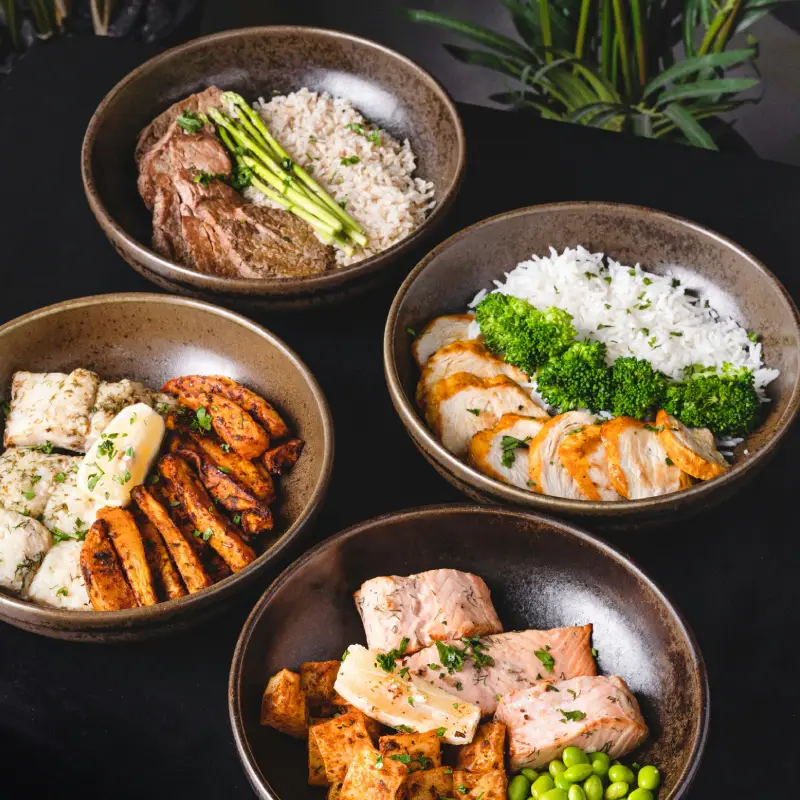
Picture a stunning presentation of your culinary creations on your WordPress website. Our detailed image analysis layout features a modern, visually appealing multi-column grid format. This design beautifully displays a curated selection of food and drink images, making it a delightful visual treat for your visitors. The three-row, three-column layout holds nine high-quality sections that promise to whet your audience’s appetite.
Improve your restaurant’s online presence with this grid layout, showcasing a variety of dishes in a contemporary style. Such website design in WordPress not only enhances customer appetite but also adds an aesthetic appeal to your menu displays. By focusing on the visual charm of your meals, it highlights quality, inviting patrons to explore more.
For food bloggers, this showcase grid is a powerful tool for presenting diverse recipes in one visually captivating view. By using picturesque imagery, bloggers can fully engage readers, emphasising culinary skill and creativity. Applying aesthetic consistency via templates or themes, bloggers enhance the website’s professional look, potentially increasing blog traffic and engagement.
If you’re hosting an online culinary art gallery, this grid layout offers a museum-like feel, making it a great way to showcase gourmet creations or intricate baking designs. Its website pattern can become an artwork itself, helping artists get the attention they seek while delivering a sophisticated visual experience for online visitors.
Caterers can benefit immensely from this grid by displaying versatile menu options for weddings, parties, and corporate events. Such a WordPress website builder feature can allure potential clients, showcasing both diversity and professional presentation skills crucial for attraction.
Organise your contest entries with an engaging grid to let judges and viewers enjoy a seamless viewing experience of all submissions. Highlighting key dish elements amid an array of bold colours, this modern grid helps in fair comparison and can propel your event’s appeal without any interactive clutter adding confusion.
For aspiring authors, turning an organised and beautifully designed grid into a digital cookbook increases user interaction and readership. Pages filled with WordPress block themes resonate, making it easier for gourmet explorers to navigate through recipes.
Market fresh produce with vibrant, high-resolution images arranged in an eye-catching fashion. This strategy could significantly boost your stall’s digital footprint by highlighting its unique selling points-the quality and diversity of produce available-which ultimately entice customers online and offline.
Appeal to culinary tourists with well-shot images of exotic dishes from around the world. Employing a drag and drop website builder open source strategy may help tour operators engage aficionados of global foods, showcasing thrilling edible adventures.
Educational institutes can leverage this grid layout to display course specialties, exhibiting student work as part of reflecting course success. These elements help establish trust, showing potential students and parents the vibrant educational experiences and practical learning outcomes achieved within culinary programs.
Professional photographers specializing in food can display their works with this luxurious grid, emphasizing sharp, intricate details highlighting their skillset, making it easier for prospective clients to gauge their expertise. WordPress icons could further integrate into the design skin.
The homepage is often a visitor’s first impression. By integrating image grid layouts, a website design can draw immediate attention, providing an engaging preview of what’s inside, keeping visitors curious to explore more.
Implement grids in gallery pages to present stunning collections, where each image showcases distinct art, crafts, or photography projects. Enhanced to flow seamlessly in a WordPress website builder, these galleries exhibit talents in a sophisticated and contemporary manner.
When selling goods online, cohesive image display can make product pages stand out using well-arranged visual grids. Not only do such designs make shopping simpler and more attractive, but they ensure uniformity throughout the shop display.
Personal portfolios prepared using WordPress grid layouts can illuminate your skills effectively. Whether artist, designer, or developer, this visual showcase draws potential clients’ interest through powerful photographic narratives with professional navigation menus for easy access.
Empathize with clients’ journeys by placing snapshots and lengthy texts side-by-side. Arranged either linearly or asymmetrically, such testimonies highlight authenticity – to boost credibility in business or professional ventures instantly.
Feature memorable posts using thumbnail images tiled neatly across the page, unlocking fascinating stories within milliseconds. Moreover, linking blog archive pages with block templates improves accessibility and interaction from readers.
For tutors, create interactive course materials in easy-to-browse formats where images become essential aids, organizing lessons with appealing consistency. Utilising open-source builders, this technique serves as potent motivation for enduring engagement.
If you provide multifaceted services, using a showcased grid can elaborate capabilities, highlighting flexibility and adaptability of business deliverables thourgh visuals. By employing aesthetic tools such as Elementor Alternatives, these pillars serve to involve viewers further.
Utilise a cleanly structured grid to break down in-depth case studies, featuring detailed images throughout each progression stage. This platform showcases completed tasks, allowing stakeholders to appreciate from start to finish how the challenges were solved.
Curated as a complete digital rendition of physical exhibitions, these pages put gallery visitors into your space virtually. By incorporating WordPress block templates, it efficiently showcases artist biography, work synopsis, and exhibition video compliments.
The captivating food showcase grid is perfect for WordPress website design. With its modern look and focus on high-quality imagery, this grid layout deliciously serves up your food and beverage offerings with an impressive visual edge. Whether you’re running a foodblog, a restaurant, or exploring another exciting application, this layout effectively elevates your site, enticing visitors effortlessly.
