Case study
Lorem ipsum dolor sit amet, consectetuer adipiscing elit. Donec odio. Quisque volutpat mattis com eros.
Lorem ipsum dolor sit amet, consectetuer adipiscing elit. Lorem ipsum dolor sit amet, consectetuer adipiscing elit.

Build WordPress sites with MaxiBlocks. All features free forever. No locked functionality. Optional Cloud Library saves you 10+ hours per project. Start free

Lorem ipsum dolor sit amet, consectetuer adipiscing elit. Lorem ipsum dolor sit amet, consectetuer adipiscing elit.
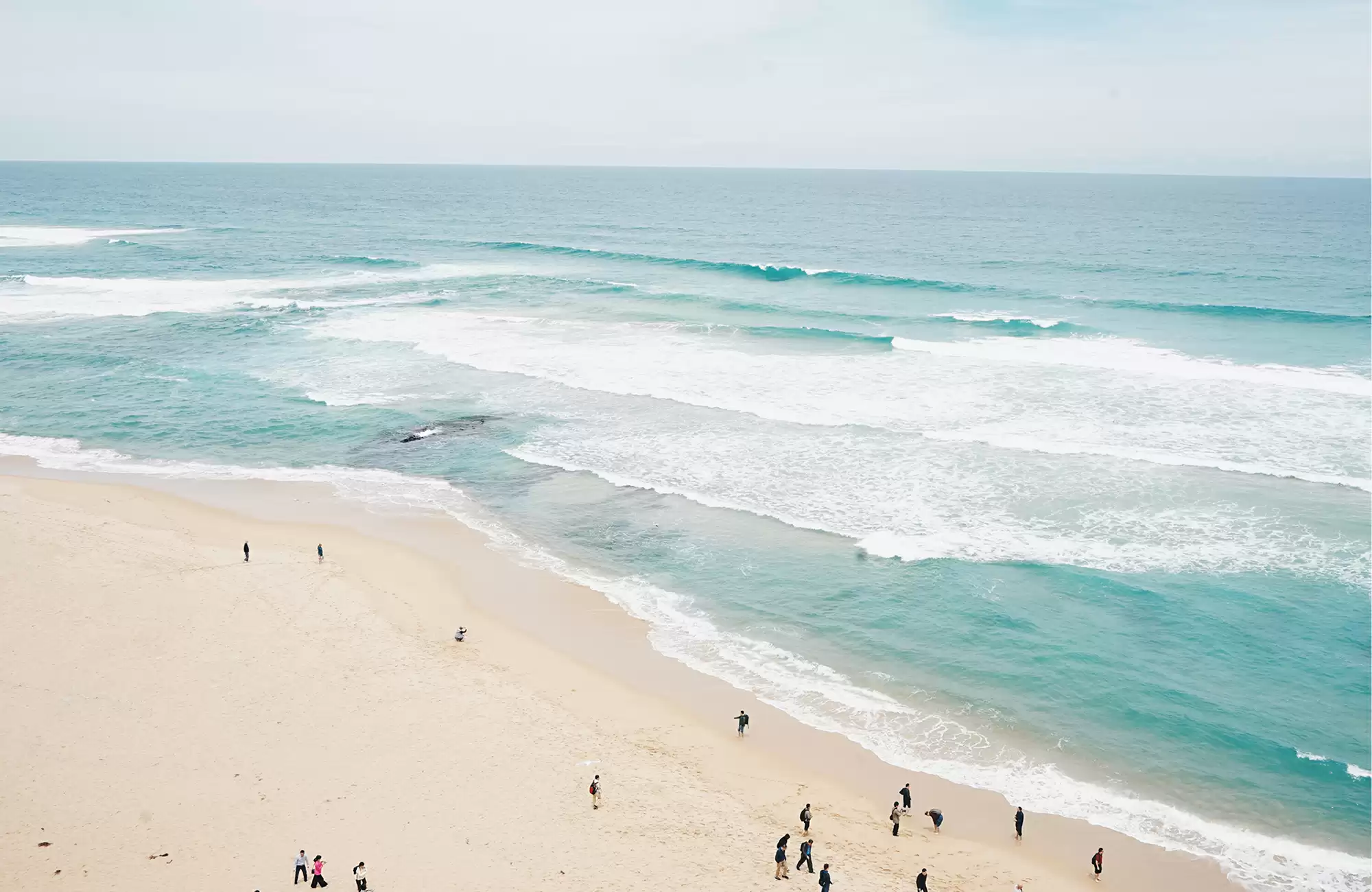
Imagine a design that blends visuals and text seamlessly, captivating visitors at first glance. This stunning layout features a large, landscape-format image of a beach on the left, drawing attention with vibrant beauty. On the right, concise and engaging textual content complements the imagery, inviting users to delve deeper into your message.
This layout adopts a multi-column design, perfect for presenting captivating visuals alongside informative text. The combination creates an aesthetically pleasing balance that is both engaging and functional.
It consists of a single horizontal row split into two vertical sections: a visual-rich two-thirds space for the image paired with a one-third text section. This arrangement creates a harmonious balance that efficiently communicates your message.
By emphasizing visual storytelling with bold imagery and strategically positioning the call-to-action button, this layout offers an engaging asymmetry that makes your content stand out.
The prominent button encourages engagement, suggesting a deeper connection with your content.
Modern and clean typography enhances readability, with size variations that emphasize the header and supporting text.
The focus remains on the button and your rich content, keeping distractions to a minimum.
The landscape orientation of the image creates a beautiful setting that smoothly integrates into the overall design.
The combination of a striking image with targeted text ensures that your audience’s attention is captured right away, making it an effective marketing tool.
While the design is clean and straightforward, consider adding subtle hover effects for enhanced interaction when the button is engaged.
The layout is built to respond well across devices, ensuring an optimal experience for users on desktops and mobile phones alike.
With a clear call to action and straightforward content presentation, this design supports accessibility needs, making your site more inviting for all users.
This layout embodies a modern and minimalistic approach, featuring clean lines and an uncluttered aesthetic that draws users in.
The design skillfully guides the eye from the stunning image to the engaging header, through descriptive content, and finally to the call-to-action button.
Thoughtful use of white space creates breathing room around your content, enhancing clarity and focus without overwhelming your visitors.
Organising your content with categories and tags ensures that your audience can easily find relevant information. Categories provide a broad grouping of your posts, while tags allow for more specific labeling, enhancing searchability and user experience.
Custom post types expand the default WordPress settings, allowing you to create content beyond standard posts and pages. This flexibility helps structure your content in a way that fits your website’s unique needs.
Pages are ideal for content that doesn’t change regularly, such as your contact or about pages. Subpages can nest related information under main pages, creating a structured hierarchy of content.
If managing multiple sites, WordPress multisite allows you to run several sites from a single installation. It’s perfect for a network of related blogs or sites under one roof, ensuring consistency and ease of management.
A dedicated landing page focuses user attention on specific calls to action, guiding visitors through the journey you intend. It’s an effective way to drive conversions and emphasize particular content or offers.
Archives organise your previously published posts by date, making browsing past entries easy for your audience. They offer a chronological way to sift through your work and can be automatically handled by WordPress.
Menus create clear navigation paths for visitors, helping them find the content they seek quickly. Meta-navigation, dropdowns, and sticky menus improve usability and engagement, guiding users through your site smoothly.
Widgets offer small yet effective means to display information in sidebars or other dedicated areas. They can include anything from recent posts, popular content to search bars, enhancing the user’s browsing experience.
Gutenberg blocks immerse you in content creation by allowing you to build complex designs with simplicity. This modular approach lets you drag and drop elements, inspiring creativity and ease.
An editorial calendar helps schedule and organize your content strategy efficiently. It provides a visual outline of what’s published and what needs to be prepared, ensuring timely and consistent posting.
Blog posts are the backbone of [WordPress websites](https://maxiblocks.com/wordpress-websites/), providing users with regular updates, stories, and insights. They form a key part of engaging audiences, encouraging interaction and discussion.
Static pages deliver essential information that doesn’t change frequently. Often, they host key site content like ‘About Us’ or ‘Contact’, offering timeless value that complements your [WordPress website design](https://maxiblocks.com/wordpress-websites/what-is-wordpress/wordpress-website-design/).
Portfolios showcase projects or works in an organized manner. This content type is perfect for creatives, allowing you to highlight your work and achievements effectively on your [WordPress website](https://maxiblocks.com/wordpress-websites/).
Testimonials build credibility and trust. Feature customer feedback prominently to showcase real experiences and the positive impact your products or services deliver, enhancing buyer confidence.
For e-commerce sites, product pages are critical. They display detailed information, images, and purchasing options for your offerings, serving as the final step in converting traffic into sales.
Designed for persuasion, landing pages focus on converting visitors into leads or customers. They direct attention to specific calls to action, bolstering marketing efforts with a targeted approach.
FAQs resolve common inquiries, reducing friction and helping users find answers quickly. This content type enhances user experience by offering immediate solutions and aids in search optimisation.
Event posts help inform your audience about upcoming occasions or promotions. They integrate calendar functionality, providing details and updates to keep participants engaged and informed.
Case studies provide detailed explorations of your accomplishments and methodologies. These stories of success convincingly establish your expertise and demonstrate the effectiveness of your solutions.
Regular news updates keep your audience informed about your business activities or industry developments. They promote transparency and reinforce your authority within your field.
This modern, minimalistic design not only looks fantastic but also effectively engages your audience. With its thoughtful structure and compelling visual storytelling, you can make your [WordPress website](https://maxiblocks.com/wordpress-websites/) not just a destination, but a captivating experience. Ready to transform your online presence? This layout is your perfect starting point. Explore [WordPress website design](https://maxiblocks.com/wordpress-websites/what-is-wordpress/wordpress-website-design/) today and elevate your web presence effortlessly!
