Discover a modern food layout design
Experience a visually striking multi-column layout that captures the essence of your culinary offerings! This design features a central text area complemented by a grid of enticing food images, making it perfect for food enthusiasts or any establishment looking to showcase their menu in style.
Design Overview
- Overall Structure: The layout is elegantly organised into a primary text section alongside a captivating grid of images that draw attention and spark interest.
- Arrangement of Rows and Columns: It boasts two distinct rows; first with a bold header and a descriptive text block on the left, followed by four mouth-watering food images in a grid to the right.
- Asymmetrical Choices: With a significant text block occupying the left side, this asymmetrical design creates a compelling visual contrast with the image grid, making your content stand out.
Element and Feature Description
- Visible Elements:
- Headers: A striking header reading “Devilishly good!” grabs immediate attention with its large, bold font.
- Text Blocks: Informative supporting text offers a brief but engaging description of your establishment.
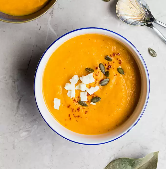
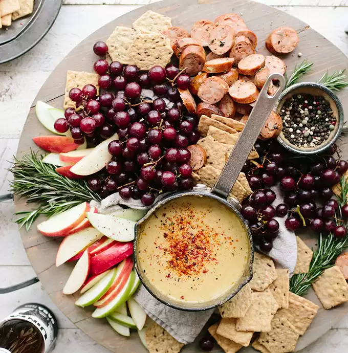
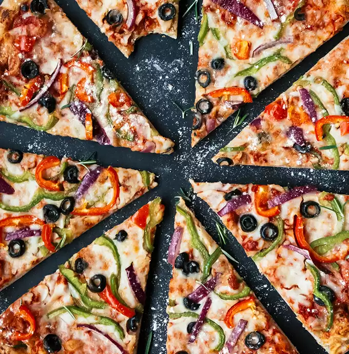
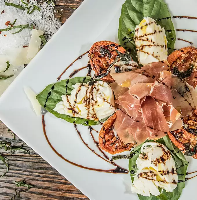
- Images: A grid of four food-related images showcases delectable dishes, arranged in an eye-catching two-by-two format.
- Interactive Elements: Although not displayed, there’s potential for including buttons or links for enhanced engagement.
- Typography:
- Font Styles: The header features a bold, sans-serif font, while the body incorporates a clean, regular sans-serif style.
- Sizes: The striking header size effectively elevates its prominence above the body text.
- Icons/Graphical Elements: The design focuses on functional graphical representations of food, ensuring the imagery takes centre stage.
- Image Borders/Rounding: Subtle borders accentuate the images, adding a polished touch to the grid layout.
- Image Orientations: The images predominantly lean towards landscape orientation, enhancing visual appeal.
- Overlays/Shadows: The layout maintains a clean look with no visible overlays or shadow effects.
Unique Design Aspects
- Standout Design Choices: Bold typography in the header, paired with minimalist body text, creates a striking visual impact that keeps visitors engaged.
- Hover Effects/Animations: Currently static, the design leaves room for dynamic hover effects or animations to further engage users.
- Responsive Design Elements: This layout flexibly adapts to various screen sizes, ensuring a seamless user experience across devices.
- Accessibility Considerations: The clear contrast in text sizes and styles enhances readability. Incorporating specific accessibility features could further improve user experience.
Overall Design Style
- Design Style: This layout embodies a modern and playful aesthetic centred around food imagery, perfect for engaging food lovers.
- Visual Hierarchy: The large header demands attention first, followed by informative text and tantalising images, guiding users’ viewing journey from left to right.
- Use of White Space: Thoughtful use of white space around text and images lends a clean, uncluttered look, allowing each element to shine.
10 ways to organise content in WordPress
1. Categories and Tags
Use categories and tags to group related content in your WordPress website builder. Categories offer a broad grouping, while tags offer a more specific organisation. This method helps users find related content easily and improves your site’s navigation.
2. Custom Post Types
Create custom post types to handle specific types of content such as portfolios or testimonials, distinct from the regular post and page structures. This enhances content organisation and presentation, making it more tailored to your website’s needs.
3. Menus and Submenus
Utilise WordPress’s menu feature to organise content into neat navigation structures. Adding submenus can further enhance user experience by making it intuitive to navigate related content, as described in WordPress navigation menus.
4. Page Builders
Implement page builders to create custom layouts that showcase your content intelligently. Alternatives to Elementor like those in the Elementor Alternatives are worth exploring for a customised content structure.
5. Widgets and Sidebars
Enhance content organisation by using widgets in sidebars. They allow you to display a diverse range of content, including recent posts, popular posts, and social media links, providing a comprehensive content overview to site visitors.
6. Sticky and Featured Posts
Highlight important articles by using sticky posts or marking them as featured. This approach ensures key content remains accessible and omnipresent in your content feed, grabbing user attention right away.
7. Gutenberg Blocks
Leverage the power of Gutenberg blocks to modularly organise content. Each block in this Gutenberg environment represents a specific content element, from text to multimedia, enhancing the overall structure.
8. Archive Pages
Create dedicated archive pages to house past content efficiently. This method aids in preserving older content in an organised manner, while still making it accessible for users seeking archived material.
9. Taxonomies
Implement custom taxonomies for advanced content classification. This feature enables a nuanced arrangement of content into groups beyond standard categories and tags, perfect for complex content websites.
10. Content Filters
Incorporate content filters to allow users to sort and find information by specific criteria easily. Filters integrate smoothly into your WordPress website, offering a streamlined navigation experience, particularly for sites with extensive content.
10 different types of content in WordPress
1. Blog Posts
Blog posts are the heart of many free WordPress themes and sites, providing a platform for sharing news, insights, and stories. They are typically arranged in reverse chronological order, keeping the content fresh and up-to-date.
2. Pages
Pages are a staple in structuring a WordPress site, offering static content like about us, contact, or services pages. They form the backbone of your site’s navigation by providing essential information and context to site visitors.
3. Galleries
Galleries enable you to showcase images in a visually appealing format. Whether for a portfolio or a photo album, galleries enhance user engagement by providing a more immersive content experience.
4. Videos
Integrating videos into your WordPress site can dramatically enhance content engagement. Videos can be embedded from platforms like YouTube or Vimeo, or uploaded directly, serving as dynamic elements that enrich user interaction.
5. Podcasts
Podcasts are increasingly popular, allowing content creators to reach audiences through auditory means. WordPress supports embedding audio players, making it seamless to integrate podcast episodes into posts or pages.
6. Testimonials
Testimonials provide social proof, enhancing credibility and trust in your WordPress website design. Featuring real customer feedback prominently can persuade potential customers to engage with your business.
7. E-commerce Products
For businesses, showcasing products effectively is crucial. WordPress offers robust e-commerce solutions, such as WooCommerce, enabling the creation and management of product listings, complete with descriptions, pricing, and purchase options.
8. Events
Highlight upcoming events with specialised plugins or tools within WordPress. These allow detailed event listings, including dates, venues, and ticket links, ensuring attendees have all the information they need at their fingertips.
9. Tutorials
Tutorials serve as educational resources, guiding users through processes or tasks. WordPress empowers creators to craft rich, multimedia tutorials that blend text, images, and video in a cohesive learning experience.
10. Portfolios
Portfolios are essential for creatives wishing to display their work and accomplishments. Using dedicated portfolio plugins or WordPress patterns and templates, you can craft an impressive showcase easily navigated by potential clients or employers.
Conclusion
The multi-column layout offers a modern, playful vibe that’s sure to captivate food lovers. With its bold typography and enticing food imagery, this design maximises visual interest while effectively communicating culinary offerings. Elevate your establishment’s online presence with a layout that promotes readability, engagement, and a feast for the eyes! Whether you’re starting with a WordPress website or enhancing an existing one, this design can help spotlight your menu in style.


