
WordPress themes: Blog Hero Dark BHOD-PRO-04
Build WordPress sites with MaxiBlocks. All features free forever. No locked functionality. Optional Cloud Library saves you 10+ hours per project. Start free

Transform Your Blog with a Stunning Hero Pattern
Imagine captivating your readers with a striking hero image that immediately draws them in. A well-designed WordPress website can feature a bold, full-width image as an inviting focal point, expertly paired with a clear and compelling title like “Maximising Productivity: Top 5 Tools Every Business Should Use.” With a modern design approach, this template not only engages but also delivers content effectively.
Layout highlights
- Overall structure: Embrace a sleek single-column format that showcases your content in a straightforward manner, stacking information vertically for easy reading.
- Row arrangement:
- The first row presents your blog title and essential metadata.
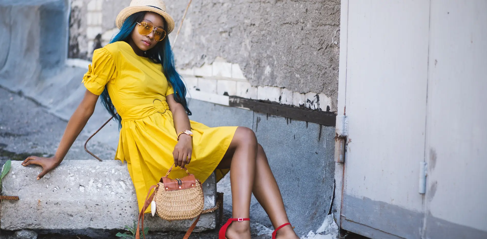
- The second row showcases a large, impactful image that enhances your message.
- Asymmetrical elements: The bold visual image occupies a significant width, creating striking contrast with the minimalist text above.
Key features
- Visible elements:
- Header: A prominent, centred title in a large, bold font that commands attention.
- Subheader/Metadata: Author name and date are provided in smaller fonts, maintaining a clean aesthetic.
- Image: A captivating full-width image of a person in a yellow dress adds a personal touch, inviting readers to connect.
- Typography:
- The title is designed for maximum impact with its large, bold font.
- Metadata supports readability without overshadowing the main content.
- Graphical focus: The image not only complements your post’s theme but also serves as a visual narrative that enhances engagement.
Unique design features
- Eye-catching design choices: The balance between a minimalist title section and a vibrant image below creates a strong visual hierarchy that retains reader attention.
- Responsive and accessible: The single-column design is adaptable to various screen sizes, ensuring a seamless experience for all users. Text legibility against a contrasting background enhances accessibility.
Design style overview
- Minimalistic and modern: This design prioritises content delivery while remaining visually appealing, making your blog feel contemporary and inviting.
- Intuitive navigation: The clear structure leads readers effortlessly from the title to the accompanying image.
- Balanced use of white space: Thoughtful spacing around elements prevents overcrowding, enhancing the overall readability and user experience.
Element insights for a WordPress hero pattern
1. Blog hero section basics
The hero section of a blog is the first visual element that readers see. It’s an opportunity to make a compelling impression. It includes the title, subtitle, a captivating image, and sometimes a brief description. Its role is to draw attention and entice visitors to explore further. A successful hero section combines engaging design and precise content.
2. Crafting a blog hero image
A blog hero image is a large, striking image positioned at the top of your post or page. It serves as a visual hook that encourages visitors to dive into the content. An effective hero image is not only visually appealing but also relevant to the topic. Consider high-quality images that align with your blog’s theme.
3. Designing the hero section
To design a standout hero section, focus on balance and simplicity. Use contrasting colours to make your text pop. Ensure the typography is bold yet readable. Integrate visual elements like graphics and icons that enhance the narrative. Keep in mind the importance of responsive design, so your hero section looks great on any device.
4. Understanding hero website design
Hero website design refers to a similar concept as a hero section but on a broader scale. It’s the design approach where the main image and its components dominate the web page, guiding the visitor’s attention to calls to action or key content areas. It’s about making a strong visual statement while keeping navigation straightforward.
5. Distinguishing landing page and hero page
A landing page is focused on guiding the visitor towards a specific action, like signing up. In contrast, a hero page serves as an introductory page with high visual impact, setting the tone for the rest of the site. While both are designed to engage, their objectives and content organisation differ significantly.
6. Optimal size for a hero image
Your hero image should be large enough to stretch full-width, with dimensions typically around 1920 pixels wide and 1080 pixels high. This ensures visual clarity across different devices, preserving quality without slow loading times. Remember to balance size with file optimisation to maintain a fast, responsive site.
7. Elements of a good hero image
A good hero image is high-quality, relevant to the content, and evokes emotion or curiosity. It’s essential to ensure that it is clear and does not distract from the content but rather enhances it. Paired with succinct text or a headline, it can significantly boost engagement.
8. Exploring hero image layout
Hero image layout involves positioning your title, text, and image to create an eye-catching composition. The aim is to lead the visitor’s eye naturally from the visual to the text. Asymmetrical layouts can add dynamic interest, but ensure navigational elements remain intuitive.
9. Creating a full-page hero image
To create a full-page hero image, ensure the image is of sufficient resolution to cover the screen without pixelation. Use CSS to set the image as a background, aiming for high-quality compression to avoid delay. This approach creates a strong visual impression, delivering your blog’s essence in a heartbeat.
10. How to write catchy blog titles: 12 tips and examples
Writing a catchy blog title is crucial. Here are 12 tips to make your titles pop: 1) Use numbers for listicles. 2) Keep it short and sweet. 3) Ask questions. 4) Use compelling adjectives. 5) Add a hint of urgency. 6) Be clear on the benefit. 7) Add power words. 8) Create curiosity. 9) Incorporate words with personal appeal. 10) Use testimonials or quotes. 11) Optimise for SEO by including keywords. 12) A/B test for effectiveness. Examples: “10 Easy Steps to Boost Your Productivity,” “Why Every Business Needs These Tools Today.”
Conclusion
Utilising a compelling WordPress hero pattern is a remarkable way to elevate your content presentation. By combining a striking image, clear typography, and modern layout, you create an engaging platform to showcase your ideas effectively. Enhance your WordPress website design and transform how your audience engages with your blog, ensuring an unforgettable experience!


