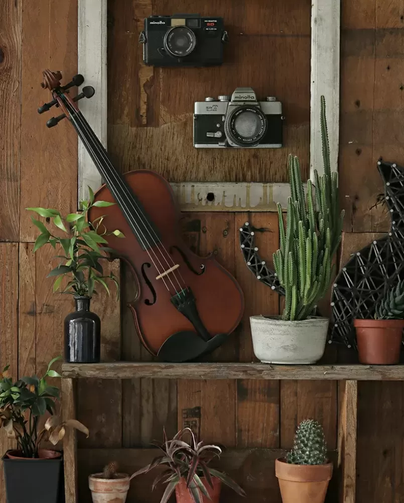
Life is good
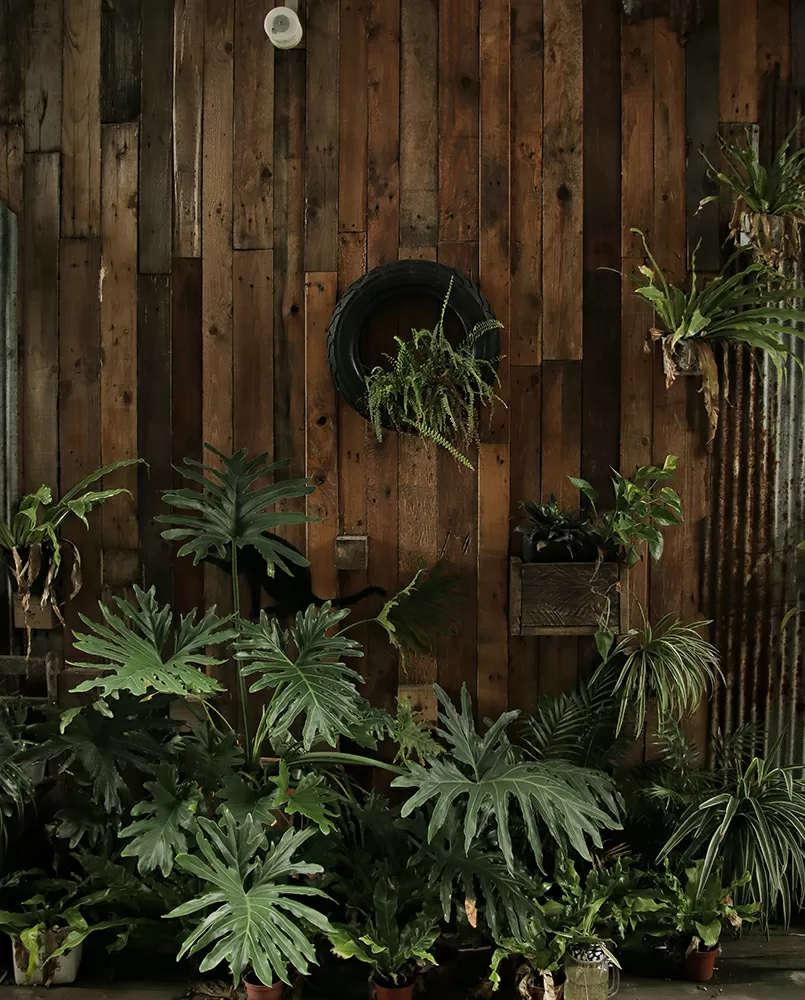
Keep on thinking

Build WordPress sites with MaxiBlocks. All features free forever. No locked functionality. Optional Cloud Library saves you 10+ hours per project. Start free


Enhance your WordPress website with our visually striking three-column layout. It’s designed to captivate and inspire, offering a unique assortment of natural imagery and impactful text that draws viewers in and delivers a clear message. Each column presents a different theme, giving your content fresh perspectives and engaging storytelling.
Experience a multi-column design that organises content into three distinct sections. Each one showcases a unique visual element, making your communication both thematic and clear.
This layout uses one row with three columns strategically, allowing for thematic differentiation and clarity.
Our design embraces asymmetry with each column boasting distinct imagery and text. This highlights each section’s individuality while creating an eye-catching design.
The layout is static but ready for future integration of interactive elements like buttons or forms.
Clean, modern sans-serif fonts enhance readability against a rich dark background, ensuring the visual impact.
The design focuses on striking imagery and text, reducing distractions from unnecessary icons.
The blend of natural visuals and a warm wooden aesthetic creates a welcoming atmosphere. The dark background makes images pop, enhancing visual appeal.
While there are no hover effects yet, the layout can seamlessly accommodate them for added interactivity.
The adaptable three-column arrangement ensures a friendly experience across devices.
With a high contrast between the dark background and light text, the design improves readability, making it accessible to a diverse audience.
The layout embodies a minimalist yet organic style-focusing on natural elements that evoke warmth and simplicity.
Images capture immediate attention followed by informative text, allowing intuitive content navigation.
Strategic use of negative space around the columns maintains a clean, balanced look, enhancing the user experience.
Photographers seeking a creative way to display their work will love this layout. Three columns allow for the presentation of different themes or photo series side by side. Pair each image with descriptive or thematic captions to enrich viewers’ understanding. The inclusion of varying image sizes adds depth and visual interest, making this an ideal choice for anyone looking to make their photography stand out.
Artists and designers can effectively display their portfolios with this layout. Each column can represent a distinct project or theme, with images at varied heights creating a dynamic visual experience. Accompany project visuals with short descriptions or insights, ensuring potential clients or collaborators understand the depth of your work. The minimalist design ensures the artwork itself remains the focal point.
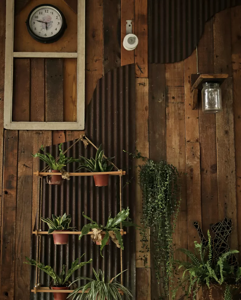
Lifestyle bloggers can organise content into thematic columns, each driving home messages such as “Healthy Living,” “Mindfulness,” or “Travel Adventures.” The imagery-including plants, cameras, and clocks-supports these themes perfectly. Writers can provide readers with inspiration, ideas, or practical tips, ensuring that the layout not only captivates but also delivers meaningful content.
Educational sites can benefit greatly from this layout when organising content into sections like “Science Exploration,” “Historical Insights,” or “Mathematical Wonders.” The layout’s design provides an easy and engaging way to present complex information clearly, leveraging impactful imagery to bolster comprehension and retention among learners.
Businesses looking to showcase different products or product features can adapt this layout to fit their needs. Each column can display a product along with key benefits or specifications, harnessing imagery and text to compel potential buyers. This offers an immersive, informative experience, encouraging customers to learn more and prompt conversions directly from the site.
News sites that want to deliver engaging stories will find this layout effective. Sort articles into visual columns that highlight various topics such as “Local,” “International,” and “Business.” The layout invites readers to explore more while maintaining clarity and ease of navigation, making it perfect for comprehensive coverage without overwhelming visitors.
Event organisers can utilise this layout to highlight upcoming events, follow-ups, and post-event recaps. Each column can represent a phase of the event lifecycle, paired with engaging images and brief descriptions. This approach ensures guests are well-informed at each stage, making event planning seamless and user-friendly.
Travel bloggers or agencies can employ this design to highlight unique destinations or itineraries. Imagery with varied orientations mimics the dynamism of travel itself, while concise text presents key highlights or tips. This setup offers an immersive travel planning experience, making it easier to attract and retain potential travellers.
Restaurants looking to present menus creatively have a great option in this layout. Organise dishes or drinks by type or occasion within each column. Photos of dishes in high-quality format alongside short descriptions allow potential diners to visualise their meals, enhancing the appeal of both the menu and the dining experience.
Designers aiming to showcase concepts or proposals can arrange their ideas in each column, pairing visuals with keynotes. This layout helps clients or stakeholders grasp robust design narratives efficiently, fostering engaged and informed decision-making. The minimalist design keeps the focus on the concepts themselves, allowing for clear concise communication.
Nature-themed designs often use rich greens and earthy tones, pairing them with stunning photographs of landscapes, flora, and fauna. They captivate and relax visitors, making them ideal for businesses in the wellness or eco-friendly space.
These themes use a clean design and simple typography, focusing on “less is more.” They prioritise functionality and ease of navigation, making them highly effective for professional portfolios or corporate sites wishing to maintain sleek aesthetics.
With bold colours, vintage fonts, and nostalgic imagery, retro-themed designs transport visitors to another era. They work well for creative industries or brands that want to convey a sense of story or legacy.
These themes incorporate sleek lines, contemporary fonts, and muted colour palettes. They are well-suited to tech companies or businesses aiming for a cutting-edge identity that displays innovation and professionalism.
Urban themes fill pages with bustling city imagery, vibrant nightlife shots, and street photography. They are ideal for urban-centric blogs or companies aiming to convey energy and modernity.
Artistic themes employ bold graphics, unique layouts, and expressive typography. Perfect for artists, galleries, or creative agencies, they convey originality and artistic flair effectively.
Old-world charm and elegance define vintage themes, enticing visitors with ornate patterns, classic typography, and sepia-toned images. They appeal particularly to brands emphasising tradition or history.
Tech-based designs use cool colours, abstract visuals, and dynamic interfaces. Perfect for technology firms, these websites convey agility and forward-thinking ethos in an ever-evolving industry.
Lavish designs with rich colour schemes, elegant typography, and polished imagery embody sophistication. Suitable for luxury brands, they aim to provide a high-end, exclusive user experience.
Travel themes often use wide color palettes, breathtaking destination imagery, and fluid layouts. Ideal for travel agencies or blogs, they inspire wanderlust and make trip planning inviting and exciting.
Our multi-column layout is a visually appealing and effective way to display content that resonates with users, offering thoughtful design and compelling themes. It’s perfect for anyone looking to inspire creativity and enhance their WordPress website builders with WordPress website design strategies. Whether you’re seeking new WordPress templates or practical WordPress design ideas, this layout provides a solid foundation to get started. Elevate your site with this stunning design and explore the vast world of Elementor Alternatives for more inspiration.
