Services
Engineered for life
Lorem ipsum dolor sit amet, consectetuer adipiscing elit. Donec odio.

Services
Be direct
Lorem ipsum dolor sit amet, consectetuer adipiscing elit. Donec odio.

Build WordPress sites with MaxiBlocks. All features free forever. No locked functionality. Optional Cloud Library saves you 10+ hours per project. Start free

Services
Lorem ipsum dolor sit amet, consectetuer adipiscing elit. Donec odio.

Services
Lorem ipsum dolor sit amet, consectetuer adipiscing elit. Donec odio.
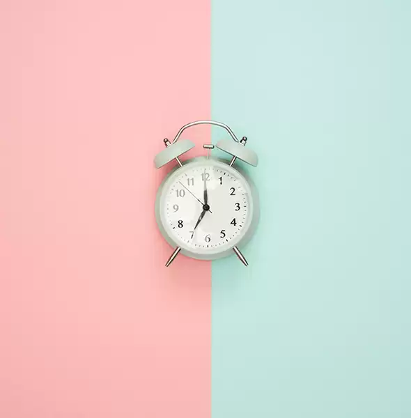
Transform your WordPress website design into a captivating showcase with our sleek multi-column layout. Featuring two striking columns side by side, this design not only attracts attention but also promotes clarity. Each row elegantly combines engaging images-think headphones and a clock-with structured text to highlight your offerings.
Utilise this design to create a stunning portfolio that highlights your top projects. The dual-column layout effectively separates images from detailed descriptions, making each project easy to explore. When users engage with the portfolio, the Gutenberg blocks can ensure a clean, interactive experience.
Present your services clearly and attractively with an image and text pairing. This layout is perfect for highlighting unique offerings or special deals, keeping content well-structured and engaging.
Make customer testimonials shine by pairing quotes with customer images, lending credibility and visual appeal. Use simple, impactful text alongside an image to enhance the emotional connection with potential clients.
Showcase products in a compelling way by using this design’s visual appeal to highlight features and benefits. Each row can present a product with a picture, detailed specs, and compelling call-to-action.
Enhance learning materials by combining educational text with relevant images. The structured nature of this layout makes it easy to consume information, enabling effective dissemination of knowledge.
For event planners, this layout is a great way to combine visuals of past events with critical event details. This dual approach can capture attention and generate interest, ensuring higher engagement.
Break the monotony of a traditional blog layout by injecting this dynamic design. Combine engaging text and images to create a visually appealing and content-rich experience that keeps readers scrolling.
Deliver impactful news with matching visuals that instantly communicate the story’s context. This approach enhances reader comprehension and retention of the main points in each news piece.
Give travel enthusiasts a colourful glimpse of their next adventure by using vivid imagery alongside itinerary details. Showcasing destinations with engaging views can inspire and captivate potential travellers.
Don’t let those amazing team members go unnoticed. Highlight each person’s role and expertise with their picture beside an engaging biography. This humanises your brand and builds credibility with clients.
Your homepage is where first impressions matter. Use this image-rich design to draw in visitors immediately, offering them a quick and visually appealing guide to your site’s most important sections.
Inject personality into your About Us page by pairing team photos with the company’s history or mission. This combination of imagery and text personalizes your brand and resonates with visitors.
Highlight the nitty-gritty of your projects through vivid visuals and comprehensive descriptions. This setup ensures potential clients swiftly obtain all the information they need.
Use imagery to visualise services alongside detailed descriptions focusing on key features and benefits. Prospects will appreciate the clarity and engagement of this simple yet effective layout.
A dual-column layout helps buyers visualise products, while descriptive text clarifies features and advantages. This blend of visuals and readability is ideal for creating persuasive product pages.
Make contacting you inviting with strategically-placed images that speak to your brand’s identity. Combine with clear contact forms or call details for a smooth, attractive user journey.
Organise blog entries neatly with images and summaries, offering a quick glance at a breadth of content. Users can browse more effectively, improving engagement and reader retention.
Turn seemingly drab FAQ pages into visually appealing resources by embellishing with relevant images. WordPress templates can further enhance usability, appealing to users by designing a companionable experience.
Showcase your best work with sharp imagery next to concise descriptions in crisp formatting. This structure allows easy navigation through your portfolio, highlighting key projects and achievements.
Create compelling testimonial pages using visual aids that give your claims authenticity. Images of satisfied clients or collaborations lend credibility and offer a more personal touch to testimonials.
Our modern multi-column website image design features distinct cards that brilliantly showcase images and headers. With unique color contrasts and a minimalist approach, your audience will appreciate the clarity and accessibility, making it an ideal choice for promoting your services. Elevate your WordPress website today and see the difference it can make!
