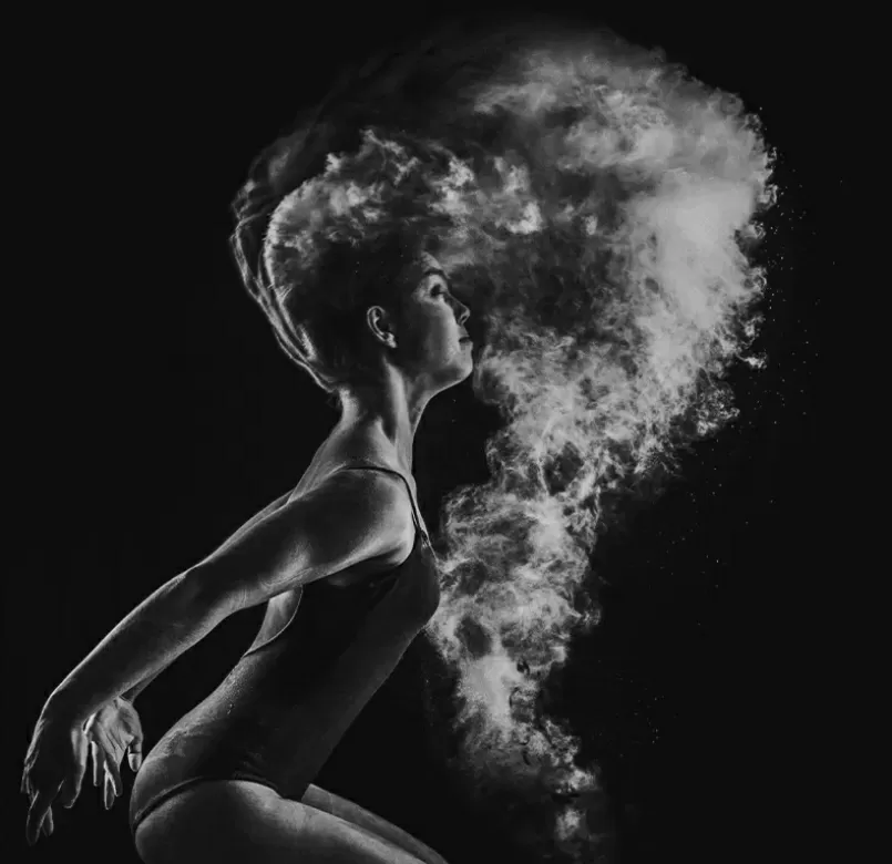
A better way
Lorem ipsum dolor sit amet, cons ectetuer adipiscing elit.
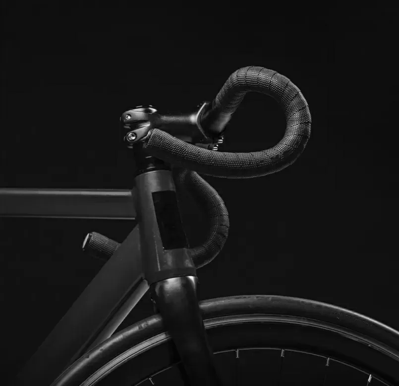
Choose freedom
Lorem ipsum dolor sit amet, cons ectetuer adipiscing elit.
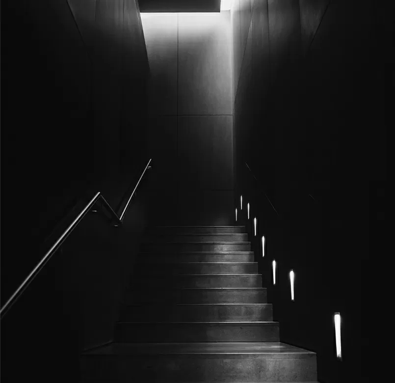
Connecting people
Lorem ipsum dolor sit amet, cons ectetuer adipiscing elit.

Build WordPress sites with MaxiBlocks. All features free forever. No locked functionality. Optional Cloud Library saves you 10+ hours per project. Start free

Lorem ipsum dolor sit amet, cons ectetuer adipiscing elit.

Lorem ipsum dolor sit amet, cons ectetuer adipiscing elit.

Lorem ipsum dolor sit amet, cons ectetuer adipiscing elit.
Take your WordPress website to the next level with a sleek three-column layout that’s perfect for images and informative text. This modern design grabs attention and improves the user experience, making it a top pick for presentations, portfolios, and more.
This layout includes three distinct sections set horizontally, giving your site a clean and organized look.
Each column features a standout image with descriptive text beneath, allowing for a cohesive and engaging visual story.
While the layout is balanced, the unique images provide variety, keeping it visually interesting without overwhelming the viewer.
This layout prioritises the images and content, free from interactive buttons or forms.
Bold sans-serif headers create a strong hierarchy, with lighter text bodies for readability.
Keeping things minimal, the design focuses on images and text, without additional icons.
Images are prominently displayed without borders, allowing them to naturally blend with the background.
The high contrast between bold black-and-white imagery and minimal text ensures a striking and clean visual impact.
The design remains static, with no animations to detract from the visual experience.
The layout is crafted to be responsive, adjusting to different screen sizes and stacking neatly on smaller devices.
High text-background contrast aids readability, but additional accessibility features could further improve usability.
A modern and minimalist approach that focuses on strong visual impact and clarity.
Large images immediately capture attention, while headers and text effectively convey your message.
The use of white space around images and text enhances clarity and boosts user engagement.
Present your best work with this layout, highlighting your skills and creations. A WordPress block themes can further enhance this presentation by offering a variety of design options tailored to creative projects.
Display stunning images with ease, allowing the photos to speak for themselves without distractions. Utilising WordPress block templates can help in organising and showcasing your images effectively.
Capture the essence of your travels with a visual journey that complements your travel stories. Leverage WordPress website design features for an engaging narrative.
Let your food photography shine alongside recipes, enticing readers to try your culinary creations. Consider experimenting with Gutenberg blocks for custom arrangements.
Showcase products with detailed images and descriptions to entice potential buyers. A WordPress pattern library can help create structured and informative layouts.
Highlight the intricacies of your design work with high-quality images and descriptive texts. Consider an Elementor alternative for flexible design options.
Convey the essence of an event with a visual recap, capturing key moments and atmospheres. Enhance the experience using WordPress navigation menus for streamlined browsing.
Use striking visuals to present clothing lines or fashion ideas, letting audiences feel the style. WordPress getting started guides can help refine your presentation.
Display architectural projects with clean lines and stunning imagery, showcasing form and function. A block-based theme prioritizing modern visuals can further amplify your portfolio.
Bring a virtual art exhibition to life with carefully curated images and descriptive text, simulating a gallery visit.
Make a strong first impression with striking visuals and just enough information to pique interest. This sets the tone for your entire web visit.
Use images to tell your brand story in a visually compelling way, allowing audiences to connect with your vision.
Combining images with service descriptions can help potential clients visualise what you offer, creating a more engaging experience.
Featuring images alongside blog posts can grab attention and entice visitors to explore more content.
Showcasing your best work with a visual-focused layout gives a more personal and impactful demonstration of your skills.
This page can serve as an online exhibition, providing a space to present images in an organised and stylised manner.
Incorporating location or team images alongside contact information can make your business feel more approachable.
A dedicated space for products, with images offering a clear view alongside necessary details, optimises the shopping experience.
Leverage strong imagery to illustrate past events or advertise upcoming ones, enhancing event visibility and attraction.
Use real examples and accompanying images to illustrate the effectiveness of your solutions or products.
Using a minimalist three-column layout on your WordPress website design creates a lasting impact. The compelling black-and-white imagery paired with clear typography invites engagement and leaves an impression. This design is versatile enough for any project, helping you effectively communicate your ideas and boost your web presence.
