Evocative multi-column image layout for your WordPress website
If you’re ready to invigorate your WordPress website with a modern twist, this striking multi-column layout is the way to go. It magnificently blends descriptive text with enticing images, creating a seamless yet asymmetrical design. On the left, you’ll exhibit your compelling text, while the right side offers a dazzling 2×2 image grid. This arrangement draws readers naturally through your content, creating a visually balanced flow.
Layout analysis
Overall structure
The layout splits into two main sections: a text area on the left and a vibrant image grid on the right. This dual-section design facilitates a clear and attractive display of different types of content.
Arrangement of rows and columns
The clear distinction between the single text column and the 2×2 image grid offers an aesthetically pleasing setup and organisational clarity. It allows each section to shine without overshadowing the other.
Asymmetrical choices
A unique separation fosters an engaging visual experience. By highlighting different focal points prominently, the layout piques curiosity and stimulates reader interest.
Element and feature description
- Visible elements:
- Headers: The audacious title “Expanding possibilities” captures attention on the left side.
- Text blocks: Two supporting paragraphs offer descriptive content that resonates with your audience.
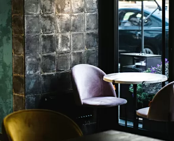
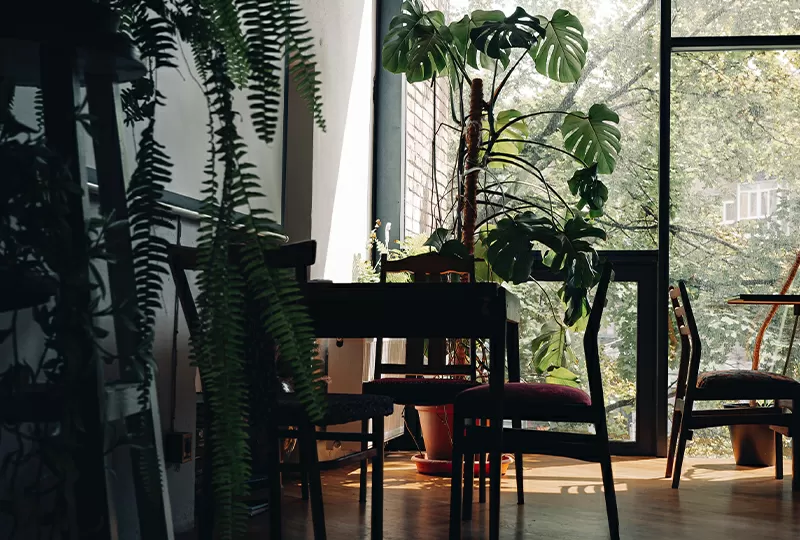
- Images: Four selected images grace the right section, each enhanced with context-providing descriptions.
- Interactive elements: Although explicit buttons are absent, the images’ potential for interaction adds depth when observed online.
- Typography: With a bold, large header, the simpler body text remains easily readable.
- Image details: With textured overlays and subtle shadows, the images offer depth, giving life and richness.
Unique design aspects
Standout design choices
This design’s contrast between lush imagery and stark backdrop creates a narrative rich in nature and innovation. Such a layout is perfect for users who wish to captivate their audience uniquely.
Hover effects or animations
While specific hover effects weren’t detailed, the idea of animations offers potential for a dynamic user interface and enhanced engagement.
Responsive elements
This adaptable layout ensures a seamless user experience across various screen sizes, crucial for today’s diverse device usage.
Accessibility considerations
High contrast between text and background improves readability. Enhance accessibility further by detailing font sizes and ensuring image alt-text.
Overall design style
Design style
The design maintains a modern, minimalist aesthetic grounded in themes of nature and innovation. It harmonises beautifully with diverse content presentations.
Visual hierarchy
A prominent header draws instant attention, guiding the audience smoothly into the body content.
Use of white space
Strategic use of white space engenders a feeling of openness, preventing crowding and ensuring clarity and ease of reading.
Use cases for this layout
- Photography portfolios:
Showcase your best works in a stunning 2×2 image grid accompanied by narrations that engage potential clients deeply.
- Travel blogs:
With a blend of imagery and insightful travel stories, entice readers into journeying through your adventures one picture and story at a time.
- Food blogs:
Entice appetites by marrying photo-rich recipes with detailed cooking instructions for a mouth-watering digital experience.
- Fashion collections:
Prominently display new seasonal collections with editorial-style text that banter readers to visualize and connect with the fashion line.
- Online store product showcases:
Highlight top products with explanatory text to inform visitors visually and contextually about your must-have items.
- Architecture and interior design portfolios:
Display awe-inspiring structures and intricate interiors balanced with descriptive narratives, emphasizing your design philosophy.
- Educational content:
Deliver tutorials that combine step-by-step text instructions with corresponding supportive image grids for effective learning.
- Corporate success stories:
Celebrate significant milestones in a company journey using impactful imagery alongside concise yet comprehensive textual backgrounds.
- Health and wellness tips:
Disseminate actionable health advice matching descriptive text with enlivening visualisations for maximised impact.
- Artistic pursuits:
Honor creative arts with rich narratives that synchronise perfectly with captivating artworks, allowing artists to express through dual mediums.
Use image-based designs for different pages
- Homepages:
Utilise a multi-column image layout to create an intriguing visual first impression for visitors on your homepage.
- About pages:
Craft compelling stories using a mix of text and images to give depth to your background and vision, making your story memorable.
- Product pages:
Display products with descriptions nestled against vivid images, enabling an immersive e-commerce experience.
- Portfolio pages:
A visual narrative intertwined with textual insight showcases your achievements and talents effectively.
- Blog posts:
Elevate the impact of your blog post with a layout that visually breaks down the content and holds reader attention firmly.
- Landing pages:
A well-balanced layout can drive conversions and engagement, focusing on essential call-to-actions through visual storytelling.
- Gallery pages:
Transform static galleries into thematic visual journeys where images and text play equally substantial roles.
- Contact pages:
Craft visually engaging elements while guiding users through forms and additional textual information seamlessly.
- Service pages:
Illustrate service offerings with detailed descriptions counterpoised by visual evidence of successful deliveries.
- Case study pages:
Highlight accomplishment stories through visuals and words that authenticate the success narratives distinctly.
Conclusion
Incorporating a balanced multi-column image layout can significantly enhance your site’s appeal and functionality. By fusing rich textual elements with captivating WordPress images, you articulate themes of nature and innovation with clarity and impact. This approach offers a modern and minimalist design that’s ideal for WordPress users looking to redefine their WordPress web design. Explore how this design style, integrated with other visual elements and patterns available in https://maxiblocks.com, aligns with the way we share, consume, and interact online in today’s visually driven ecosystem. Engage with modern tools such as Elementor Alternatives and explore WordPress website builders that can help you accomplish this vital transformation while maintaining accessibility and responsiveness across multiple devices.


