stunning three-column grid design for your wordpress site
Elevate your WordPress website with a sleek, three-column grid layout that seamlessly integrates images and text. Each column features a striking image paired with engaging descriptive text, ensuring your content stands out. The rounded corners of the images create a warm, inviting feel, while the clear organisation provides excellent readability.
layout analysis
overall structure
This design adopts a balanced three-column format, perfect for displaying multiple pieces of content simultaneously.
arrangement
Each column is evenly spaced to promote symmetry and visual interest, creating a cohesive look that draws users in.
element and feature description
visible elements
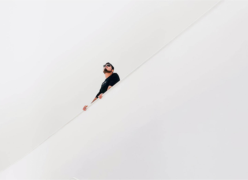
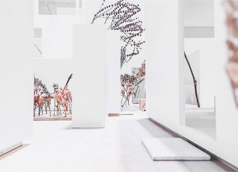
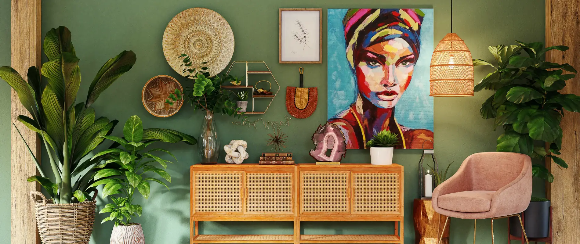
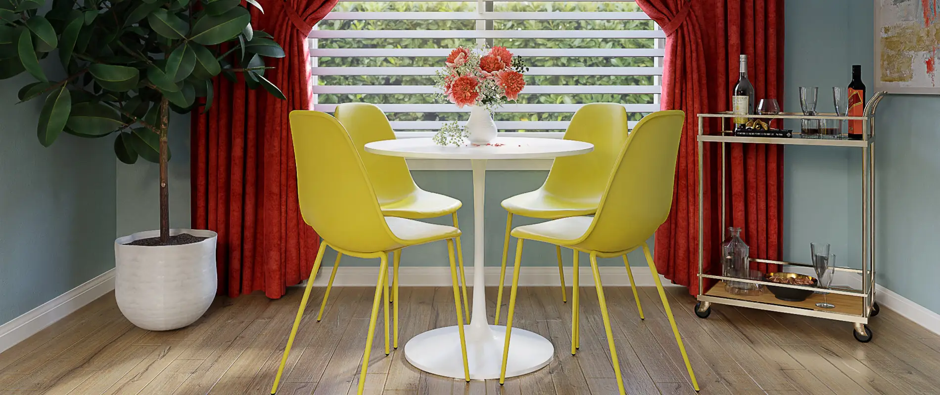
- Images: Each column showcases a unique image that captivates visitors right from the start.
- Text blocks: Below each image, placeholder text provides an opportunity for you to add relevant descriptions.
- Icons: A vibrant plus icon in the upper corner of each image invites users to explore further.
interactive elements
These plus icons suggest exciting interactivity, potentially allowing users to expand on the content related to each image.
typography
Clean, modern sans-serif fonts ensure that your text is both legible and visually appealing across all blocks.
graphical elements
A straightforward visual hierarchy guides users from the engaging imagery to the informative text, enhancing user experience.
unique design aspects
standout design choices
The bold orange plus icon contrasts beautifully with a muted colour palette, instantly drawing attention to interactive possibilities.
hover effects
While not explicitly shown, the layout’s design hints at additional interactivity, such as hover states that enrich user engagement.
responsive design
This grid layout is designed to adapt to various screen sizes, ensuring your content looks great on desktops and mobile devices alike.
accessibility considerations
The combination of clear text labels and an uncomplicated design enhances navigability for all users, improving overall accessibility.
overall design style
design style
The minimalist approach results in a clean, uncluttered layout that prioritises your content.
visual hierarchy
The strategic layout guides attention from the captivating images to important text, facilitating easy comprehension.
white space usage
Generous white space surrounds each element, providing visual relief and allowing users to focus on the content.
use cases for website image-based patterns
1. portfolio galleries
Use image-based patterns to highlight your creative work. A grid layout with space for text allows you to showcase artwork, photography, or design projects. This structure helps potential clients quickly understand the breadth and depth of your skills.
2. product showcases
Perfect for e-commerce sites, a three-column layout effectively displays products. Include images and key details for each item. This simple yet engaging format helps users navigate products easily, boosting engagement and sales.
3. blogging sections
Organise your blog posts using a sophisticated three-column design. This layout offers readers a streamlined overview of diverse topics, enriching their browsing experience and increasing time spent on site.
4. feature announcements
Highlight new products, services, or updates with an image-text combination. This format grabs attention while providing crucial information in small, digestible sections.
5. event highlights
If you host workshops or events, use image patterns to showcase highlights. Offer snippets of what attendees can expect, enticing them to sign-up with engaging visuals and text.
6. testimonials and case studies
The layered image-text format is great for featuring customer stories. Balance client quotes with relevant visuals to build credibility and interest.
7. service breakdowns
Articulate your service offerings with specificity. A structured three-column grid allows potential customers to quickly understand what you offer, complete with images to complement textual descriptions.
8. educational content
For educational websites, this layout supports multimedia instructional content. Images paired with brief insights or bullet points make learning both aesthetic and effective.
9. team introductions
Introduce your team members individually with images and bios laid out in a three-column spread. Balanced design and structured text provide a sophisticated look to engage your audience.
10. travel logs
For travel blogs, this layout functions superbly to share captivating experiences. Package vibrant travel images with tidbits of your journey to inspire wanderlust in viewers.
types of pages for image-based designs
1. homepages
Use image grids on your homepage to highlight key areas of your wordpress website builders. This layout makes navigation easy while catching users’ attention right as they land.
2. product pages
Effective for e-commerce, this design crafts a stellar first impression. Highlight key product features and variations, encouraging visitors to make informed decisions.
3. service pages
Break down complex service offerings with a balanced grid showing distinct advantages. Enhance with images to build understanding and trust around your service suite.
4. about us pages
Your organisation’s story stands out within this structured layout, combining visuals and narratives to differentiate your brand effectively.
5. galleries and portfolios
Ideal for creative professions, this pattern elegantly presents your oeuvre, allowing users to explore your work in context quickly.
6. blog homepages
Organise diverse blog topics and posts into accessible segments, each with featured images that invite deeper exploration.
7. educational content
Academically inclined sites can benefit from aesthetically pleasing educational modules, enhancing comprehension and engagement through balanced layouts.
8. event detail pages
Promote upcoming events with highlight images and explanatory text, addressing when, where, and why users should attend.
9. portfolio resumes
This elegant approach offers career details in an engaging manner, making your qualifications easily scan-able with strong visual cues.
10. support or FAQ pages
A graphical FAQ allows users to grasp commonly asked questions visually, helping them identify answers quickly without wading through text-heavy content.
conclusion
With its clean and modern aesthetic, this three-column layout is ideal for content-focused WordPress website design. It combines user-friendly features with a minimalist design, ensuring your website not only looks professional but also engages visitors effectively. Transform your WordPress website today with this elegant image integration solution!
Remember, for those seeking free wordpress themes or looking into Elementor Alternatives, your options are plenty. Leverage the best tools and strategies to make the most of the exceptional capabilities of wordpress website builders, ensuring a powerful online presence.
Also, when you need images, consider exploring public domain images or using resources for free image downloads. Such strategic sourcing can revolutionise your web aesthetics while keeping you compliant and resourceful!
