WordPress pattern: Pure Image Light PIL-PRO-02
Build WordPress sites with MaxiBlocks. All features free forever. No locked functionality. Optional Cloud Library saves you 10+ hours per project. Start free
Discover the Perfect Multi-Column Image Block Pattern!
Transform your WordPress website with our stunning multi-column layout that beautifully showcases your content! This design features three evenly spaced columns, each containing a captivating image paired with descriptive text, making it an ideal choice for engaging your audience. Dive into this versatile design that’s sure to leave a lasting impression!
Key features of the design
1. Layout analysis
- Overall structure: A modern, multi-column design that elegantly organizes content in a horizontal row.
- Arrangement: Three distinct columns give ample space, allowing each section to shine without clutter.
- Unique layout choices: The gaps between sections promote clear content separation, enhancing readability.
2. Element and feature description
- Visible elements:
- Headers: Capture attention with a compelling primary header like “A greater measure of confidence.”
- Text blocks: Each column features strong introductory lines, such as “A better way,” “Inspire the next,” and “Pushing limits.”
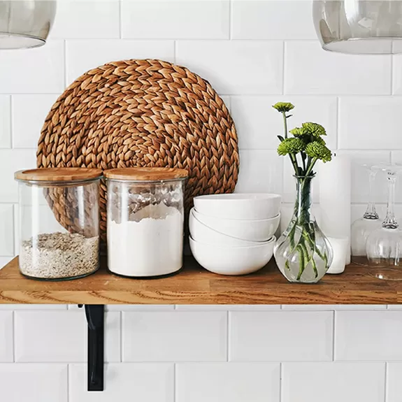
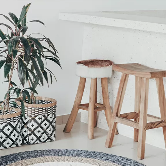
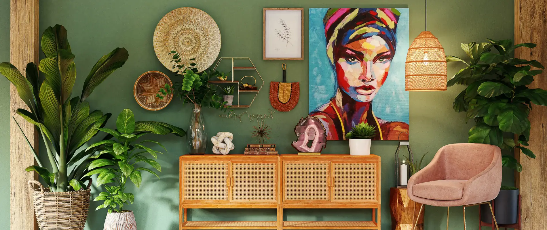
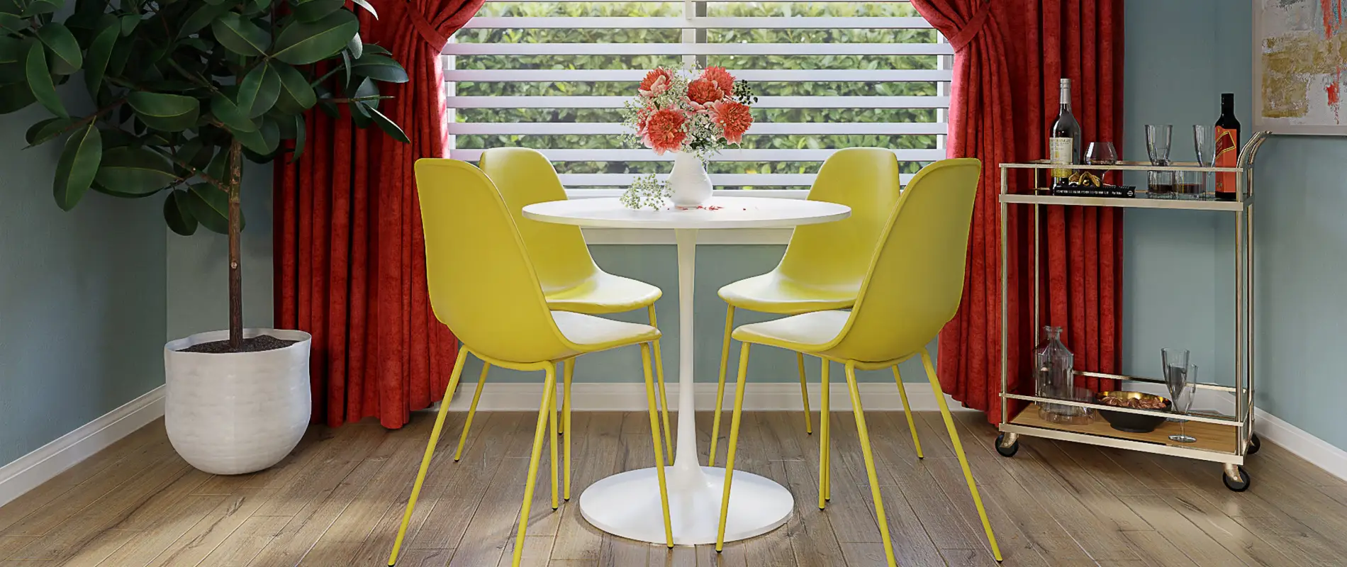
- Images: Eye-catching visuals of various indoor settings and objects.
- Buttons: An inviting “Read more” link under the first text block encourages user interaction.
- Typography: Enjoy a chic, modern sans-serif font that balances bold headlines with clean, readable body text.
- Image details: Each image boasts rounded corners for a softer, contemporary look.
3. Unique design aspects
- Standout choices: The combination of rounded images and a three-column layout adds modern flair.
- Responsive design: The layout adapts seamlessly to smaller screens, stacking columns vertically for optimal viewing.
- Accessibility: Thoughtful typography and clear divisions ensure readability for all users.
4. Overall design style
- Minimalist aesthetic: Emphasizing simplicity and clarity, this design lets your content take center stage.
- Visual hierarchy: The header guides users naturally from top to bottom through engaging text and visuals.
- Balanced white space: Ample space around each column promotes easy navigation without overwhelming visitors.
10 use cases for this website image-based pattern
1. Product showcases
Use the multi-column layout to display different aspects or features of your product. Each column can focus on a unique selling point, paired with a captivating image and brief text. Buttons can link to detailed product pages, fostering a seamless user journey and boosting engagement.
2. Portfolio highlights
Artists, photographers, and designers can utilise this layout to create a professional portfolio. Each column can present a piece of work, with the supporting text offering insights into the creative process or techniques used. This structure enhances both aesthetics and navigation.
3. Team introductions
Introduce your team in style by dedicating a column to each member, featuring a professional photo and a brief bio. The layout helps convey personalities and roles clearly, fostering a connection with site visitors while maintaining a tidy, organised appearance.
4. Service comparisons
Highlight your services alongside each other for easy comparison. Each column can describe a different service, with accompanying images or icons to reinforce the message. This approach clarifies options for potential customers, assisting in informed decision-making.
5. Blog summaries
Attract readers by showcasing your most popular or recent blog posts. Feature excerpts and images that tempt visitors to dive deeper into the content. The “Read more” button is perfect here, encouraging further exploration of your blog.
6. Event promotion
Generate buzz for upcoming events by detailing them within the columns. Each section could cover a different event or aspect, such as themes, speakers, or schedules. Such a display aids in communicating all essential information at a glance.
7. Educational content
Educators can break down complex information into digestible sections with this design. Present each column as a standalone lesson, complete with visuals and explanations, to enhance understanding and student engagement in a structured layout.
8. Home page highlights
First impressions matter, and this layout is perfect for an eye-catching homepage. Display your primary offerings or values at the forefront of your WordPress website design, leveraging striking images and concise text to transform visitors into engaged users.
9. Content comparisons
For businesses, travel sites, or any platform offering multiple options, comparing content in aligned columns can be invaluable. Detail each choice with images and descriptions, making it simpler for the user to compare and choose.
10. Creative narratives
Bring storytelling to life by breaking it into sections. Each column represents a chapter or part of the story, ensuring readers can follow along in a visually appealing and organised manner.
10 different types of pages you can use image-based designs
1. Landing pages
Make your landing pages stand out with striking visuals and clear content separation. Use the columns to present key points that define your brand, driving home the message that potential customers should choose your offering.
2. E-commerce product pages
Showcase your trending products within a streamlined design, where each column highlights a product’s unique selling points. Make it easy for customers to find what they want amidst a well-structured, visually appealing page.
3. Testimonials pages
Having a dedicated page for testimonials benefits from a clean, organised approach. Use columns to display customer reviews, images, and accolades, lending credibility and transparency to your business.
4. Portfolio pages
Creatives can express their work through a page that uses image-based designs to form a gallery of achievements. The column layout allows each project its moment in the spotlight, while keeping visitors captivated.
5. Gallery pages
Photographers and artists can assemble their artworks into a vibrant tapestry using an image-based grid. This format coherently presents visual work while offering necessary textual context in an appealing arrangement.
6. Services pages
A service-oriented business could benefit from showcasing its offerings on a clear and concise page. Each column presents a different service, along with its unique advantages, creating a comprehensive and user-friendly experience.
7. About pages
Convey your journey or team ethos through a visual storytelling page. The use of structured columns allows for a layered narrative that maintains engagement while delivering key facts and figures.
8. Event pages
When promoting events, organising details within an image-centric framework helps to clearly convey essential information. Delegate sections for speakers, schedules, and registration forms, optimising clarity and accessibility.
9. Blog index pages
Display an organised index of blogs with the image-based design, where each write-up receives its dedicated section. Use visuals to captivate and teasers to intrigue, driving traffic through cleverly designed layouts. Find elements to enhance engagement with the best best website builder software.
10. Feature pages
For software or digital products, detail core features through organised columns that offer visuals, explanations, and use cases. An image-based design clarifies these complexities, presenting a coherent picture of what your service offers and how it meets user needs.
Conclusion
Elevate your WordPress website builders with this minimalist multi-column layout. Its effective use of images, clear typography, and ample white space not only enhances user engagement but also ensures clarity and accessibility. Don’t miss the opportunity to make a lasting impression-design your site with our chic image block pattern today! Discover other engaging gutenberg blocks and free wordpress themes for best results.


