WordPress pattern: Pure Image Light PIL-PRO-07
Build WordPress sites with MaxiBlocks. All features free forever. No locked functionality. Optional Cloud Library saves you 10+ hours per project. Start free
discover our dynamic two-column image layout for WordPress
Transform your WordPress website with our eye-catching two-column image layout! This sleek design features a harmonious balance, showcasing captivating images paired with engaging text that is perfect for making comparisons or highlighting themes.
design overview
- Overall structure: The layout boasts a modern two-column design, presenting a visually appealing and symmetrical look that enhances balance.
- Rows and columns: Each column contains a single row, ensuring clarity and directing focus to the content beneath each image.
element and feature description
visible elements
- Headers: Grab attention with bold headers, such as “Born to play” or “Get in the game,” that introduce your content powerfully.
- Text blocks: Simplified text blocks follow each header, providing pertinent information that engages visitors.
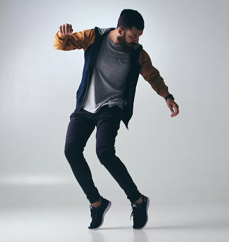
- Images: Feature stunning images of individuals in action, perfectly aligned with the messages of your columns.
interactive elements
Although this layout focuses on image and text presentation, it offers a clean slate for adding interactive elements later.
typography
Enjoy a modern, sans-serif font that enhances readability, with clear distinctions between headers and body text.
image style
Images are presented cleanly, without borders or roundness, ensuring a contemporary look in portrait orientation.
subtle effects
A gentle shadow around the images adds depth to the overall design, creating a polished appearance.
unique design aspects
- Dynamic presentation: The dual-image format fosters a comparative narrative, making it engaging for users.
- Responsive adaptability: Designed to be mobile-friendly, this layout seamlessly stacks columns vertically for an optimal viewing experience on smaller screens.
- Accessibility features: With clear headers and organized text blocks, users of all abilities will find the content easy to navigate.
overall design style
- Minimalist aesthetic: This design prioritizes imagery and concise text, ensuring your main messages are front and centre.
- Visual hierarchy: The bold headers and striking images command attention, guiding the viewer’s journey through your content.
- Balanced white space: Ample white space around elements promotes clarity and comfort, allowing each part of your layout to shine.
use cases for our image-based layout
Showcase your portfolio
Use the two-column layout to highlight different projects in your portfolio. This setup allows you to pair images of your work with descriptions of the thought process, technique, and outcome for prospective clients or employers to see. It’s a dynamic and engaging way to present your capabilities.
Product comparisons
Compare two products side by side in a clear, user-friendly manner. With images and succinct text, customers can easily weigh the benefits of each option, guiding their purchasing decisions.
Before and after showcases
Ideal for websites featuring transformations-be it home renovations or personal makeovers. Display a direct comparison of the ‘before’ and ‘after’ states to emphasize the impact of your services.
Event highlights
Use the two-column layout to showcase images and descriptions of major events or segments of an event. This allows viewers to grasp the highlights and feel of the occasion at a glance.
Thematic storytelling
Narrate a story through paired images and text blocks. The dual-column layout helps convey complex themes effectively while keeping the story engaging and easy to follow.
Educational content
Pair instructional images with step-by-step instructions. This is perfect for educational purposes such as blog posts, tutorials, or guides where visuals enhance understanding.
Customer testimonials
Feature testimonials alongside images of satisfied clients. Visual context can make customer reviews more relatable and convincing to potential new clients.
Travel blogs
Share your travel experiences with pictures from your trips and matching narratives. This layout beautifully balances visuals and written content, ideal for engaging your audience.
Art and design displays
Artists and designers can use the layout to display their creations alongside captions or commentary, offering insight into their inspiration or process.
Team member bios
Introduce team members through profile images and brief biographies. This layout can help humanise your brand by showcasing the people who make it happen.
types of pages to use image-based designs
Landing pages
Create impactful landing pages for marketing campaigns using the two-column layout, ensuring the visual and text content complement each other to capture and retain viewer interest.
Service offerings pages
Present various services your business offers with icons and descriptions in side-by-side columns, allowing potential clients to understand options clearly.
E-commerce product pages
Utilise image-based layouts to present product features and details, encouraging customers to visualise and understand the product better.
Blog posts
Enhance the storytelling element of your blogs with images and text that guide the reader through topics with clarity and engagement.
Portfolio pages
Display your best work in an aesthetically pleasing manner through paired images and descriptions, making it easy for visitors to browse your projects.
About us pages
Utilise images and text balance to tell your company’s story, sharing your mission, vision, and background clearly and engagingly.
Case studies
Present in-depth case studies with a focus on imagery and text that walk the reader through the stages and outcomes of each case.
Testimonial pages
Create compelling stories by combining customer testimonials with images that relate to their experiences, putting a face to the feedback.
Educational resource pages
For teaching or instructional content, pair visuals with explanatory text to make information easy to access and understand.
Event pages
Use the layout to promote events, illustrating highlights, guest speakers, or programme details with images that engage your audience.
Conclusion
Our two-column layout featuring portrait imagery and succinct text is a perfect blend of minimalism and functionality. Ideal for promotional content or informative purposes, this design not only emphasizes visual appeal and accessibility but also provides an elegant structure. It’s a strategic choice for those looking to explore WordPress website design and elevate their WordPress website to the next level!
Searching for images to enhance your WordPress web designs? Discover the best ways to download high-quality, copyright-free images. Use sites like Unsplash and Pexels for free images online, or access public domain images on platforms like Wikimedia Commons. For Google Images, simply adjust your search settings to filter for images without copyright. Need to download? Right-click and save, or use download options provided.


