WordPress pattern: Pure Image Light PIL-PRO-09
Build WordPress sites with MaxiBlocks. All features free forever. No locked functionality. Optional Cloud Library saves you 10+ hours per project. Start free
Transform your website with a modern multi-column image layout
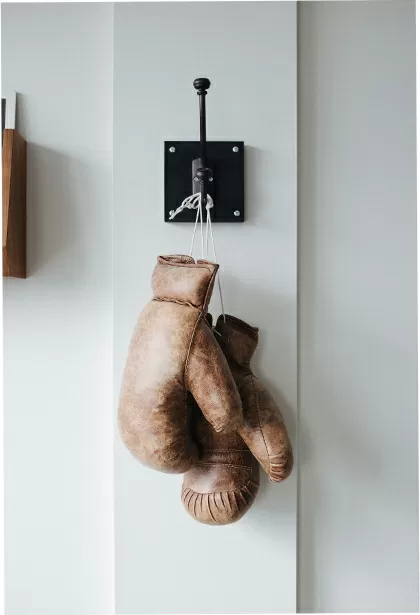
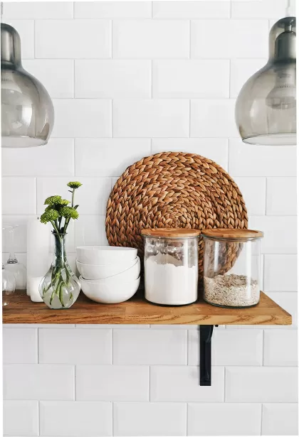
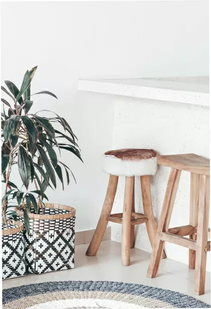
Elevate your WordPress website with a stunning, clean multi-column design that seamlessly integrates images and text. This layout features a single row with four well-defined columns, each showcasing unique content blocks. The equal-width columns provide structure, while diverse content within each block offers a dynamic touch to your visual presentation.
Key features of this design:
Clear layout structure
- Enjoy an organised, easy-to-read format that enhances user experience. The balanced arrangement lets visitors absorb information effortlessly.
Distinctive element descriptions
- Headers: Each column displays a bold header, setting the stage for the content to follow.
- Text Blocks: Beneath the headers, concise paragraphs of placeholder text offer brief insights tailored to your audience.
- Images: Complementing the text, a striking image in each column visually reinforces the message, ensuring consistency and engagement.
Minimalist and functional design
- The overall style embraces minimalism, focusing on clarity and function. Thoughtful use of space and effective visual hierarchy guide users through the information smoothly.
Responsive and accessible
- Built with responsiveness in mind, this layout adapts beautifully across devices, stacking columns vertically on smaller screens for optimal viewing. Descriptive text enhances accessibility for screen readers, while attention to contrast and font size ensures all users can access the information comfortably.
Balanced white space
- Ample white space prevents visual clutter, promoting a clean aesthetic that keeps your audience engaged without overwhelming them.
Why use this design?
This modern design not only presents your content clearly and attractively but also encourages interaction and exploration. It’s perfect for blogs, portfolios, and business sites looking for a professional yet inviting appearance. Upgrade your WordPress website design today and captivate your visitors with this elegant image layout!
10 use cases for this website image-based patterns
1. Personal blogs
This design suits personal bloggers who want to showcase writing, photography, or other creative outputs. The clean layout helps focus readers’ attention on content while displaying images and text harmoniously. It encourages visitors to explore different sections, increasing engagement with various posts.
2. Business portfolios
Entrepreneurs and freelancers can benefit from a versatile multi-column layout to present their services and previous work. Visually appealing images paired with informative text blocks help potential clients quickly grasp what you offer, effectively acting as a virtual business card.
3. E-commerce product showcases
Online stores can use this design to highlight featured products, new arrivals, or special offers. Customers easily scan through product images and descriptions, enhancing their shopping experience and potentially boosting sales through clear and inviting presentation.
4. Travel blogs
Travel enthusiasts can transport readers worldwide through eye-catching visuals and compelling narratives. The structured yet fluid design allows for immersive storytelling, providing a captivating backdrop for each destination you explore.
5. Photography galleries
Photographers can leverage this layout to create beautiful, organised galleries that showcase their work in a professional setting. Each column can represent a different theme or collection, providing structure while allowing each piece to shine individually.
6. Educational content websites
Educational websites presenting concepts, courses, or tutorials can enhance learning through visual representation. This setup supports both text and visual aids, facilitating a comprehensive understanding for students or learners accessing the site.
7. Restaurant menus
Restaurants can offer a more interactive online menu experience, integrating vivid food images with descriptions. The design helps tantalise potential patrons’ taste buds, making it easier to feature beverages and dishes within different menu categories.
8. Charity and non-profit sites
Charities can share their missions, stories, and achievements by blending messaging with striking visuals. Highlighting projects and testimonials in separate columns can create a deeper connection with potential donors or volunteers.
9. Health and wellness platforms
Health brands can present products, tips, wellness guides, or success stories with clarity and appeal. Carefully chosen images alongside informative text make exploring healthy lifestyle changes inviting and accessible.
10. Event announcement pages
Event organisers can showcase schedules, speakers, and ticket options using this dynamic setup. Each column can hold essential details with engaging visuals, making it easy for attendees to find everything they need at a glance.
10 different types of pages you can use image-based designs
1. Homepages
A homepage serves as the first introduction to a website, often being the most visited page. An image-centered design draws visitors in by highlight key areas of interest and prompts them to explore deeper into your offerings.
2. About us pages
About pages provide an opportunity to tell a brand’s story more compellingly. Using images of team members, offices, and milestones can humanise a business and create relatable touchpoints for visitors.
3. Service pages
For businesses offering multiple services, this layout helps in demonstrating each service with relevant images and descriptions. Prospective clients can easily evaluate the offerings and identify the services they need most.
4. Product detail pages
Product pages benefit from featuring images that offer a closer, more vivid look at items available for purchase. By utilising photography strategically, sites can increase consumer confidence in the purchase decision process.
5. Testimonial pages
Create a narrative around positive testimonials by incorporating photos of customers with their endorsements. This visual element enriches the trust factor and further validates a brand’s promises.
6. News & blog article pages
Blog pages and news articles benefit from image integration, breaking the text and enhancing storytelling. A complementary image can serve as the visual hook that piques a reader’s curiosity about further content.
7. Contact pages
Contact pages could include map images, team portraits or office photos for the personal touch. By visualising your location or contact points, visitors have a clearer impression of reaching out to the brand directly.
8. Landing pages
Dedicated landing pages aim to prompt specific actions, often benefiting from clean, image-driven designs that convey one clear message. Photos help focus attention and serve as powerful reinforcement of a call to action.
9. FAQs pages
Adding visuals to frequently asked questions can help illustrate more complex answers or clarify common queries. Iconography or specific imagery associated with each query may help in simplifying understanding in areas like troubleshooting.
10. Portfolio pages
Portfolios aim to showcase a collection of works, whether personal or professional. Utilising high-definition images in a crisp, organised manner let the work speak for itself and entice potential clients or collaborators.
Conclusion
Embracing a contemporary multi-column image layout can significantly enhance your WordPress website design. By combining text and imagery privatively, your site conveys professionalism and intrigue, encouraging deeper engagement. Whether opting for free WordPress themes or exploring WordPress block templates, there are endless opportunities to refine and perfect your website. As highlighted, versatile use cases allow you to apply these patterns across various industries and page types. Start exploring today to transform your WordPress website builder capabilities!


