WordPress pattern: Pure Image Light PIL-PRO-47
Build WordPress sites with MaxiBlocks. All features free forever. No locked functionality. Optional Cloud Library saves you 10+ hours per project. Start free
Transform Your Website with Our Engaging Column Image Layout
Want to give your WordPress website a fresh look? Our stunning three-column grid layout might just be the answer. This design expertly combines images and text, offering a polished yet engaging site that will captivate your audience.
Original Design Overview
Our layout features a sleek three-column grid that beautifully presents unique visual elements alongside captivating text. By employing uniform width for the columns, we create a balanced look while also ensuring each column stands out thanks to varying content. This is perfect for displaying your story or brand message effectively.
Layout Analysis
- Overall Structure: The multi-column design guarantees a professional and streamlined presentation.
- Arrangement of Rows and Columns: Comprised of three distinct, horizontally-aligned elements in a single row.
- Asymmetrical Layout Choices: Equal-width columns host diverse content to capture unique interest.
Element and Feature Highlights
Visible Elements
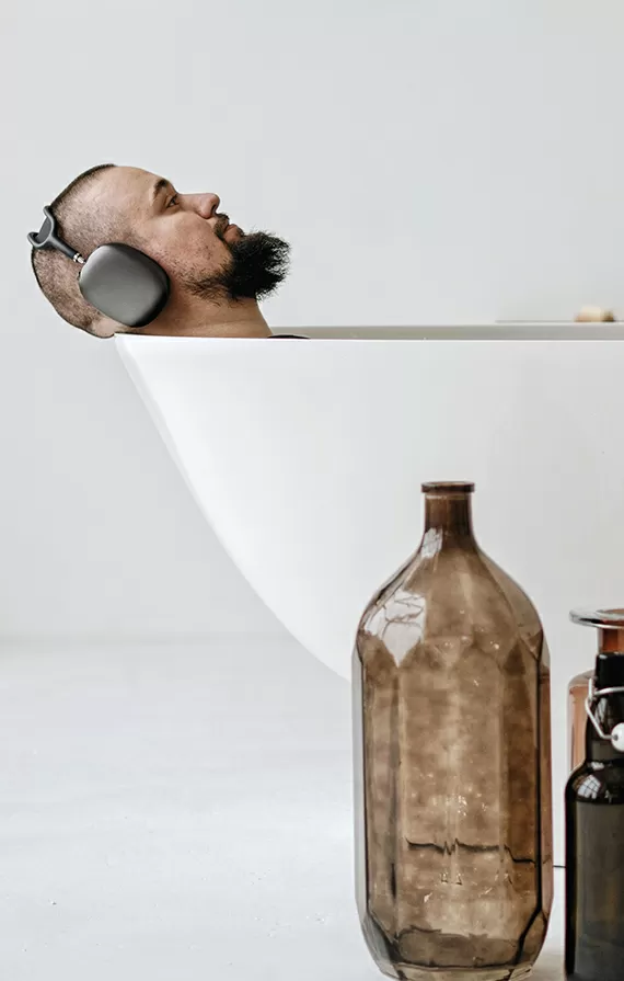
Our layout showcases striking images-think someone chilling in a bath or an artistic tattoo-which draws in viewers. Attention-grabbing headers like “Having fun,” “We delight,” and “We’re experienced” offer context and invite deeper exploration.
Interactive and Typographic Elements
Interactive points suggested by the text spark curiosity, while font styles and sizes create a clear visual hierarchy, guiding user focus seamlessly.
Icons or Graphical Elements
The focus remains on images and text sans distractions. Landscape-oriented images with subtle borders keep the aesthetic clean and professional.
Unique Design Aspects
- Standout Design Choices: Diverse imagery and succinct text foster thematic interest across columns.
- Responsive Design Elements: Spaced columns ensure an optimal user experience, even on mobile devices.
- Accessibility Considerations: High-contrast text with descriptive imagery appeals to a broad audience.
Overall Design Style
Featuring a minimalist and modern style, our design prioritizes clarity and functionality. White space is strategically used to avoid clutter, allowing easy absorption of content.
Use Cases for This Layout
- Online Portfolios:
Creatives like photographers and artists can seamlessly display their work through a structured, engaging presentation.
- Blogs with Visual Stories:
Food or travel bloggers can enhance storytelling with vibrant pictures and inviting narratives.
- Corporate Websites:
A great tool to succinctly communicate company values and showcase products or services.
- Educational Platforms:
Useful for presenting educational content in a logical and accessible manner.
- Basic Product Catalogues:
Retailers can highlight featured products with elegant descriptions and imagery.
- Non-Profit Causes:
Engage supporters with compelling visuals and testimonials from beneficiaries.
- Event Promotions:
Dynamic layouts to attract attendees through rich imagery and event details.
- Tourism Site Pages:
Incorporate destination-based imagery to entice potential visitors.
- Client Case Studies:
Feature success stories and project results in a structured format.
- Health and Wellness Blogs:
Create a calming aesthetic with serene imagery and supportive text.
Types of Pages Using Image-Based Designs
- Home Pages:
Grab attention with powerful visuals and decisive opening statements.
- About Us Pages:
Illustrate company history or vision through evolving imagery.
- Service Descriptions:
Detail specific offerings with visual explanations and content blocks.
- Gallery Pages:
Image grids to beautifully display portfolios or product images.
- Testimonials Pages:
Pair client stories with positive images to reinforce trust and satisfaction.
- FAQ Sections:
Make information digestible by combining graphics with textual content.
- Contact Pages:
Foster a personal touch with images of team members alongside contact information.
- Resource Centres:
Organize downloadable content or articles efficiently with an intuitive interface.
- Future Developments:
Keep your audience informed and excited with visual updates on forthcoming plans.
- Interactive Tutorials:
Guide users step-by-step through processes using illustrative images.
Image Sourcing and Downloads
Looking for images to enhance your site? Many assume that public domain images are hard to find, or you may wonder, “Can you get free images online?” They absolutely can! Websites like Unsplash, Pixabay, or Pexels offer a wealth of freely accessible, high-quality images. When using platforms like Google for images, ensure you activate filters for non-copyrighted images. Discover more about working with images and costs with our article on WordPress design.
Conclusion
Transforming your WordPress website with an engaging three-column grid layout featuring impactful headers and stunning imagery can enhance usability and deliver your message effectively. Ready to step up your web design? Dive into modern themes and resources like our free WordPress themes and explore WordPress web designs to get started today.


