The sight & sound of information

The way it’s meant to be played

A virtual world of live pictures


Build WordPress sites with MaxiBlocks. All features free forever. No locked functionality. Optional Cloud Library saves you 10+ hours per project. Start free


Want to make your WordPress site pop? Try our visually captivating multi-column image layout! This design offers a sleek and clean presentation that’s perfect for drawing your visitors in and getting them to interact with your content.
This layout sports a trendy, asymmetrical design with four distinct columns lined up in a single row. The diverse imagery-from giraffes in the wild to cozy indoor scenes-tells a balanced visual story that keeps viewers captivated. This layout not only invites exploration but also adds a touch of class to your WordPress website design.
The overall approach leans modern and minimalist, focusing on striking WordPress icons and ample white space for an organised look. Strategic placement of text and images effectively guides user attention. The smart use of white space creates a timeless and balanced feel, ideal for anyone keen to explore the endless possibilities of WordPress free themes and designs.
Bring creativity to your WordPress web designs with a sleek image layout that showcases your work, talents, and projects in a way that wows potential clients. Artists and designers will particularly benefit from this approach.
Highlight your fashion finds with an easy-on-the-eyes layout. It’s perfect for displaying styles, trends, and looks with flair, turning the ordinary scroll into a stylish journey.
Invite readers to explore wanderlust destinations with vivid imagery. Create a travel journal that takes them on an adventure, right from their screen, with landscapes, snapshots of cityscapes, and candid travel moments.
Add layers of flavour to your culinary blog by showing off dishes, recipes and restaurant reviews with mouth-watering imagery that will have visitors ready to dig in-or cook up something delicious.
Boost conversions by making your products shine on your Gutenberg blocks. Each product can be beautifully presented to entice buyers with stunning visuals that are just a click away.
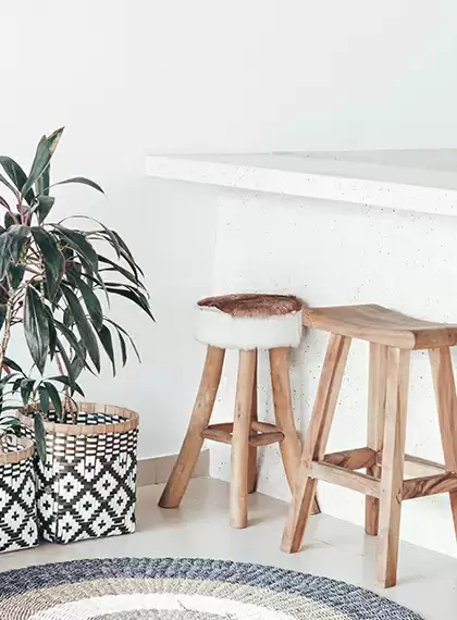
Capture the elegance of spaces through imagery showcasing various aspects of interior design and decor, be it a chic living room or a cosy nook. This is perfect for interior designers keen on drawing in new clientele.
Frame your architectural feats with strategically placed images that reflect your expertise and vision. The mix of minimalist and detailed shots offers viewers a comprehensive look at your work.
Highlight your upcoming event, be it a wedding, seminar, or party, with captivating visuals. Make sure every last detail is beautifully captured, helping your audience imagine themselves there.
Break down complex information through instructive imagery. Use this layout to enhance understanding by pairing text with visual aids, making learning interactive and engaging.
Put a spotlight on causes, fundraising activities, and success stories. The engaging photo layout appeals to potential donors and volunteers who want to support what truly matters to them.
Establish the tone and style of your site with an engaging homepage filled with appealing visuals. First impressions count, and a warm, inviting design can keep visitors exploring longer.
Personalise your site with visuals illustrating the story of your brand or business. This adds authenticity and depth to words, helping you connect with your audience on a personal level.
Even contact pages can sparkle. Use clear imagery to guide users on how to reach you, whether through location photos or pictures of team members ready to assist.
Convey expertise and reliability through visuals that highlight your services. Add images depicting team activities, project samples, or images of satisfied customers in their improved space.
Display past posts with accompanying images that encourage users to browse. Images are the windows to your written content, making browsing enjoyable and engaging.
Pair client testimonials with their portraits or relevant project images. This boosts social proof and helps potential clients see the rewarding results you’ve produced for others.
Bring life to your galleries by selecting eye-catching thumbnails for easier navigation of your multimedia content. Beautiful images invite users to engage more with varied content types.
Boost conversions by creating landing pages that include imagery to captivate visitors instantly and lead them through a tailored user experience focused primarily on one call-to-action.
Make your e-commerce or catalogue websites a visual delight by featuring clear, detailed images of your products, encouraging user interaction and triggering keywords like WordPress development considerations.
Visuals from past events let viewers relive the moment or anticipate the next one. Such a page captures the essence of what went down and what makes future engagements worth attending.
Our multi-column image layout is a beautiful fusion of aesthetics and usability, providing an enriched experience for WordPress website users. Whether you’re looking to enhance a portfolio or showcase products, this layout breathes life into sites without overwhelming its visitors. For those looking to stand out with style and responsiveness, it’s time to transform your site now!
