WordPress pattern: Pure Image Light PIL-PRO-61
Build WordPress sites with MaxiBlocks. All features free forever. No locked functionality. Optional Cloud Library saves you 10+ hours per project. Start free
Elevate your WordPress site with a striking three-column image layout
Transform your WordPress website design with a stunning three-column layout that showcases your images and text beautifully. Perfect for grabbing attention, this design enhances how visitors experience your site while ensuring everything looks sleek and stylish.
Design overview
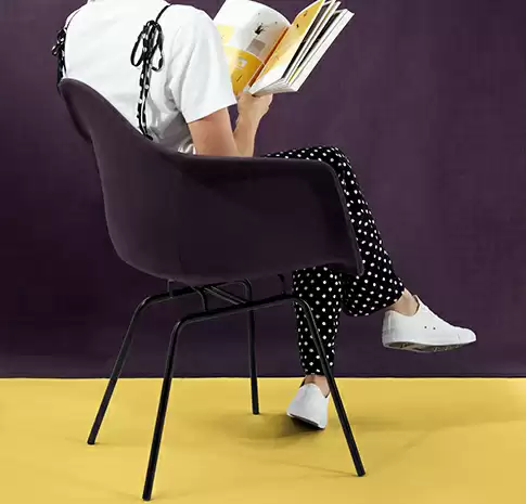
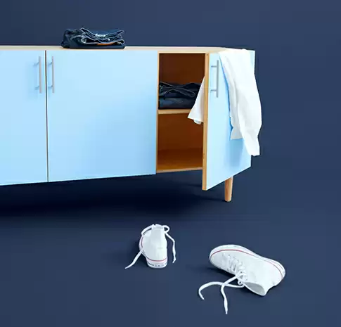
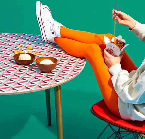
This layout splits a single horizontal row into three equally sized columns, each displaying a distinct image with its narrative. The neat, symmetrical arrangement not only looks balanced but also maintains a modern, minimalist style.
Key features
- Stunning visuals: Each column has a large, eye-catching image at the top, followed by a concise text block with a bold heading. This compelling combination grabs readers’ attention and invites them to explore more.
- Clean typography: Bold, striking headings alongside smaller, lighter body text ensure your message is clear and easy to read. Using crisp, legible fonts enhances communication effectiveness.
- User-friendly design: Prioritising responsive design ensures your layout adapts seamlessly across devices, looking fabulous on both desktops and mobiles.
- Ample white space: Strategically placed empty spaces around each column keep things balanced and decluttered, allowing your images and text to shine without distraction.
Unique aspects
- Visual diversity: Each column’s unique image enriches the design, delivering a vibrant visual journey that encourages viewer engagement.
- Accessibility considerations: The high contrast between text and background supports readability, helping users with varying visual abilities.
Why use this layout?
This three-column format is ideal for guiding users effortlessly through your content with a clear visual hierarchy. It’s perfect for blogs, portfolios, and business websites, making your information both digestible and engaging.
Don’t miss this chance to elevate your WordPress website design. Implement this captivating image layout today to attract and retain visitors.
Use cases for this three-column layout
Blogging showcase
Present your blog posts in an engaging way with a three-column layout. Each column can feature an image representing different topics or categories. This style not only attracts readers but also allows easy navigation through various content types, making it an ideal option for lifestyle, travel, or food blogs seeking a distinctive look.
Photography portfolios
For photographers looking to showcase their work, this layout offers a structured yet visually appealing way to present your best pieces. Each column can highlight a standout image or different themes, offering potential clients a comprehensive view of your style and capability.
E-commerce product gallery
Enhance your online store’s aesthetic by displaying products in a three-column grid. Each column can feature product images, enticing viewers to click through for more details, thus boosting engagement and potentially increasing sales.
Event highlights
Whether you’re hosting an online event or recapping past events, this layout provides a straightforward method to highlight key moments with images and stories. It’s a great way to visually communicate your event’s successes and attract future participants.
Artist galleries
For artists and graphic designers, a three-column view lets you display artwork in an organised and impressive fashion. Each column can detail unique artworks or various styles you specialize in, providing a mini-exhibition directly on your WordPress website.
Company portfolios
Share your company’s journey, mission, and achievements with clients and stakeholders through striking visuals complemented by succinct descriptions in each column. This approach ensures your stories are not only told but also remembered.
Storytelling projects
Craft narratives that resonate by visually narrating different parts of your story. Each column could represent a chapter or scene, enriched by accompanying images that give life to the text.
Non-profit impact reports
Impress donors and members with visual reports that speak of your impact. A three-column layout can highlight key achievements, ongoing projects, and future goals, making your mission instantly understandable and engaging.
Travel diaries
If you’re sharing travel experiences, this layout is perfect for showcasing varied destinations. Each column can transport your audience to different locations, enriched with lively images and descriptive anecdotes.
Recipe posts
Food bloggers can entice readers by displaying mouth-watering images alongside ingredients and instructions in a clean and organised manner. Each column can offer a comprehensive look at a different recipe.
Types of pages using image-based designs
Homepages
Your homepage is your site’s first impression-it needs to be memorable. Using a three-column design helps create a catchy, visually appealing front page that visitors will easily navigate and want to explore further.
About us pages
Share the story of your brand or team with images that capture key moments and achievements. This format allows space to detail individual stories or contributions, making your narrative relatable and engaging.
Service pages
Break down different services or products through distinct columns. This helps streamline information, enabling potential clients to quickly understand what’s on offer without being overwhelmed by content.
Portfolio pages
For creatives, displaying work in a balanced, visually pleasing manner is crucial. A three-column layout can highlight multiple projects simultaneously, giving potential employers or clients a broad sense of skill and style.
Contact pages
Use imagery and precise content in columns to direct visitors swiftly to needed information-like contact forms, maps, or FAQ sections-creating a user-friendly experience.
Testimonials
Feature client testimonials that include both praise and associated visual stories. A structured layout ensures each client’s voice stands out, building credibility and trust easily.
Courses and tutorials
A well-organised layout supports learners in navigating through course content or tutorials, with images enhancing understanding and readability, especially in instructional settings.
Lookbooks/fashion
Fashion brands can present collections using bold visuals while maintaining magazine-styled sleekness. Each column can show different outfits, accessories, or seasonal looks.
Press/news pages
Divide your latest news or press coverage effectively, letting a three-column setup bring attention to standout stories or media mentions without overwhelming the audience.
FAQ pages
With distinct images identifying different sections, viewers can navigate through frequently asked questions, making their information-seeking journey effortless and visually pleasing.
When sourcing images for your website, leverage resources like public domain sites or reputable free image databases. To avoid copyright issues, filter Google Images by usage rights or explore our WordPress icon library for inspiration. Consider also the art of resizing while maintaining the correct favicon dimensions for optimal consistency.
Conclusion
A captivating three-column image layout is not just a website design in WordPress but a tool to elevate how your content interacts with visitors. Use it across various types of pages to make your WordPress website informative and visually appealing. Integrate this layout to capture interest and encourage engagement, setting your online presence apart with elegance and simplicity.


