WordPress pattern: Pure Image Light PIL-PRO-64
Build WordPress sites with MaxiBlocks. All features free forever. No locked functionality. Optional Cloud Library saves you 10+ hours per project. Start free
Discover the perfect image layout for your WordPress site
Transform the way you present visuals and information with our sleek, minimalist grid layout! This design showcases your content in a structured yet engaging format that is perfect for highlighting multiple concepts simultaneously. With six thoughtfully arranged blocks, each with a clean aesthetic and uniform sizing, your content will shine and draw attention.
Layout overview
- Overall structure: Enjoy a meticulously organised multi-column format that creates a harmonious grid system.
- Arrangement: The layout features two rows and three columns, ensuring an organised presentation that’s easy to navigate for your audience.
- Asymmetrical choices: While symmetry is maintained, varying content within each block adds dynamic visual interest, keeping viewers engaged.
Element and feature highlights
- Visible elements:
- Headers: Each block presents a prominent header, succinctly capturing the essence of the content.
- Text blocks: Descriptive text enhances each header, providing additional context for your audience.
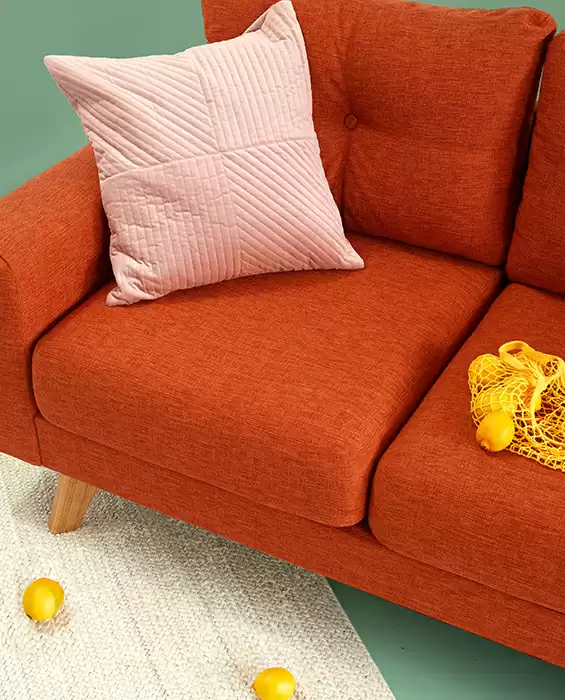
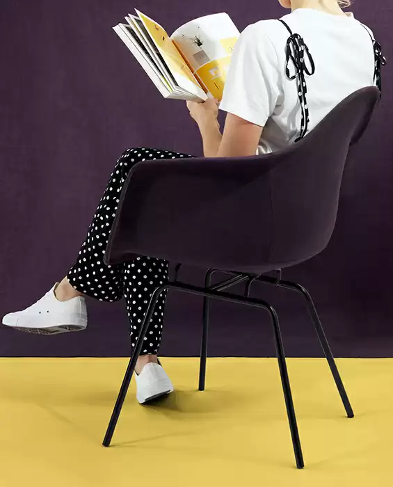
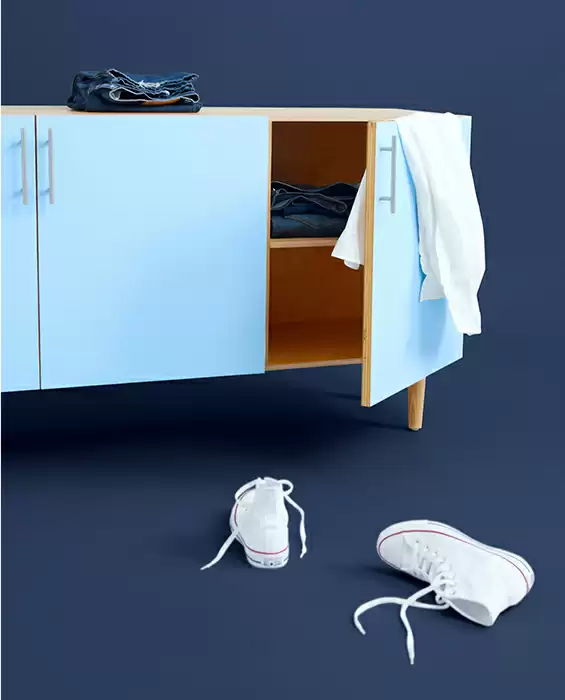
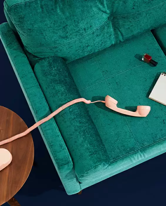
- Images: Relevant visuals accompany each section, beautifully complementing the themes presented.
- Interactive elements: A hand icon signals interactivity, hinting at potential hover effects or clickable areas that make navigation a breeze.
- Typography: With modern and legible font styles, the design features a clear typographic hierarchy that guides the reader’s attention effortlessly.
- Icons and graphical elements: The hand icon stands out, inviting users to engage; its presence implies an interactive experience waiting to unfold.
- Image characteristics: The design favours rectangular or square images with a clean, flat aesthetic, free of borders or shadows.
Unique design features
- Standout elements: The engaging interactivity is a standout aspect! The hand icon invites users to explore further, enhancing their experience on your site.
- Hover effects: While specific animations aren’t visible, the design encourages curiosity about hover effects that could add an interactive layer to your content.
- Responsive design: The adaptable grid layout is mobile-friendly, effortlessly reformulating for smaller screens and ensuring a seamless browsing experience.
- Accessibility considerations: The clear hierarchy and large call-to-action elements promote readability, making this layout suitable for all users.
Design style and impact
- Minimalist elegance: The overall style can be classified as simplistic yet refined, focusing on usability and visual appeal.
- Effective visual hierarchy: This layout guides users’ eyes to the most important elements, ensuring headers and content areas draw focus effectively.
- Clever use of white space: Ample white space enhances visual balance, preventing the layout from feeling overcrowded and making content consumption a pleasure.
Use cases for the minimalist grid layout
Portfolio showcaser
Capture the essence of your work in a visually appealing way, perfect for photographers, designers, and artists. The grid layout allows your portfolio items to shine individually while maintaining a cohesive look across the site.
Product highlights
Display various products in an organised manner, ensuring that each item gets the visibility it deserves. This format is ideal for e-commerce sites wanting to showcase multiple products at a glance.
Content hub
Organise articles, resources, or educational content in a reader-friendly manner. This layout aids in easy content discovery, encouraging visitors to engage with more material.
Team introduction
Present your team members attractively, allowing for easy introduction to each individual while maintaining a professional and cohesive team image.
Event calendar
Showcase upcoming events with a layout that provides clear details at a glance, making it easy for visitors to stay informed about what’s happening.
Testimonials
Engage your audience with genuine customer or client feedback displayed in a visually appealing format that builds trust and credibility for your brand.
Blog overview
Summarise blog post categories or popular articles in an engaging manner that entices readers to dive deeper into your content offerings.
Case studies
Showcase detailed case studies in a structured layout that presents each project or success story comprehensively and attractively.
Service offerings
Highlight different services in an organised grid, ensuring each offering is clearly defined and visually appealing to potential clients.
Gallery display
Curate a selection of images to tell a story or present themes in a way that captivates and keeps visitors engaged with your site.
Different types of pages suitable for the layout
Landing pages
Perfect for making a striking first impression with a clear and engaging layout that draws users in and guides them through your offerings.
Home pages
Set the tone for your entire site with an organised, visually appealing home page that highlights key areas and content within your site.
Portfolio pages
Showcase your work in a professional and enticing manner, ideal for creative professionals looking to highlight their talents.
Product pages
Displays products attractively, providing customers with a seamless browsing experience that encourages purchases.
About us pages
Create an engaging narrative about your brand, company mission, and team members with a structured and readable layout.
Services pages
Clearly outline your service offerings, making it easy for potential clients to understand what you offer and how you can help them.
Blog summary pages
Present a clear overview of your blog categories or recent posts in a way that encourages visitors to explore your content further.
Photo gallery pages
Showcase images beautifully, ensuring that each photo has its moment to shine within the grid structure.
Contact pages
Provide visitors with an easy way to get in touch, complemented by visuals and details about your team, location, or services.
Event pages
Showcase upcoming events or past highlights in an easy-to-navigate format that keeps your audience informed and engaged.
The perfect WordPress website design can greatly influence your site’s effectiveness. Whether you’re using free WordPress themes or exploring Elementor Alternatives, opting for the right layout sets the foundation for success. Using a minimalist grid layout ensures a clean, engaging, and user-friendly experience. Alongside modern WordPress website builders, this layout empowers you to present content beautifully. Consider how each element can aid your site’s user experience and explore new dynamics that this layout offers.
Conclusion
This minimalist, interactive grid layout is designed to captivate and engage, making it an ideal choice for WordPress website users looking to showcase multiple ideas clearly and effectively. With a focus on user experience, typographic clarity, and elegant visuals, this design is ready to elevate your website’s aesthetic and functionality! Transform your site and start captivating your audience today!

