Discover an engaging grid layout for your WordPress site!
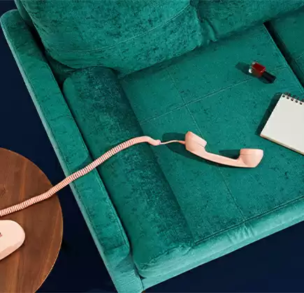
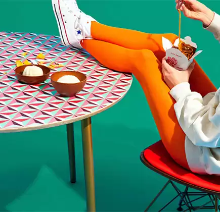
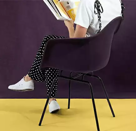
Transform your website with a stunning 2×2 grid layout that showcases your visual content beautifully. This design features four distinct cards, each thoughtfully arranged to create eye-catching symmetry, enhancing user experience.
Layout overview
- Overall structure: The design employs a clean grid layout with two rows and two columns, providing an organized and polished appearance for your website.
- Visual interest: Within the cards, images of diverse content and orientations keep the layout fresh and engaging, maintaining symmetry.
Key features
- Headers that pop: Each card captures attention with bold, captivating headers like “Born to play,” introducing your content effectively.
- Concise descriptions: Accompanying short text blocks help convey key messages at a glance.
- Interactive buttons: Prominent “Say hello” buttons on each card invite users to engage further, leading them to more information or actions.
Design elements
- Modern typography: Enjoy a stylish blend of bold headers and clean body text that creates a clear visual hierarchy, making information easy to digest.
- Unique imagery: Each card displays distinct images-landscapes, objects, and people-adding a personalized touch to your site’s theme.
- Responsive and accessible: The design adapts seamlessly to various screen sizes, ensuring your content looks great on any device. Its clear headings and buttons enhance accessibility, making navigation a breeze.
Unique design aspects
- Sleek modern style: Embrace a minimalistic aesthetic that prioritizes clarity and visual appeal, avoiding clutter for a focused user experience.
- Engaging user interaction: While hover effects are subtly hinted, they encourage interaction, making engagement with your content more dynamic.
- Balanced composition: Ample white space between cards promotes readability and balance, ensuring your site remains inviting.
Why choose this design?
This responsive grid layout-with its modern, minimalistic style, strong visual hierarchy, and engaging elements-is perfect for boosting user interaction on your WordPress website. Whether you’re showcasing products, services, or portfolio pieces, this design will capture your visitors’ attention and keep them exploring. Elevate your website today with our visually compelling grid layout!
10 use cases for this website image based patterns
1. Travel blogs
Showcase breathtaking destinations using an image-focused grid layout. Each card represents a destination with enticing images and engaging descriptions inviting readers to plunge into the adventure. Inspire wanderlust and facilitate easy navigation to detailed articles or travel itineraries.
2. Photography portfolios
Photographers can highlight their best work through a wordpress website builder, providing a visually stunning layout to display their artistic creations. Encouraging hands-on interaction, viewers can dive into collections, stimulating interest and appreciation for the artist’s craft.
3. E-commerce sites
Online stores can use this layout to feature product images, jumping between collections. Each card can lead to specific product pages, displaying essential details, prices, and call-to-action buttons. This approach enhances a Best website builder software, attracting potential buyers more intuitively.
4. Personal blogs
Narrate life experiences and personal stories through visually appealing cards. The minimalist design ensures each tale stands out, engaging visitors with structured, inviting content. Captivated, readers spend more time perusing engaging stories.
5. Art galleries
Utilise this grid layout to reveal diverse artworks, combining imagery with insightful annotations. Each card serves as a doorway to detailed explanations of pieces, nurturing deeper appreciation. The grid promotes seamless navigation across curated collections.
6. Recipe websites
Highlight culinary delights, embodying diverse cuisines through mouth-watering images. With recipes and comprehensive guides just a click away, this layout smoothly directs users to individual recipe pages, encouraging culinary exploration.
7. Educational resources
Academic websites can use a grid structure to feature educational categories or topics. Each card leads to supplementary material, such as articles, worksheets, or courses, fostering a coherent, organised learning experience for visitors.
8. Fashion lookbooks
Fashionistas can craft an eye-catching digital lookbook, showcasing collections via stylish photography and complementary textual descriptions. dynamic, immersive, and apt for captivating browsers intrigued by prevailing fashion waves.
9. Event portfolios
Event managers can unveil noteworthy events, using a timeline-based visual narrative. Each card unveils an event, delivering an immersive recollection complete with pivotal imagery and informative briefs. Captivate prospective clients by exuding professionalism.
10. Tech showcases
Technology aficionados can spotlight cutting-edge gadgets or innovations within the tech realm. Cards can focus on different devices or technologies, inviting users to delve deeper into specifications, reviews, and potential integrations.
10 different types of pages you can use image based designs
1. Homepage
Your website’s introductory page should employ a visually engaging grid layout to captivate visitors at first glance. Highlight significant elements, transforming casual visitors into interested participants.
2. Product pages
An image-heavy design aptly enhances e-commerce product pages, allowing shoppers to examine products with clearly engaging imagery along with succinct descriptions.
3. Portfolio pages
Artists, photographers, or creatives can use a grid design for a compelling visual display of their work. The integration highlights featured projects and facilitates seamless navigation through diverse categories.
4. Galleries
Create visually pleasing galleries with this design, perfect for extensive collections. Seamless categorisation and aesthetic presentation engage visitors, providing room for detailed exploration across your repertoire.
5. Blog archives
Use a grid layout to better organise your blog archives. Readers can quickly identify appealing post images paired with punchy previews, effectively enhancing overall navigability within extensive content troves.
6. About pages
Humanise your business or project through an image-based About Page. Integrate candid images showcasing your team, convey stories, or illustrate projects that underline your organisation’s core values.
7. Contact pages
Integrate thoughtfully arranged imagery on contact pages to display location details or previous interactions. This approach adds context-driven engagement to encourage visitor interaction, improving the odds of genuine connection.
8. Service pages
Feature a grid showcasing various services offered, each linking to detailed descriptions. Visualisation aids comprehension, helping customers easily understand your offerings, boosting higher conversion prospects.
9. Testimonials
Convert testimonials into captivating visuals within a grid design. Personalised cards can boost readability, trustworthiness, and authenticity, amplifying client satisfaction visibility across your digital space.
10. Case studies
Implement a grid page to house case studies, showcasing tangible success stories. Display specific images accentuating key points, while accessible links offer readers in-depth insights into each unique accomplishment.
Conclusion
With our word image-based template, you can create an impactful, engaging experience for your visitors. Whether you are leveraging wordpress webdesign or looking for elementor alternative options, this grid layout can transform your website’s aesthetic and functionality with its focus on clarity and interaction. As a quintessential tool for a responsive WordPress design, integrating such dynamic layouts elevates the prominence and utility of your site. Let the WordPress pattern library lead you in crafting the perfect website design in WordPress.
