Transform your content with a clean two-column design
Imagine a beautifully streamlined two-column layout that effortlessly captures attention while clearly conveying your message. This design features an engaging image on the left, complemented by a concise text block on the right-perfect for conveying information effectively and aesthetically.
Design analysis
Layout analysis
- Overall structure: This design employs a multi-column approach featuring a well-organised two-column layout that pairs visual and textual content seamlessly.
- Arrangement: With an image on the left and descriptive text on the right, the layout ensures clarity and balance, making your content easy to digest.
- Asymmetry: While predominantly symmetrical, the deliberate separation between image and text adds an organised touch, enhancing the professional look.
Element and feature description
- Visible elements:
- Headers: Start strong with a bold header titled “What we do.”
- Text blocks: Immediately follow with a compelling statement: “We’re passionate about helping your business grow,” along with three engaging list items.
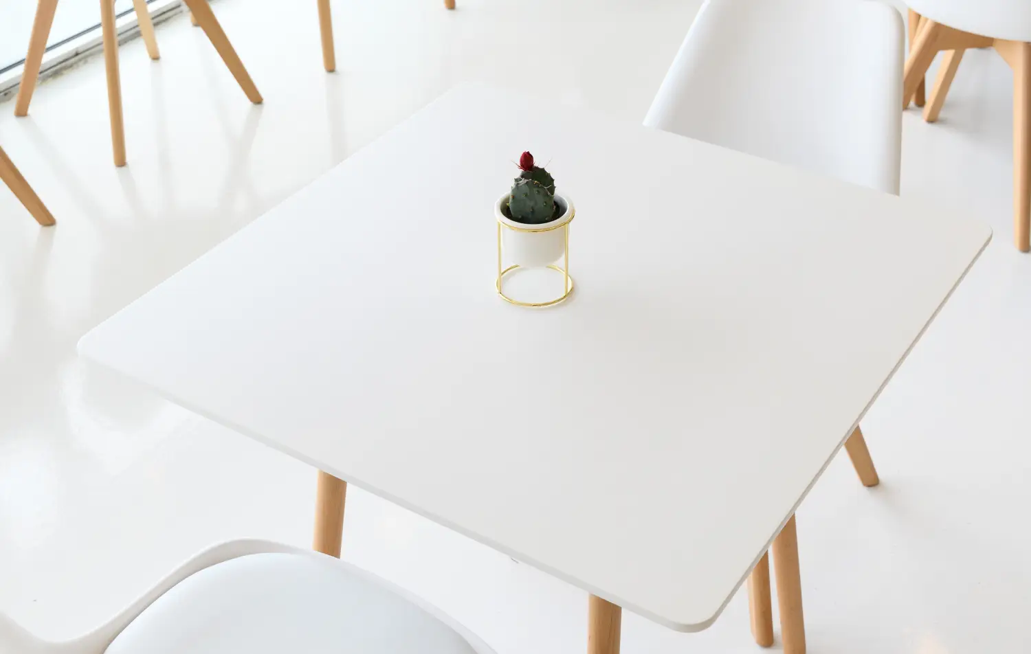
- Images: The left column showcases a visually appealing square or rectangular image that adds a decorative touch.
- Interactive elements: Although this design focuses on static content, it creates a solid foundation for incorporating interactive buttons or forms in the future.
- Typography: The bold header grabs attention, supported by standard typography that enhances readability and structure.
- Icons/graphical elements: The minimalist approach is conveyed through the absence of additional icons, allowing the header to stand alone.
- Image composition: Clean, borderless image alignment maintains a polished appearance, drawing the viewer’s eye without distractions.
Unique design aspects
- Standout design choices: The combination of visual and textual clarity in this minimalist design not only beautifies your content but also keeps the focus where it belongs-on your message.
- Hover effects/animations: Although static, this design serves as a blank canvas, inviting you to add subtle hover effects or animations if desired.
- Responsive design: Crafted with flexibility in mind, this layout easily adapts to various screen sizes, ensuring your content looks perfect everywhere.
- Accessibility considerations: Thoughtful typography contrasts enhance readability, making your design accessible to a wider audience.
Overall design style
- Design style: With a clean, minimalist aesthetic, this design prioritises simplicity, allowing your message to shine.
- Visual hierarchy: The powerful header draws immediate focus, and the effective organisation leads viewers naturally through the content.
- White space and balance: Strategic use of white space creates a balanced feel, ensuring neither the text nor the image overwhelms the viewer, promoting a sense of calm and clarity.
Accordion: Use cases & tips
Understanding accordions in web design
An accordion in a website acts as a collapsible content panel, allowing users to expand and contract sections as needed. This helps in organising content neatly and keeping the user interface clean.
Common examples of accordions
A prime example is the FAQ accordion layout, where frequently asked questions are listed and can be expanded to show answers upon clicking. This reduces clutter and improves user experience.
The advantage of using accordions
Accordions are excellent for conserving space and organising content in a visually appealing way. Their dynamic accordion layout is user-friendly and keeps information accessible.
Are accordions a good choice?
When implemented wisely, accordions can significantly enhance WordPress website design. However, overuse or poor execution might lead to less engaging user interfaces.
Are accordions SEO-friendly?
When used correctly, accordion content is usually read by Google, meaning they can be SEO-friendly. However, it’s crucial to keep the content accessible and readable to ensure it contributes positively to SEO.
When to avoid using accordions
Avoid using accordions on WordPress websites where all information is equally important, as some users might miss hidden content.
Are website accordions accessible?
Yes, but care must be taken. With proper coding (consider using WordPress web design tools), you can enhance their accessibility for users with disabilities.
UX design outlook
While Elementor alternatives for UX design evolve quickly, accordions remain a staple due to their efficiency in content management.
Alternatives to the accordion
Consider using Gutenberg blocks or carousels if your content is better suited to a more visual presentation, such as image galleries.
Accordion vs. carousel
The difference lies mainly in their use; accordions are for text-heavy, collapsible sections, while carousels are ideal for image or content sliders, offering a continuous loop experience.
10 use cases for the accordion
- FAQ sections: Perfect for listing questions with expandable answers, facilitating a clean presentation.
- Collapsible sections website: Ideal for pages needing structured, condensed information without overwhelming detail.
- Product descriptions: Offers detailed insights into product features while conserving space.
- Toggle accordion sections: Allows content such as project timelines or company history to be easily toggled on and off.
- Portfolio items: Collapsible details in design portfolios present comprehensive projects without clutter.
- Mobile-friendly accordion designs: Ensures seamless readability and interactivity on mobile devices.
- Terms and conditions: Allows users to expand sections and view specifics within lengthy legal text.
- Textual footnotes: Accredits and references within content without disrupting flow.
- Interactive accordion interfaces: Dynamic interaction within applications aids in showcasing complex processes.
- Vertical accordion menus: Ideal for navigation in sidebars, particularly in compact web applications.
5 ways to use the accordion
- Quick load accordion scripts: Employ lightweight scripts to ensure fast loading, enhancing user experience.
- YAML configured accordions: Use YAML for a structured data approach in complex web builds.
- React accordion components: Harness the power of React for modular, stateful implementation.
- Keyboard accessible accordions: Ensure accessibility by providing full keyboard navigation functionality.
- Lazy load accordion content: Implement lazy loading for content-heavy sections to improve load times.
Summary
This striking two-column design combines a bold header and streamlined text with a beautiful image, resulting in a clean and effective communication tool. The minimalist approach not only captures attention but also guarantees readability and visual appeal, making it a perfect choice for WordPress users. Embrace this layout to enhance your website’s effectiveness and charm today!


