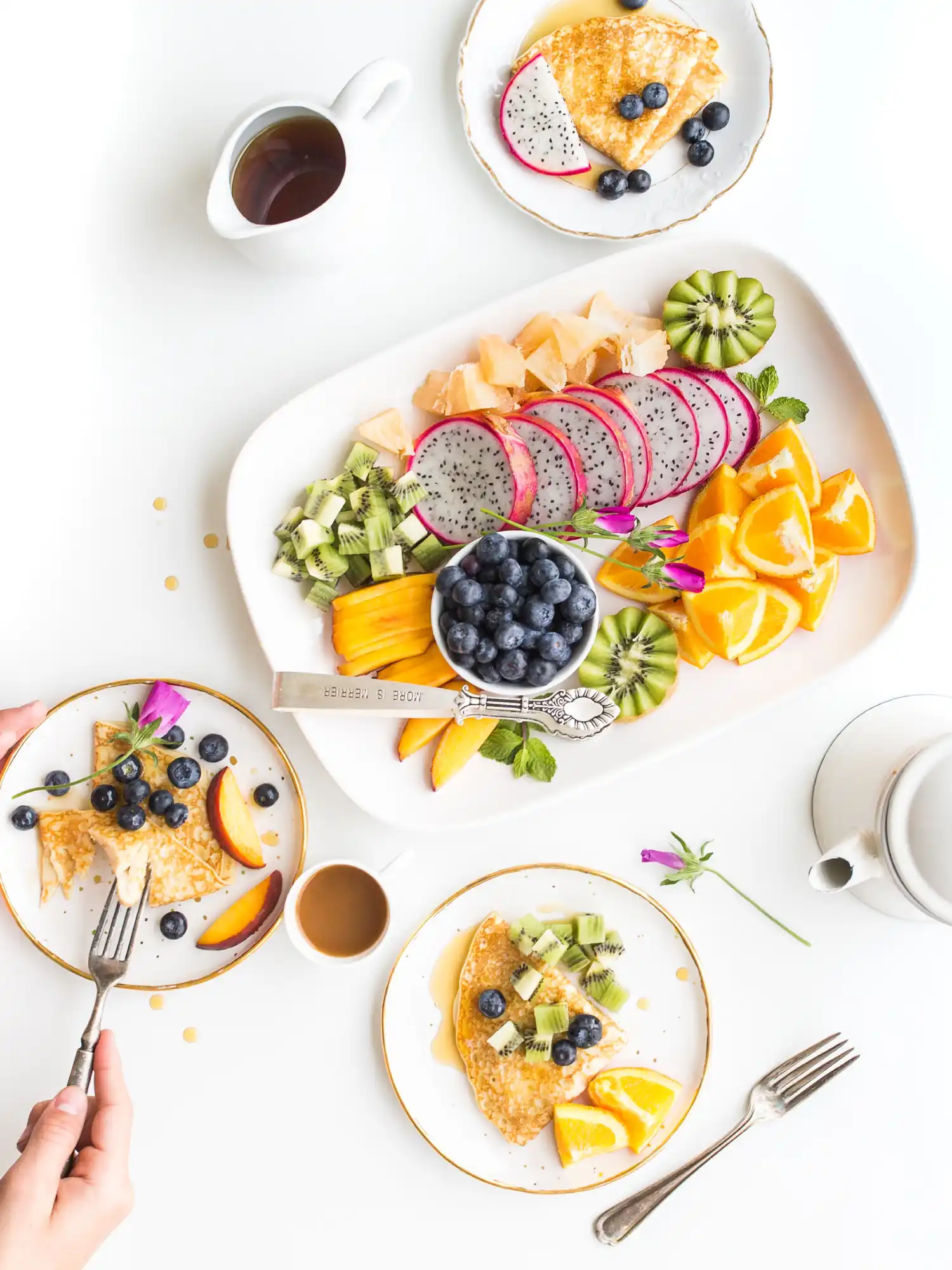
Good quality fuel for the car….then why not for yourself?
Lorem ipsum dolor sit amet, adipiscing elit. Donec odio. Quisque volutpat mattis eros.
Trusted by


Build WordPress sites with MaxiBlocks. All features free forever. No locked functionality. Optional Cloud Library saves you 10+ hours per project. Start free

Lorem ipsum dolor sit amet, adipiscing elit. Donec odio. Quisque volutpat mattis eros.
Trusted by


Elevate your WordPress website with our captivating hero banner design that seamlessly blends engaging text and stunning imagery. This unique layout features a striking, colourful food image on the right, showcasing its vibrant colours with rounded edges and a subtle drop shadow to add depth and interest.
The WordPress website hero banner design is versatile, fitting perfectly on various website types. Below are ten unique ideas to deploy this hero image with suitable descriptive text:
Capture appetites with vibrant images of your signature dishes. Use captivating text and a “Reserve a Table” button that tempts visitors to dine in.
Engage readers with a beautiful hero banner showcasing your most popular posts. The dynamic layout piques interest, encouraging exploration.
Highlight courses with a visually appealing hero banner. Use a “Sign Up Now” button to quickly onboard potential students.
Inspire action with stories of impact. A hero banner filled with eye-catching visuals can draw in supporters to “Join the Cause.”
Display the latest trends with stunning visuals. A bold “Shop Now” call to action can guide users to purchase directly from the homepage.
Entice wanderlust with picturesque travel destinations. Use this hero banner to offer exclusive travel packages that invite exploration.
Showcase your work dynamically with high-resolution images. A well-placed “Explore Portfolio” button facilitates discovery.
Inspire fitness goals with vibrant photos of training facilities. Use an inviting “Join Now” button to attract new members.
Highlight innovative solutions with sleek, modern designs. The hero banner can introduce breakthroughs with an inviting “Learn More” button.
Elevate your exhibits by showcasing art pieces. Draw visitors in with an engaging “Visit Us” call to explore creative showcases.
Personalizing your hero banner can set your WordPress website design apart. Below are ten suggestions to customise it reflecting your unique brand:
Blend your brand’s colours into the hero banner, enriching recognition and creating a cohesive look throughout your site.
Swap stock photos for authentic images to convey originality and strengthen your connection with the audience.
Select typefaces that reflect your brand’s personality. An alignment of typography creates a consistent visual theme.
Incorporate animations that the dynamic element adds depth and catches visitor interest effectively.
A moving hero banner attracts attention. Consider a short loop video to showcase products or services dynamically.
Utilise layers for added texture. This enriches the design, and draws attention to key elements.
Engage users with interactive components, like scroll-triggered animations, to promote engagement.
Add depth by using shadowing techniques to lift elements off the page for a more engaging design.
Personalise call-to-action buttons with strong, action-oriented language that aligns with your overall goals.
Gather insights from user feedback to fine-tune design elements that resonate most with visitors.
Transform your site with this modern, asymmetric hero banner design, combining text and imagery. With a strong visual hierarchy and engaging elements, it’s made to capture attention and drive interaction, the WordPress website design dream. Leverage responsive design techniques and best practices in hero banner creation to ensure your WordPress website builder project stands out. Start creating your compelling presence today!
