

Build WordPress sites with MaxiBlocks. All features free forever. No locked functionality. Optional Cloud Library saves you 10+ hours per project. Start free
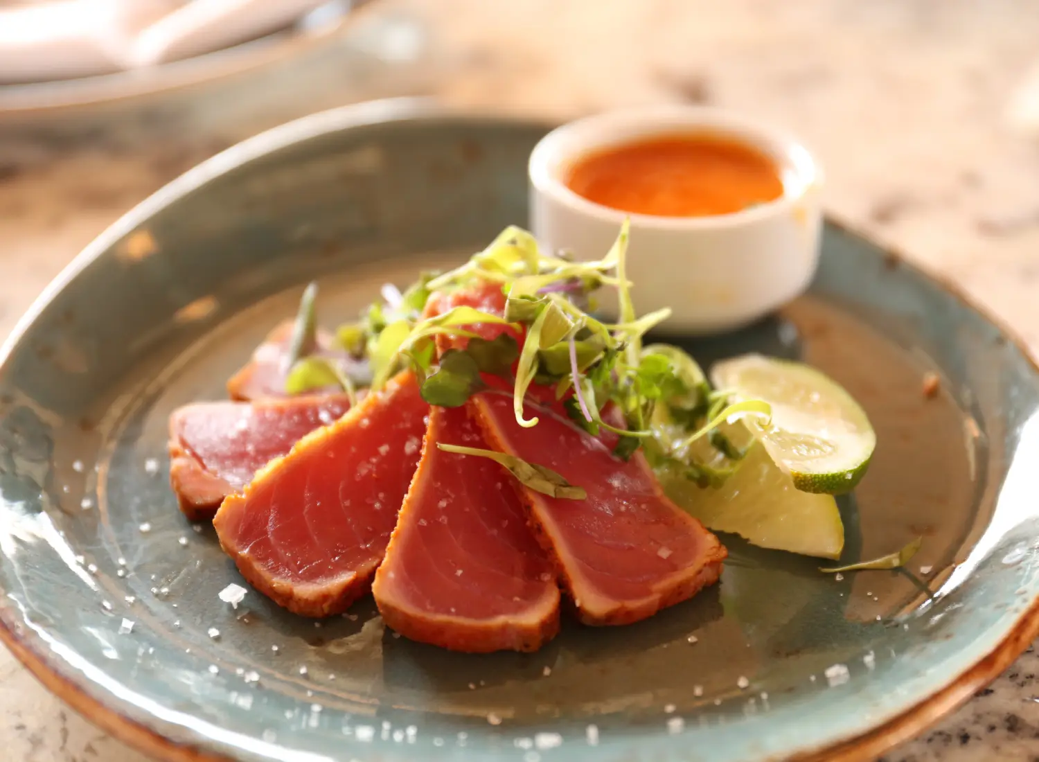
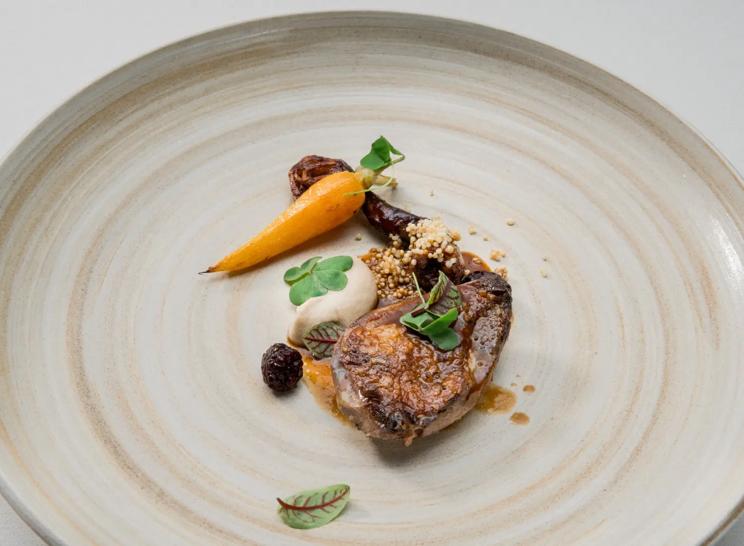
Transform your WordPress website with this eye-catching two-column layout that perfectly blends culinary presentation with minimalist elegance. On one side, you’ll find a neatly organized menu, while the contrasting side showcases a vibrant image of exquisite plated food that captures attention and whets the appetite. This design not only highlights your dishes but also enhances user experience with its clean structure.
This layout features a two-column design-one side dedicated to a menu and the other spotlighting a stunning food image.
The left column presents a vertical list of menu items, divided into sections for easy navigation. The right column boasts a central image of a carefully arranged plate, creating a compelling visual focus.
The asymmetrical design enhances interest, with a slender menu on the left contrasting beautifully with the broad, detailed food image on the right.
Enhance restaurant sites with captivating visuals that allow chefs to highlight their signature dishes. These designs provide potential diners with an engaging preview, maximizing the impact of gastronomy.
Artists and photographers can present their work in beautiful formats, keeping each piece front-and-center for audiences, thanks to the platform’s natural layout capabilities.
Travel enthusiasts can share immersive experiences with layout patterns that combine detailed itineraries on one side and stunning destination images on the other.
Firms can effectively display past projects, ensuring each client’s work receives highlighted attention with balance and clean visual presence.
Photographers can showcase love stories through images that captivate audiences, providing galleries of cherished moments for clients to relive.
Perfect for e-commerce platforms, this design pattern elevates product visuals, promoting merchandise qualities with accompanying detailed specs or reviews.
Those sharing wellness journeys can craft articles paired with motivational images that parallel or deepen users’ reading experiences.
Lectures or online courses presenting complex information can be simplified using a half-image, half-text layout, which aids in clearer understanding.
Business websites can present vital information and performance analyses side-by-side, bolstered by supportive visuals and illustrative comparisons.
Promoters can couple event detail lists with vibrant photos of past initiatives, setting the right atmosphere to attract future participants.
Grab attention with exemplary site introductions that draw viewers in and clearly convey your brand ethos through balanced text and imagery.
Explain the journey of your business with a mixture of founding moments, team images, and inspiring mission statements.
Make it easy for clients to reach out by clearly listing contact information and using maps providing visual guidance alongside high-quality images.
Whether artist, designer, or developer, showcase exemplary works side-by-side with descriptions, crafting a cohesive, visually compelling display.
Breakdown offerings using an image-centric approach that ties each service with descriptors, resulting in a clean, easily navigable read-through.
Accompany engaging articles with captivating images that serve as story enhancers, aiding imagination in topics requiring visualization.
For merchandise, use image-focused templates to effectively display features, accompanied by product specifications and lists for a transparent review.
Highlight satisfied customers with snapshots paired with full reviews or acclaiming statements, enhancing authoritative reassurance with smile-filled imagery.
Present common queries using a centerpiece table or text-based side, aided by symbolic images to contextualize possible point-of-interaction questions.
Mix image-focused setups with detailed explanations or progress reports, thereby showcasing successful business or individual growth paths comprehensively.
This two-column layout design combines a captivating food image with a well-organized menu, creating an inviting atmosphere that assists diners in making food choices. Its modern, minimalist style, strong visual hierarchy, and readability make it an excellent tool for showcasing your culinary delights on your WordPress website. Whether you’re just starting with a free WordPress theme or considering Gutenberg blocks, this template can elevate your restaurant or cafe presentation today. And if you’re exploring WordPress website design or seeking Elementor alternatives, consider this adaptable structure for a seamless, standout web presence.
