Case studies
Building your visions and creating your reality
01
Lorem ipsum
02
Lorem ipsum
03
Lorem ipsum
04
Lorem ipsum
05
Lorem ipsum
06
Lorem ipsum
07
Lorem ipsum
08
Lorem ipsum

Build WordPress sites with MaxiBlocks. All features free forever. No locked functionality. Optional Cloud Library saves you 10+ hours per project. Start free
Case studies
Building your visions and creating your reality

01
Lorem ipsum

02
Lorem ipsum

03
Lorem ipsum

04
Lorem ipsum

05
Lorem ipsum

06
Lorem ipsum

07
Lorem ipsum

08
Lorem ipsum
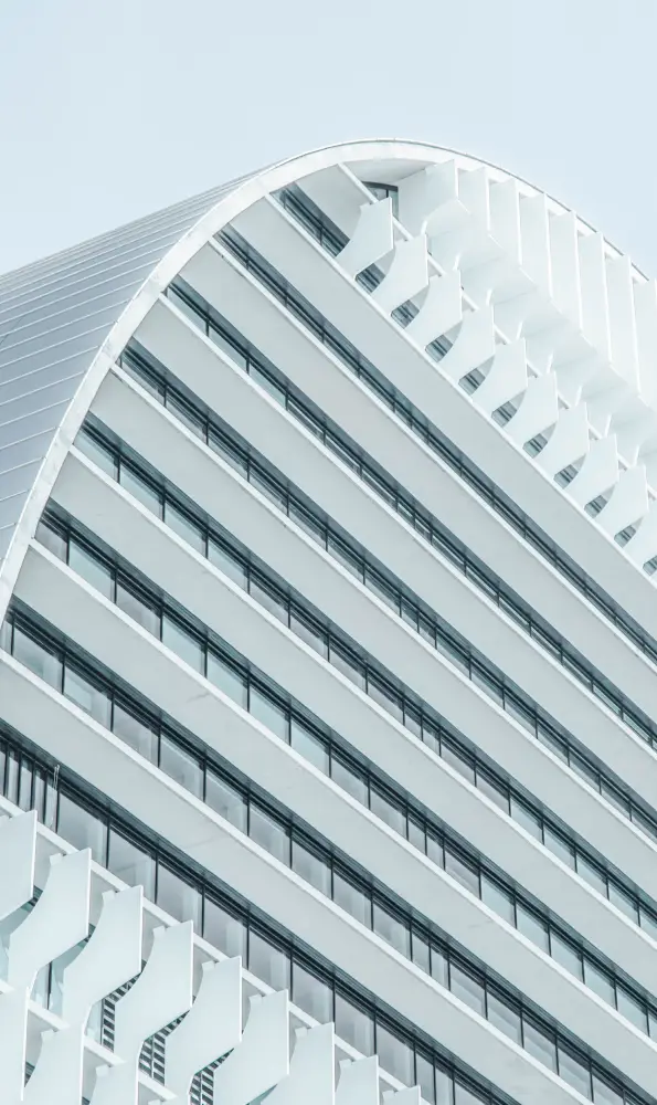
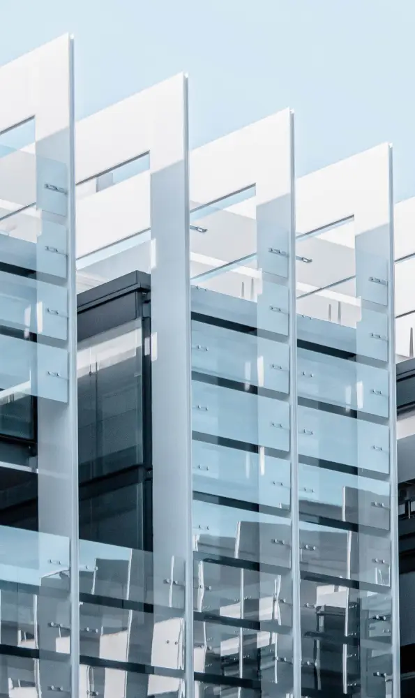
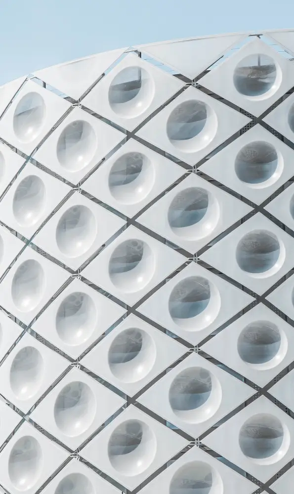
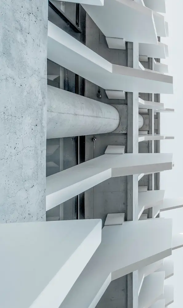
Are you looking to elevate your WordPress website‘s aesthetic and showcase your projects in a unique way? Discover this modern and minimalistic layout design crafted specifically for case studies. It features a visually engaging two-row, four-column grid of images, distinguished by its innovative use of circular borders at the bottom of each image, creating a dynamic contrast against the grid’s rectangular structure.
Transform your WordPress website into an impressive portfolio display. This layout is perfect for artists, designers, and creatives to highlight their projects seamlessly. With a two-row, four-column grid, you can present up to eight pieces uniquely framed to attract potential clients or employers. The clean and modern aesthetic ensures your work remains the focal point, with each piece enhanced by the dynamic circular framing.
Boost your credibility by showcasing client success stories using this adept layout. Displaying testimonials alongside related project images creates a compelling narrative of satisfaction and achievement. The distinct circular framing adds an engaging twist that ensures your testimonials stand out, while the minimalist design keeps the focus firmly on your clients’ words.
Photography enthusiasts and professionals can take advantage of this layout to create a stunning, clean gallery. Display your collection in a way that appreciates every detail of your work. The circular bottom borders bring an artistic edge to each photograph, while the structured grid maintains coherence, suitable for both large collections and curated showcases.
Entrepreneurs can elevate their product pages by applying this engaging layout. Highlight key products with striking imagery, ensuring each appears both distinct and professional. The two-row, four-column setup offers ample space for various products, while the circular framing adds a touch of sophistication, turning potential viewers into buyers.
Highlight the breadth of your offerings with styled service descriptions. Pair detailed textual explanations with matching visuals to create an immersive understanding of your brand. The structured grid helps organize content effectively, while the image style livens up service overviews, keeping prospective clients engaged.
Capture readers’ attention by showcasing top blog posts with captivating thumbnails. This eye-catching presentation, enhanced by circular framing, ensures your content stands out and attracts new readers. Providing a functional yet visually pleasing layout transforms simple blog links into dynamic entry points for your audience.
Whether you’re planning past or upcoming events, a structured presentation ensures they remain vibrant in visitors’ minds. Utilize engaging images alongside event descriptions within this layout, making your WordPress website design efforts rewarding and memorable.
Educational institutions or online course creators can adopt this pattern to feature courses attractively. Each tile can explore a different subject, with text explainer overlay creating a cohesive understanding. The organized grid ensures easy navigation for learners, while the aesthetic boosts educational appeal.
Replace traditional menus with this modern digital design. Display top dishes visually, applying enticing descriptions that complement mouth-watering imagery. This fresh approach to presenting menus excels in drawing both casual diners and culinary enthusiasts, eager to explore your offerings.
Effectively communicate your non-profit’s mission through visually driven projects. Bring causes and achievements to life by wrapping your case studies in memorable imagery. This layout helps build emotional connections, encouraging visitors to engage and contribute both time and resources to your cause.
Incorporating image-based designs into your home page can create an immediate impact, engaging visitors from the outset. An aesthetically pleasing entry point instantly conveys professionalism and creativity, while offering visitors clear pathways towards your core content. Balancing powerful visuals with strategic text is key to a compelling first impression.
Using image-based designs on your “About Us” page personalises the visitor experience. Complementing your narrative with images of your team and workspace fosters trust and relatability, making viewers feel more connected to your mission. This approach captures the essence of your brand, going beyond words to display authenticity.
Illustrating your service offerings through compelling imagery helps communicate value quickly and memorably. Pairing images with service descriptions creates an intuitive flow, demonstrating your expertise and commitment to quality. Clients can seamlessly appreciate the benefits, encouraging conversion through clear visual storytelling.
Showcase client success stories with impactful images, deepening the authenticity of your testimonials. Utilizing matching visuals alongside positive client feedback brings stories to life, building trust in your product or service. An enhanced testimonials page directly influences confidence in prospective clients.
An image-based design is ideal for artists, photographers, and creatives who want to spotlight their work effectively. This format highlights projects visually, inviting potential clients to explore work examples in a curated, engaging manner. Image-driven portfolios emphasize skills and creativity, paving the way for new opportunities.
Revitalise your blog page by structuring content through eye-catching thumbnails and layout. This design enhances article visibility, transforming simple text links into visually inviting paths to your posts, increasing click-through rates. An impactful blog page keeps your content fresh, drawing new readers consistently.
A visually engaging product page can make all the difference in e-commerce. By incorporating vibrant images with clear descriptions, you can create a seamless shopping experience. This design uses imagery to convey product details and quality, attracting users and directly influencing purchasing decisions.
Enhance your event page by presenting key details through striking images. This design effectively communicates the essence of events in a lively and engaging manner, encouraging attendance. Image-driven event pages not only inform but also inspire excitement, driving higher participation rates.
Even a contact page can benefit from visual elements. Adding images of your team or office location personalises the experience, building trust with visitors. A visually inviting contact page increases engagement, guiding users seamlessly towards initiating communication, crucial for business growth.
A gallery page dedicated to showcasing images benefits immensely from a well-planned design. Grouping visuals in a structured format facilitates easy browsing and exploration, highlighting themes and collections effectively. A strategic gallery layout ensures each image is featured prominently, maximizing viewer impact.
Elevate your WordPress website design with this cutting-edge layout that blends functionality and visual appeal. The unique circular framing and meticulous structure ensure your case studies aren’t just seen, but remembered. Ready for a standout upgrade? Boost your site’s impact by exploring more about WordPress website builders and Elementor Alternatives to enhance your project’s potential.
