WordPress pattern: Pure Image Dark PID-PRO-72
Build WordPress sites with MaxiBlocks. All features free forever. No locked functionality. Optional Cloud Library saves you 10+ hours per project. Start free
Discover the Engaging Two-Column Image Layout for Your WordPress Site
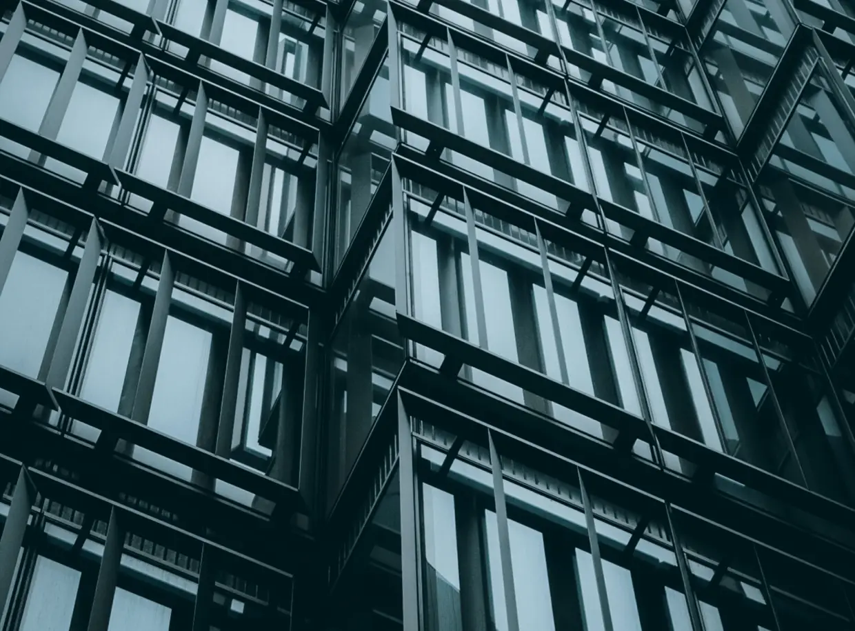
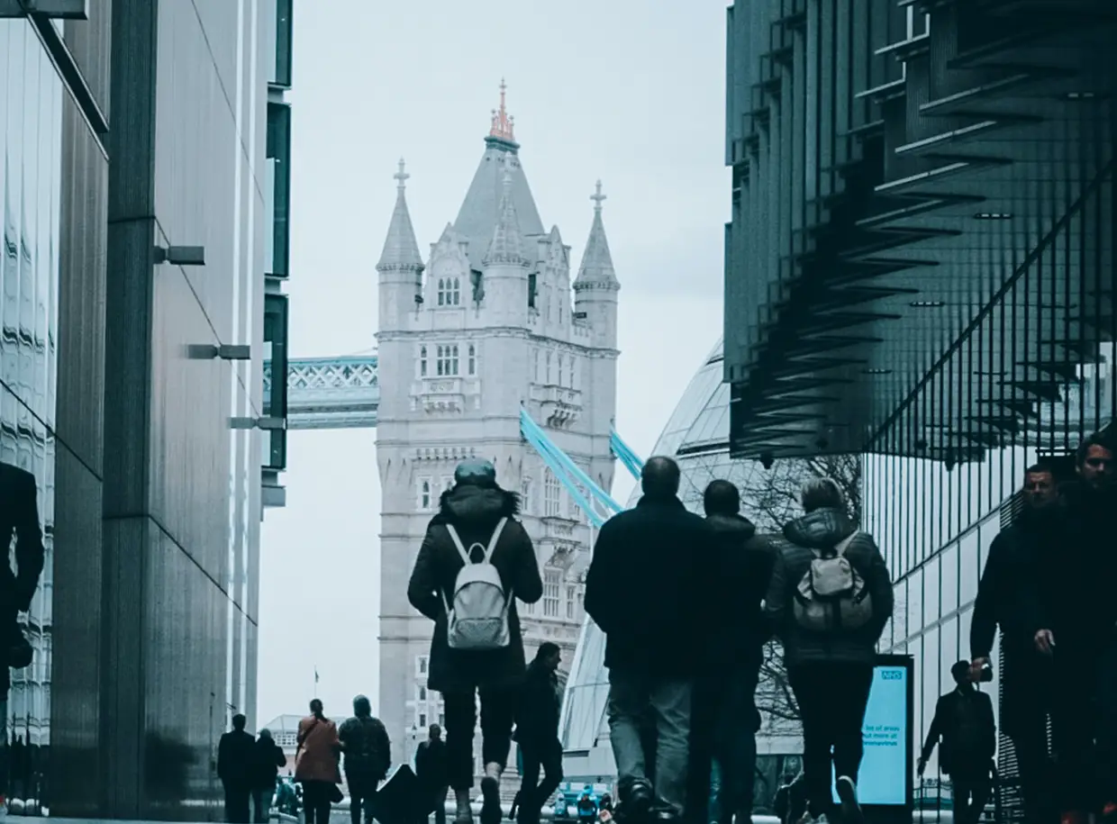
Elevate your WordPress site’s aesthetic with this striking two-column image layout that captures attention and enhances user engagement. Designed to showcase the contrasting themes of “Minimalist” and “Trends,” this layout seamlessly integrates bold headers, stunning visuals, and interactive elements. It’s a fantastic choice for those looking to impress and inform through effective WordPress website design.
Layout overview
- Overall structure: The eye-catching design features a balanced two-column format.
- Image arrangement: Each column hosts a distinct image complemented by a descriptive header and a dynamic button, offering a visually appealing contrast between two engaging concepts.
Key elements and features
Headers
Bold titles- “Minimalist” on the left and “Trends” on the right-immediately draw attention, setting a clear theme.
Images
Full-width visuals relevant to each header enhance storytelling and knowledge sharing. Incorporating images is a staple in WordPress web designs, creating unique opportunities for exploration.
Interactive buttons
Prominently placed circular buttons act as intuitive gateways for further engagement. Users can navigate beyond the surface of your design effortlessly with these eye-catching elements.
Typography and visuals
Typography
Headers are designed with bold fonts for strong emphasis, ensuring readability against likely darker image backgrounds.
Graphical elements
The circular buttons not only facilitate interaction but also add a sleek touch, enhancing the visual appeal of your web design for WordPress.
Design innovations
Unique aspects
This design stands out by artfully contrasting two dynamic themes, creating an engaging visual narrative that’s perfect for discovering inventive WordPress icons.
Responsive design
Columns are proportionate and designed to adapt seamlessly across various device screens, ensuring a flawless user experience on all platforms.
Overall design style
Aesthetic
With a modern minimalist approach, this layout offers clean lines and effective visual separation of distinct concepts, making it both stylish and practical.
Visual hierarchy
The clear hierarchy guides users’ attention, helping them navigate seamlessly from headers to images and actions.
White space
The thoughtful use of white space not only enhances readability but also gives the design room to breathe, contributing to an uncluttered look.
Use cases
Photography portfolios
This layout is perfect for photographers looking to showcase their work, highlighting contrasting styles within a single webpage. It allows images to stand out while offering easy navigation through interactive elements.
Fashion lookbooks
Fashion brands can use the two-column format to display seasonal collections. The “Minimalist” and “Trends” themes offer a distinctive way to navigate between classic and contemporary pieces.
Corporate profiles
Businesses can utilize this layout to present service offerings and company values side-by-side, providing a quick yet comprehensive view for potential clients.
Travel blogs
For travel enthusiasts documenting their journeys, this layout vividly contrasts different locations through imagery coupled with engaging stories.
Art exhibitions
Ideal for art galleries, this format allows for the seamless presentation of diverse exhibits, inviting viewers to explore various artistic themes.
Product showcases
Complement a product launch or feature with imageries that highlight both core functionalities and innovative trends, drawing user focus efficiently.
Restaurant menus
Capture the ambiance of your establishment alongside a detailed menu, inviting visitors to experience culinary trends and timeless dishes.
Tech reviews
Highlight the cutting-edge and traditional elements of tech products, making comparisons easy and engaging for readers.
Landscape design
Gardeners and landscape designers can beautifully display before-and-after shots under minimalist and trending themes, showcasing their impactful transformations.
DIY tutorials
With a focus on step-by-step imagery, this layout helps in presenting both simple and trendy DIY projects efficiently.
Types of website image-based themes
Urban exploration
Focus on the gritty details of city life amidst towering architectures and bustling streets to engage urban travelers and city enthusiasts.
Rustic charm
An earthy tone to showcase rural life or rustic decor, appealing to those who embrace old-world charms and tranquility.
Minimalist elegance
For fans of simplicity and clean lines, this theme offers images with muted tones and straightforward compositions.
Vibrant pop
Use bold colours and striking imagery to captivate users, ideal for dynamic brands aiming to make an impression.
Vintage nostalgia
Create a sense of bygone eras with sepia tones, distressed textures, and age-old charm, perfect for retro-focused brands.
Abstract artistry
Appeal to art lovers with abstract imagery that challenges convention and sparks curiosity through creative play of form and colour.
Black and white
This classic theme highlights contrasts and dramatises visual narratives through monochrome photography and designs.
Nature’s palette
Showcase the great outdoors with lush greens, vibrant blues, and fauna, great for eco-aware brands or lifestyle sites.
Culinary delights
A visual feast with a focus on food, spices, and ingredients, engaging culinary enthusiasts and encouraging them to discover new flavours.
Industrial modernity
Capture the essence of urban life using industrial themes with metal, glass, and sleek lines, appealing to modernists and industrial aficionados.
Conclusion
In conclusion, this two-column image layout combines a minimalistic design with functional engagement, making it an excellent choice for your WordPress website design. With its visual appeal and user-friendly interactive features, it effectively communicates distinct themes while inviting further exploration. Transform your content with this professional layout that perfectly balances design elegance and user experience. For those keen on exploring Elementor alternatives and the best practices in web design, this layout presents an optimal solution.


