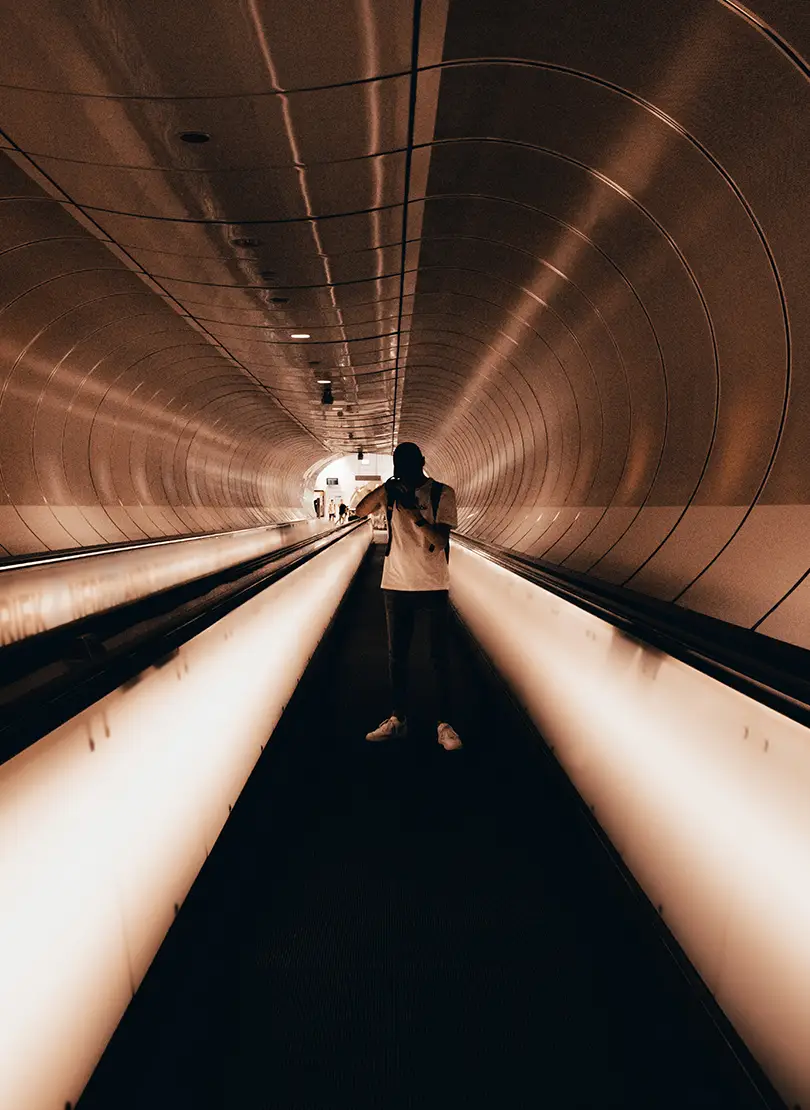
Born to play
Lorem ipsum dolor sit amet, consectetuer adipi
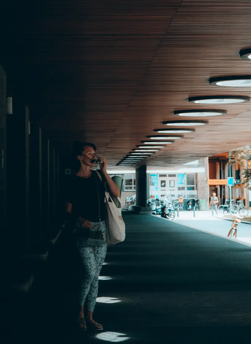
Empowering people
Lorem ipsum dolor sit amet, consectetuer adipi
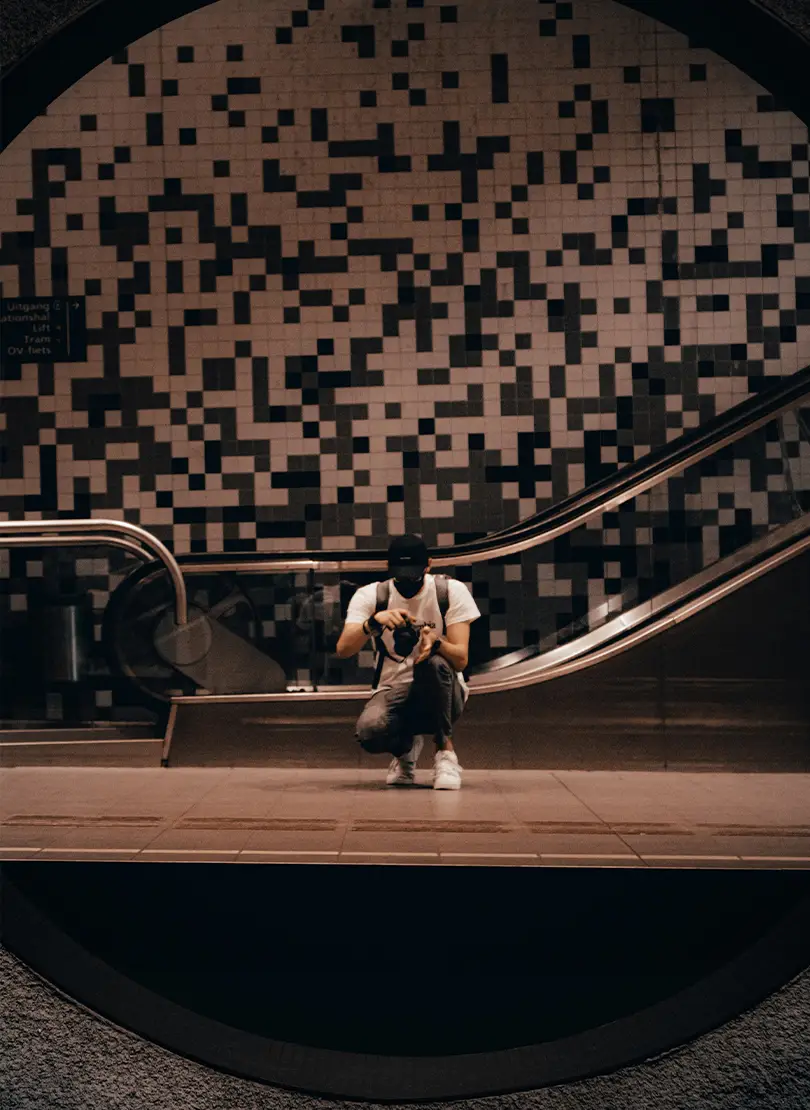
Be direct
Lorem ipsum dolor sit amet, consectetuer adipi

Build WordPress sites with MaxiBlocks. All features free forever. No locked functionality. Optional Cloud Library saves you 10+ hours per project. Start free

Born to play
Lorem ipsum dolor sit amet, consectetuer adipi

Empowering people
Lorem ipsum dolor sit amet, consectetuer adipi

Be direct
Lorem ipsum dolor sit amet, consectetuer adipi
Elevate your WordPress website‘s visual appeal with a sleek, multi-column image design. By combining striking imagery with clear messaging, it becomes the perfect tool for showcasing products, services, or key information. This layout features three equal-sized vertical columns in a single row, each filled with unique content to create a dynamic and balanced viewing experience.
Highlight different product features or variations using individual columns for each item. This makes it easy for customers to compare options at a glance.
Display your various services attractively. Assign each service to a column with an image, description, and call-to-action button for inquiries.
Focus on simplicity and clarity with zero clutter. Use ample white space and a bit of text to let the images make the strongest impact.
Explore vibrant hues and dynamic layouts. Perfect for brands wanting to make a lively statement and captivate their audiences instantly.
Finding the right images enhances the WordPress design. Sources like stock photo websites, public domain collections, or hiring photographers can provide high-quality visuals. You can even browse various online repositories offering royalty-free downloads for more budget-friendly options.
This minimalist, symmetrical multi-column layout features rounded images and bold typography to enhance engagement and direct user focus. Its elegant design is ideal for modern web interfaces, making it a top choice for [WordPress web designs](https://maxiblocks.com/wordpress-websites/what-is-wordpress/wordpress-website-design/full-site-editing-fse/wordpress-full-site-editing-theme/). Bring your website alive with this impactful image design and reach your audience in a captivating way!
