Discover a stunning multi-column layout for your WordPress site!
Transform your WordPress website with this captivating and minimalist multi-column layout! With three elegantly arranged vertical panels, you can showcase distinct images and accompanying text side by side, creating a visually engaging experience for your visitors.
Layout overview
Overall structure
This layout is crafted in an organized multi-column format, consisting of three vertical panels that capture attention.
Arrangement
With its three columns in a single row, each section serves as a unique canvas for images and text, ideal for thematic content.
Asymmetrical choices
While the overall layout maintains a symmetrical balance, each column presents unique subject matter, ensuring diversity and intrigue.
Element and feature highlights
Clear and impactful elements
- Headers: Each panel boasts a striking heading that draws the reader in.
- Text blocks: Descriptive text underneath each header provides context and information.
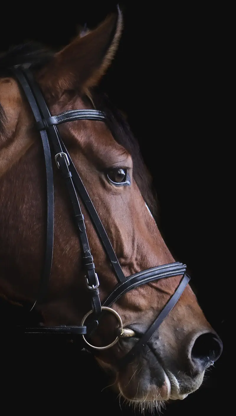
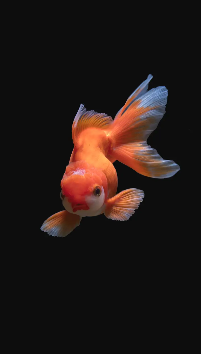
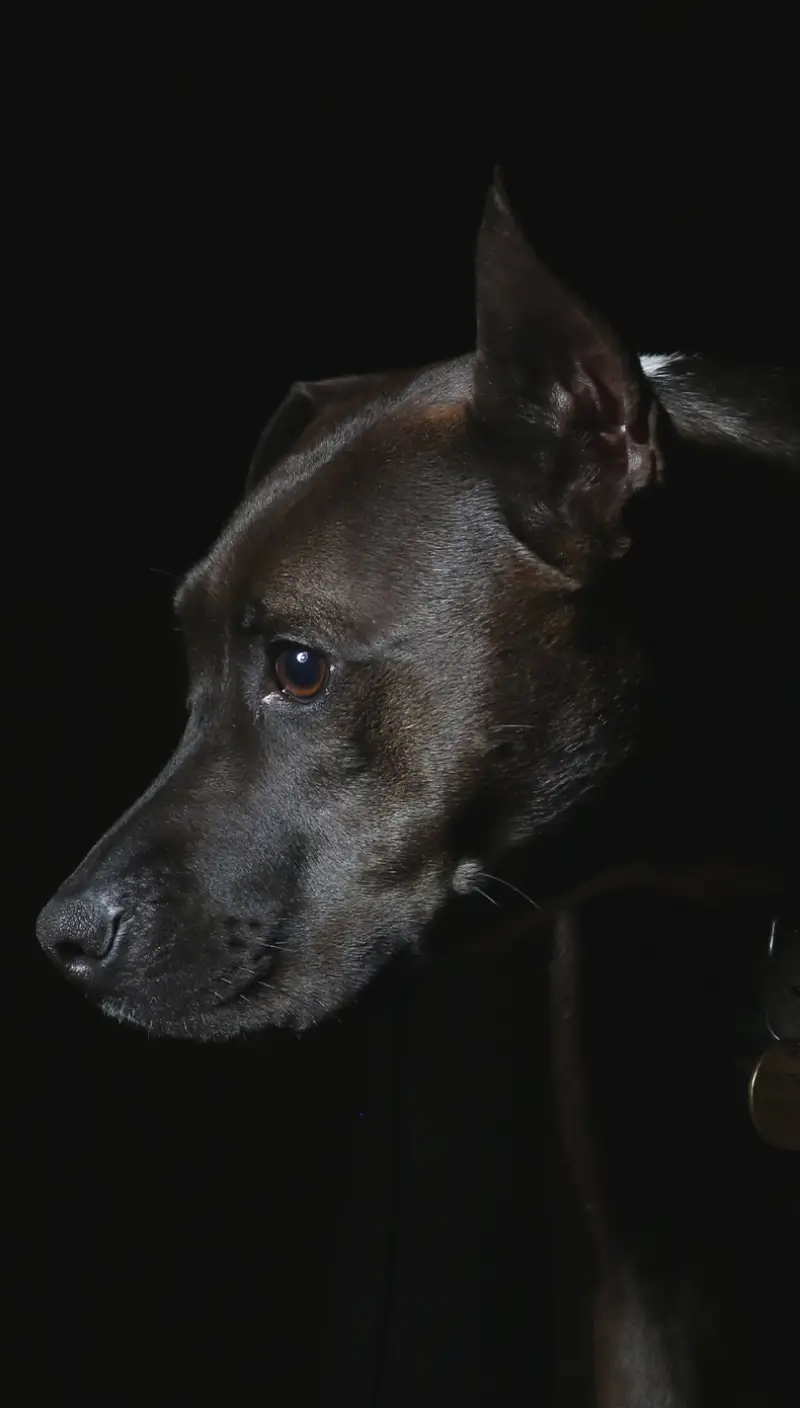
- Vibrant images: Showcasing diverse subjects like a horse, goldfish, and dog, each image conveys its own message.
Simple interaction
Though there are no buttons or links in this design, its clean presentation invites exploration.
Stylish typography
The modern font with varying sizes enhances readability and establishes a clear hierarchy, guiding users effortlessly through your content.
Image presentation
Each image features crisp edges and a portrait orientation, ensuring they stand out while maintaining a focus on their subjects.
Unique design features
Thematic differentiation
The combination of different animal images adds a layer of storytelling, engaging your audience with varied visual narratives.
Static presentation
The design follows a clean, static format without unnecessary animations, making it straightforward and focused.
Responsive design
Each column adapts seamlessly to different screen sizes, ensuring your content looks amazing on all devices.
Accessibility awareness
The high contrast between the text and dark background enhances readability, catering to all users, including those with visual impairments.
Overall design style
Minimalist aesthetic
This layout exemplifies a minimalist approach, promoting clarity by minimizing distractions and emphasizing essential content.
Effective visual hierarchy
The arrangement leads the viewer’s gaze from stunning images to impactful headers and descriptive text, enhancing comprehension.
Mindful use of white space
Thoughtful spacing between columns and elements maintains balance, ensuring that your content is clean and not overcrowded.
Use cases for this website image-based pattern
Portfolio showcase
This layout is perfect for showcasing your work if you’re an artist or photographer. The clean design lets your images shine, presenting your portfolio in a professional and engaging way.
Product features
Display product features alongside high-quality images to engage potential customers. This setup works excellently for e-commerce platforms aiming to provide detailed product insights.
Travel blog
Capture your audience’s imagination with stunning travel images paired with intriguing stories and insights from your adventures. This layout brings your travel tales to life.
Recipe blog
Entice readers with delicious images and recipes. Each column can feature a different recipe, complete with images and step-by-step instructions, making it a feast for the eyes.
Event highlights
For event organisers, showcase the best moments of a recent event with this layout. Pair images with descriptions to create a keepsake gallery for attendees.
Educational content
Use this layout for educational websites to present concise and engaging learning material. Each column can tackle a different topic or concept.
News features
This format is excellent for online journals and news outlets focusing on feature stories. The blend of image and text draws readers to different aspects of a story.
Corporate presentations
Corporations can use this method to offer insight into company culture, divisions, and success stories. It helps build a transparent and engaging corporate image.
Art gallery exhibitions
Ideal for virtual art exhibitions, this setup allows art curators to present pieces alongside artist statements or historical context, enriching viewer experience.
Health and wellness advice
Share health tips or workout routines with compelling imagery that motivates your audience towards healthier lifestyles. The dynamic layout compels exploration.
Different types of website image-based themes
Minimalist gallery
This theme focuses on simplicity, allowing images to speak for themselves. With a monochrome palette and restrained design elements, the images take centre stage.
Nature-inspired layout
Infuse natural beauty into your site with a theme inspired by landscapes and organic patterns. Perfect for photographers and environmental projects.
Urban chic portfolio
For those wanting to capture the hustle and bustle of city life, this theme showcases urban imagery alongside sleek typography, ideal for street photographers.
Vintage elegance
Bring a touch of nostalgia to your site. Use vintage overlays and sepia-toned images to evoke a sense of history and timeless elegance.
Modern abstract
This theme uses geometric shapes and bold colours to create a striking visual experience. Perfect for contemporary artists or tech-forward companies.
Classic typography
When text and image intertwine artfully, this theme shines. It’s great for magazines where editorial features require as much visual punch as words.
Monochromatic harmony
Explore the striking potential of a black-and-white theme. This design highlights the simplicity and elegance of monochrome, emphasising the artistry in details.
Nature-mimicking open spaces
Promote tranquillity and peace by mimicking nature’s expansiveness with open spaces and gentle colours. Suitable for lifestyle and wellness projects.
Whimsical illustration
Great for creative enterprises, this theme intersperses illustrations with photos, inviting playful interaction and sparking imagination.
Fashion-forward flair
Designed with clothing retailers in mind, emphasising high-fashion aesthetics with striking visuals and ample room for featuring designer statements.
Conclusion
Elevate your web presence with this sophisticated minimalist multi-column layout that harmoniously blends striking visuals and concise text. It’s designed to captivate and inform, making your WordPress website design not only readable but also visually compelling. Take advantage of these expertly crafted free WordPress themes to engage your audience with thoughtful design-transform your WordPress website builders now!


