Case studies
Building your visions and creating your reality
01
Lorem ipsum
02
Lorem ipsum
03
Lorem ipsum
04
Lorem ipsum
05
Lorem ipsum
06
Lorem ipsum
07
Lorem ipsum
08
Lorem ipsum

Build WordPress sites with MaxiBlocks. All features free forever. No locked functionality. Optional Cloud Library saves you 10+ hours per project. Start free
Case studies
Building your visions and creating your reality

01
Lorem ipsum

02
Lorem ipsum

03
Lorem ipsum

04
Lorem ipsum

05
Lorem ipsum

06
Lorem ipsum

07
Lorem ipsum

08
Lorem ipsum
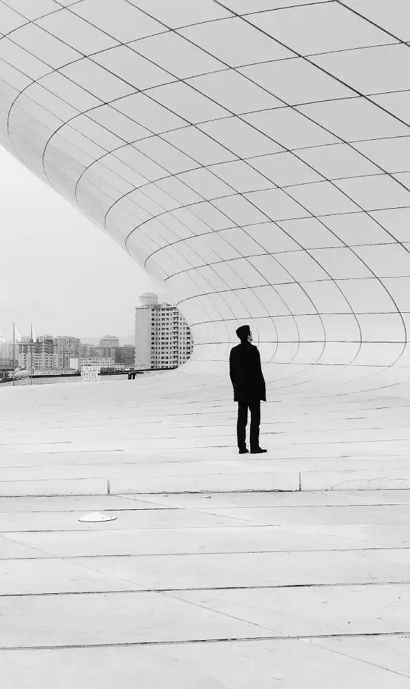
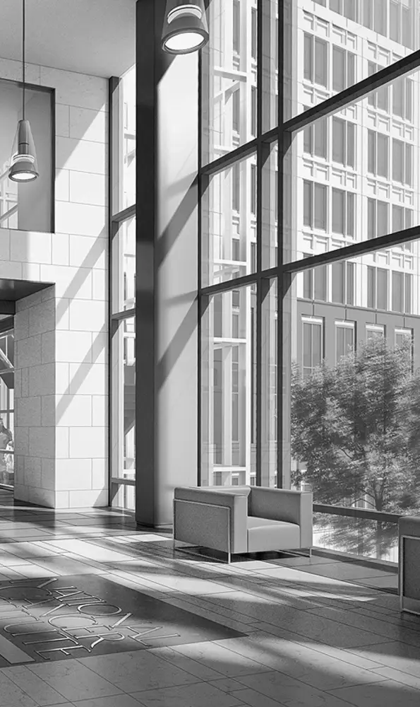
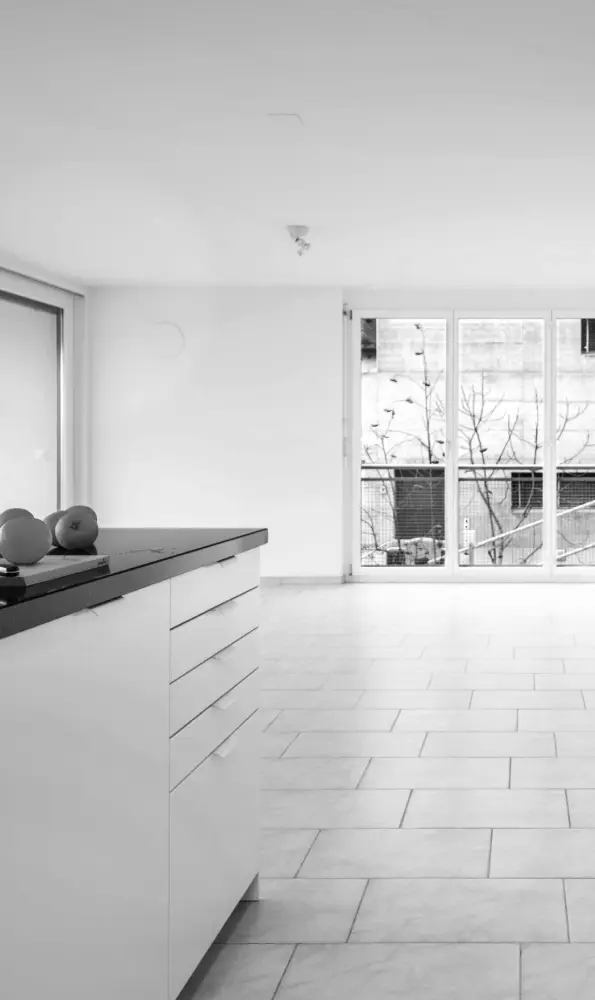
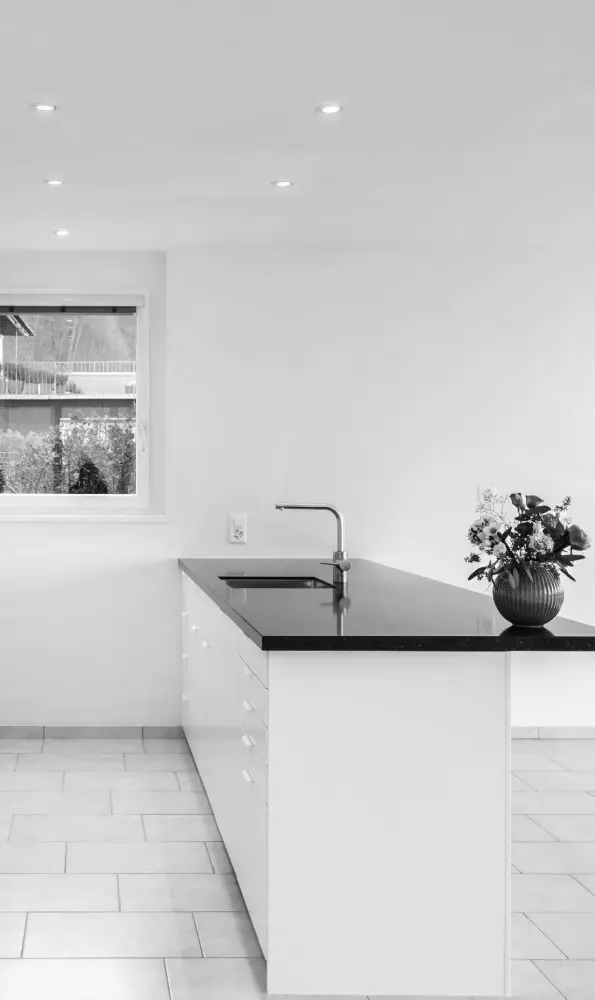
Transform your WordPress website with a visually striking grid layout designed to enhance user engagement! This design features a compelling arrangement of eight image blocks, divided into two rows of four columns. Each block showcases rounded edges that offer a fresh and playful touch, breaking away from the typical square formats.
Displaying case studies with this grid allows potential clients to grasp your past accomplishments quickly. The visual arrangement helps communicate complex projects succinctly, giving viewers a structured and visually appealing snapshot of your work.
A grid layout is perfect for photographers looking to display their work online. With each section acting like a frame, it provides a neat and structured layout that lets the images speak for themselves. Adjust the grid to accommodate landscape, portrait, or square images for versatility.
Showcase your products effectively by employing this grid design in your WordPress website builders. Each product can have an individual block with a description and price underneath, making it easier for visitors to browse and make purchasing decisions.
Highlight your blog’s top posts using a grid format to encourage readers to explore more. Accompany each image with a brief teaser, linking to the full article. This layout enhances user engagement by presenting multiple articles simultaneously.
Introduce your team members with individual image blocks. The grid layout allows potential clients or partners to see the faces behind your business. Place each team member’s bio below their image to share their role and background.
The grid format can beautifully showcase step-by-step images or screenshots from your Gutenberg blocks or other tutorials, providing a visual guide that’s clean and easy to follow.
Demonstrate the top features of a product or service in a visually appealing way. The rigid structure of grids ensures that each feature is given equal attention, helping users compare benefits easily.
For event-based websites, highlight key moments or speeches. Each block can encapsulate a unique moment, turning the whole grid into a pictorial summary of an event for those who couldn’t attend in person.
Curate your testimonials with a sense of style. Each image block can feature a happy customer or an icon with their review underneath. This setup not only showcases positive feedback but adds a lively feel to the testimonials section.
Website designs employing motivational quotes benefit from using a grid layout where each block harbors a quote, making it sharable and visually engaging for your audience.
As the initial point-of-contact, the homepage is a perfect space to employ an image-based grid design. It provides a snapshot of your offerings, guiding visitors to various corners of your site while maintaining an engaging user experience.
Artists, designers, and other creatives can show off their work using a grid structure. The setup ensures each piece gets attention while presenting their body of work in a cohesive and digestible format.
Detail the various services you offer with individual image blocks. Provide a picture or icon representing each service coupled with brief and impactful descriptions underneath, aiding quick understanding by potential clients.
Transform the way you present customer feedback by using a grid design to feature testimonials. A modern layout imbues the space with authenticity, breaking down lengthy reviews into approachable, bite-sized insights.
A Grid layout shines for event pages, allowing you to present speakers, sessions, and schedules attractively, providing a quick reference for attendees navigating your event’s details.
Get creative on your “About” page by using images to narrate your brand’s story. Visual elements coupled with engaging text in a grid format can convey the journey of your company’s evolution.
Convey frequently asked questions with a mix of images and text in a grid layout. It breaks down complex questions and provides visually engaging answers, assisting users in finding information quickly.
Make your pricing options more attractive and easier to compare with image-based grids. Visual differentiation of plans offers a clear breakdown, helping potential customers pick the best plan without confusion.
Compose visual listicles enriched with images that enhance the list’s theme. Sorting the list into a grid layout attracts visual interest, keeping readers engaged till the end.
Guide users towards helpful links using an images and text grid. For support, tutorials, and resource pages, this technique clarifies the navigation process for users trying to educate themselves or solve problems independently.
Embrace the future of WordPress website design with this modern grid layout, combining style with functionality. From portfolios to blogs, this adaptable design enhances user interaction and presents content effectively. Whether you’re aiming to market your services or showcase an outstanding gallery, image-based layouts offer endless possibilities. Ready to take the leap? Explore these free WordPress themes and discover more on optimizing your WordPress website today.
