WordPress pattern: Pure Image Light PIL-PRO-72
Build WordPress sites with MaxiBlocks. All features free forever. No locked functionality. Optional Cloud Library saves you 10+ hours per project. Start free
Captivating image design for your WordPress site
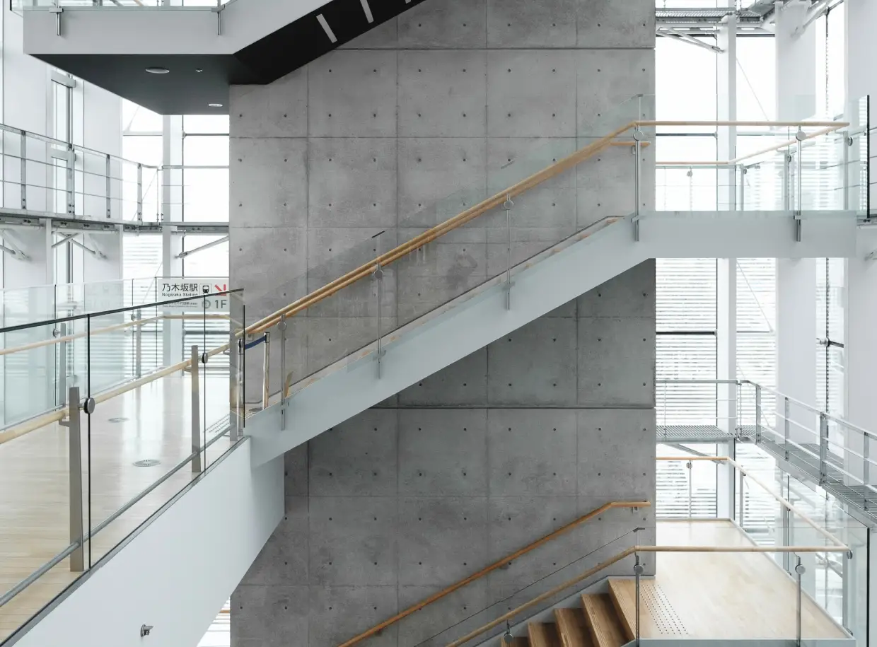
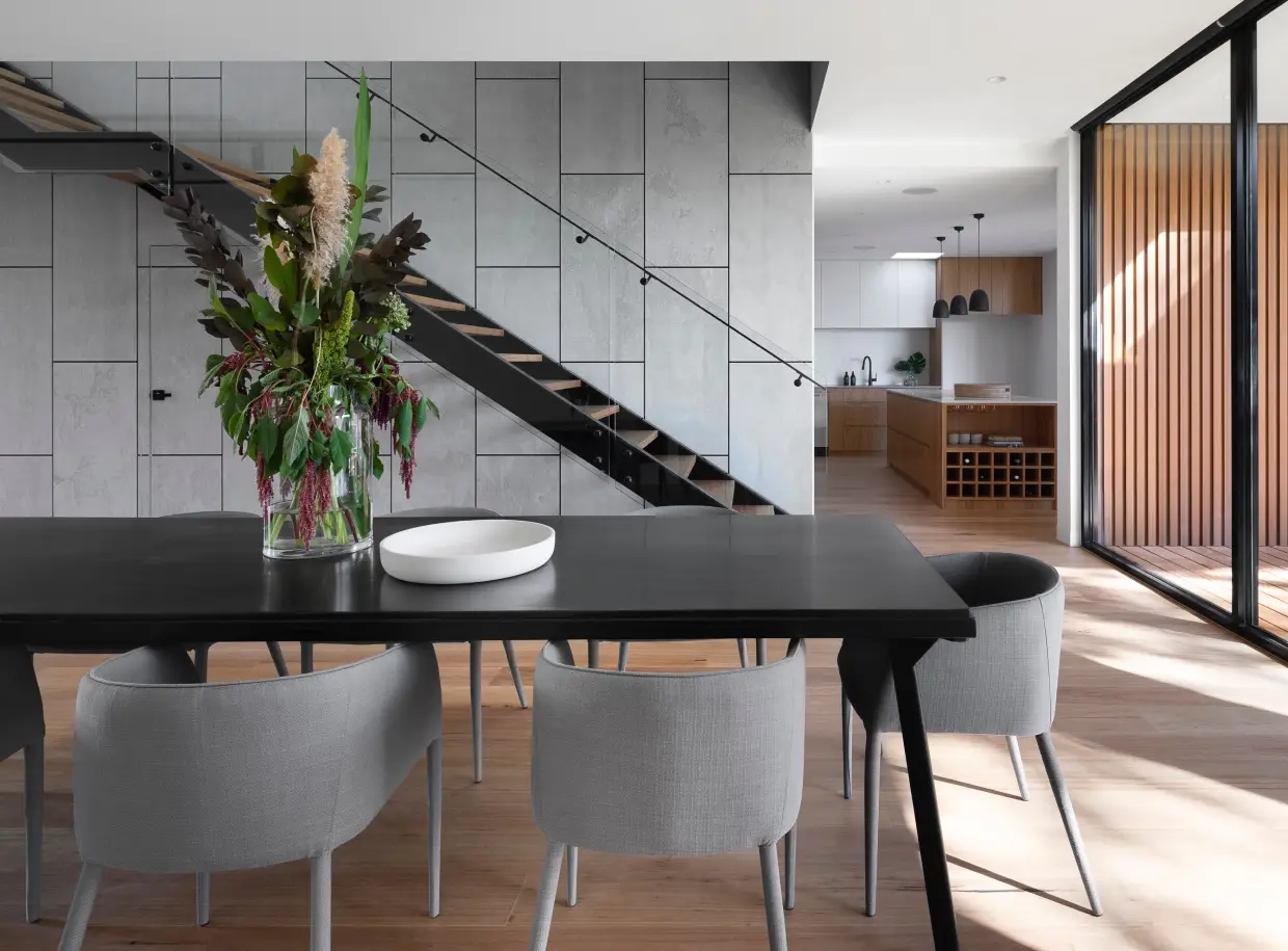
Ever dreamt of a visually striking layout that seamlessly merges minimalism with modern design trends? Imagine a two-column structure featuring one captivating image in each column. On the left, a stunning staircase depicts minimalist design, while the right side flaunts an inviting and trendy interior. This unique mix not only catches the eye but also piques curiosity, making it ideal for engaging your audience.
Layout analysis
- Overall structure: A clean two-column layout showcasing two distinct images side by side.
- Arrangement: Each column features a vertically aligned image for a balanced look.
- Unusual choices: Contrast between two themes offers a refreshing visual appeal while maintaining a conventional format.
Element and feature description
- Visible elements: Modern headers like “Minimalist” and “Trends” direct the viewer’s attention.
- Images: A minimalist staircase and a trendy interior serve as focal points.
- Interactive elements: “+” signs suggest expandable content, enticing user interaction.
- Typography: Modern, sans-serif fonts ensure clarity and cohesion.
- Icons/Graphical elements: “+” signs signal potential extra information.
- Image borders and orientation: Images are displayed without borders in a landscape orientation for an elegant look.
Unique design aspects
- Standout design choices: The contrast of minimalist and trendy themes weaves a compelling visual narrative.
- Hover effects/animations: “+” signs suggest interactivity, inviting the viewer to explore.
- Responsive design: The two-column layout adapts to different screen sizes for a mobile-friendly experience.
- Accessibility considerations: Clear headings enhance user navigation and understanding.
Overall design style
- Design style: Combines modern, clean aesthetics with minimalist influences and contemporary elements.
- Visual hierarchy: Prominent headings draw attention to key themes, aiding in creating a cohesive flow.
- Use of white space: Ample white space surrounds elements, enhancing readability and spotlighting the images.
Use cases for this website image-based pattern
- Interior design blogs: Showcase contrasting styles to inspire readers with innovative design ideas.
- Architecture portfolios: Highlight different architectural concepts in a visually engaging way.
- Fashion websites: Illustrate the juxtaposition of classic and modern fashion trends.
- Technology reviews: Demonstrate the evolution of tech gadgets, from minimalist designs to modern innovations.
- Art exhibitions: Display contrasting artworks or artistic techniques to engage visitors.
- Travel blogs: Capture the essence of traditional vs modern travel destinations.
- Health and wellness websites: Contrast traditional therapies with modern wellness trends.
- Photography portfolios: Present a diverse range of photographic styles and subjects.
- Education platforms: Compare different educational approaches or themes.
- E-commerce sites: Feature contrasting products to attract diverse customer interests.
Types of pages using image-based designs
- Homepages: Establish a strong first impression by using striking image contrasts.
- About pages: Employ images that reflect brand ethos or history.
- Service pages: Showcase diverse facets of service offerings via thematic images.
- Product pages: Offer a visual narrative showcasing product features through dynamic imagery.
- Portfolio pages: Display creative work in a visually compelling way.
- Blog pages: Enhance blog topics with supporting images that draw in readers.
- Contact pages: Use attractive visuals to complement contact information.
- Landing pages: Utilise strong visuals to drive conversions and maintain engagement.
- Gallery pages: Present a cohesive visual experience through arranged images.
- Testimonials pages: Feature happy customer images alongside their feedback.
Conclusion
This dynamic design, featuring a two-column layout juxtaposing minimalist with trendy aesthetics, enriched with clear headers and inviting interactive elements, ensures an engaging user experience. With a modern style, effective visual hierarchy, and responsive design, it’s a standout choice for any WordPress website design. Whether you’re displaying design philosophies or making a bold statement, this layout elevates your website’s visual appeal effortlessly.
To build such layouts, consider using a WordPress website builder that supports drag-and-drop features or Elementor Alternatives effectively. For more insights on creating sophisticated WordPress website designs, explore our recommendations for free WordPress themes.


