Born to play
Lorem ipsum dolor sit amet,
consectetuer adipi

Empowering people
Lorem ipsum dolor sit amet,
consectetuer adipi

Be direct
Lorem ipsum dolor sit amet,
consectetuer adipi

Build WordPress sites with MaxiBlocks. All features free forever. No locked functionality. Optional Cloud Library saves you 10+ hours per project. Start free

Born to play
Lorem ipsum dolor sit amet,
consectetuer adipi

Empowering people
Lorem ipsum dolor sit amet,
consectetuer adipi

Be direct
Lorem ipsum dolor sit amet,
consectetuer adipi
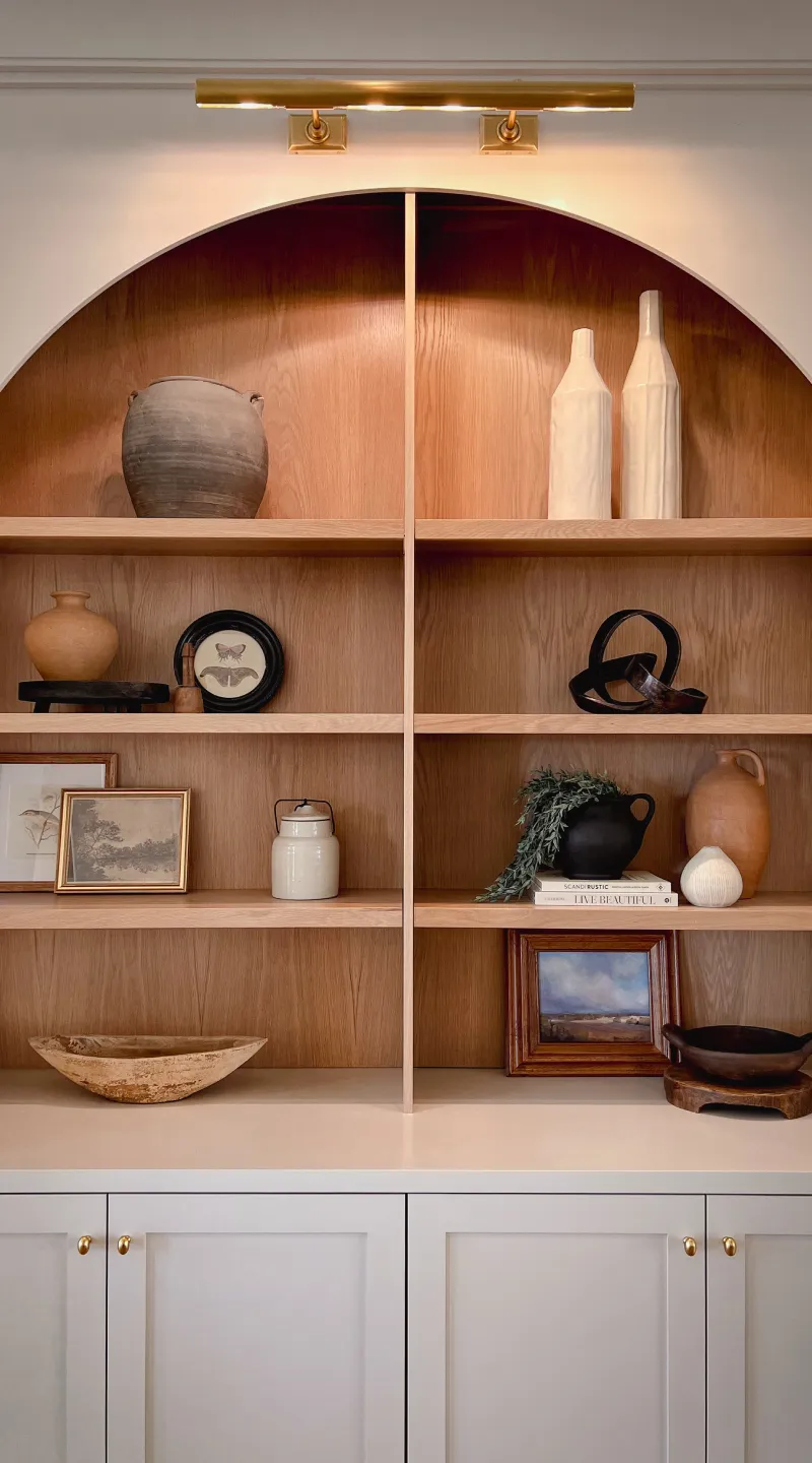
Transform your WordPress website with a stunning minimalist three-column layout that effortlessly enhances your content presentation. Each of the three distinct columns gracefully showcases captivating images aligned with compelling text, making it perfect for engaging your audience.
This layout features a symmetrical three-column design, each with a large thematic image at the top followed by concise text blocks. The clean and well-aligned structure offers balance while highlighting different ideas side by side, allowing your content to stand out.
An elegant three-column image layout excels at showcasing portfolios. By allowing photographers to display their work in a visually engaging way, this layout brings images to the forefront. The clean design lets each photograph shine, ensuring viewers can appreciate their beauty and detail without distraction.
When it comes to displaying products, clarity is paramount. This image-based layout is ideal for eCommerce sites wanting to highlight product images with supporting descriptions. The three-column setup allows users to compare products side by side, helping potential customers make informed purchasing decisions effortlessly.
Creating an inviting blog section on a WordPress website design becomes seamless with this layout. Each column can feature a captivating image, enticing headline, and short excerpt, making it ideal for summarising articles and inviting readers to explore further.
This layout serves excellently for highlighting multiple events, offering a snapshot of what each entails. Using compelling images alongside key details for each event ensures attendees can quickly grasp what’s on offer, fostering excitement and anticipation.
Interactive educational content thrives with a structured layout. Educators can present diverse subjects by visually separating topics into distinct columns. This organisation helps learners navigate information easily and enhances comprehension through visual cues and text support.
Nothing speaks louder than customer testimonials. Integrating them on your WordPress site design using this layout allows businesses to feature client stories with accompanying images. It strengthens social proof, encouraging trust and showcasing credibility.
Description: For companies sharing updates through press releases, this multi-column approach can segment various aspects of a single announcement. Using compelling images with concise text ensures each section garners deserved attention, delivering news efficiently.
Displaying case studies becomes more impactful with this layout, facilitating clear storytelling through structured sections. It helps businesses dissect success stories, displaying challenges, solutions, and results beautifully aligned, aiding potential clients’ understanding.
Crafting a mouth-watering visual menu for recipes is simplified by utilising this layout. Each column can feature dish images, enticing titles, and brief overviews. It allows food bloggers and chefs to effectively entice culinary enthusiasts to get creative in the kitchen.
Travel enthusiasts and agencies can create alluring trip previews, exhibiting distinct destinations side by side. The icons or images paired with brief descriptions entice explorers to immerse themselves in detailed itineraries, reinforcing travel dreams.
The homepage represents the digital face of a WordPress website. A minimalist three-column layout introduces your brand concisely, showcasing core services or products, ensuring visitors understand who you are right from the moment they land.
Artists, designers, and photographers can exhibit their work by employing this layout. It allows portfolios to shine by presenting images with relevant context, highlighting creativity and skill, thus attracting potential clients or collaborators effectively.
Businesses can articulate their value propositions, illustrating each service’s unique offerings concisely. Potential clients can effortlessly compare different services, helping them make informed decisions quickly, thereby driving conversions.
Use the three-column design to foreground featured posts with stunning visuals. It assists in segmenting various categories or popular articles, offering visitors an engaging reading experience while encouraging deeper engagement with your content.
Businesses can use this format to tell their story by featuring team members, company culture, or history. It provides a welcoming way to introduce key figures and milestones, turning visitors into loyal followers or customers.
Organise contact details with an appealing layout that includes locations, phone numbers, and additional info like social media or support sections. This friendly design makes it easy for customers to connect, enhancing user experience.
Showcase varied client testimonials through this structured approach, enhancing social proof. Visuals paired with experiences communicate authenticity, building trust and confidence among new visitors or potential clients.
When hosting events or workshops, this layout effectively segments details while maintaining an organised presentation. It encourages attendee engagement through easy-to-digest information paired with eye-catching imagery.
Provide potential consumers with vital product details through captivating photos and succinct descriptions. Reading about product features side by side streamlines their decision-making process, leading to higher sales conversions.
In-depth case studies can be made visually appealing by breaking them into digestible sections. Graphics and text mutually support storytelling efforts, aiding businesses in showcasing their success stories engagingly and concisely.
Elevate your WordPress presence with this minimalist three-column layout. It artfully combines striking images, clear text, and engaging calls-to-action, guiding user engagement and seamlessly highlighting individual concepts. Whether you’re showcasing themes, services, or rich content, this design maximises the impact of your site. Don’t miss the opportunity to enhance both design and user experience-try this versatile layout today! If you’re looking for WordPress website builders to implement such layouts, explore the numerous free WordPress themes available for customising your site effortlessly.
