01
Contact
Lorem ipsum dolor sit amet, con sectetuer adipi.

02
Food diary
Lorem ipsum dolor sit amet, con sectetuer adipi.

03
Goals
Lorem ipsum dolor sit amet, con sectetuer adipi.

04
Support
Lorem ipsum dolor sit amet, con sectetuer adipi.

Build WordPress sites with MaxiBlocks. All features free forever. No locked functionality. Optional Cloud Library saves you 10+ hours per project. Start free

01
Contact
Lorem ipsum dolor sit amet, con sectetuer adipi.

02
Food diary
Lorem ipsum dolor sit amet, con sectetuer adipi.

03
Goals
Lorem ipsum dolor sit amet, con sectetuer adipi.

04
Support
Lorem ipsum dolor sit amet, con sectetuer adipi.
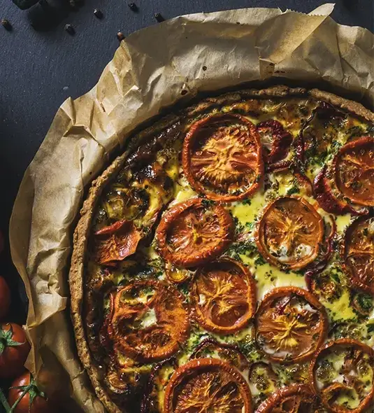
Imagine a sleek and modern layout showcasing your content with a unique four-column design. Each column has its own distinct focus: “Contact,” “Food Diary,” “Goals,” and “Support.” The circular images in each section add a splash of creativity, ensuring a seamless flow of information and setting your site apart from other traditional designs.
Experience the clarity of a multi-column design that keeps your audience engaged and informed. This well-structured layout makes it easy for users to follow along.
This layout includes a single row divided into four clearly defined columns. Navigation becomes intuitive, with each section numbered and enriched by relevant visuals.
What sets this design apart is its symmetrical yet unconventional style. Circular image containers lend a fresh and inviting look to your WordPress website.
While the layout may not feature visible buttons or forms, its intuitive arrangement hints at dynamic content, ready to be explored using various WordPress navigation menus.
With a combination of bold headers and clear, concise text, your content remains both readable and appealing.
Distinctive circular images and emphasized numbers create a visually compelling design, making navigation a breeze.
This design features modern, circular images and connecting arrows between sections, offering a layout that is both functional and engaging.
This layout gracefully adapts to various screen sizes, ensuring an excellent user experience on any device, thanks in part to AI website builders innovations.
High contrast between text and background fosters readability and accessibility, allowing all users to navigate the content effortlessly.
Enjoy a minimalist design that emphasizes both functionality and clean lines, perfect for any WordPress website.
The numbering system and bold headers guide users confidently through each section, while accompanying images maintain interest and clarity.
Effective use of white space provides balance and breathing room, ensuring each section stands out.
By using categories, you can efficiently group similar posts together, making it easier for visitors to navigate your site. Categories allow your audience to find related content effortlessly. Use them to organise topics hierarchically, which is particularly useful when managing a varied range of subjects. A well-organised category system enhances the usability of your WordPress website by improving user experience and SEO performance. Whether you’re managing a blog or a more complex site, categories are one of the best practices for content organisation.
Tags offer a flexible way to describe specific details or topics within a post. Unlike categories, tags don’t follow a hierarchy. Utilise tags to identify specific details of posts, functioning much like an index, helping users discover posts with similar elements or subjects. This quick method ensures content remains interconnected without a rigid structure, providing readers additional pathways to explore the rich tapestry of your WordPress website content.
Pages are ideal for static content that won’t frequently change, like an “About Us” or “Contact” page. Utilizing pages ensures that vital information is easily accessible, supporting the structural integrity of your site even as your content evolves. They are not organised by categories or tags, setting them apart as dedicated information hubs within your WordPress website, crucial for defining your site’s core offer and storytelling.
Well-crafted menus are essential for guiding users through your site and enhancing navigation. Organise your menus intelligently to reflect the journey you want your visitors to take. They can include links to pages, categories, or custom URLs, offering a strategic navigation tool for a seamless user experience. Visit this guide on responsive WordPress design and how to make menus adapt to all devices.
Widgets allow you to add content and features to your sidebar or footer. Use widgets to display recent posts, a calendar, or any custom feature that enhances interaction and engagement. Proper utilisation of widgets can offer readily accessible information or functionality, adapting to individual user needs without overwhelming them, thus preserving the simplicity and coherence of your WordPress website design.
When the default post and page formats don’t meet your needs, custom post types can come to the rescue. They allow you to create specific content types with tailor-made functionality, such as product listings, reviews, or portfolios, enhancing both functionality and user engagement. This capability improves the organisation and delivery of specialized information on your WordPress website.
An editorial calendar is a powerful tool for planning and organising your content schedule, ensuring consistent posting. This planning aids in visualising future content, managing deadlines, and streamlining the overall production process. Employing an editorial calendar makes it easier to allocate resources effectively, synchronize team efforts, and maintain a steady content flow, benefiting any scale of WordPress site.
Organising content with SEO in mind ensures your website’s visibility in search engines is maximised. By incorporating AI website builder strategies, you can refine keyword placement, meta descriptions, and inter-linking, providing a more tailored user experience. These practices support higher search rankings and reflect positively on your WordPress website performance.
Archive pages consolidate all past posts under a category, tag, or date. They make it easy for users to find older content or historically thematic pieces, facilitating greater user retention. Archives serve to highlight the depth and breadth of your content, allowing users to rediscover past topics with ease and enhancing the comprehensive accessibility of your WordPress website.
Beyond categorisation and tags, use taxonomies to classify your content based on unique criteria suited to the specialised nature of your website. This custom organisational method allows for flexibility in structuring your site, offering more options for users to explore specific content paths intuitively, refining the navigational logic and enriching content experience on any WordPress website.
Blog posts are the cornerstone of any WordPress website, offering a versatile medium to share ideas, stories, and updates. They are organised by categories or tags and displayed in reverse chronological order. Regularly updated, blog posts keep your audience engaged and provide a platform for interaction through comments. Consider implementing submenus navigation for easy access to related posts.
For e-commerce sites, product pages provide detailed information about each item you’re selling, including images, descriptions, and prices. Product pages are integral to the buying process, offering potential customers everything they need to make a purchase decision. Optimise them with high-resolution images and concise yet informative descriptions to enhance the shopping experience and facilitate purchasing on your WordPress website.
Landing pages are designed for specific campaigns or products, aimed at guiding users towards a particular call to action, such as signing up for a newsletter or making a purchase. They focus content strategically, removing distractions to increase conversion rates. Using WordPress templates for landing pages can streamline creation and maintain consistency in your WordPress website design.
Image galleries visually engage visitors, ideal for showing off collections or portfolios. Integrate galleries to highlight visual content, providing a cohesive visual narrative that complements textual information. Image galleries can provide context, tell a story, or simply showcase beauty, enhancing the user experience and keeping visitors on your WordPress website for longer durations.
Portfolios are perfect for showcasing work in a professional manner, often used by artists, designers, and freelancers. Implementing portfolios allows you to display completed projects, client testimonials, and progress galleries, offering a comprehensive overview of your skills and accomplishments to potential clients or employers. They are a vital part of your professional presentation and digital footprint.
Your WordPress website can benefit immensely from displaying testimonials, as they build trust and credibility with new visitors. These positive reviews from past clients or users validate your offerings and influence potential customers’ decisions. Testimonials can be integrated into various sections, from dedicated pages to strategically placed quotes throughout your site, amplifying their impact.
Videos are a dynamic addition to your content strategy, capable of conveying messages quickly and engagingly. Whether it’s a product demonstration, tutorial, or promotional message, videos can enhance understanding and retention of information. A well-crafted video strategy not only boosts engagement but also improves the SEO effectiveness of your WordPress website.
Infographics are excellent for conveying complex data in a visually digestible format. They can simplify complicated themes, making them more accessible to your audience and sparking interest with engaging visuals. Their sharable nature on social media platforms can extend your reach, drawing more visitors to your WordPress website.
Maps can provide valuable location or service area information. Adding interactive maps invites user engagement and interaction, often revealing more cultural or geographic context than simple text. They can highlight locations, reveal travel routes, or offer in-depth information, adding another layer of depth to your WordPress website content strategy.
Webinars are effective for hosting live or recorded presentations, providing value through education or discussion. They allow you to reach a broader audience, offering real-time interaction with viewers. Hosting a webinar directly on your WordPress website can create a sense of community and belonging while positioning you or your brand as a thought leader in your industry.
Elevate your WordPress site with this unique, user-friendly four-column layout. It is designed to enhance your WordPress website design, guiding your audience through sequential information with engaging circular images. Use the insights within this article to organise and diversify your content, employing techniques such as SEO, taxonomies, and an editorial calendar. With resources like open-source website builders and free WordPress themes, you can transform your site into a standout digital experience.
