WordPress pattern: WooCommerce Light WCL-PRO-07
Build WordPress sites with MaxiBlocks. All features free forever. No locked functionality. Optional Cloud Library saves you 10+ hours per project. Start free
Transform your WooCommerce store with stunning product displays!
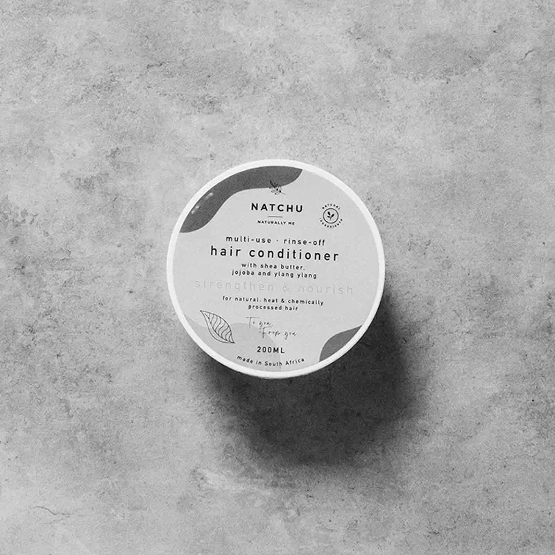
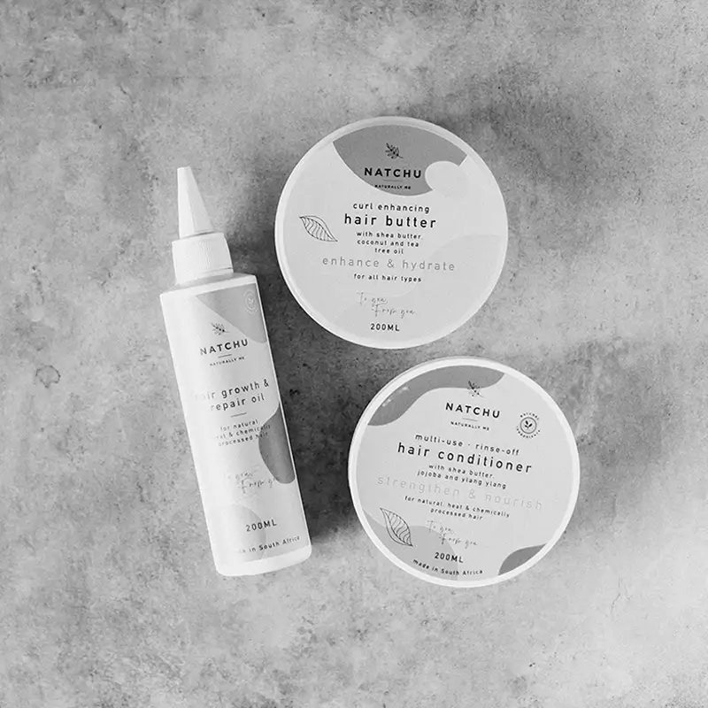
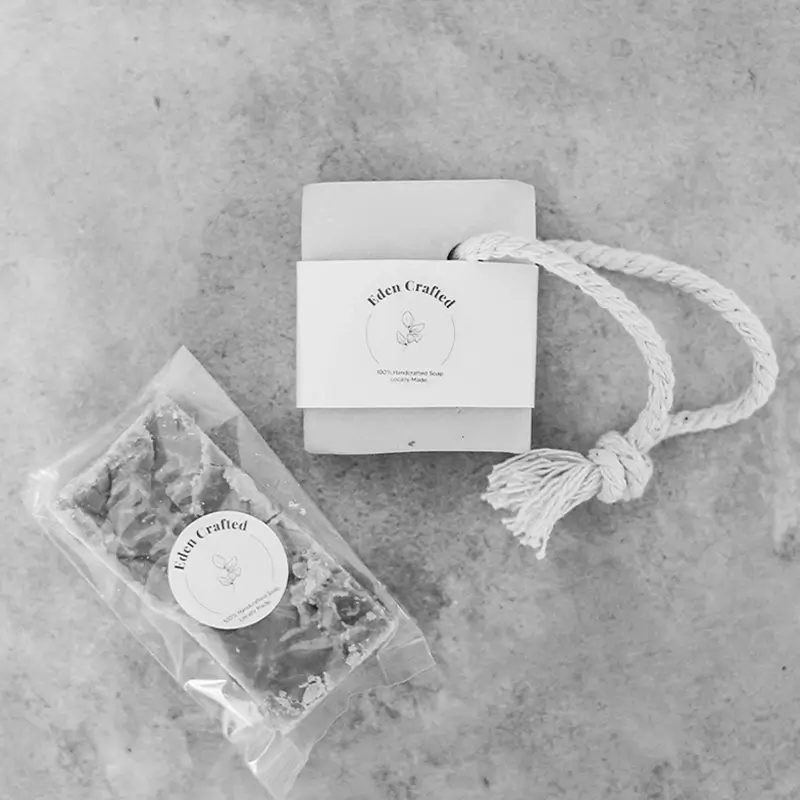
Imagine this: a beautifully organised WooCommerce product display that captures your customers’ attention from the moment they land on your page. The design features a sleek multi-column grid showcasing four eye-catching product cards, arranged to make browsing effortless and engaging. Each product card features images that vary in size and shape, adding a dynamic flair to your store that keeps your layout fresh and inviting.
Key features of an effective product display
Layout that speaks volumes
- Overall Structure: A thoughtfully crafted multi-column grid featuring four product cards.
- Arrangement: Products displayed in two rows and two columns create a clean and organised shopping experience.
- Dynamic Visuals: The unique sizing of images ensures a vibrant display that breaks the monotony of a conventional layout.
Engaging elements and features
- Clear Visibility: Each product has its own title prominently labelled as “Product title” so shoppers instantly know what they’re looking at.
- Transparent Pricing: Pricing information is straightforward, displayed below product titles, for instance, “$39” and “$99”.
- Product Imagery: Stunning product images take centre stage, showcasing your items effectively.
- Action-Oriented Buttons: The “Add to cart” button is strategically placed for user engagement, along with a ‘+’ icon encouraging users to mark favourites or compare products.
- Modern Typography: Using a sans-serif font, the layout boasts a contemporary look, with appropriate font sizes guiding attention from titles to prices.
- Sleek Design Elements: No visible borders or shadows on images contribute to a clean and minimalist aesthetic.
Unique design considerations
- Consistent Grid: The unified grid format not only organises your products but also enhances visual appeal and user experience.
- Mobile-Friendly: The responsive grid adjusts beautifully to different screen sizes, ensuring your store looks great on any device.
- Accessibility Focus: Clearly visible product titles and prices help users navigate with ease, enhancing accessibility across your store.
Overall aesthetic and functionality
- Minimalist Style: A focus on simplicity and functionality defines this modern design, encouraging a pleasant shopping journey.
- Visual Hierarchy: The layout intuitively leads users from product titles to prices and onto the “Add to cart” call to action, promoting seamless navigation.
- Balanced Use of Space: Ample white space around each product card provides visual clarity, making it easy for customers to digest information without feeling overwhelmed.
Design elements to elevate your WooCommerce site
Sleek multi-column grid
Embracing a sleek multi-column grid helps organise products cleverly while making shopping smoother. This arrangement promises a pleasing visual flow that readily highlights your range, capturing customer interest from the start. By adopting this clean structure, your store effectively encourages engagement, ensuring visitors feel empowered to browse different categories. Such a strategic design transforms the entire shopping experience into an enjoyable adventure, heightening both customer satisfaction and likelihood of purchase.
Dynamic product imagery
A key product image strategy involves using high-quality pictures that differ in size and shape. This approach boosts your store’s visual appeal, making it not only attractive but also engaging. By captivating your audience with diverse visuals that stand out, you create a fresh and exciting shopping environment. Incorporating dynamic product imagery is a modern way to showcase items, keeping your customers intrigued and eager to explore further.
Engaging call-to-action buttons
Integrating well-placed, action-oriented buttons like “Add to cart” serves as a crucial engagement tool. It enhances user interaction, channeling attention towards conversion actions seamlessly. Moreover, the inclusion of intuitive icons and labels piques curiosity towards features like marking favourites or comparing items, encouraging decisions. Thoughtful call-to-action buttons cordialize the purchasing journey, making the process more intuitive and enjoyable for visitors.
Responsive design adaptability
Ensuring your WooCommerce store is mobile-friendly is imperative in today’s digital landscape. Through responsive design, your multi-column grid display adjusts gracefully to different screens, from desktop to mobile. This adaptability guarantees your store consistently looks stunning, no matter the device. By prioritising responsive design, you not only enhance user experience but also expand accessibility, reaching a wider audience effortlessly.
Modern typography choices
Choosing appropriate typography involves selecting clear, sans-serif fonts that provide a contemporary look. Thoughtful font sizes guide visitor attention through content, from enticing titles to informative prices. By prioritising aesthetic consistency and readability, modern typography enhances user engagement and navigational ease. This approach compliments minimalist design principles, crafting a harmonious online retail space.
Accessibility considerations
A successful WooCommerce layout prioritises accessibility ensures all customers can navigate with ease. Elements like clear product titles and prices contribute to this focus, and a minimalist approach enhances clarity. By meeting accessibility standards, your store becomes welcoming, offering equal opportunities in browsing and purchasing. A [WordPress website](https://maxiblocks.com/wordpress-websites/) equipped for accessibility stands out by providing an inclusive experience.
Ample use of white space
White space serves as an understated hero in design by providing balance and clarity. Utilising sufficient spacing around product cards allows information to breathe, creating an appealing and organised feel. It reduces cognitive overload, making navigation effortless and preventing visitors from feeling overwhelmed. Incorporating ample white space in your [WordPress website design](https://maxiblocks.com/wordpress-websites/what-is-wordpress/wordpress-website-design/) effectively elevates the shopping experience by highlighting key features without distraction.
Minimalistic design ethos
Embracing a minimalist design ethos promotes both functionality and beauty, stripping away clutter to focus on essential elements. Such an approach creates a seamless, user-centric shopping experience, guiding visitors fluidly from item to item. By employing minimalist principles, your store remains visually enticing, drawing attention to products effectively. A [WordPress website](https://maxiblocks.com/wordpress-websites/) built on simplicity complements modern tastes while maximising efficiency and engagement.
Strategic visual hierarchy
Visual hierarchy in a layout leads customers naturally from one shopping step to another. By highlighting product titles, prices, and interactive elements appropriately, your platform encourages a smooth journey. Creating pathways through a visual hierarchy not only aids navigation but also enhances sales potential. Structuring your store in this manner fundamentally supports both customer experience and the business’s performance.
Consistent and cohesive grid design
A consistent grid design organises products efficiently, ensuring a cohesive visual presence. This approach helps visitors intuitively follow browsing paths while maintaining structured aesthetics. Such a format enhances user satisfaction by making exploration pleasant and effortless. For instant success in capturing audience interest, opting for a unified layout becomes essential in crafting memorable shopping experiences.
Exciting call to action ideas for your WooCommerce site
Discover our exclusive deals!
Inviting your customers to “discover our exclusive deals” taps into their curiosity and urges them to explore special offers. Strategically placing this call-to-action on your homepage or product pages motivates visitors to browse and potentially find something irresistible. By highlighting unique promotions, your store paves the way for engagement and conversions, enticing buyers to partake in exciting opportunities.
Sign up for our newsletter
Encourage users to keep in the loop by prompting them to “sign up for our newsletter.” This enticing call-to-action grows your email list while ensuring customers stay informed about the latest products and exclusive offers. By offering value through updates, your WooCommerce store establishes a connection with customers, keeping them engaged and fostering loyalty in the long term.
Add to cart now
Inviting users to “add to cart now” serves as a classic, proven call-to-action that turns interest into definite action. Present this button prominently across product pages, making it convenient for customers to decide quickly. By integrating such straightforward navigation, you enhance the purchasing journey, leading visitors confidently to their next step and boosting overall sales efficiency.
View more like this
“View more like this” entices users to delve deeper into your product catalogue, exploring similar items that may pique their interest. By suggesting complementary or related items, your store tap into customers’ curiosity, increasing the likelihood of prolonged browsing and higher spending. It’s a strategic move that aligns with personalisation efforts, elevating customer satisfaction through targeted experiences.
Get instant access
The call to “get instant access” creates urgency and encourages customers to use unique features or content immediately. Whether it’s a special membership or limited-time offer, seizing the moment translates to a richer shopping journey. By prioritising quick access, this call-to-action communicates the value and exclusivity of features, enticing users to take prompt action towards enriching their experience.
Explore our new arrivals
Introduce visitors to your latest additions by inviting them to “explore our new arrivals.” Placing emphasis on new stock keeps your store up-to-date and inviting. This call-to-action sparks curiosity and keeps your audience engaged, as they’ll want to see fresh offerings first-hand. By creating anticipation for new products, customers become more enthusiastic, fostering increased exploration and possible purchases.
Join our loyalty programme
Encouraging customers to “join our loyalty programme” invites them into a rewarding experience, turning purchases into perks. This call-to-action not only fosters continued relationship but also builds loyalty through valuable incentives like discounts or exclusive access. Such programmes keep customers invested as repeat buyers, providing long-term benefits for both parties through meaningful engagement and sustainable connections.
Download our app
Inviting users to “download our app” creates opportunities for expanding engagement beyond your website. An app centralises the shopping experience, making it portable and easily accessible to customers. With features that simplify browsing and purchasing, this call-to-action holds immense value. It reflects a commitment to modern solutions, ensuring your store remains top-of-mind for customers on the go.
Chat with us live
Offering real-time assistance by inviting users to “chat with us live” demonstrates commitment to exceptional customer service. This call-to-action serves as a direct link for addressing immediate concerns or queries, fostering trust and satisfaction. By removing barriers to communication, live chat makes shopping more personable and efficient, leading to informed decisions and enhanced customer experiences.
Visit our [WordPress website design](https://maxiblocks.com/wordpress-websites/what-is-wordpress/wordpress-website-design/) demo
Encourage customers to “visit our [WordPress website design](https://maxiblocks.com/wordpress-websites/what-is-wordpress/wordpress-website-design/) demo” to explore how your products or themes come alive. This call-to-action provides visual and technical insights into potential outcomes, helping customers imagine product integration. By showcasing practical applications, demos inspire confidence and understanding while driving interest and enthusiasm towards potential purchases.
Conclusion
In summary, a well-crafted WooCommerce product display not only looks inviting and modern but also facilitates effective product browsing. With a responsive design, engaging interactive elements, and a clean layout, your WooCommerce store can transform the online shopping experience for your customers. Make the smart choice today to captivate your audience with a stunning product display using [free WordPress themes](https://maxiblocks.com/wordpress-websites/what-is-wordpress/wordpress-block-themes/free-wordpress-themes/)! Whether you’re starting your journey with a [WordPress website builder](https://maxiblocks.com/wordpress-websites/wordpress-website-builder/wordpress-website-builders/) or exploring [Elementor alternatives](https://maxiblocks.com/wordpress-websites/wordpress-plugins/wordpress-page-builder/elementor-alternatives/), your design can elevate both functionality and aesthetic, securing your place in the competitive digital landscape.


