MaxiBlocks WordPress homepage design: how to use and customise it
A well-designed homepage is the gateway to engaging visitors on your WordPress website. The MaxiBlocks homepage design template provides an effective and visually captivating structure, ideal for a variety of businesses. In this guide, we’ll walk you through each section of the template, sharing how to customize it to suit your unique needs. Whether you’re a WordPress website designer or a business owner, these tips will help you get the best out of this versatile layout.
Hero section: make a strong first impression
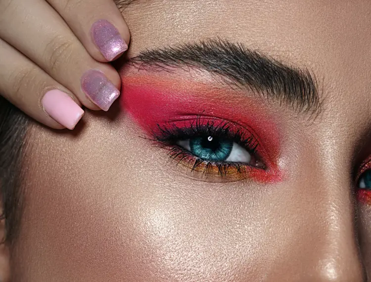
The hero section of your homepage is for capturing attention immediately. In this MaxiBlocks template, it features a striking close-up image of an eye with elegant makeup. Here’s how you can make it your own:
- Change the hero image: Select a high-resolution image that resonates with your brand or service. For inspiration, browse MaxiBlocks pattern templates.
- Modify the headline: Customize the main headline to reflect your unique value proposition.
- Update the CTA button: Change the call-to-action (CTA) text and link it to your lead magnet or contact page.
- Experiment with animation: Add subtle animations to draw the user’s eye to the CTA button.
- Add brand colours: Update colours to align with your brand palette.
- Background overlay: Adjust the opacity of the overlay to ensure the headline is always visible.
- Include video: Add a short video in place of the static image to make it more dynamic.
- Utilise icons: Include icons from the WordPress icon library to reinforce messages.
- Custom fonts: Use fonts that reflect your brand’s tone, whether playful, elegant, or professional.
- CTA button shape: Experiment with the button shape—circular, rounded, or sharp edges—to create a unique look.
Video and quote section: add depth to your story
The video section adds a visual storytelling element, while the accompanying quote brings a human touch. Customisation ideas include:
- Replace the brush video: Add a video clip that tells your brand story or features a customer testimonial.
- Adjust the quote: Make the quote relevant to your audience by choosing one that speaks to your brand values.
- Embed different media: Replace the video with an image gallery or animation to create a new focal point.
- Change colours: Align the background colour with your brand.
- Modify the play button: Update the play button to reflect your brand’s style.
- Testimonial addition: Consider adding an extra testimonial for credibility.
- Add a CTA beneath the video: Encourage viewers to take action after watching.
- Incorporate icons: Add icons to visually break up text.
- Background visuals: Replace the background with something more specific to your brand.
- Include an opt-in form: Add a form beneath the video to collect leads.
Service categories section: showcase your expertise
The services section offers three cards, each highlighting a different area of your expertise. Here’s how to personalise it:
- Update service images: Replace default images with ones that align with your brand.
- Customise service titles: Update the service titles to reflect what makes your business unique.
- Background adjustments: Change each card’s background to use a colour or texture that ties into your branding.
- Add service descriptions: Include more detailed descriptions to help potential clients understand your offer.
- CTA on each card: Link each service card to a dedicated page for more details.
- Hover effects: Add effects when users hover over each card to make the interaction engaging.
- Icons on services: Add relevant icons to each card for better visual cues.
- Adjust card alignment: Experiment with the alignment of the cards to create a unique flow.
- Make each card interactive: Include testimonials within the cards for added credibility.
- Add pricing info: Show price ranges if relevant to the services.
Portfolio/showcase section: add personality
The gallery section allows you to showcase your work or products. Here are ten tips for customising this section:
- Image replacement: Choose images that represent the diversity of your work.
- Headlines for each image: Use headlines that evoke curiosity and add storytelling elements.
- Filters and tags: Allow users to filter different aspects of your portfolio.
- Interactive hover effect: Add animations when users hover over images.
- Lightbox: Enable a lightbox so users can view images in more detail.
- Captions: Include captions that explain each image and its significance.
- Colour themes: Use different border colours or styles for each image.
- Add video: Replace static images with videos if it makes sense.
- Link to projects: Link images to more comprehensive case studies.
- Grid layout customisation: Adjust the grid layout to create a unique look.
Testimonials section: build trust
Adding customer testimonials makes your site more trustworthy. Here’s how to customize this section:
- Change profile images: Replace these with your actual customers’ photos.
- Use more quotes: Add additional testimonials from satisfied customers.
- Incorporate video testimonials: Where applicable, add video testimonials.
- Rearrange layout: Customize the alignment of testimonial cards for better visual flow.
- Add icons: Use relevant icons to signify the type of service or experience.
- Text style: Change fonts and styles to match your branding.
- Add a call-to-action: Encourage viewers to get in touch after reading the testimonials.
- Differentiate quotes: Use different colours or borders to separate different testimonials.
- Clickable profiles: Link profiles to case studies or more comprehensive customer stories.
- Add carousel: Make testimonials into a carousel for better use of space.
Pricing plans section: make it work for your audience
The pricing tables offer clarity on your services. Here’s how to make this section your own:
- Update plan names: Customise the plan titles to reflect your offerings.
- Pricing details: Adjust the prices to suit your target audience.
- Highlight a plan: Emphasise the most popular plan with a contrasting background.
- Modify features: List features relevant to each pricing level.
- CTA for each plan: Link to a checkout or enquiry page.
- Animations on hover: Add animations to highlight cards when hovered.
- Discount options: Add time-limited discounts to encourage quicker decisions.
- Icons for each feature: Use icons to make feature lists more engaging.
- Brand colours: Apply your brand’s colours to each card.
- Incorporate FAQs: Add links to FAQ pages beneath the plans.
Booking CTA section: encourage interaction
This section is all about making conversions easy. Here are ten ideas to customise it:
- Update image: Change the background to reflect your business services.
- Different CTA text: Customise the button text to be more relevant to your audience.
- Change button shape: Make the button shape more on-brand.
- Urgency language: Use language that encourages action (e.g., “Limited spots available”).
- Link to calendar: Connect the CTA to an easy-to-use booking calendar.
- Add trust signals: Place customer logos or badges nearby to build trust.
- Personalise the message: Make the text more personal to your audience.
- Update button colour: Use contrasting colours to make the CTA button stand out.
- Add icons: Use a clock icon next to the booking button to convey urgency.
- Test different offers: Experiment with different booking offers.
Types of websites that can use this homepage template
This versatile homepage template can be used by a wide range of websites, including:
Makeup Studios:
Perfect for showcasing different makeup styles, services, and customer testimonials. Explore the beauty website templates for inspiration.
Fashion Brands:
Use the image-rich sections to highlight different collections and editorials. Check out the fashion website templates to elevate your brand.
Photography Businesses:
Display your portfolio in a visually captivating way to attract new clients. View the photography website templates for design ideas.
Event Planning Services:
Add an event gallery, testimonials, and packages to convert visitors. Browse the event website templates for layout options.
Fitness Instructors:
Show success stories, highlight different programmes, and use pricing cards. Explore the health website templates for suitable designs.
Consulting Firms:
Use testimonials and pricing sections to display services and client feedback. Check out the consulting website templates for customization ideas.
Non-Profit Organisations:
Showcase events, impact stories, and add donation options. Review the non-profit website templates to find the perfect fit.
Law Firms:
Utilise testimonials and service cards to build trust and guide potential clients. Explore the law firm website templates for inspiration.
Catering Services:
Showcase food imagery, client testimonials, and event coverage. Check the food and restaurant website templates for layout ideas.
Construction Businesses:
Use project images and testimonial sections to provide a detailed insight into your work. Browse the construction website templates for design options.
Explore more homepage design templates to find the best fit for your website needs.
Customising elements: examples and use cases
- Hero section video for fitness websites: Swap the hero image for a video featuring fitness routines to instantly engage your audience.
- Service cards for law firms: Add icons depicting different areas of law and link each card to a detailed page.
- Testimonials for consulting businesses: Highlight client success stories along with icons representing achieved milestones.
- Booking CTA for event planners: Link the CTA to an event management software to streamline the booking process.
- Gallery section for photographers: Include lightboxes for better visual effects when showcasing your work.
- Pricing plans for catering: Use pricing tables to list out different catering packages.
- Quotes section for non-profits: Include impact quotes from beneficiaries to emotionally connect with viewers.
- Icons for fitness instructors: Use gym-related icons in the service cards to add visual cues.
- Brand colours for fashion brands: Use your brand’s colour scheme across the hero section, service cards, and testimonials.
- Call-to-action customisation: Tailor CTA buttons to encourage actions like “Book a tasting,” “Join today,” or “Learn more.”
- The footer: Typically includes contact information, social media links, a copyright notice, or links to important pages like the privacy policy and FAQ sections. Enhance your navigation for improved usability.
The MaxiBlocks homepage template offers incredible flexibility and customisation opportunities, enabling you to build a WordPress website that’s uniquely yours. With thoughtful adjustments to each section, you can create a visually stunning homepage that resonates with your audience. Ready to get started? Check out our WordPress templates and see how easily you can build a responsive, visually compelling website.
